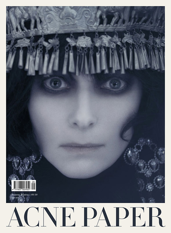
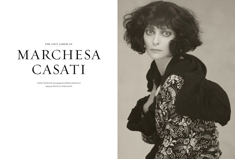
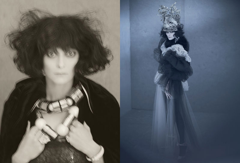
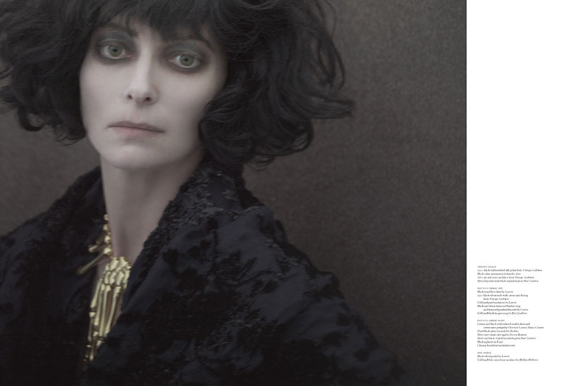
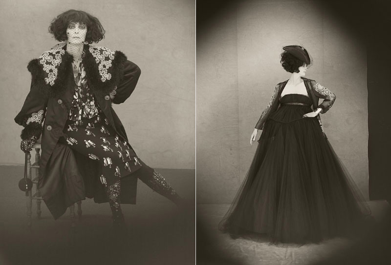
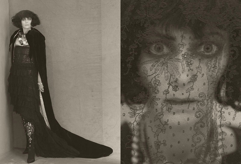
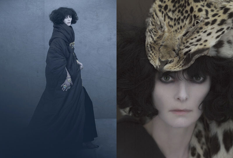
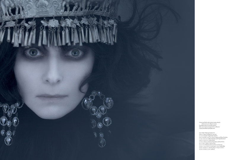
Donning a brunette wig, actress Tilda Swinton takes on the daunting task of channeling the late fashion icon and patroness of the arts, Marchesa Casati, in the fall-winter issue of Acne Paper Sweden. In front of the lens of Paolo Roversi, Swanton transforms into the Italian legend in dark ensembles styled by Mattias Karlsson.



Gaunt, hollow-eyed, emaciated. Is this beauty? Is this fashion?
I hope not!
no it unfortunately isn't as much as it should, thanks to people who thinks like you. Is this fashion? oh please…
no it unfortunately isn't as much as it should, thanks to people who thinks like you. Is this fashion? oh please…
Gaunt, hollow-eyed, emaciated. Is this beauty? Is this fashion?
I hope not!
Gaunt, hollow-eyed, emaciated. Is this beauty? Is this fashion?
I hope not!
no it unfortunately isn't as much as it should, thanks to people who thinks like you. Is this fashion? oh please…
Not really feeling this editorial. I like what they were trying to do, but it seems too much.
Not really feeling this editorial. I like what they were trying to do, but it seems too much.
Not really feeling this editorial. I like what they were trying to do, but it seems too much.
Roversi is one of my favorite photographers, but since the 8×10 Polaroid (discontinue by the Polaroid Corp.) has been discontinued, his work no longer has the same magic. It's missing that element, which can only be had when using that incredible film. He's shooting less with 8X10 cameras, as well, it looks like. In the days when he was shooting the 8X10 Polaroid, he was using that camera and doing creative focusing with the title/shift elements. That's missing, as well.
Roversi is one of my favorite photographers, but since the 8×10 Polaroid (discontinue by the Polaroid Corp.) has been discontinued, his work no longer has the same magic. It's missing that element, which can only be had when using that incredible film. He's shooting less with 8X10 cameras, as well, it looks like. In the days when he was shooting the 8X10 Polaroid, he was using that camera and doing creative focusing with the title/shift elements. That's missing, as well.
Roversi is one of my favorite photographers, but since the 8×10 Polaroid (discontinue by the Polaroid Corp.) has been discontinued, his work no longer has the same magic. It's missing that element, which can only be had when using that incredible film. He's shooting less with 8X10 cameras, as well, it looks like. In the days when he was shooting the 8X10 Polaroid, he was using that camera and doing creative focusing with the title/shift elements. That's missing, as well.
Beautiful!!!
Beautiful!!!
Beautiful!!!
Finally an editorial that isn’t full of empty glam and blank “looks”. So Art Nouveau, with the sunken eyes and the long curves..
Finally an editorial that isn’t full of empty glam and blank “looks”. So Art Nouveau, with the sunken eyes and the long curves..
Finally an editorial that isn’t full of empty glam and blank “looks”. So Art Nouveau, with the sunken eyes and the long curves..
Amazing blog 🙂
Amazing blog 🙂
Amazing blog 🙂
Isn't her last name Swinton, not Swanton?
Isn't her last name Swinton, not Swanton?
Isn't her last name Swinton, not Swanton?
In style of Man Ray (Markiza Casati photo).
In style of Man Ray (Markiza Casati photo).
In style of Man Ray (Markiza Casati photo).
Fantastic!!!
Fantastic!!!
Fantastic!!!
Weird and beautiful. Just like her.
Weird and beautiful. Just like her.
Weird and beautiful. Just like her.
Wow, they look just like the originals.
Wow, they look just like the originals.
Wow, they look just like the originals.
why does she turn out to be like Jonny Depp in the 1st picture??
I actually thought it was Johnny Depp as the Mad Hatter for Alice in Wonderland when I first saw the pic. The pics are nice though and more interesting than most of the other U.S. fashion magazine spreads.
I actually thought it was Johnny Depp as the Mad Hatter for Alice in Wonderland when I first saw the pic. The pics are nice though and more interesting than most of the other U.S. fashion magazine spreads.
why does she turn out to be like Jonny Depp in the 1st picture??
why does she turn out to be like Jonny Depp in the 1st picture??
I actually thought it was Johnny Depp as the Mad Hatter for Alice in Wonderland when I first saw the pic. The pics are nice though and more interesting than most of the other U.S. fashion magazine spreads.
well I love it, such dark beauty!
well I love it, such dark beauty!
well I love it, such dark beauty!