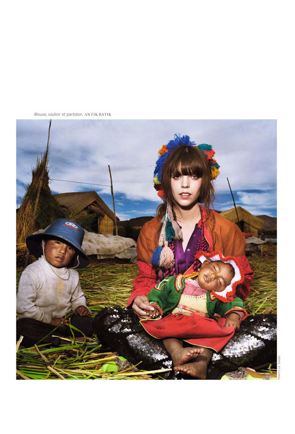
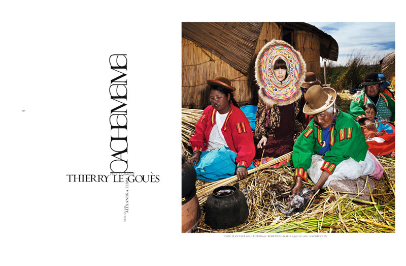
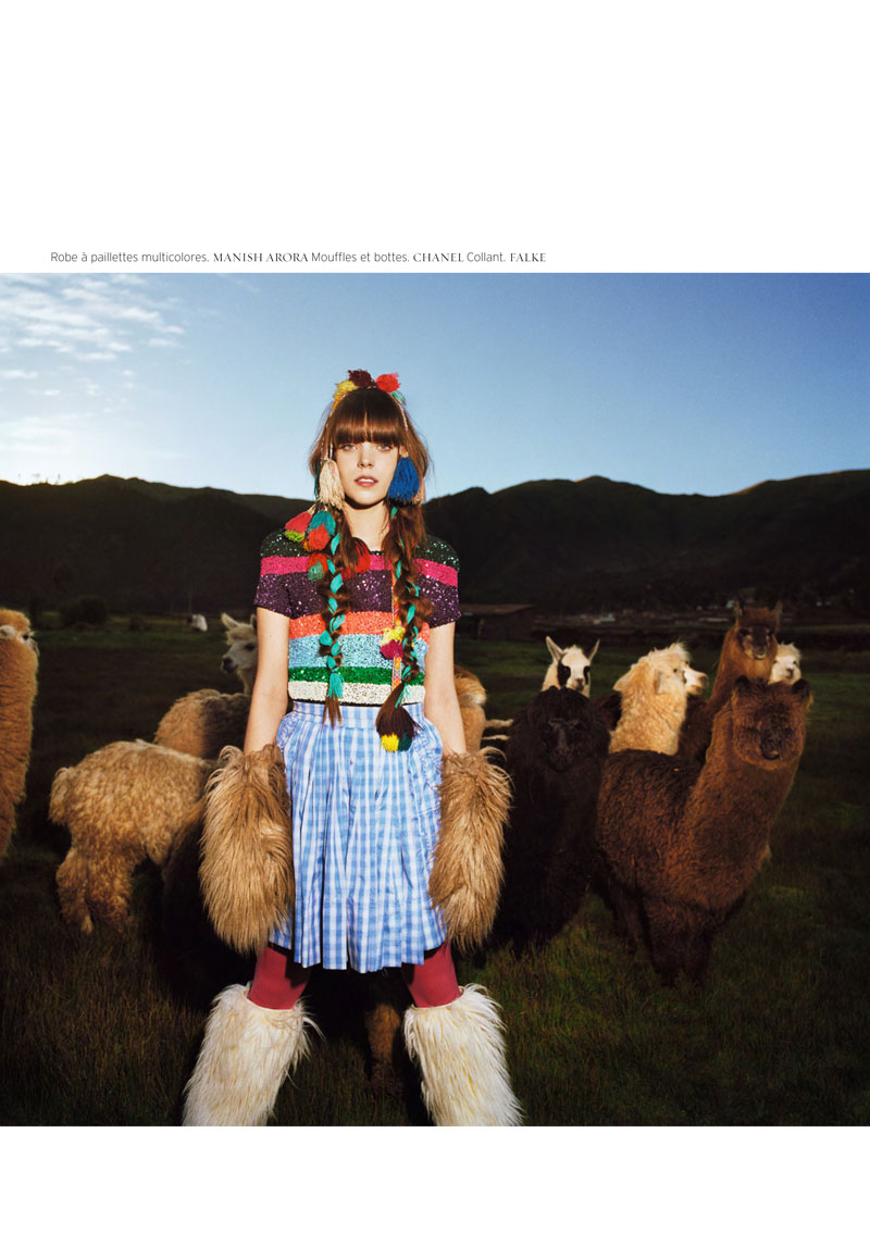
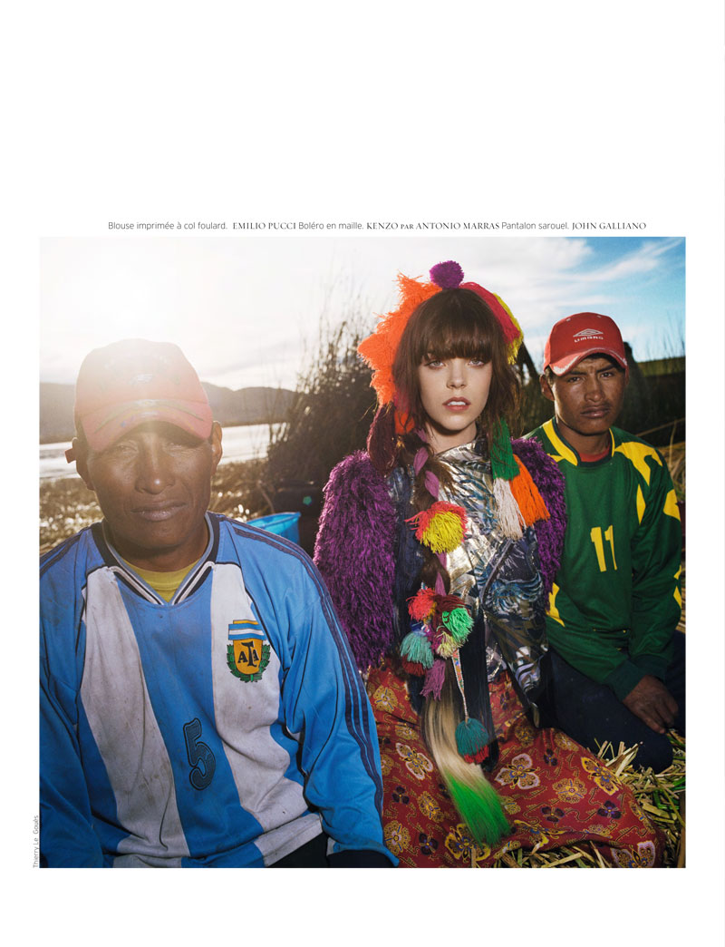
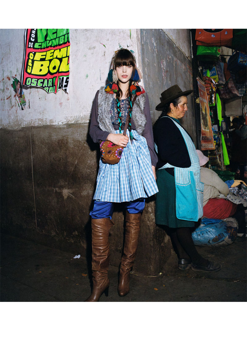
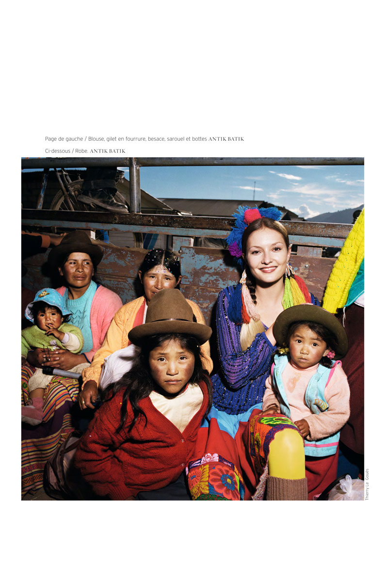
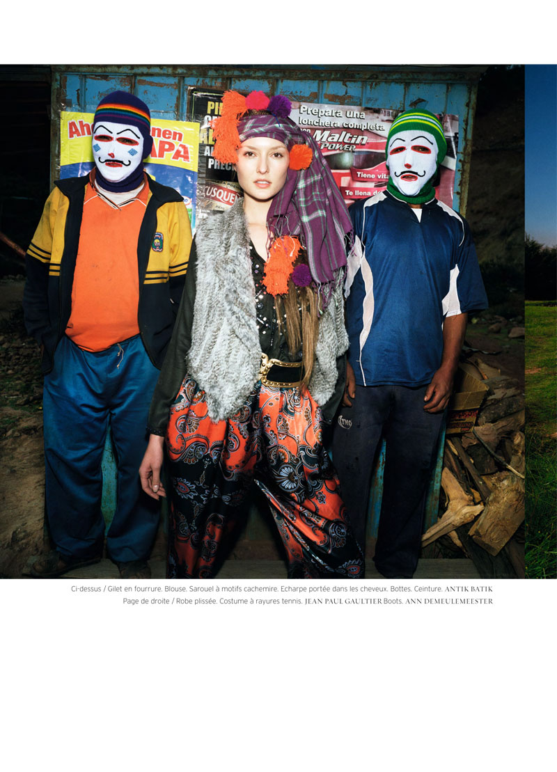
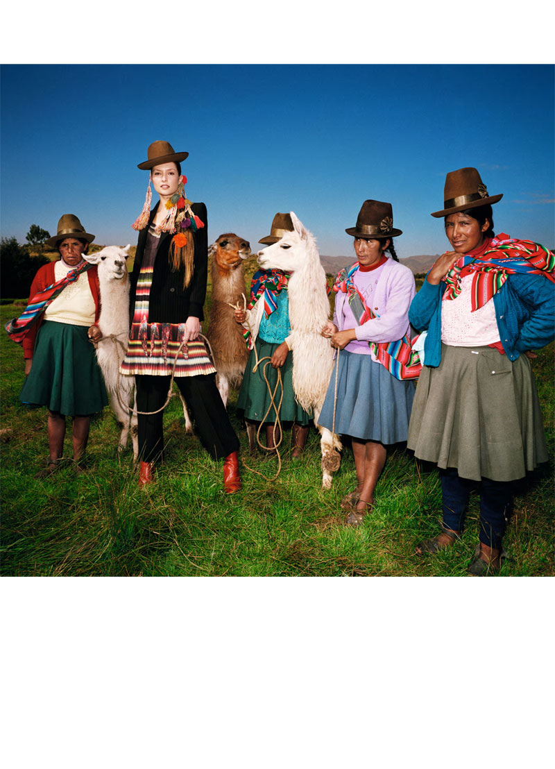
Thierry Le Gouès travels to Peru for a story of fall fashions and local traditions in the latest French Revue de Modes. Starring Meghan Collison and Solange Wilvert, the colorful spread features boldly layered looks from the likes of Emilio Pucci, Kenzo and Antik Batik. Styled by Alexandra Elbim, Meghan and Solange take to the rich landscapes including markets, water and open land.
Personally I think the stylist failed in this shoot.
quite ugly, to be honest.
What a beautiful tribute to my neighbors that Peruvians. I do not see the pictures a banal portrayal of a people. Fashion is somewhat ostentatious then take him to Peru is to elevate the soul of the people. I loved the pictures!
elevating the soul with ostentatious fashion?
What a beautiful tribute to my neighbors that Peruvians. I do not see the pictures a banal portrayal of a people. Fashion is somewhat ostentatious then take him to Peru is to elevate the soul of the people. I loved the pictures!
I love seeing the Peruvians! Pretty good editorial
haha you say that as if they’re a brand and not people.
Doesn’t this seem…forced? I dunno…the images themselves seem interesting…but the model seems…stiff and not interacting with the scenes…
*yikes* I love Peruvian fiber arts. For Andean peoples, the fiber arts were more important than precious metals. This feels horribly forced. It doesn’t seem to draw on the background of the garments at all or the culture from which they come, but simply replaces them on a staring, mannequin-faced model. It is an interesting concept, and one that I think deserves attention, but it needs a bit of work.
yeah it seems more like, oh look first world rich people clothes on a skinny white girl surrounded by brown people! we are so trendy and edgy. get the fuck out. this is horrible and forced and the community members look like they hate it. also, the styling sucks.
Great style and I LOVE the colors.
http://nyc-fashion.com/
meghan collison only knows how to make one face. it’s the “my teeth are showing but im not smiling” face. wish she could.. switch it up.
meghan collison only knows how to make one face. it’s the “my teeth are showing but im not smiling” face. wish she could.. switch it up.
meghan collison only knows how to make one face. it’s the “my teeth are showing but im not smiling” face. wish she could.. switch it up.
this editorial is QUITE DISTURBING…… this is not a tribute but a mockery of those people and culture.
I completely agree. If the photographer wanted to document Peru’s countryside culture, he shouldn’t bring a 5,10′ white model with ostentatious and outrageously expensive clothes to pose with them. What is this, a joke? If he wanted to make Peruvians look cute or make social commentary (which I really doubt) either way, he failed tremendously. This is ridiculous and it bothers me.
I agree, it’s exploitive, cheap and also rather absurd.
I agree, it’s exploitive, cheap and also rather absurd.
People of color never take center stage. Sigh.
I’m a fan of Thierry since first seeing his Cuba pictures back in the days of film. Fashion surfers might want to contrast this editorial with another one recently shot in Peru by Mario Testino and featuring Daria Werbowy and Lily Donaldson. The Testino editorial seems to have been well recieved (in stark contrast to this one) and my guess is that it’s because the models were disconnected from the locals while still being portrayed as friendly multi-cultural tourists or visitors. Thierry appears to have attempted to go a few steps further by connecting the models directly with the locals rather than just portraying them simply as visitors. But his attempt doesn’t appear to go over well and maybe it’s because most people still aren’t willing to take the leap from multi-culturalism into multi-racialism.
Mike, it’s not about multiculturalism vs multiracialism.
The Testino editorial was good because they were obviously tourists posed as trying to appreciate the local culture for what it was. This editorial is, look she is one of them! And she’s obviously not. It has less to do with her being white and them being not-white and more to do with how the photog might be trying to convey Peruvian culture but feels a person who looks and is nothing like the locals is more apt to do so. As if the locals cant stand on their own two feet. You can’t stick someone in traditional clothes and say assimilate! And hope it works.
This is such a bad editorial.
I didn’t like Testino’s editorial either. But how can you talk about multi-culturalism or multi-racism here? there’s no ‘multi’, there’s just one simple dichotomy here: in the center, calling all the attention, a first world rich skinny tall white girl wearing expensive clothes (clothes that the local people wouldn’t be able to buy, not even in their wildest dreams), and surrounding her, third world brown poor people in dirty clothes. There’s no connection or mingling around here. The photographer also chose to give the same clichéd image of Peru everybody has seen…very original!
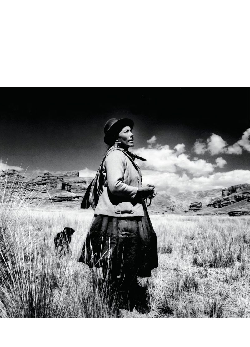
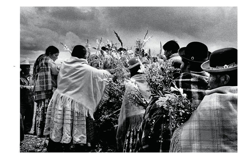
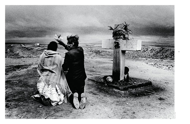
On another note, I checked Thierry’s site and he really has wonderful photographs, but this is sooo bad. Except for the bw shots where there’s no model, of course.
The Peruvians in this shoot look so much more good than those girls and clothes !
The best pictures are the ones without the model. Not where you want to be, guys.
My thoughts exactly!
The best pictures are the ones without the model. Not where you want to be, guys.
The best pictures are the ones without the model. Not where you want to be, guys.
The best pictures are the ones without the model. Not where you want to be, guys.
Im from Peru and i really dont like this editorial. Its not only that im sick and tired of seeing always the same approach to my country, which is real in a way, but not everything is rural people in the highlands (many foreign friends didnt knew Peru has jungle and a seacost). The models are totally disconnected from whats happening around them and it looks like theyre not even trying. The styling also feels clumpsy and in some shoots, the people look really uncomfortable (just my impresion, but i feel pretty sure on this). The most beautiful shots are the b/w ones, without the models and all that awkwardly staged composition.
After Constance traveled to Africa, Meghan decided to vacation in Peru. She mingled with locals, they had a good time.
After Constance traveled to Africa, Meghan decided to vacation in Peru. She mingled with locals, they had a good time.
http://www.ihurtiaminfashion.com
I like the colors but that’s about it when it comes to the models. It really does just look forced, almost like a crappy comedy where the some pretty rich decides that she’s going to try to save what doesn’t really need to saving and she’s the only one happy about it. They don’t fit into the scene very well at alls. D:
Though I do lovvve the black and white photos.
I agree with the consensus that this spread was done in poor choice, the photos seem forced and I agree with Allee Lee “almost a crappy comedy..” Definitely not a fan.
I agree with the consensus that this spread was done in poor choice, the photos seem forced and I agree with Allee Lee “almost a crappy comedy..” Definitely not a fan.
I agree with the consensus that this spread was done in poor choice, the photos seem forced and I agree with Allee Lee “almost a crappy comedy..” Definitely not a fan.
Anybody else more distracted by the fact that Meg Collison’s face is frozen in every shot? Close that mouth girl, please.
Anybody else more distracted by the fact that Meg Collison’s face is frozen in every shot? Close that mouth girl, please.
You gottah be kidding me with this crap
You gottah be kidding me with this crap
I don’t like this at all….and Why does this look more like Bolivia than Peru!?? are you positive this was shot in Peru?
I don’t like how the models seem so healthy and perfect next to the peruvian people, it looks racist, sorry but it’s true. Didn’t like it at all
As a peruvian myself, I found this extrely beautiful, original and touching
actually I think the composition is good, but my God… those each of those 2 models only has 1 look and both of them look sleepy
las personas están siendo utilizadas como adorno de la foto, los niños, los animales, es un insulto para los peruanos, que tomen a nuestros compatriotas como objetos que adornan la composición. UGLY