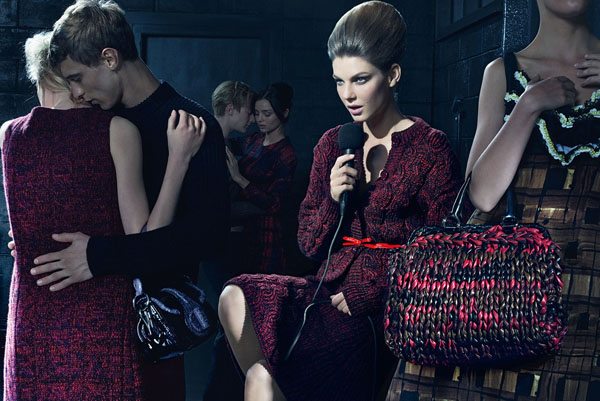
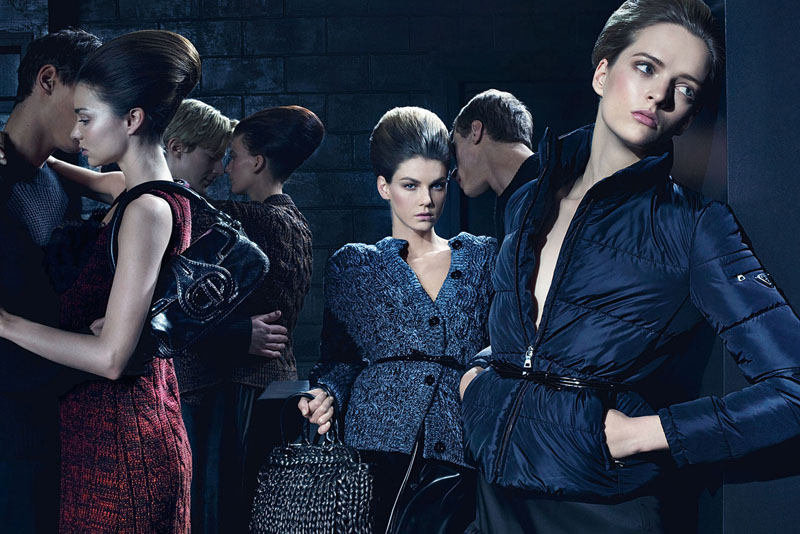
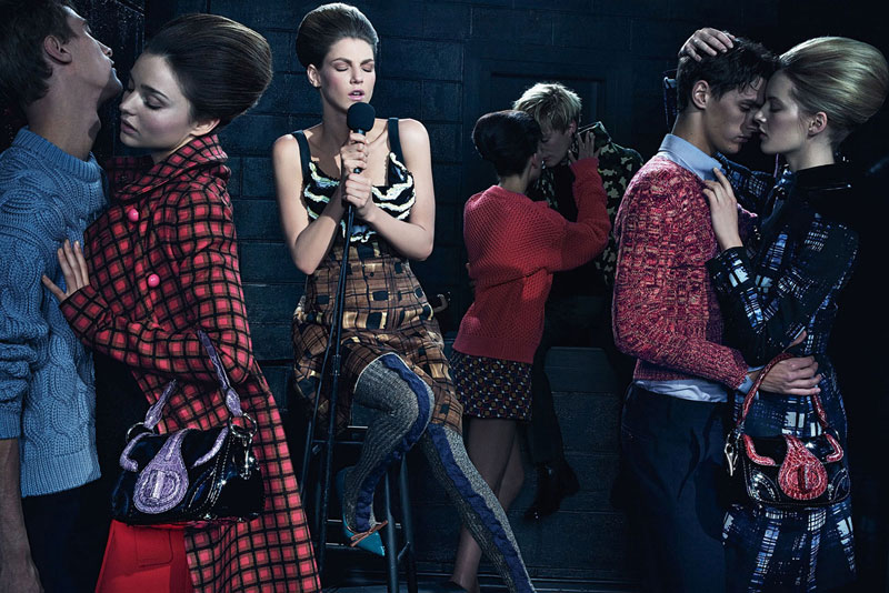
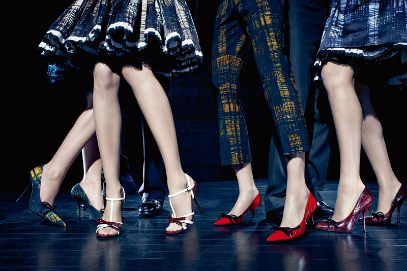
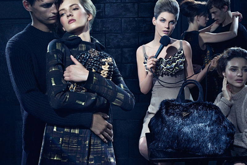
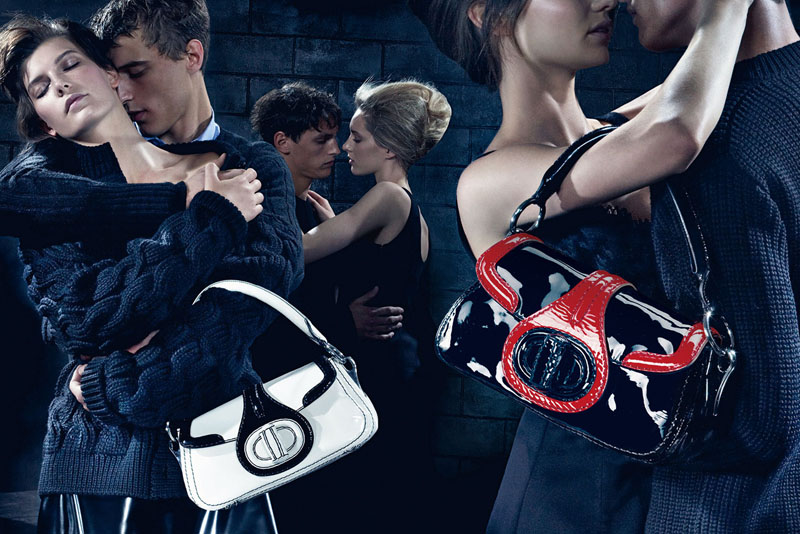
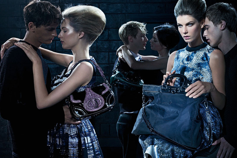
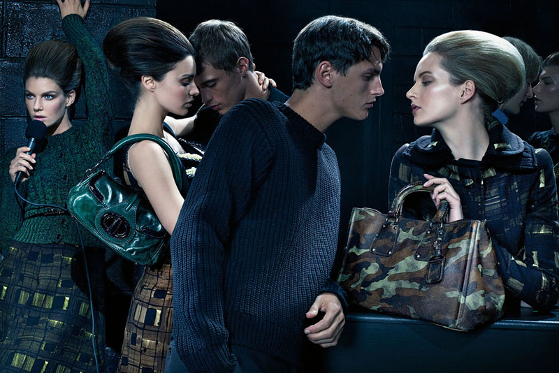
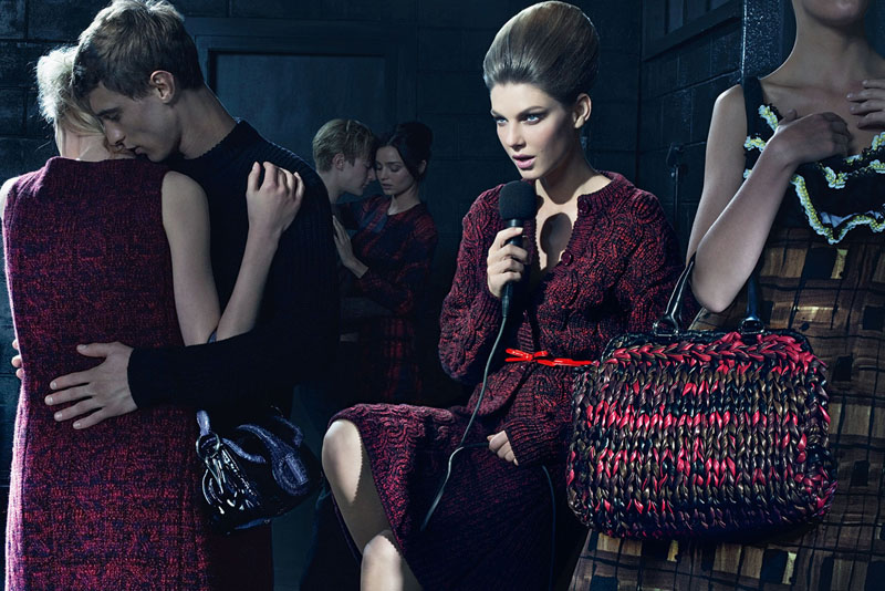
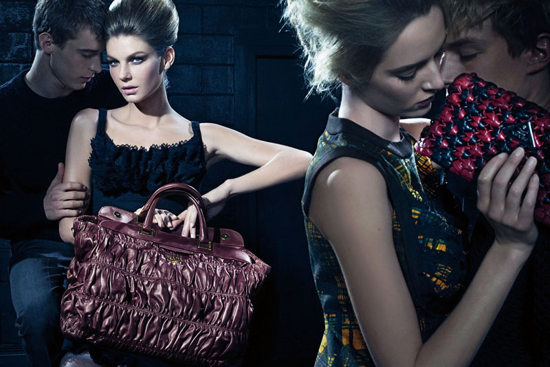
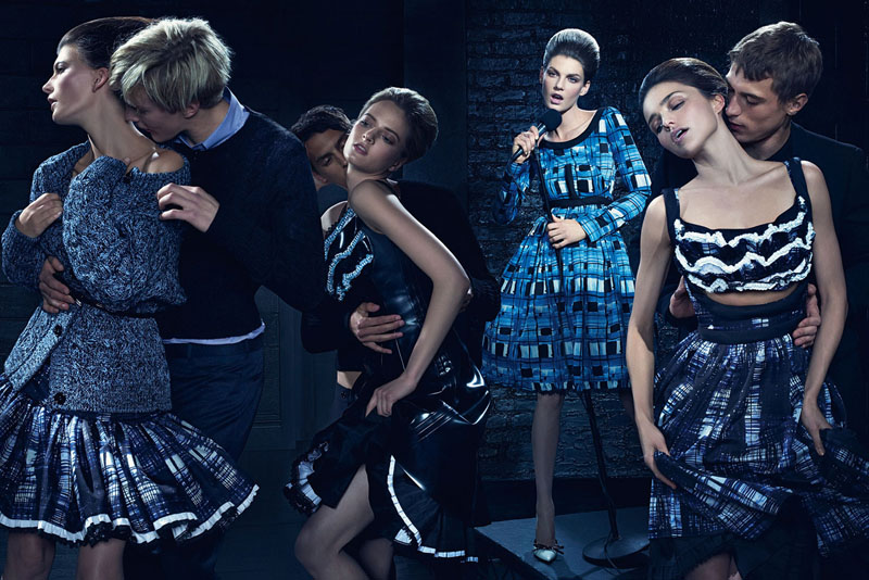
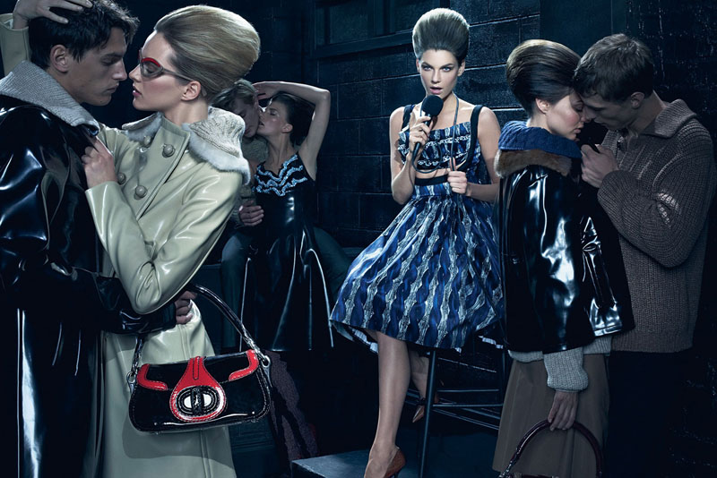
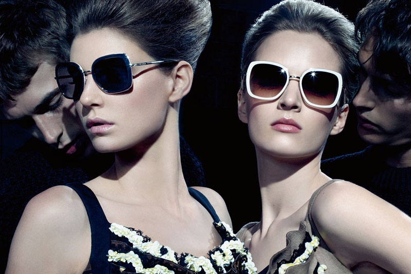
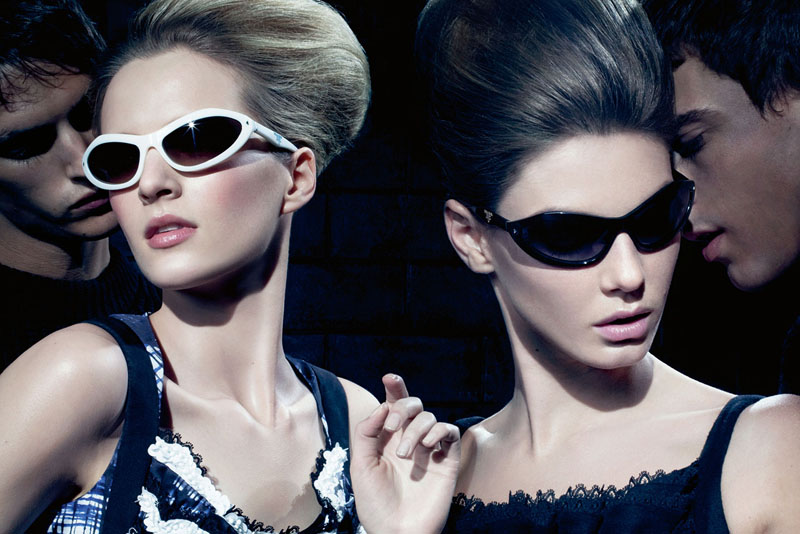
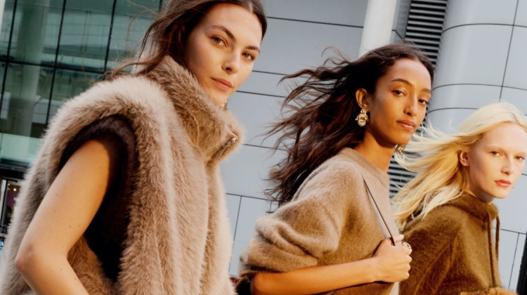
Despite being a campaign of many models, the absolute standout of Prada’s fall advertisements is Angela Lindvall. Surrounded by the moody crowd of Daria Strokous, Valerija Kelava, Miranda Kerr and others, Angela sings her heart out in front of Steven Meisel’s lens as she dons the brand’s kitsch dresses and accessories.
Beyond gorgeous. ♥
Beyond gorgeous. ♥
Beyond gorgeous. ♥
lol why is Miranda even here? & im sorry but this is so uninspiring
She's been trying high fashion a lot more lately.
She's been trying high fashion a lot more lately.
lol why is Miranda even here? & im sorry but this is so uninspiring
She's been trying high fashion a lot more lately.
Love the mood of this campaign. Steven really lit the pieces of this collection beautifully!
http://www.chungkitblog.wordpress.com
Love the mood of this campaign. Steven really lit the pieces of this collection beautifully!
http://www.chungkitblog.wordpress.com
Love the mood of this campaign. Steven really lit the pieces of this collection beautifully!
http://www.chungkitblog.wordpress.com
I get they were going for a mood, but what's the point if every shot is so completely distracting. Do the bags have to be so prominently in the foreground that the clothes seem completely secondary. But more importantly, it looks like all the couples were shot separately and photoshopped together. Right? Am I crazy?
re: the couples, I see that too and it is what bothers me the most about this campaign. The bags look to me as if they were also shot seperately. I suppose the idea was to create depth but instead it all just looks pasted together, ruining any attempt at atmosphere. How disappointing.
re: the couples, I see that too and it is what bothers me the most about this campaign. The bags look to me as if they were also shot seperately. I suppose the idea was to create depth but instead it all just looks pasted together, ruining any attempt at atmosphere. How disappointing.
I get they were going for a mood, but what's the point if every shot is so completely distracting. Do the bags have to be so prominently in the foreground that the clothes seem completely secondary. But more importantly, it looks like all the couples were shot separately and photoshopped together. Right? Am I crazy?
re: the couples, I see that too and it is what bothers me the most about this campaign. The bags look to me as if they were also shot seperately. I suppose the idea was to create depth but instead it all just looks pasted together, ruining any attempt at atmosphere. How disappointing.
these are weird :/ but those glasses are beautiful
these are weird :/ but those glasses are beautiful
these are weird :/ but those glasses are beautiful
Miranda Kerr has never stroked me as editorial material. This shoot kind of clarifies it for me.
The lighting and set up is pretty amazing.
Miranda Kerr has never stroked me as editorial material. This shoot kind of clarifies it for me.
The lighting and set up is pretty amazing.
Miranda Kerr has never stroked me as editorial material. This shoot kind of clarifies it for me.
The lighting and set up is pretty amazing.
Some of the models/couples look like they were photoshopped in. Something about the disparity of the lighting bothers me…
Some of the models/couples look like they were photoshopped in. Something about the disparity of the lighting bothers me…
Should have used Joanna Cole she exudes classy confidence better than any of these girls, imo
Should have used Joanna Cole she exudes classy confidence better than any of these girls, imo
Should have used Joanna Cole she exudes classy confidence better than any of these girls, imo
Angela looks like the most boring singer in the world
Angela looks like the most boring singer in the world
Angela looks like the most boring singer in the world
You can hardly even see Miranda in any of these :[
You can hardly even see Miranda in any of these :[
You can hardly even see Miranda in any of these :[
Miranda Kerr is completely invisible. She's not even TRYING. She fails as an editorial model. Its just a sad waste, really.
She should go back to Teen Vogue + VS.
Miranda Kerr is completely invisible. She's not even TRYING. She fails as an editorial model. Its just a sad waste, really.
She should go back to Teen Vogue + VS.
Miranda Kerr is completely invisible. She's not even TRYING. She fails as an editorial model. Its just a sad waste, really.
She should go back to Teen Vogue + VS.
dont like miranda here she's not prada material for me
agree is very distracting i dont even know what to look at here, beautiful clothes and valerija!
dont like miranda here she's not prada material for me
agree is very distracting i dont even know what to look at here, beautiful clothes and valerija!
dont like miranda here she's not prada material for me
agree is very distracting i dont even know what to look at here, beautiful clothes and valerija!
whenever I see Miranda Kerr I immediately think VS not prada. I kinda have mixed feelings about this campaign
whenever I see Miranda Kerr I immediately think VS not prada. I kinda have mixed feelings about this campaign
oh the clothes ♥♥♥
oh the clothes ♥♥♥
oh the clothes ♥♥♥
These are pretty weirdly shot. I know that this is the typical Prada style of photography, yet just something…ugh, I don’t know. With these clothes, and the setting, and the intended mood, and just…everything about the concept, the lighting and all-over sharpness and color scheme is just WRONG. Speaking on purely aesthetic terms, this really bothers me. It’s all so fake, and not in a conceptually interesting way, in a cheap way that doesn’t seem intentional.
On the other hand, Clement Chaubernaud is fine as hell.
The whole concept seems really awkward. The 50s/60s housewife inspired clothes with a beatnik underground scene? So wrong.
Plus the photoshopping and colour tone make it very stiff and forced – and not in a quirky or ironic way.
The whole concept seems really awkward. The 50s/60s housewife inspired clothes with a beatnik underground scene? So wrong.
Plus the photoshopping and colour tone make it very stiff and forced – and not in a quirky or ironic way.
The whole concept seems really awkward. The 50s/60s housewife inspired clothes with a beatnik underground scene? So wrong.
Plus the photoshopping and colour tone make it very stiff and forced – and not in a quirky or ironic way.
Except for the ponyskin bag, the bags are * ugly,
Except for the ponyskin bag, the bags are * ugly,
Except for the ponyskin bag, the bags are * ugly,
I adore this. Kinda sexual, but yet tamed, and I could care less for Miranda, she is not editorial material at all, proven here once and for all.
I adore this. Kinda sexual, but yet tamed, and I could care less for Miranda, she is not editorial material at all, proven here once and for all.
I adore this. Kinda sexual, but yet tamed, and I could care less for Miranda, she is not editorial material at all, proven here once and for all.
i really do not like this. i get where they are trying to go for but i just dont feel it. i dont feel the mood at all
i really do not like this. i get where they are trying to go for but i just dont feel it. i dont feel the mood at all
i really do not like this. i get where they are trying to go for but i just dont feel it. i dont feel the mood at all
singer is Kate Judd
http://www.youtube.com/user/KiNkSTaKaTeY
singer is Kate Judd
http://www.youtube.com/user/KiNkSTaKaTeY
singer is Kate Judd
http://www.youtube.com/user/KiNkSTaKaTeY
I adore this. Kinda sexual, but yet tamed, and I could care less for Miranda, she is not editorial material at all, proven here once and for all.