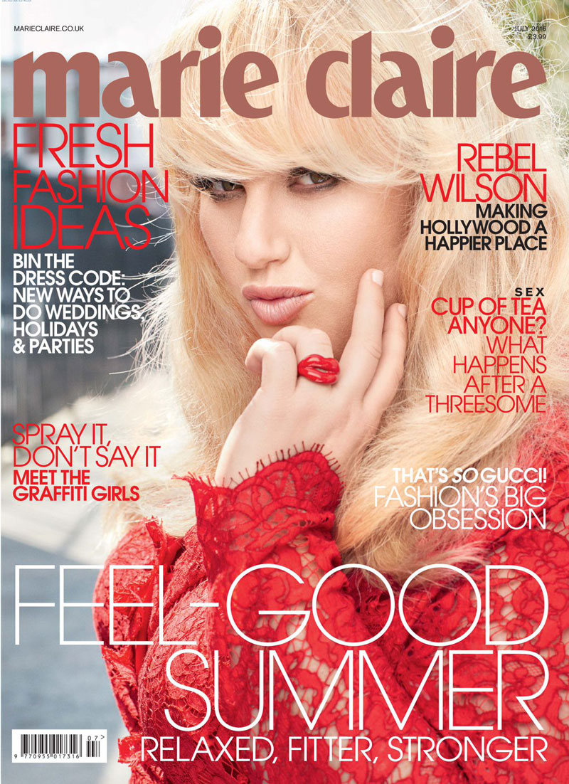
Rebel Wilson looks absolutely gorgeous on her Marie Claire cover, as her smoky eyes peek out from under a full-bodied blonde bombshell fringe – only one of the biggest 2016 hairstyle trends. Her captivating eyes that are subtly seductive are further complemented by full, pouty lips that seem to be perfectly posed for a fun and flirty kiss. Enticing, absolutely! However, there is some are frustrated at the way that most high-fashion magazines only ever seem to want to show Wilson’s pretty face, and never want to show her full curvy body on the cover. And that goes for all of the gorgeous actresses with curves that consistently grace the covers of the top fashion and beauty magazines.
For the Marie Claire July Issue, Wilson is featured from the bust up in a sort of head-shot composition, and is featured in the same kind of shot on the covers of ELLE, Glamour, Cleo, and The New Yorker, to name a few. Although the majority of covers from these magazines tend to show a three-quarter shot of cover models when they are thin, they always seem to resort to the same “hide the curves” shots when featuring a woman with this type of body shape, and have done so not only with Rebel Wilson, but also with Melissa McCarthy, Adele, Octavia Spencer, Mindy Kaling, and many more.
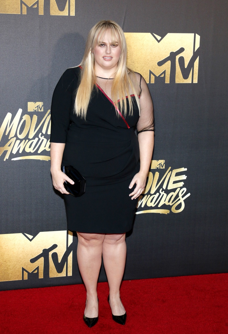
And although many of the feature stories in these magazines include full-body shots within the feature story pages – shots like the one of Wilson in a full sequin gown looking incredibly Hollywood glam and knockout gorgeous in the Marie Claire feature – none of the full body shots ever seem to make it onto the covers. And often even when full body shots are included within the feature pages, they are usually photographed at more flattering angles to make the model look thinner, or with large, draped clothing that also conceals the curves.
The question then arises: why are women with curves portrayed in this way, and why don’t these voluptuous curves ever make their way onto the covers of magazines? The explanation seems to be related to drawing factor and appeal to purchase the magazine. Even if they don’t blatantly say it, by not featuring their plus sized models in all of their curvy glory, magazines are sending a message that this is not an attractive enough look and will not sell magazines.
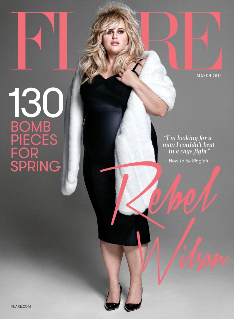
And yet, basic marketing 101 would seem to suggest that this approach is far from an optimal marketing strategy, let alone far from the truth. In conventional marketing, successful tactics revolve around researching the core demographic that the brand or product is trying to reach, and the creation of a buyer persona is often necessary which can reflect that target market and which the market can relate to. However, as the average woman in the UK is “5ft 3in tall, weighs 11 stone (70.2kg) and wears a size 16,” showing only size 2 and size 4 models on the covers of magazines doesn’t accurately reflect the core demographic that the magazine is ultimately trying to sell to. It would actually seem to be a better tactic to consider showing women closer to a size 16.
Without question, Rebel Wilson is absolutely stunning in her Marie Claire spread, proving once again that she is an incredibly beautiful and alluring person with a unique spark that is distinctly her. She exudes confidence exactly the way she is – curves and all! Some of this spark is captured in these photographs and should be allowed to shine bright, not only within the feature pages, but also on the cover for all the world to see.
