
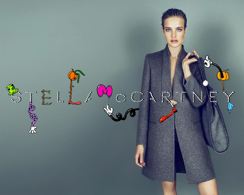
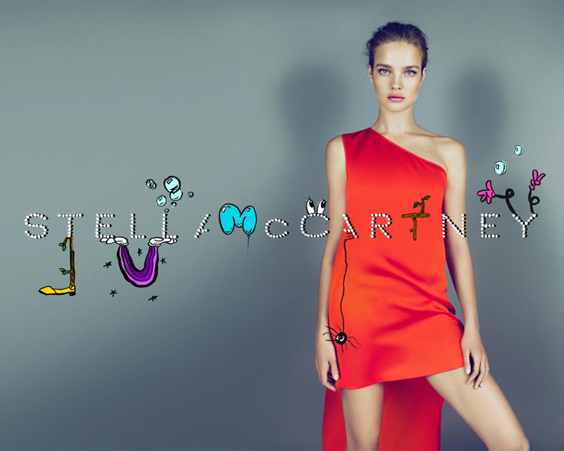
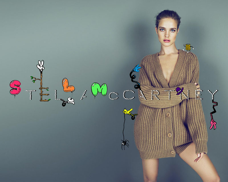
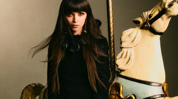
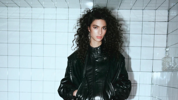
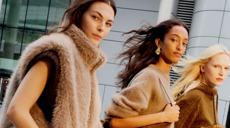
Once again, Stella McCartney goes for a touch of whimsy with its fall 2010 campaign featuring Natalia Vodianova. Lensed by Mert & Marcus, the series show Natalia against a studio backdrop with cartoons in the forefront which highlight the brand’s tailored collection.
Poorly photoshopped, too little variation. I was so excited to see this after the preview, but ah, I find this really dull.
Poorly photoshopped, too little variation. I was so excited to see this after the preview, but ah, I find this really dull.
Love the whole cartoon aspect but the positioning of the print really bothers me. Natalia looks amazing, as all ways.
Love the whole cartoon aspect but the positioning of the print really bothers me. Natalia looks amazing, as all ways.
Love the whole cartoon aspect but the positioning of the print really bothers me. Natalia looks amazing, as all ways.
love this
love this
love this
goodness, natalia looks perfect.
goodness, natalia looks perfect.
Sexy, minimal, and whimsical = Fabulous!
Sexy, minimal, and whimsical = Fabulous!
see one, seen em all.
not that I don't like it, I do, but a bit of variation would have be nice.
see one, seen em all.
not that I don't like it, I do, but a bit of variation would have be nice.
she is just perfect.
she is just perfect.
I love the playful text juxtaposed with the classic clothes. Such beautiful clothes and such a beautiful model – just perfect!!
I love the playful text juxtaposed with the classic clothes. Such beautiful clothes and such a beautiful model – just perfect!!
love that stella McCartney campaign, natalia is perfect for it, she looks gorgeous in so many ways
elena http://elenavasilieva.blogspot.com/
love that stella McCartney campaign, natalia is perfect for it, she looks gorgeous in so many ways
elena http://elenavasilieva.blogspot.com/
love that stella McCartney campaign, natalia is perfect for it, she looks gorgeous in so many ways
elena http://elenavasilieva.blogspot.com/
Her face is stunning
Her face is stunning
I like the concept but feel like the illustrations need a little more thought
I like the concept but feel like the illustrations need a little more thought
I like the concept but feel like the illustrations need a little more thought
She is so expressionate… not!!
She is so expressionate… not!!
She is so expressionate… not!!
This could have been boring, but it´s actually beautiful. LOVE it!!
This could have been boring, but it´s actually beautiful. LOVE it!!
This could have been boring, but it´s actually beautiful. LOVE it!!
This were the three outfits that Natasha Poly wore in the runway… I like that.. first in the runway with a great model, then to print with another great model
This were the three outfits that Natasha Poly wore in the runway… I like that.. first in the runway with a great model, then to print with another great model
This were the three outfits that Natasha Poly wore in the runway… I like that.. first in the runway with a great model, then to print with another great model