

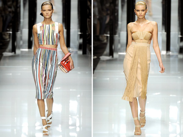
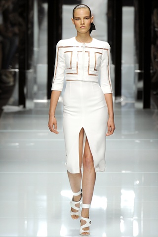
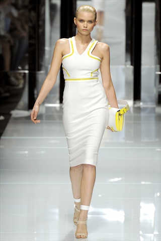
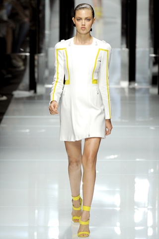
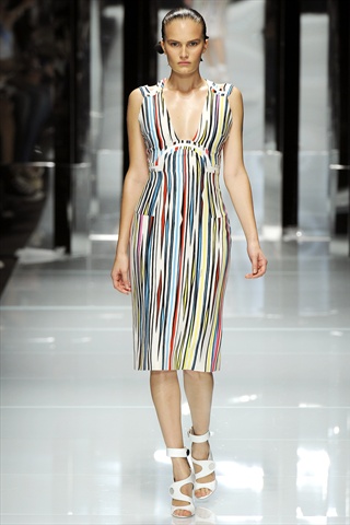
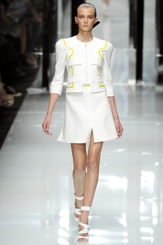
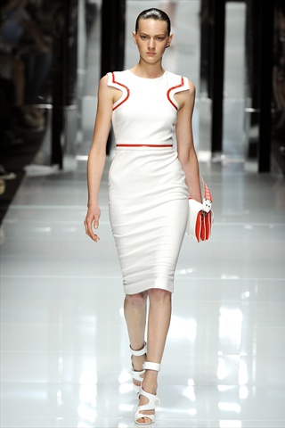
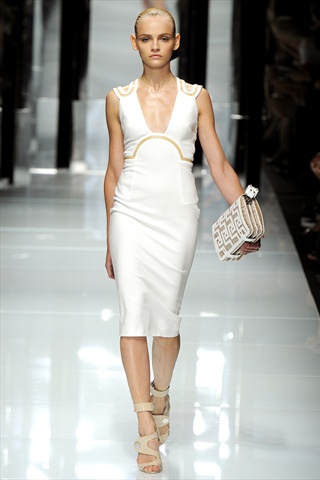
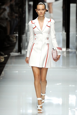
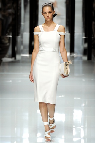
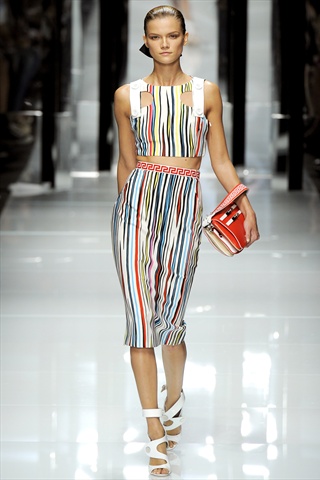
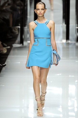
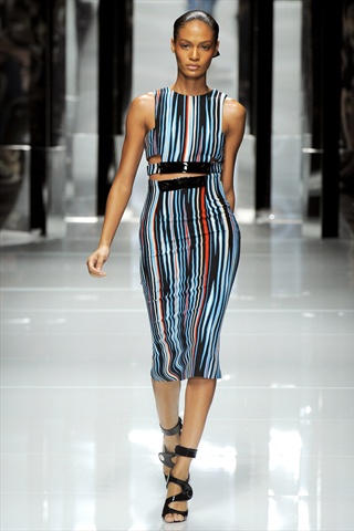
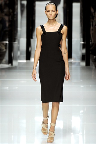
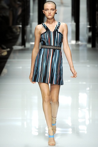
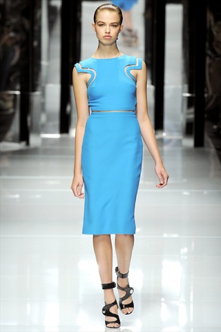
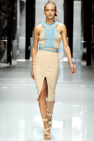
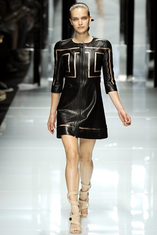
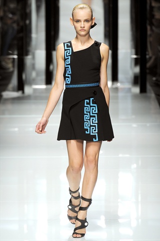
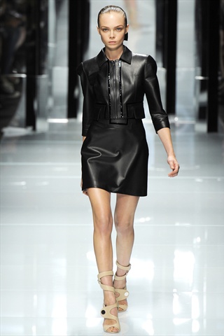
Contrast is key to Versace’s spring 2011 collection. Light and dark. Lustrous and matte. Clean and patterned. Opposites truly attract in the Italian fashion house’s latest outing. In addition to the reoccurring theme of contrasts, the Versace logo made an appearance on a few pieces used as a decorative design. Know for its sexiness and glamour, there was certainly not a shortage of skin on the runway with interrupted silhouettes broken up by PVC inlays or cut-outs. Ending with a finale of fringe decorated gowns, seduction took runway form.
                    |

great collection!nice show
Have a Fabulous day!
http://tiffanyssmallworld.blogspot.com
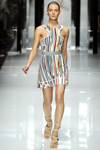
oh…no..usually i do like Versace VERY much….but now i like like 3 pieces, how about you guys? It doesnt look expensive at all, and the multi colour pieces? NO!
I love the greek style but I agree the multi colour pieces are not so great.
I love the greek style but I agree the multi colour pieces are not so great.
loved the collection, gorge white dresses + great detail too
vasilieva
http://elenavasilieva.blogspot.com/
x
loved the collection, gorge white dresses + great detail too
vasilieva
http://elenavasilieva.blogspot.com/
x
can be much better… very bad this fashion week 🙁
Not quite Versace like I remember, but this is still pretty nice. I’m not LOVING this collection, but I definitely would buy a few of these pieces.
I like it, I always like versace. It’s sexy but mimalistic
17andalwaysdreaming.blogspot.com
love this collection. feels wearable. and i LOVE the midriffs.
http://www.collaborationetc.wordpress.com
love this collection. feels wearable. and i LOVE the midriffs.
http://www.collaborationetc.wordpress.com
Sleek and sexy!!
http://alafemme.blogspot.com
The tribal multicoloured pieces look like they just droped there.I don’t get them..