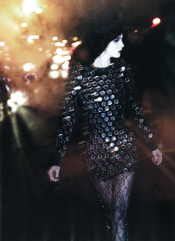
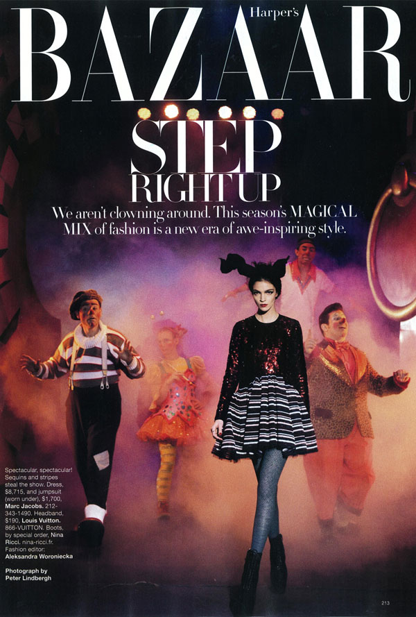
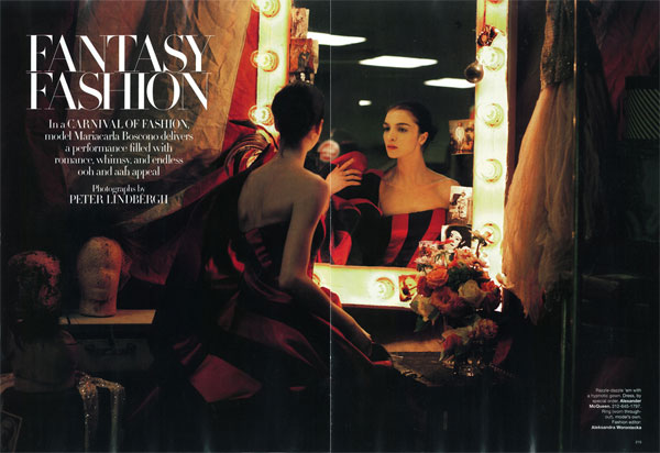
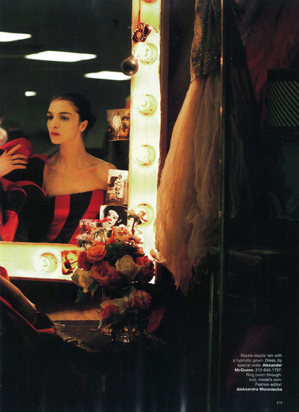
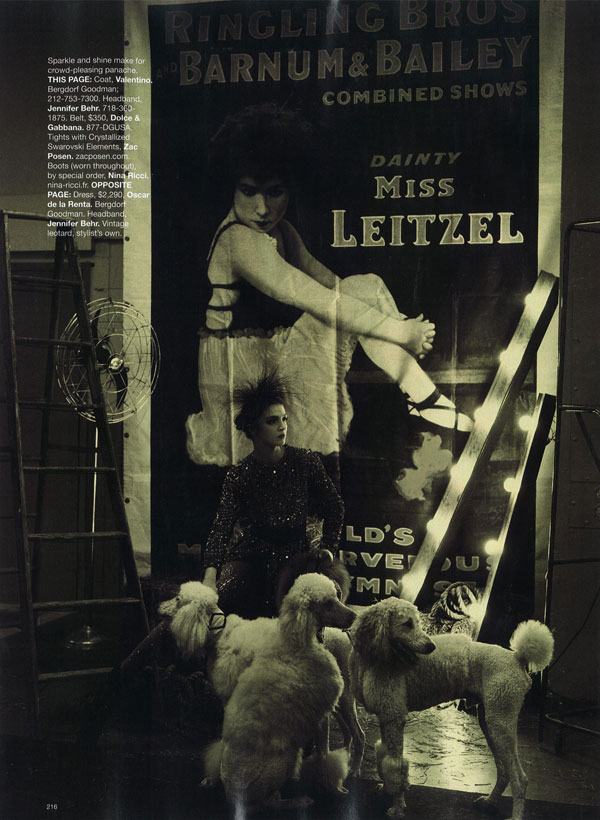
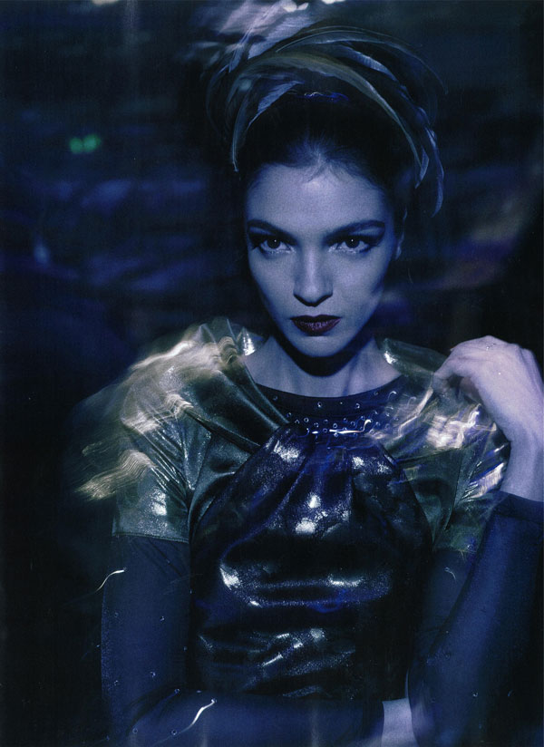
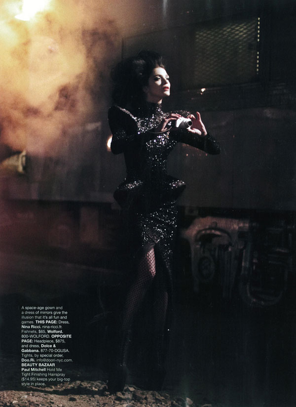
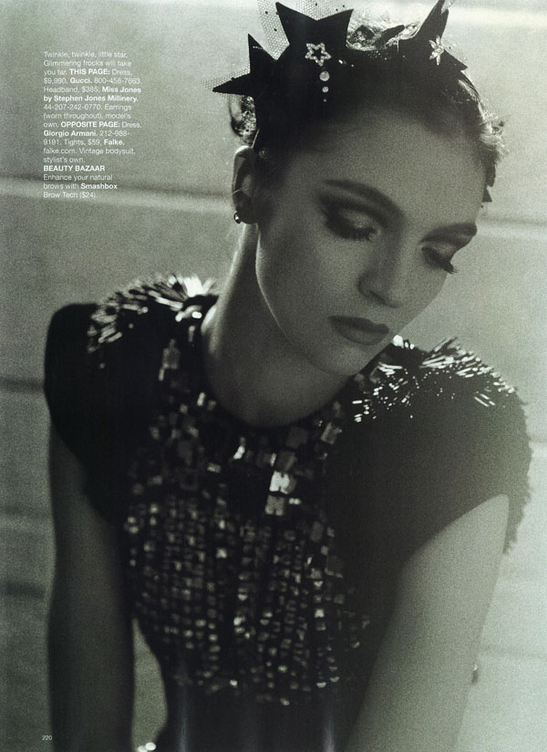
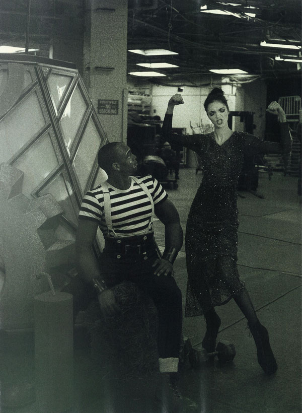
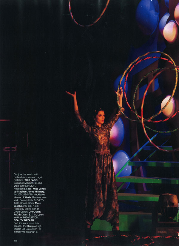
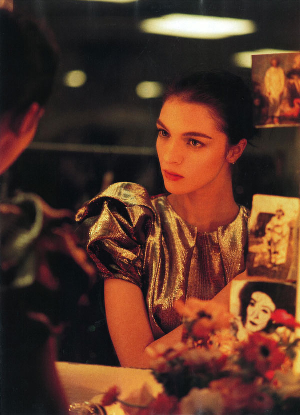
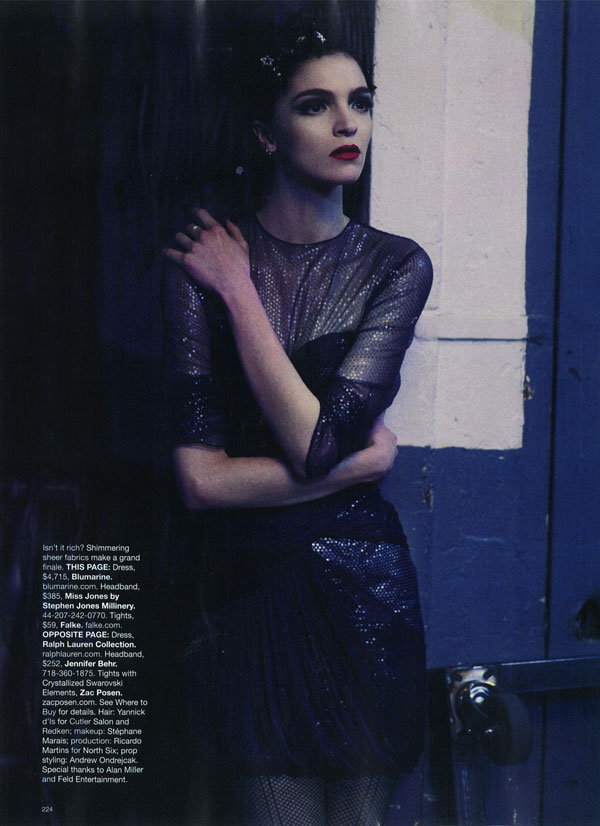
Famed photographer Peter Lindbergh brings a spectacular circus to the December issue of American Harper’s Bazaar with “Fashion Fantasy”. Styled by Aleksandra Woroniecka and featuring Mariacarla Boscono, the 13 page layout showcases designs by Nina Ricci, Gucci and Giorgio Armani.
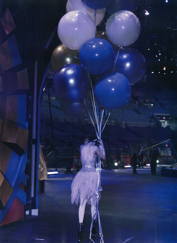
Source | behansu @ tfs
Lindbergh totally ripped off a shoot I did 4 years a go. Almost pic for pic!!!
Lindbergh totally ripped off a shoot I did 4 years a go. Almost pic for pic!!!
The first picture is just AMAZING!!! love it
The first picture is just AMAZING!!! love it
The first picture is just AMAZING!!! love it
wow, i am in love with the first photo! amazing!
wow, i am in love with the first photo! amazing!
wow, i am in love with the first photo! amazing!
here is a link comparing the 2, you decide! http://gallery.me.com/jwphotostudio#100314
Because the circus is such an original theme…
Because the circus is such an original theme…
lindbergh managed to capture emotion and you haven’t. big deciding factor for me.
lindbergh managed to capture emotion and you haven’t. big deciding factor for me.
If anything you should be flattered.. although he did seriously show you up.
If anything you should be flattered.. although he did seriously show you up.
here is a link comparing the 2, you decide! http://gallery.me.com/jwphotostudio#100314
here is a link comparing the 2, you decide! http://gallery.me.com/jwphotostudio#100314
Because the circus is such an original theme…
lindbergh managed to capture emotion and you haven’t. big deciding factor for me.
If anything you should be flattered.. although he did seriously show you up.
I really love this. The second picture is like a gateway to an alternate dimension opened it and the inhabitants are filtering in.
I really love this. The second picture is like a gateway to an alternate dimension opened it and the inhabitants are filtering in.
I really love this. The second picture is like a gateway to an alternate dimension opened it and the inhabitants are filtering in.
wow
I’m shocked by the resemblance of the image similarity…
first I thought: it was about time someone shot the inside of the circus instead of the outside.. and then this?
wow
then I started thinking: would it be possible to shoot such a similar story without having seen it?
wow
I’m shocked by the resemblance of the image similarity…
first I thought: it was about time someone shot the inside of the circus instead of the outside.. and then this?
wow
then I started thinking: would it be possible to shoot such a similar story without having seen it?
wow
I’m shocked by the resemblance of the image similarity…
first I thought: it was about time someone shot the inside of the circus instead of the outside.. and then this?
wow
then I started thinking: would it be possible to shoot such a similar story without having seen it?
I have to agree with Joanna here, the circus theme isn’t really original at all, and so there’s quite a possibility that two shoots could resemble one another without one of the photographers seeing the other before hand. I’ve seen it happen and have done it myself and vice versa. Plus in the link posted, the images barely resemble one another.
I have to agree with Joanna here, the circus theme isn’t really original at all, and so there’s quite a possibility that two shoots could resemble one another without one of the photographers seeing the other before hand. I’ve seen it happen and have done it myself and vice versa. Plus in the link posted, the images barely resemble one another.
I have to agree with Joanna here, the circus theme isn’t really original at all, and so there’s quite a possibility that two shoots could resemble one another without one of the photographers seeing the other before hand. I’ve seen it happen and have done it myself and vice versa. Plus in the link posted, the images barely resemble one another.
mariacarla looks perfect in every editorial. you sure can do no wrong with her!
mariacarla looks perfect in every editorial. you sure can do no wrong with her!
mariacarla looks perfect in every editorial. you sure can do no wrong with her!
You’re right mr. JW, the only difference is that Lindbergh’s pictures are really great, the colormanagement, exciting light and expression captured beats you, I’m sorry to say. Anyways, I admire your currage to put your images out to compare!
I was definitely not trying to compare my work to a master. I apologize if that’s how I came off. What I was trying to say was that the shoot looked has been referenced from mine. If you look at each shot and dismiss the obvious differences (styling, lighting, skill level) and look at the individual shots it seems to be more than a coincidence. Yes the theme is a common one but to have that and so many of the shots similar in crop angle and pose….. the first shot in the comparison link is roughly the same crop and her hand is drawn to her shoulder the same, the second is shot from behind looking out towards the stage, the third is the same angle, crop and almost the same pose and similar backgrounds, the fourth is very very similar pose, both BW and similarly propped with the lights, the fifth has the same angle (shot from behind with just a little of the head and full face in the mirror) flowers on the right side and pics put into the side of the mirror, his only double page spread is my only DPS and is the same location, layout and similar propping (again with the flowers and the pics slid into the side of the mirror) He is a personal hero of mine and in now way am I trying to slight his work. He (and Avedon) is part of the reason I became a photographer. It was my 3rd editorial and I was scared sh**less to shoot Tiiu. Maybe I am wrong but I had to say what I thought to be true.
I was definitely not trying to compare my work to a master. I apologize if that’s how I came off. What I was trying to say was that the shoot looked has been referenced from mine. If you look at each shot and dismiss the obvious differences (styling, lighting, skill level) and look at the individual shots it seems to be more than a coincidence. Yes the theme is a common one but to have that and so many of the shots similar in crop angle and pose….. the first shot in the comparison link is roughly the same crop and her hand is drawn to her shoulder the same, the second is shot from behind looking out towards the stage, the third is the same angle, crop and almost the same pose and similar backgrounds, the fourth is very very similar pose, both BW and similarly propped with the lights, the fifth has the same angle (shot from behind with just a little of the head and full face in the mirror) flowers on the right side and pics put into the side of the mirror, his only double page spread is my only DPS and is the same location, layout and similar propping (again with the flowers and the pics slid into the side of the mirror) He is a personal hero of mine and in now way am I trying to slight his work. He (and Avedon) is part of the reason I became a photographer. It was my 3rd editorial and I was scared sh**less to shoot Tiiu. Maybe I am wrong but I had to say what I thought to be true.
You’re right mr. JW, the only difference is that Lindbergh’s pictures are really great, the colormanagement, exciting light and expression captured beats you, I’m sorry to say. Anyways, I admire your currage to put your images out to compare!
You’re right mr. JW, the only difference is that Lindbergh’s pictures are really great, the colormanagement, exciting light and expression captured beats you, I’m sorry to say. Anyways, I admire your currage to put your images out to compare!
I was definitely not trying to compare my work to a master. I apologize if that’s how I came off. What I was trying to say was that the shoot looked has been referenced from mine. If you look at each shot and dismiss the obvious differences (styling, lighting, skill level) and look at the individual shots it seems to be more than a coincidence. Yes the theme is a common one but to have that and so many of the shots similar in crop angle and pose….. the first shot in the comparison link is roughly the same crop and her hand is drawn to her shoulder the same, the second is shot from behind looking out towards the stage, the third is the same angle, crop and almost the same pose and similar backgrounds, the fourth is very very similar pose, both BW and similarly propped with the lights, the fifth has the same angle (shot from behind with just a little of the head and full face in the mirror) flowers on the right side and pics put into the side of the mirror, his only double page spread is my only DPS and is the same location, layout and similar propping (again with the flowers and the pics slid into the side of the mirror) He is a personal hero of mine and in now way am I trying to slight his work. He (and Avedon) is part of the reason I became a photographer. It was my 3rd editorial and I was scared sh**less to shoot Tiiu. Maybe I am wrong but I had to say what I thought to be true.
Original theme or not, sometimes its the model that counts too and they are so intelligent to pink MC, just watch the closeups..
Original theme or not, sometimes its the model that counts too and they are so intelligent to pink MC, just watch the closeups..
Original theme or not, sometimes its the model that counts too and they are so intelligent to pink MC, just watch the closeups..
FANTASTIC!
FANTASTIC!
FANTASTIC!
this was thrilling to witness. peter lindbergh is amazing.
this was thrilling to witness. peter lindbergh is amazing.
this was thrilling to witness. peter lindbergh is amazing.
and with all due respect, after witnessing this shoot i find it very hard to believe that any other shoot was referenced. peter lindbergh is incredible. it is an honor to watch him work.
and with all due respect, after witnessing this shoot i find it very hard to believe that any other shoot was referenced. peter lindbergh is incredible. it is an honor to watch him work.
and with all due respect, after witnessing this shoot i find it very hard to believe that any other shoot was referenced. peter lindbergh is incredible. it is an honor to watch him work.
you must be very careful about what rumors you create-it is not wise
you must be very careful about what rumors you create-it is not wise
you must be very careful about what rumors you create-it is not wise
Beautiful
Beautiful
Beautiful