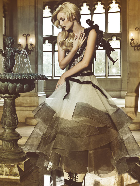
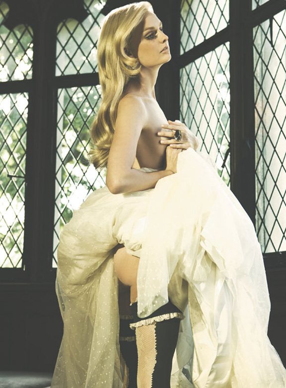
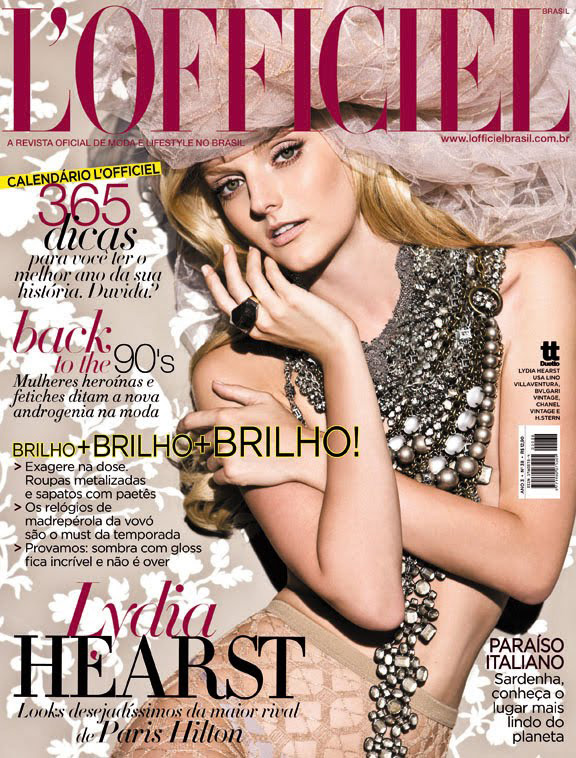
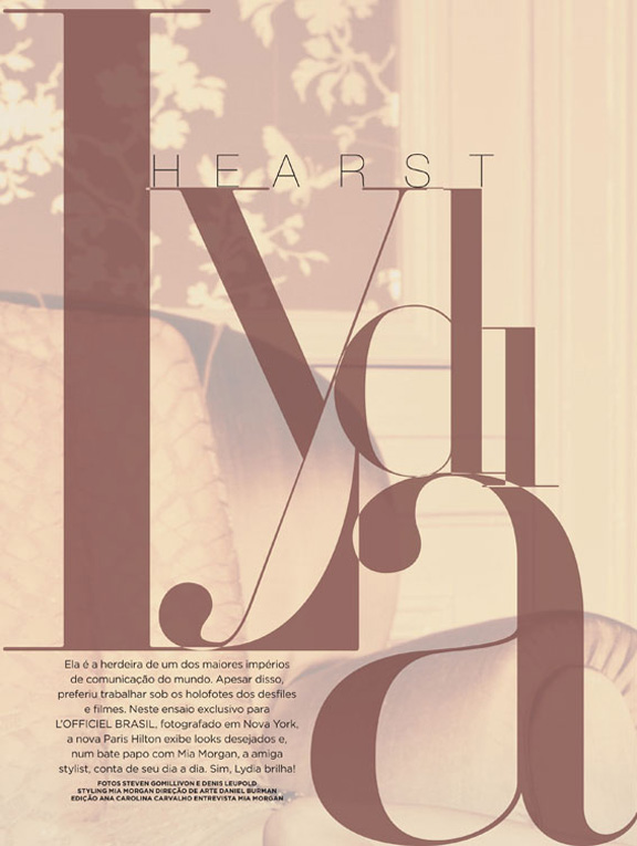
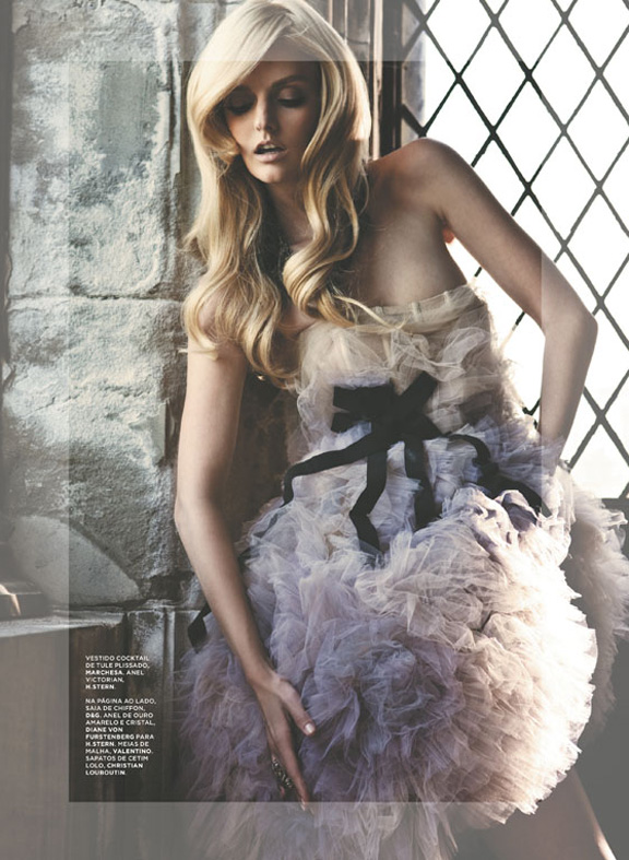
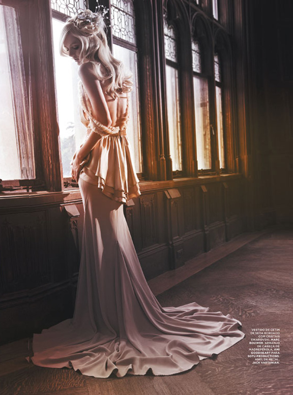
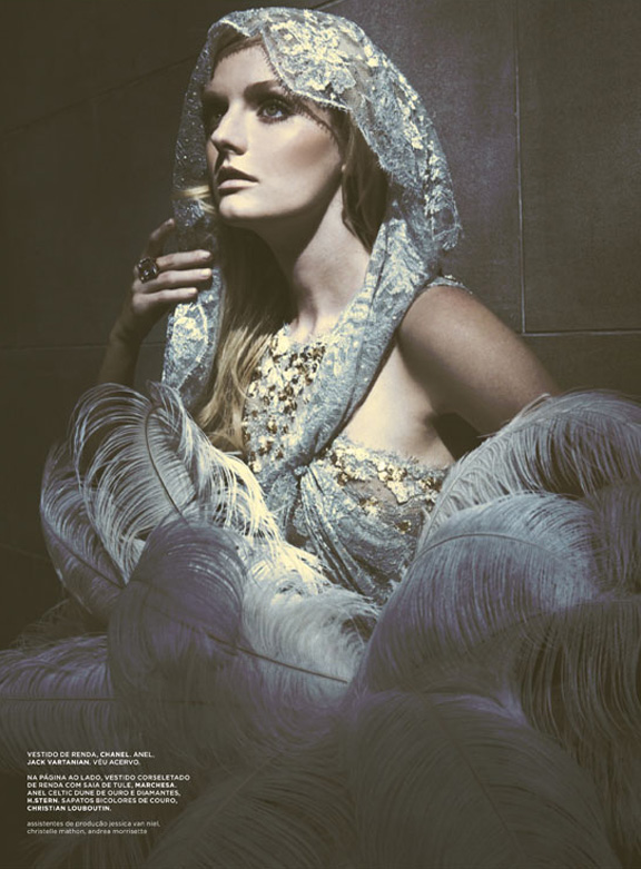
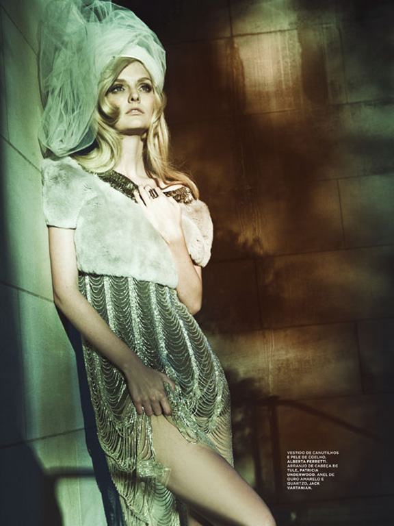
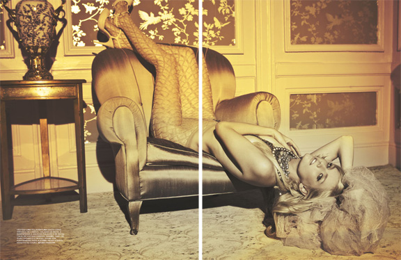
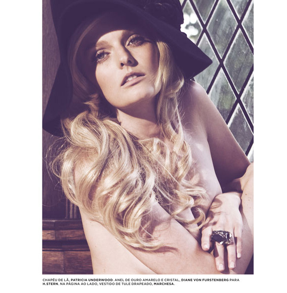
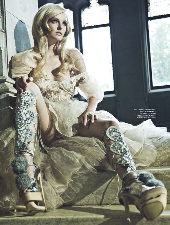
Photographed by Gomillion & Leupold, Lydia Hearst invites us into her inner sanctuary for the most recent issue of L’Officiel Brazil. With a pin-up appeal and a wardrobe full of enchanting gowns styled by Mia Morgan, Lydia falls perfectly into the role of a blonde bombshell in the seductive cover shoot.
always like l'officiel shots
always like l'officiel shots
always like l'officiel shots
always like l'officiel shots
always like l'officiel shots
i like the hair
i like the hair
i like the hair
i like the hair
i like the hair
*sigh*
they're right to compare her to paris hilton. they're trust fund babies, not models.
the clothes are beautiful, though.
*sigh*
they're right to compare her to paris hilton. they're trust fund babies, not models.
the clothes are beautiful, though.
*sigh*
they're right to compare her to paris hilton. they're trust fund babies, not models.
the clothes are beautiful, though.
*sigh*
they're right to compare her to paris hilton. they're trust fund babies, not models.
the clothes are beautiful, though.
*sigh*
they're right to compare her to paris hilton. they're trust fund babies, not models.
the clothes are beautiful, though.
Wasted shots. If only she had an interesting face. If only she can give non posy expressions. I find this set really boring and I really don't care who she is.
Wasted shots. If only she had an interesting face. If only she can give non posy expressions. I find this set really boring and I really don't care who she is.
Wasted shots. If only she had an interesting face. If only she can give non posy expressions. I find this set really boring and I really don't care who she is.
Wasted shots. If only she had an interesting face. If only she can give non posy expressions. I find this set really boring and I really don't care who she is.
Wasted shots. If only she had an interesting face. If only she can give non posy expressions. I find this set really boring and I really don't care who she is.
Her facial expressions are so wrong! This would be a decent editorial if she didn't look as old as the furniture in half the shots.
Her facial expressions are so wrong! This would be a decent editorial if she didn't look as old as the furniture in half the shots.