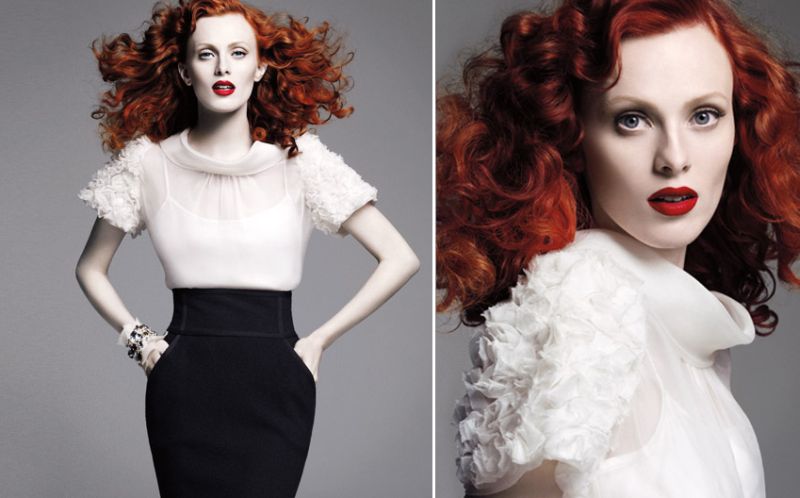
Replacing actress Angelina Jolie as St. John’s campaign star is no small feat, but Karen Elson easily does it with poise and grace. With fiery red hair and skin like porcelain, the alluring beauty was photographed by Greg Kadel.
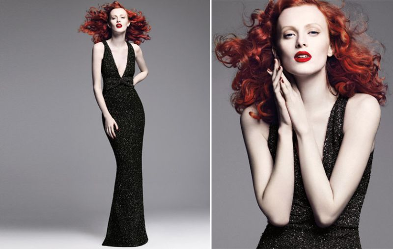
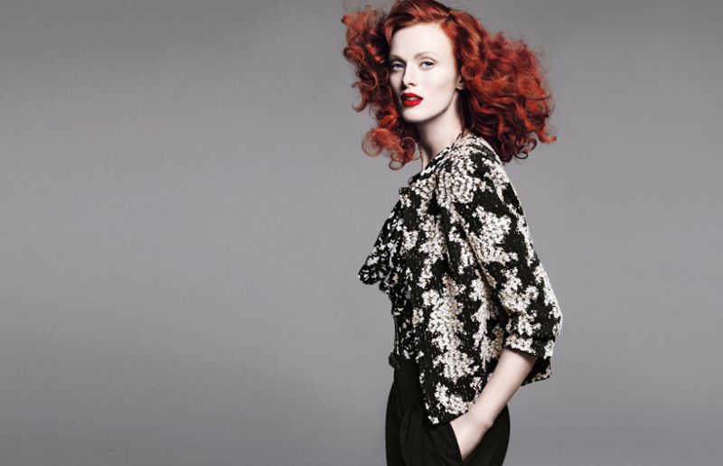
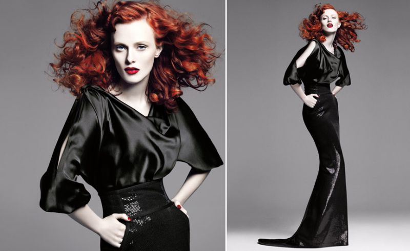
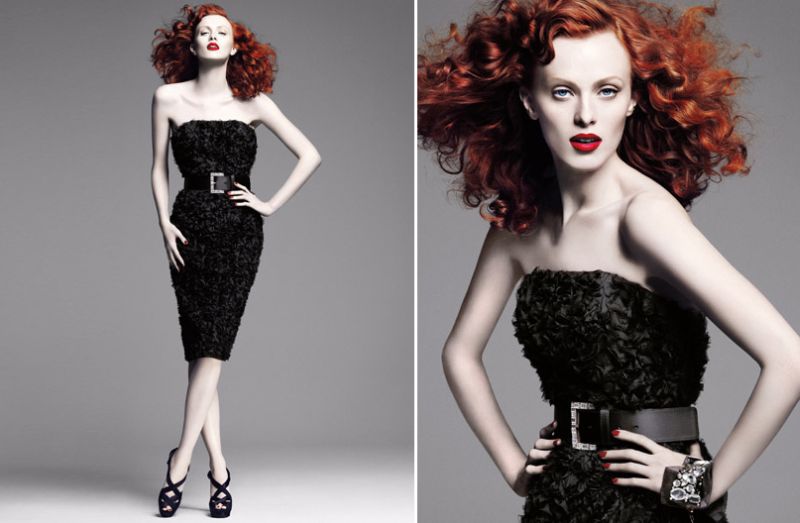

Source | testinofan @ TFS



* I meant "Karen isn't the cookie cutter model". (typo)
* I meant "Karen isn't the cookie cutter model". (typo)
* I meant "Karen isn't the cookie cutter model". (typo)
milk
milk
Beautiful campaign…it looks a bit Elizabethan.
Beautiful campaign…it looks a bit Elizabethan.
you have no idea how much i want fiery red hair.
you have no idea how much i want fiery red hair.
you have no idea how much i want fiery red hair.
Wow this is absolutely gorgeous with Karen's fiery red hair and her pale skin. Perfect!
Wow this is absolutely gorgeous with Karen's fiery red hair and her pale skin. Perfect!
Wow this is absolutely gorgeous with Karen's fiery red hair and her pale skin. Perfect!
I so prefer this campaign to the Angelina one. It is exquisite in my opinion, and Karen Elson brings a completely different vibe to the whole idea of what the St. John women is or could be.
I so prefer this campaign to the Angelina one. It is exquisite in my opinion, and Karen Elson brings a completely different vibe to the whole idea of what the St. John women is or could be.
I so prefer this campaign to the Angelina one. It is exquisite in my opinion, and Karen Elson brings a completely different vibe to the whole idea of what the St. John women is or could be.
Maybe I'm just biased because I adore the St. John ads with Angelina in it. These photos look cheap. The model is good but why use a plain drab gray color as the background? Plus the way they shot these, there's too much focus on her red hair. I get that they are steering away from blondes but this is just a little too non-blonde.
Maybe I'm just biased because I adore the St. John ads with Angelina in it. These photos look cheap. The model is good but why use a plain drab gray color as the background? Plus the way they shot these, there's too much focus on her red hair. I get that they are steering away from blondes but this is just a little too non-blonde.
Maybe I'm just biased because I adore the St. John ads with Angelina in it. These photos look cheap. The model is good but why use a plain drab gray color as the background? Plus the way they shot these, there's too much focus on her red hair. I get that they are steering away from blondes but this is just a little too non-blonde.