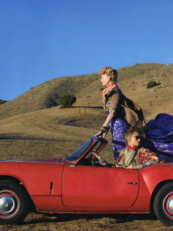
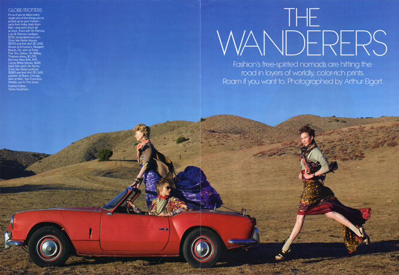
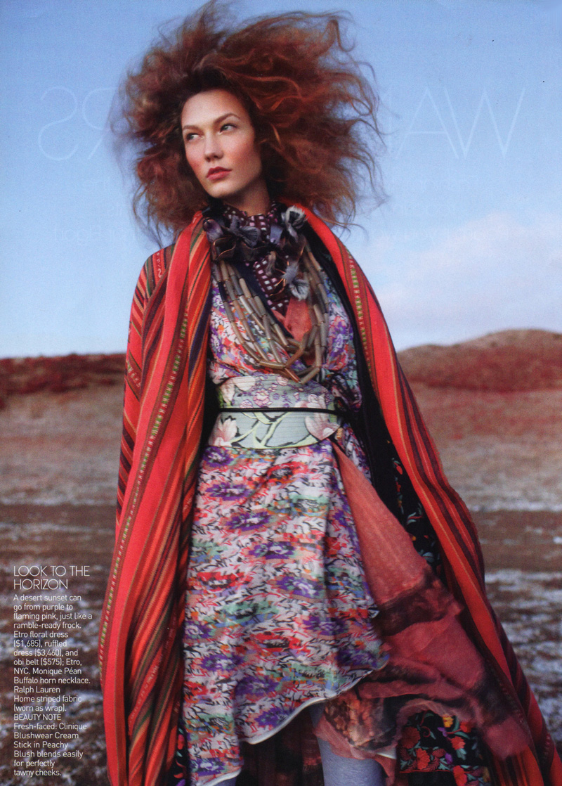
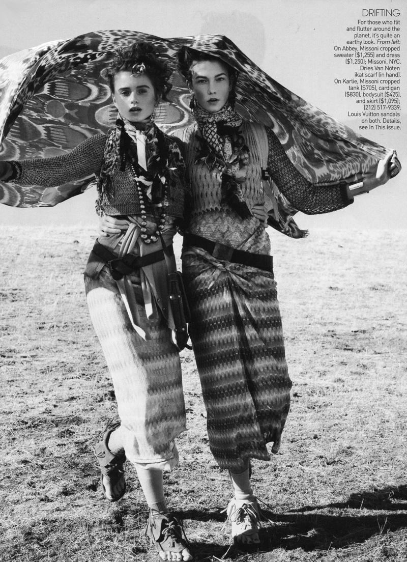
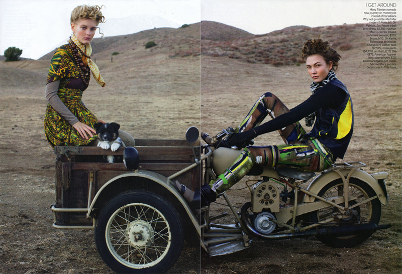
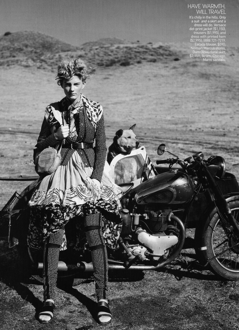
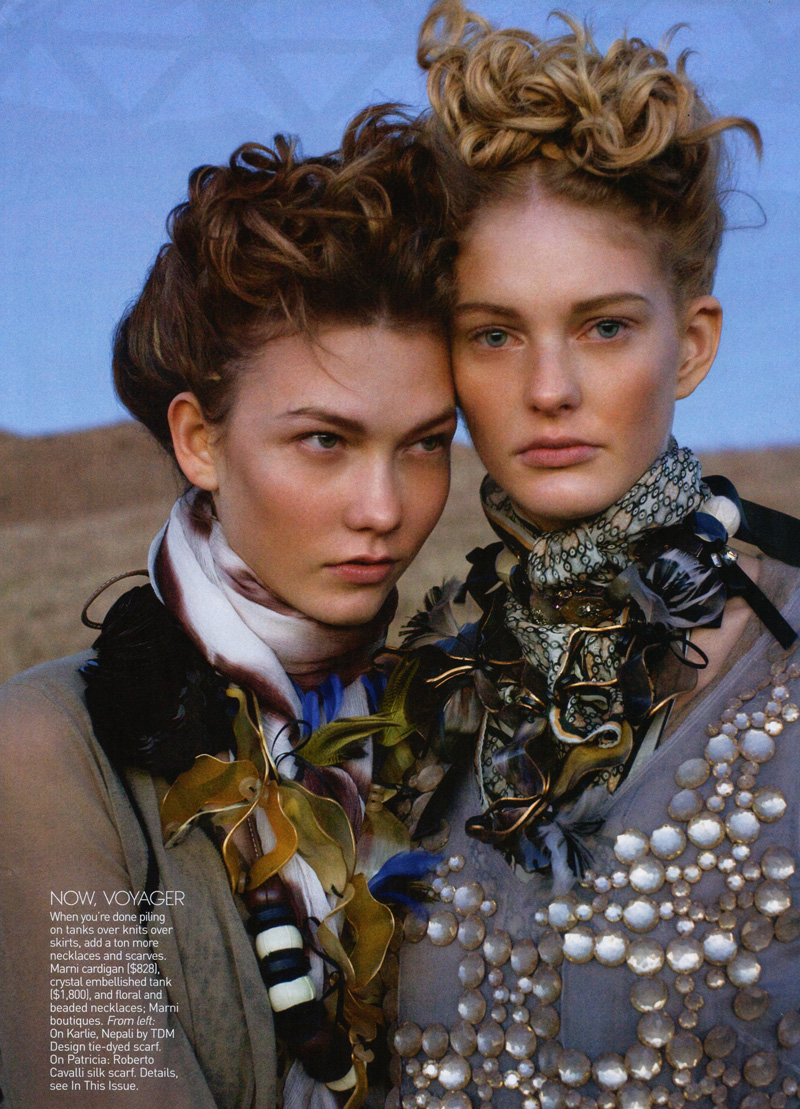
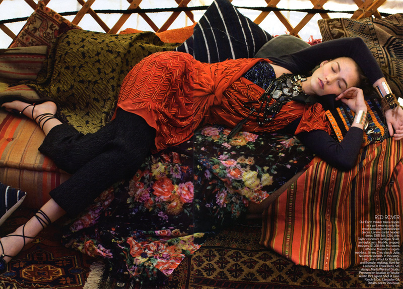
Models Abbey Lee Kershaw, Karlie Kloss and Patricia van der Vliet play modern day nomads in the latest edition of American Vogue. Armed with a red convertible and the open road, the trio is free to go anywhere they please in Arthur Elgort’s free-spirited story. With the aide of fashion editor Tonne Goodman, Elgort creates a whimsical tone with the rich patterns and landscapes of The Wanderers.
Scans by Fashion Gone Rogue


wOOo…GREAT PiCssssssssssssssssss!!!!!!!!! …i love ABBEY LEE …ONE of my favorite TOP!**
Visit my last POST! =;-D
http://www.claulovesfashion.blogspot.com
..muamua!*
wOOo…GREAT PiCssssssssssssssssss!!!!!!!!! …i love ABBEY LEE …ONE of my favorite TOP!**
Visit my last POST! =;-D
http://www.claulovesfashion.blogspot.com
..muamua!*
I would love to see that 3rd and 5th pic in colour. The print looks totally mad. Probably a good thing that it's in B&W – my head would probably explode from it all. It's fantastic!
I would love to see that 3rd and 5th pic in colour. The print looks totally mad. Probably a good thing that it's in B&W – my head would probably explode from it all. It's fantastic!
I would love to see that 3rd and 5th pic in colour. The print looks totally mad. Probably a good thing that it's in B&W – my head would probably explode from it all. It's fantastic!
I wish there was more Abbey and Patricia and a little less Karlie…
lol..i thought so too.. i was excited when i first saw this cause i thought 'yay another abbey lee post' and then it all went downhill. i never understand the appeal of karlie kloss. she looks sooooo normal. other than being skinny and tall, she looks like a hell load of other people and her editorials are mostly boring. the only unusual thing about her is her runway death stare and zombie walk. and it ends there.
about the editorial i love the outfits patterns and how they're layered and mixed but like the previous poster said, i wish the b&w pic are coloured.
I cannot STAND her walk! Her hands are cupped and swinging at her sides. Drives me nuts.
I cannot STAND her walk! Her hands are cupped and swinging at her sides. Drives me nuts.
I cannot STAND her walk! Her hands are cupped and swinging at her sides. Drives me nuts.
I cannot STAND her walk! Her hands are cupped and swinging at her sides. Drives me nuts.
I cannot STAND her walk! Her hands are cupped and swinging at her sides. Drives me nuts.
lol..i thought so too.. i was excited when i first saw this cause i thought 'yay another abbey lee post' and then it all went downhill. i never understand the appeal of karlie kloss. she looks sooooo normal. other than being skinny and tall, she looks like a hell load of other people and her editorials are mostly boring. the only unusual thing about her is her runway death stare and zombie walk. and it ends there.
about the editorial i love the outfits patterns and how they're layered and mixed but like the previous poster said, i wish the b&w pic are coloured.
I wish there was more Abbey and Patricia and a little less Karlie…
lol..i thought so too.. i was excited when i first saw this cause i thought 'yay another abbey lee post' and then it all went downhill. i never understand the appeal of karlie kloss. she looks sooooo normal. other than being skinny and tall, she looks like a hell load of other people and her editorials are mostly boring. the only unusual thing about her is her runway death stare and zombie walk. and it ends there.
about the editorial i love the outfits patterns and how they're layered and mixed but like the previous poster said, i wish the b&w pic are coloured.
I cannot STAND her walk! Her hands are cupped and swinging at her sides. Drives me nuts.
I really like this eetorial but only the last picture not…
I really like this eetorial but only the last picture not…
Ps: I love the little og in the oto o patricia an karlie
Ps: I love the little og in the oto o patricia an karlie
Ps: I love the little og in the oto o patricia an karlie
Ps: I love the little og in the oto o patricia an karlie
Ps: I love the little og in the oto o patricia an karlie
Ps: I love the little og in the oto o patricia an karlie
Ps: I love the little og in the oto o patricia an karlie
i am in LOVE with the styling in this editorial!!
xo
Amirah
i am in LOVE with the styling in this editorial!!
xo
Amirah
i am in LOVE with the styling in this editorial!!
xo
Amirah
i am in LOVE with the styling in this editorial!!
xo
Amirah
i am in LOVE with the styling in this editorial!!
xo
Amirah
i am in LOVE with the styling in this editorial!!
xo
Amirah
i am in LOVE with the styling in this editorial!!
xo
Amirah
amazing!!!!
xo
C
amazing!!!!
xo
C
Yeah, this just feels overproduced. I mean you have a trifecta with the girls, I want something more real, this feels forced.
Yeah, this just feels overproduced. I mean you have a trifecta with the girls, I want something more real, this feels forced.
Yeah, this just feels overproduced. I mean you have a trifecta with the girls, I want something more real, this feels forced.
Yeah, this just feels overproduced. I mean you have a trifecta with the girls, I want something more real, this feels forced.
So beautiful!
juliet xxx
So beautiful!
juliet xxx
So beautiful!
juliet xxx
So beautiful!
juliet xxx
So beautiful!
juliet xxx
So beautiful!
juliet xxx
So beautiful!
juliet xxx
wow….go Patricia! She looks amazing!
wow….go Patricia! She looks amazing!
wow….go Patricia! She looks amazing!
wow….go Patricia! She looks amazing!
wow….go Patricia! She looks amazing!
wow….go Patricia! She looks amazing!
wow….go Patricia! She looks amazing!
Oh how I love the hair!!! The styling is beautiful!
Oh how I love the hair!!! The styling is beautiful!
Oh how I love the hair!!! The styling is beautiful!
Oh how I love the hair!!! The styling is beautiful!
Oh how I love the hair!!! The styling is beautiful!
Oh how I love the hair!!! The styling is beautiful!
Love Abbey Lee
Love Abbey Lee
Love Abbey Lee
Love Abbey Lee
Love Abbey Lee
Love Abbey Lee
I love the hair and styling. Great photos!
I love the hair and styling. Great photos!
You Are Back !
I love you !
You Are Back !
I love you !
so happy you are back,this is my favorite blog
so happy you are back,this is my favorite blog
so happy you are back,this is my favorite blog
So thrilled FGR is back!
So thrilled FGR is back!
So thrilled FGR is back!
So thrilled FGR is back!
So thrilled FGR is back!
So thrilled FGR is back!
So thrilled FGR is back!
So glad to have you back.
And back with a bang!
I’m on an Abbey Lee kick myself. 😉
xx
So glad to have you back.
And back with a bang!
I’m on an Abbey Lee kick myself. 😉
xx
So glad to have you back.
And back with a bang!
I’m on an Abbey Lee kick myself. 😉
xx
So glad to have you back.
And back with a bang!
I’m on an Abbey Lee kick myself. 😉
xx
So glad to have you back.
And back with a bang!
I’m on an Abbey Lee kick myself. 😉
xx
So glad to have you back.
And back with a bang!
I’m on an Abbey Lee kick myself. 😉
xx
So glad to have you back.
And back with a bang!
I’m on an Abbey Lee kick myself. 😉
xx
so excited to see FGR back!!!
so excited to see FGR back!!!
Yay! I'm so glad you're up and running again! I don't know what I would have done without you 🙂
xx
Yay! I'm so glad you're up and running again! I don't know what I would have done without you 🙂
xx
Yay! I'm so glad you're up and running again! I don't know what I would have done without you 🙂
xx
Yay! I'm so glad you're up and running again! I don't know what I would have done without you 🙂
xx
Yay! I'm so glad you're up and running again! I don't know what I would have done without you 🙂
xx
Yay! I'm so glad you're up and running again! I don't know what I would have done without you 🙂
xx
Yay! I'm so glad you're up and running again! I don't know what I would have done without you 🙂
xx
It's a good shoot but I do agree with the ones who would'va liked to see more Abbey.
It's a good shoot but I do agree with the ones who would'va liked to see more Abbey.
It's a good shoot but I do agree with the ones who would'va liked to see more Abbey.
It's a good shoot but I do agree with the ones who would'va liked to see more Abbey.
It's a good shoot but I do agree with the ones who would'va liked to see more Abbey.
It's a good shoot but I do agree with the ones who would'va liked to see more Abbey.
It's a good shoot but I do agree with the ones who would'va liked to see more Abbey.
this is quite nice!
this is quite nice!
this is quite nice!
this is quite nice!
Karlie looks so ethnic!
Runnig pose is seems to be her best.
And NO ABBEY, please! enough!
Karlie looks so ethnic!
Runnig pose is seems to be her best.
And NO ABBEY, please! enough!
Karlie looks so ethnic!
Runnig pose is seems to be her best.
And NO ABBEY, please! enough!
Karlie looks so ethnic!
Runnig pose is seems to be her best.
And NO ABBEY, please! enough!
Karlie looks so ethnic!
Runnig pose is seems to be her best.
And NO ABBEY, please! enough!
Karlie looks so ethnic!
Runnig pose is seems to be her best.
And NO ABBEY, please! enough!
the styling of this is wonderful.
the styling of this is wonderful.
the styling of this is wonderful.