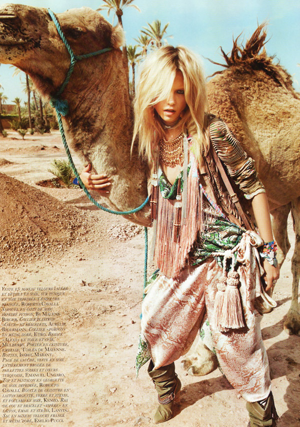
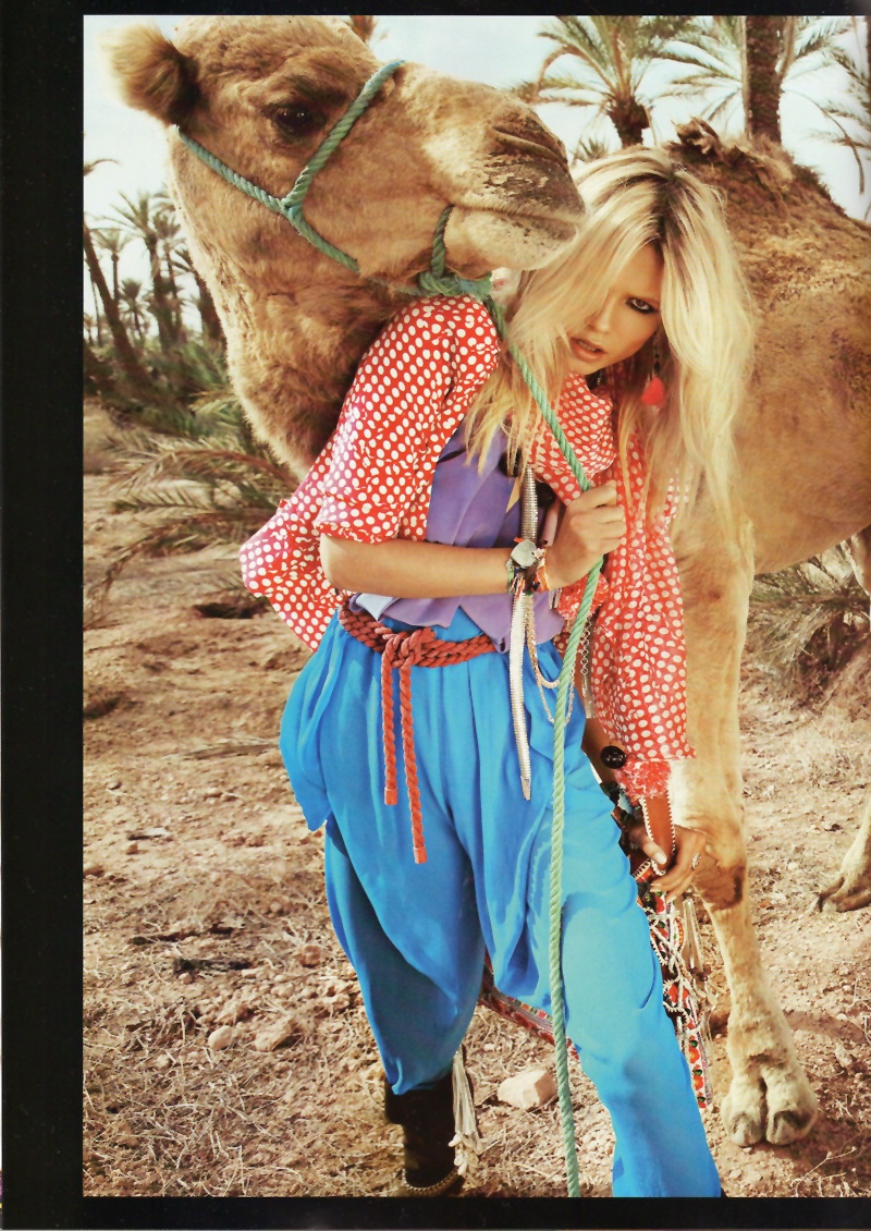
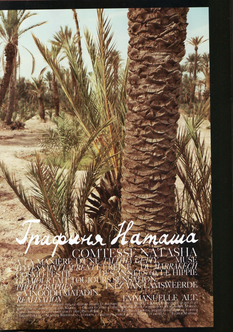
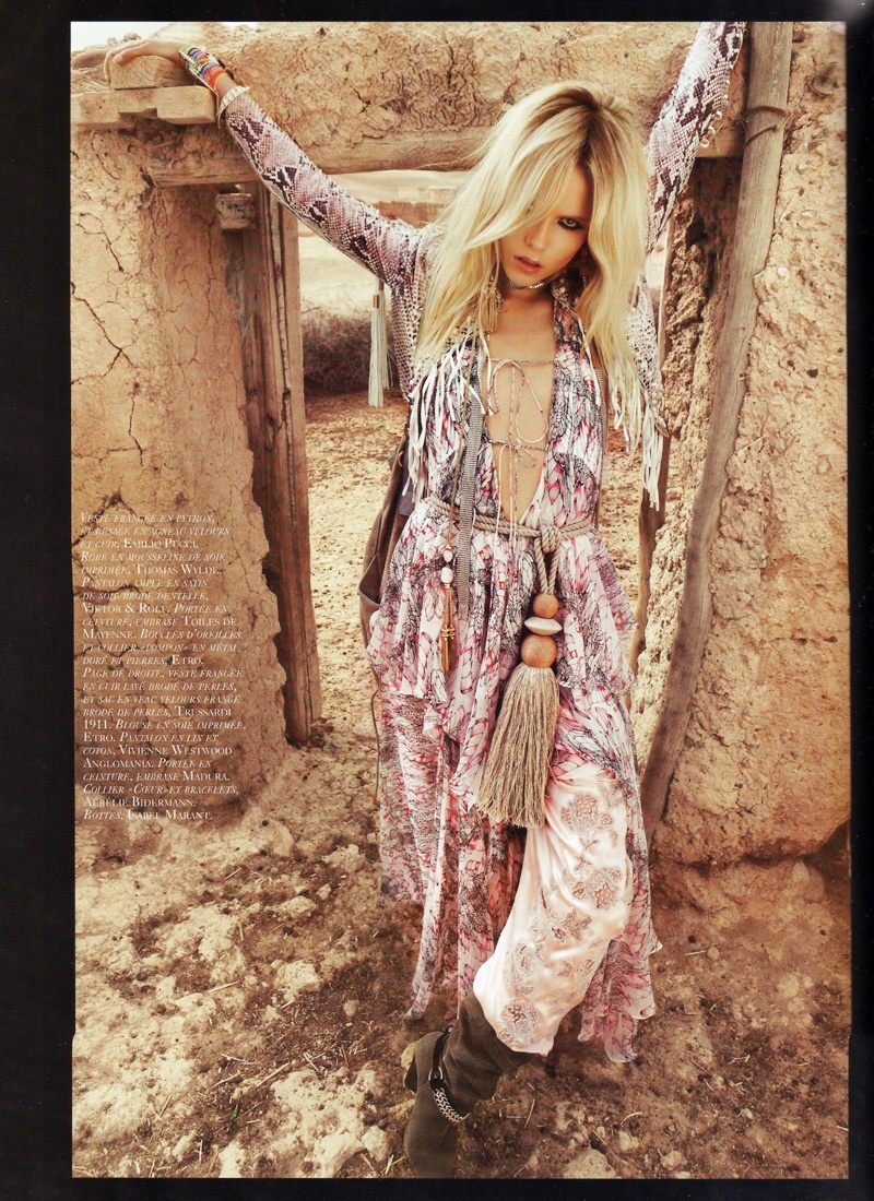
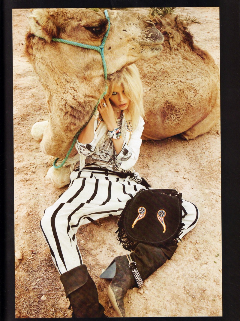
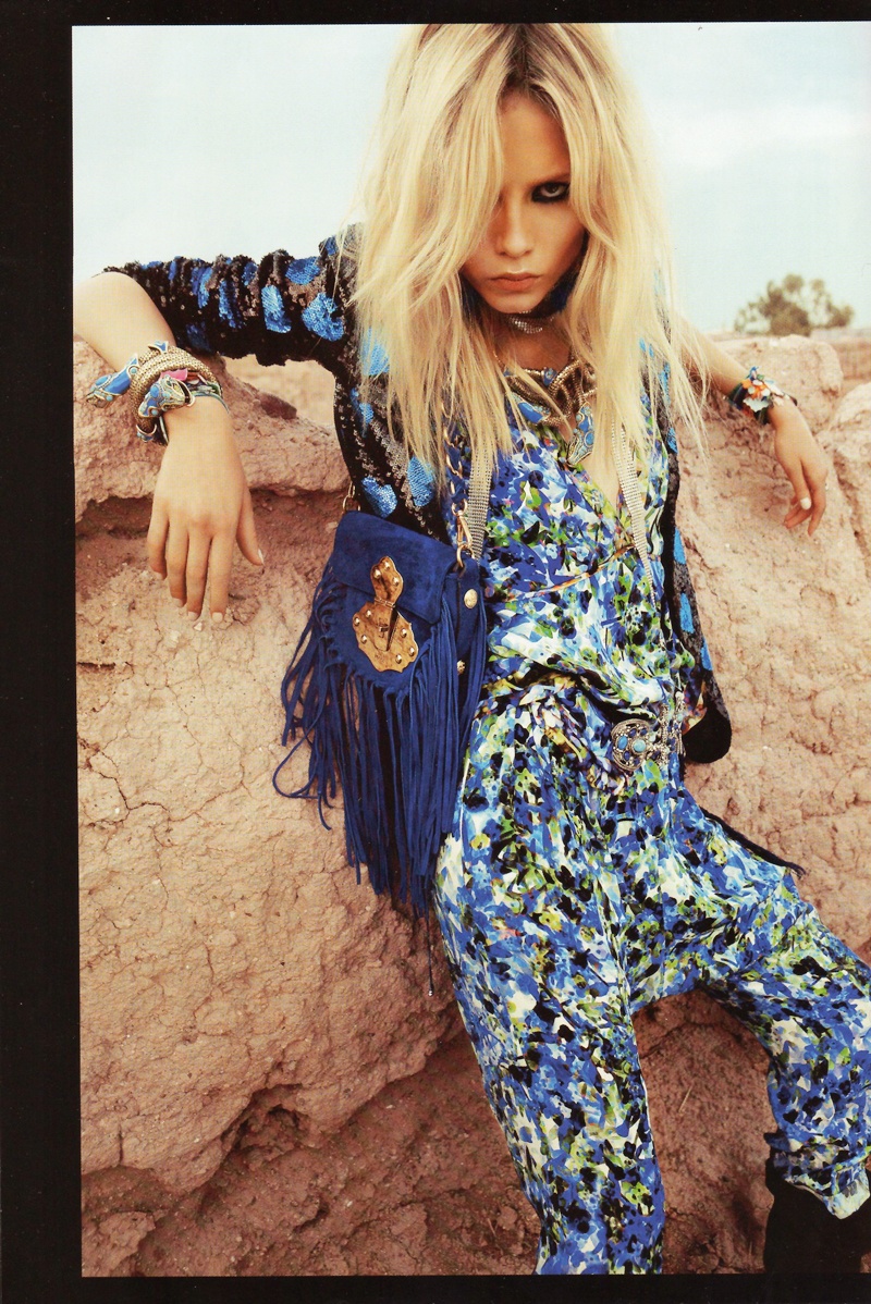
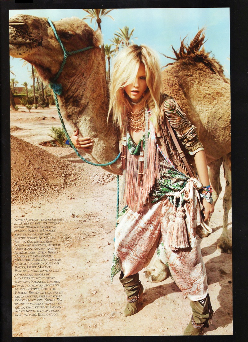
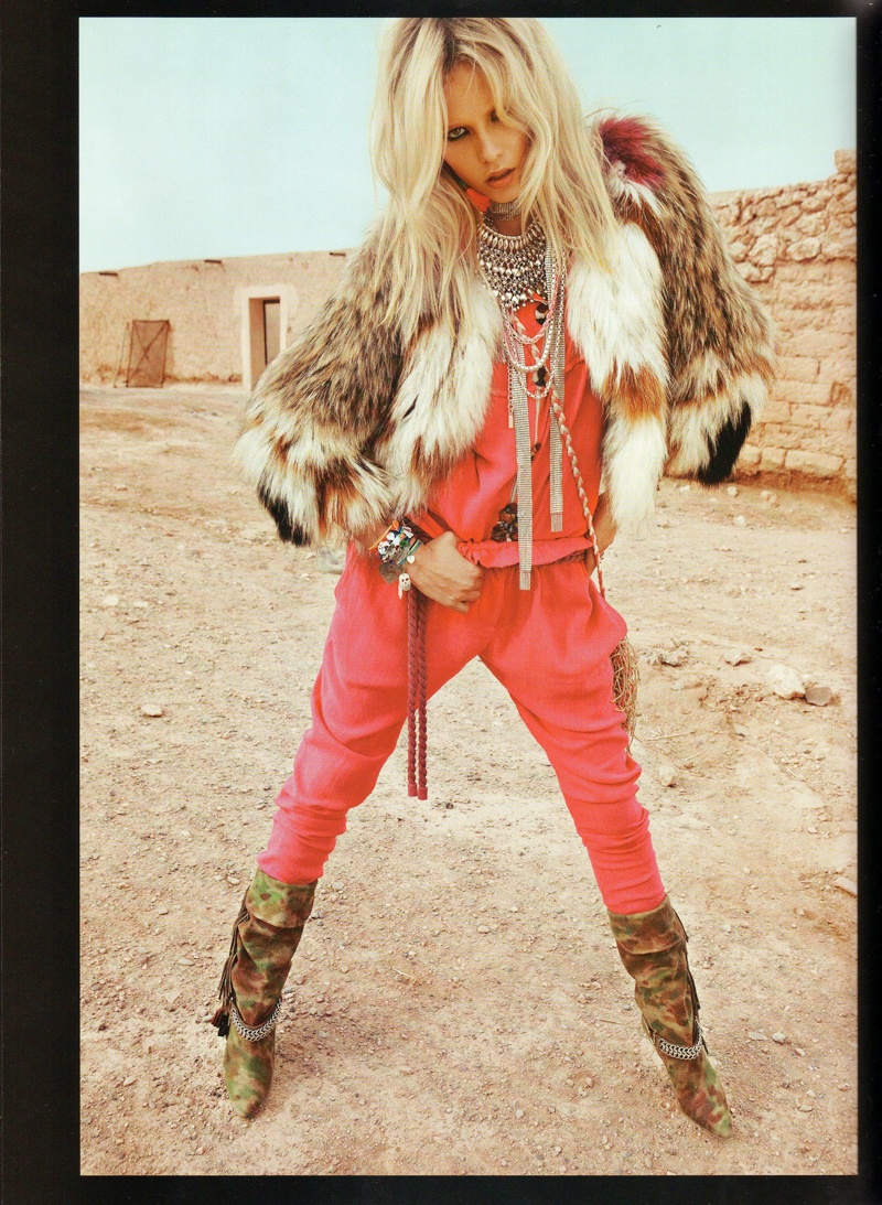
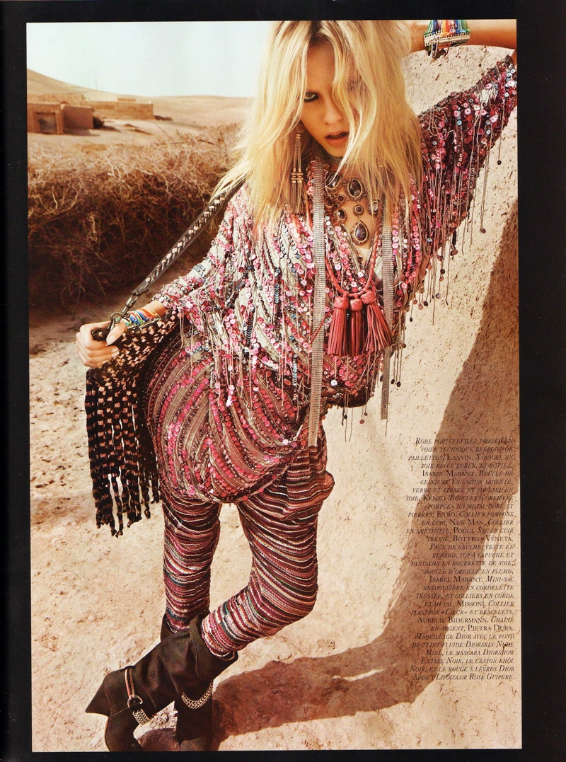
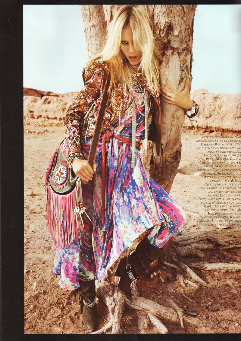
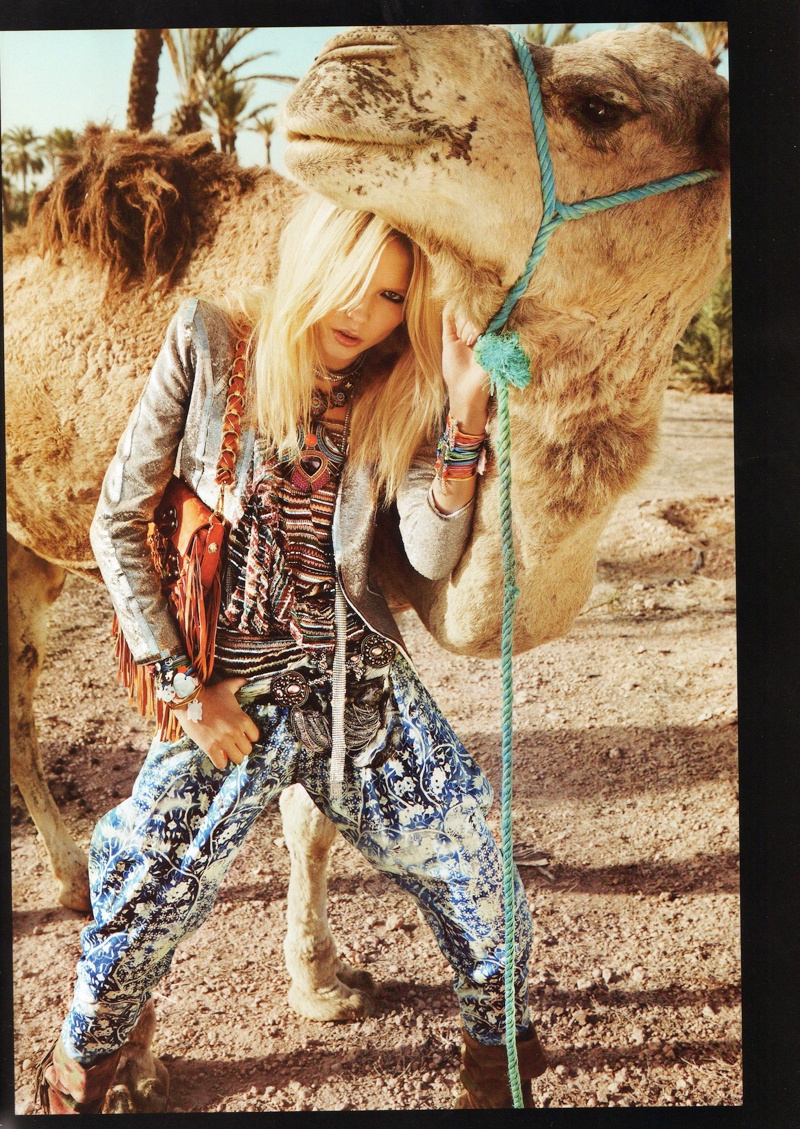
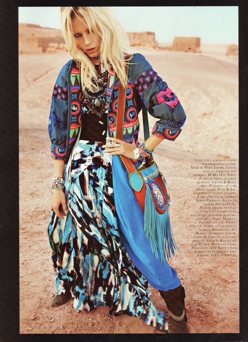
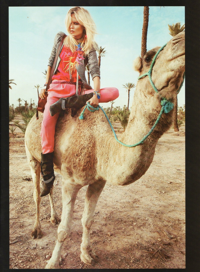
A desert setting makes the perfect backdrop for some of the season’s most exciting prints and patterns as shown by Inez and Vinoodh in their most recent contribution to Vogue Paris. Starring cover girl Natasha Poly as a camel riding traveler, the enchanting story featured pieces from Kenzo, Roberto Cavalli and Emilio Pucci styled by Emanuelle Alt.
source | elsaskywalker @ tfs
Not a fan of Natasha so much but the clothes, patterns, the camel and the whole aesthetic absolutly make up for her! Love it:)
Not a fan of Natasha so much but the clothes, patterns, the camel and the whole aesthetic absolutly make up for her! Love it:)
Not a fan of Natasha so much but the clothes, patterns, the camel and the whole aesthetic absolutly make up for her! Love it:)
i love ms poly 🙂 but her face looks the same in every picture in this editorial……. i like it anyways because the camel is cute
i love ms poly 🙂 but her face looks the same in every picture in this editorial……. i like it anyways because the camel is cute
i love ms poly 🙂 but her face looks the same in every picture in this editorial……. i like it anyways because the camel is cute
I love Natasha and I like this editorial, but she's the same on every pic :S
I love Natasha and I like this editorial, but she's the same on every pic :S
I love Natasha and I like this editorial, but she's the same on every pic :S
I agree…the clothes and location are great but her expression is the same in every pic…
I agree…the clothes and location are great but her expression is the same in every pic…
I agree…the clothes and location are great but her expression is the same in every pic…
great mix of prints!
great mix of prints!
great mix of prints!
i love the moroccain theme !! Inez & Vinoodh sure did a nice job in morocco ! this & the preview vogue cover with daria !
i love the moroccain theme !! Inez & Vinoodh sure did a nice job in morocco ! this & the preview vogue cover with daria !
i love the moroccain theme !! Inez & Vinoodh sure did a nice job in morocco ! this & the preview vogue cover with daria !
same expression in every shot
same expression in every shot
same expression in every shot
great styling though
great styling though
great styling though
Natasha's is the same in EVERY picture.
However, great styling!
Natasha's is the same in EVERY picture.
However, great styling!
Natasha's is the same in EVERY picture.
However, great styling!
Imagine what the photographer could have done had he remembered to bring a longer lens?!! 🙂
Pretty camel!
agreed. the wide angle look gets tiresome quickly. the enlarged head and miniature legs are off-putting and definitely not flattering (see pic 7 in red for an extreme example).
everything in moderation, including focal length choices.
agreed. the wide angle look gets tiresome quickly. the enlarged head and miniature legs are off-putting and definitely not flattering (see pic 7 in red for an extreme example).
everything in moderation, including focal length choices.
Imagine what the photographer could have done had he remembered to bring a longer lens?!! 🙂
Pretty camel!
Imagine what the photographer could have done had he remembered to bring a longer lens?!! 🙂
Pretty camel!
agreed. the wide angle look gets tiresome quickly. the enlarged head and miniature legs are off-putting and definitely not flattering (see pic 7 in red for an extreme example).
everything in moderation, including focal length choices.
I think the camel had more facial expressions
I think the camel had more facial expressions
I think the camel had more facial expressions
I love everything about this. textures, patterns, colors, camel, model. it just works.
I love everything about this. textures, patterns, colors, camel, model. it just works.
I love everything about this. textures, patterns, colors, camel, model. it just works.
The styling is so bright and vivid, I really love it. I usually love Natasha too but as has been said, her face was the same in every shot.
The styling is so bright and vivid, I really love it. I usually love Natasha too but as has been said, her face was the same in every shot.
The styling is so bright and vivid, I really love it. I usually love Natasha too but as has been said, her face was the same in every shot.
camel, so hot right now
camel, so hot right now
camel, so hot right now
this is gorgeous.. but she needs to put her chin up and push her hair back!
this is gorgeous.. but she needs to put her chin up and push her hair back!
this is gorgeous.. but she needs to put her chin up and push her hair back!
Love all of these!!
Twila
blog.twilasvintageclothing.com
Love all of these!!
Twila
blog.twilasvintageclothing.com
Love all of these!!
Twila
blog.twilasvintageclothing.com
I love the styling. I find it funny that everyone says Natasha looks the same in every photo (which she does) but I also wonder if they did that on purpose because one of her eyes is covered by her hair in every photo…
I love the styling. I find it funny that everyone says Natasha looks the same in every photo (which she does) but I also wonder if they did that on purpose because one of her eyes is covered by her hair in every photo…
I love the styling. I find it funny that everyone says Natasha looks the same in every photo (which she does) but I also wonder if they did that on purpose because one of her eyes is covered by her hair in every photo…
i think if her hair is in her face Inez and Vinoodh wanted it that way!
i think if her hair is in her face Inez and Vinoodh wanted it that way!
i think if her hair is in her face Inez and Vinoodh wanted it that way!
I've seen so many editorials in the sand/desert and I have to say that this one trumps all.
Love the clothes. The colors and patterns are just gorgeous.
I've seen so many editorials in the sand/desert and I have to say that this one trumps all.
Love the clothes. The colors and patterns are just gorgeous.
I've seen so many editorials in the sand/desert and I have to say that this one trumps all.
Love the clothes. The colors and patterns are just gorgeous.
very creative styling