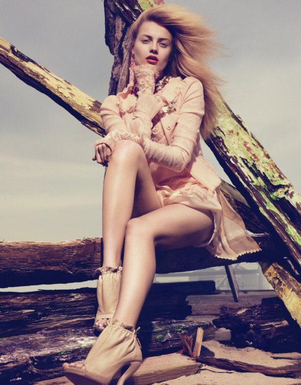
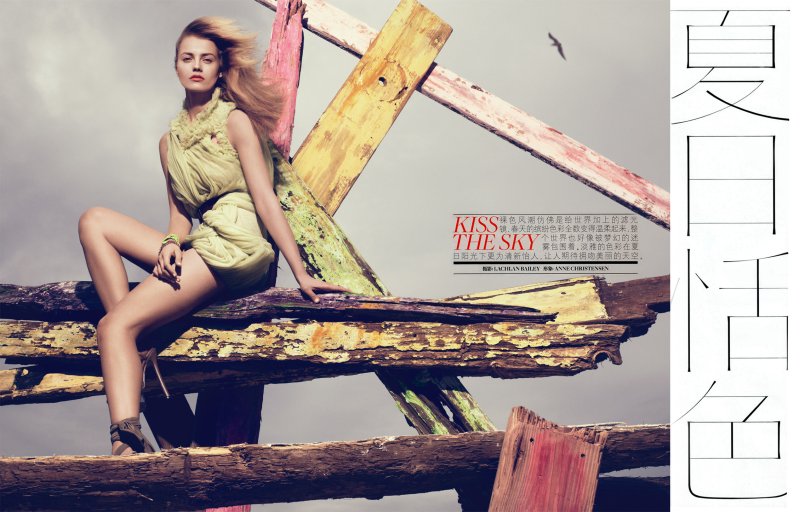
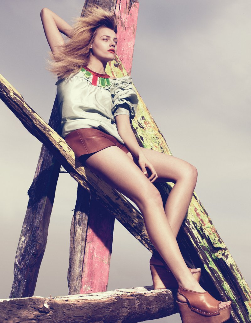
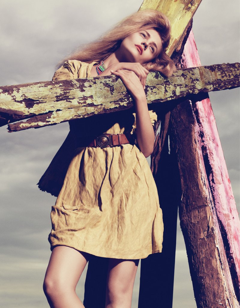
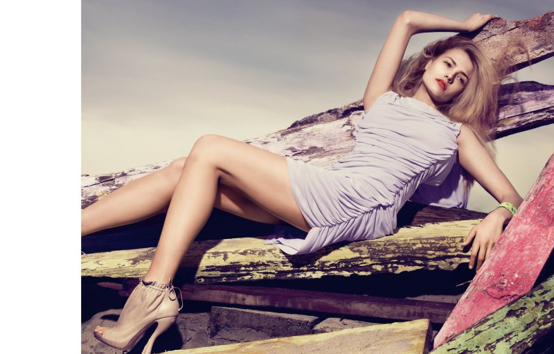
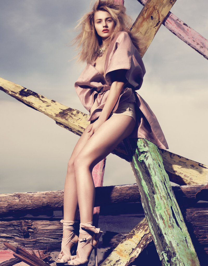
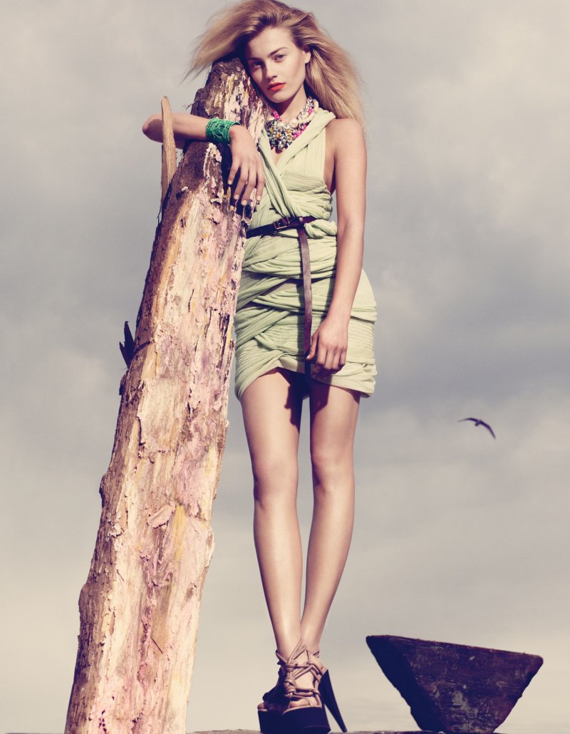
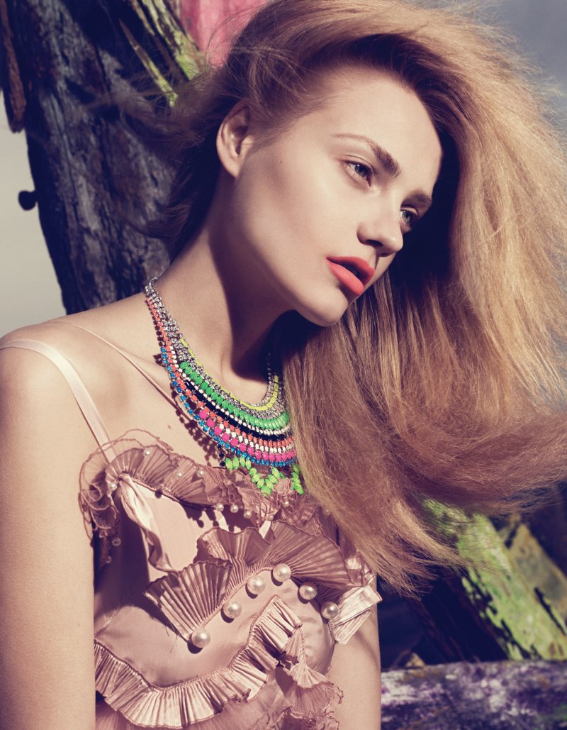
With a cool combination of romantic hues paired with a dusky background, photographer Lachlan Bailey delivers one dreamy story for his latest work in Vogue China June. Styled by Anne Christensen in light and airy garments from the likes of Fendi, Calvin Klein and Stella McCartney, model Anna Maria Jagodzinska gets leggy in Kiss the Sky.



She's so beautiful…
She's so beautiful…
Anna is too good to be so MIA.
Anna is too good to be so MIA.
Anna is too good to be so MIA.
Anna is too good to be so MIA.
Anna…<3…she rocks it
Anna…<3…she rocks it
I love the shoes, her hair and the necklaces. 🙂
PERFECT POUT too, love the lipstick.
xx
I love the shoes, her hair and the necklaces. 🙂
PERFECT POUT too, love the lipstick.
xx
I love the shoes, her hair and the necklaces. 🙂
PERFECT POUT too, love the lipstick.
xx
I love the shoes, her hair and the necklaces. 🙂
PERFECT POUT too, love the lipstick.
xx
Wow. Gorgeous. Love the pastel palette! http://www.chungkitblog.wordpress.com
Wow. Gorgeous. Love the pastel palette! http://www.chungkitblog.wordpress.com
Wow. Gorgeous. Love the pastel palette! http://www.chungkitblog.wordpress.com
Wow. Gorgeous. Love the pastel palette! http://www.chungkitblog.wordpress.com
Stunning! My fave outfit is the 1st one
http://crisgomez85.blogspot.com/
Stunning! My fave outfit is the 1st one
http://crisgomez85.blogspot.com/
Stunning! My fave outfit is the 1st one
http://crisgomez85.blogspot.com/
Stunning! My fave outfit is the 1st one
http://crisgomez85.blogspot.com/
what are you think: pictures is make in studio ??
what are you think: pictures is make in studio ??
what are you think: pictures is make in studio ??
what are you think: pictures is make in studio ??
I really love the title typography, finally they hire some graphic designer to do some type treatment…
It’s just the elements all together are not nice, they need to be tweaked, AnnaJ is my fav and I like the photog, so it’s not a bias, I just think..
I really love the title typography, finally they hire some graphic designer to do some type treatment…
I really love the title typography, finally they hire some graphic designer to do some type treatment…
I really love the title typography, finally they hire some graphic designer to do some type treatment…
Love these muted colours, but her face lacks emotion..
Love these muted colours, but her face lacks emotion..
Love these muted colours, but her face lacks emotion..
Love these muted colours, but her face lacks emotion..
soo beautiful, love the pastel colors !
soo beautiful, love the pastel colors !
soo beautiful, love the pastel colors !
Loveliiii images
Loveliiii images
Loveliiii images
soo beautiful, love the pastel colors !
Loveliiii images
Beautiful photo effect
Beautiful photo effect
Beautiful photo effect
Beautiful photo effect
i love the colors and Anna. I love the editorials in vogue china
i love the colors and Anna. I love the editorials in vogue china
i love the colors and Anna. I love the editorials in vogue china
i love the colors and Anna. I love the editorials in vogue china
love the palette too, anna maria is gorgeous
VIVA PHOTOSHOP 🙁
not tooooooooo much in this case though
love the palette too, anna maria is gorgeous
VIVA PHOTOSHOP 🙁
not tooooooooo much in this case though
I like the earthiness of the pastel hues, contrasted with the little punches of jewel brightness. Unusual combination.
I like the earthiness of the pastel hues, contrasted with the little punches of jewel brightness. Unusual combination.
I like the earthiness of the pastel hues, contrasted with the little punches of jewel brightness. Unusual combination.
I like the earthiness of the pastel hues, contrasted with the little punches of jewel brightness. Unusual combination.
I like the pastel coloring of the subject, but would have been happier if everything didn't look like it as under exposed 2/3 of a stop.
It's not so much that as the direction and texture of the light combined with the makeup is too… well… chino-flatness… and to make it worse they have pulled up the shadows.
It's just the elements all together are not nice, they need to be tweaked, AnnaJ is my fav and I like the photog, so it's not a bias, I just think…. well, imagine if the hair was wet and down… even that one thing would make the whole thing work a bit better. ALSO all the pastels… ugh! It works and has some meaning in Vogue Italia/VP maybe, but we see too much of it for decades with little or no variation out of China/Korea/etc.
Again it's a failure in Sino-Eastern tastes that they are so conservative.
I like the pastel coloring of the subject, but would have been happier if everything didn't look like it as under exposed 2/3 of a stop.
I like the pastel coloring of the subject, but would have been happier if everything didn't look like it as under exposed 2/3 of a stop.
I like the pastel coloring of the subject, but would have been happier if everything didn't look like it as under exposed 2/3 of a stop.
It's not so much that as the direction and texture of the light combined with the makeup is too… well… chino-flatness… and to make it worse they have pulled up the shadows.
It's just the elements all together are not nice, they need to be tweaked, AnnaJ is my fav and I like the photog, so it's not a bias, I just think…. well, imagine if the hair was wet and down… even that one thing would make the whole thing work a bit better. ALSO all the pastels… ugh! It works and has some meaning in Vogue Italia/VP maybe, but we see too much of it for decades with little or no variation out of China/Korea/etc.
Again it's a failure in Sino-Eastern tastes that they are so conservative.
Burberry <3
Burberry <3
Burberry <3
Burberry <3
Actually it kinda grows on you. Don't hate it so much anymore. 🙂
Actually it kinda grows on you. Don't hate it so much anymore. 🙂
Actually it kinda grows on you. Don't hate it so much anymore. 🙂
Actually it kinda grows on you. Don't hate it so much anymore. 🙂
beautiful! I just love that last picture of her face and the lighting is exquisite!