
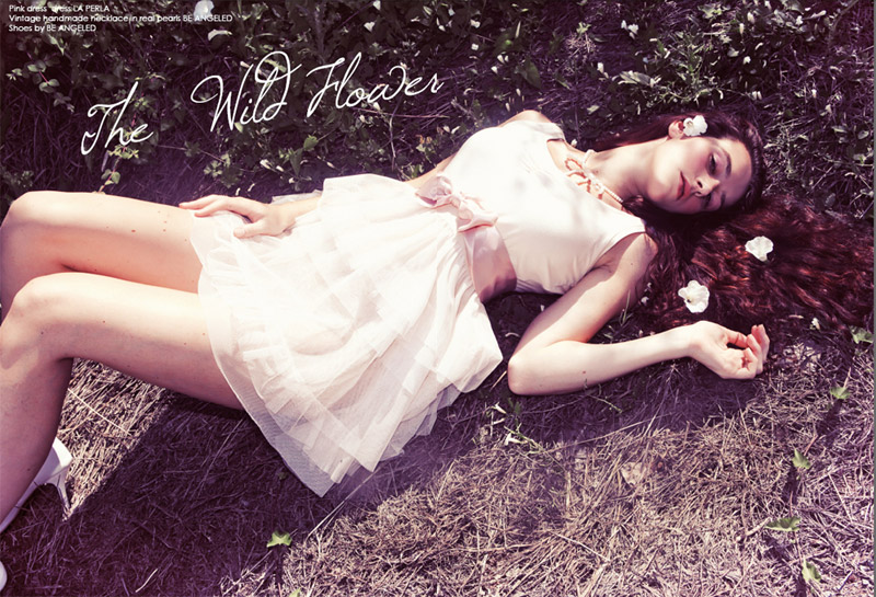
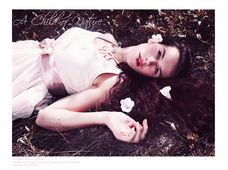
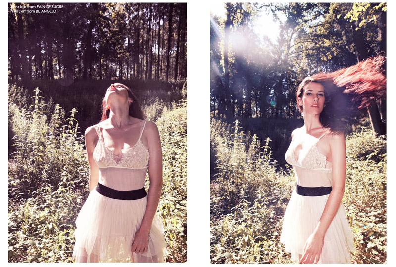
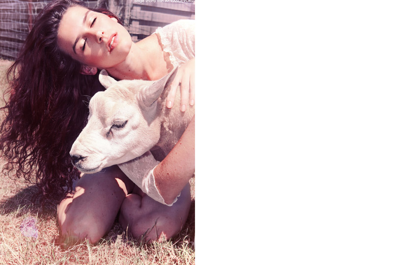
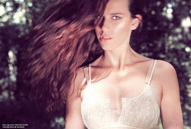
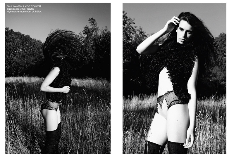
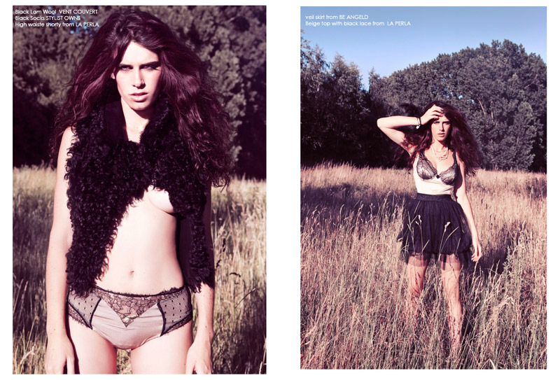
Captured by Nella Balda, model Nathalie Van Den Berg spends a day of uninterruped relaxation amongst the beauty of nature for the summer issue of F ♥ Hush. Styled in looks from Sensi Wear and Be Angeled, Nella hasn’t a care in the world as she dons girlish frocks with flowers in her hair.


love it
http://sebastiankubatz.de
cheers,
sebastian
love it
http://sebastiankubatz.de
cheers,
sebastian
Pronounced F(h)art? Silent H?
I'm glad I'm not the only one who thought that!
haha i absolutely agree that it is a confusing name wich I like because people will discuss it but the F is for Fashion the heart is just the symbol of love.
So basically its just that everybody loves fashion…man, women, kids, everybody can be inspired…
the magazine is called HUSH magazine. The F<3 stands for fashion love
How very uninteresting.
Yet another example of a photographer going into the studio and washing out the colours and putting an unnecesary filter on her shots. Everyone is doing it – so I'll do it too! It simply doesn't improve the shoot. – especially as there are B&W shots in there which change the feel of things anyway.
Then there is the distracting hair thing. In three of the shots the hair is blown/thrown in 3 different directions. For starters there is no apparent reason to do this at all, and then because the hair is blown left, right and behind it just creates visual confusion.
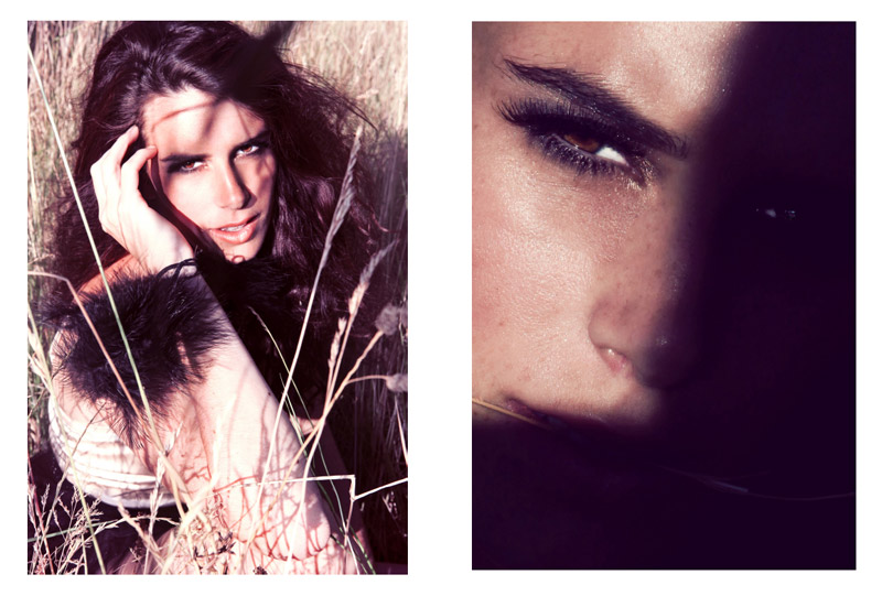
Then in the middle of it all we have the close up blurred shot with the big reflector (obviously shining in her face). Again distracting, inconsistent and just a poor shot.
what a long boring rant
Absolutely agree with your comments Charles right on the money, I think talent is poor too! Very poor shoot and really pretentious and not even interesting!
Good to read some honest critique of the images rather than another simplistic 'I love it!'.
I realise its a matter of taste, but there is a certain degree of professionalism, creativity and originality that should be achieved before something is deemed 'AMAZING' 30 times in a row.
Photography is such an overused medium that it deserves an adequate level of criticism to allow for the real talent to really stand out.
I really dont agree!
This is a very unique editorial, something that you don't see alot!
Why does photography always have to be technically perfect!
I love the fact that the photographer used the hair in such a way!
It rapresent freedom and the wild aspect, wich fits perfectly in this concept!
Why do you say ( For starters…) ??
I follow this photographer for a year now and she achieved more than the most photographers would achieve in 6 years…just look at her work and you will understand that she has a very unique style and is everything but what every other photographer does…
nice mood on these
nice mood on these
I must say this is an unique and very intresting editorial!
Love the mood!
Looking forward to see more from this photographer!
Eliz
I must say this is an unique and very intresting editorial!
Love the mood!
Looking forward to see more from this photographer!
Eliz
I Agree with Charles.
Good to read some honest critique of the images rather than another simplistic 'I love it!'.
I realise its a matter of taste, but there is a certain degree of professionalism, creativity and originality that should be achieved before something is deemed 'AMAZING' 30 times in a row.
Photography is such an overused medium that it deserves an adequate level of criticism to allow for the real talent to really stand out.
Does anyone else realize that the name of the magazine sounds like Fart Hush….?
Does anyone else realize that the name of the magazine sounds like Fart Hush….?