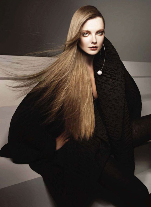
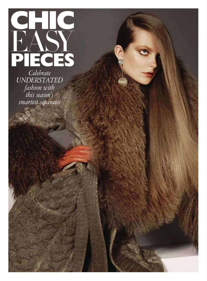
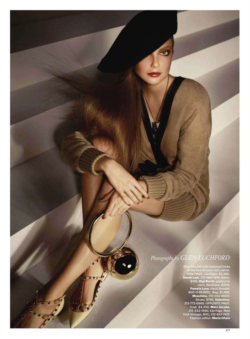
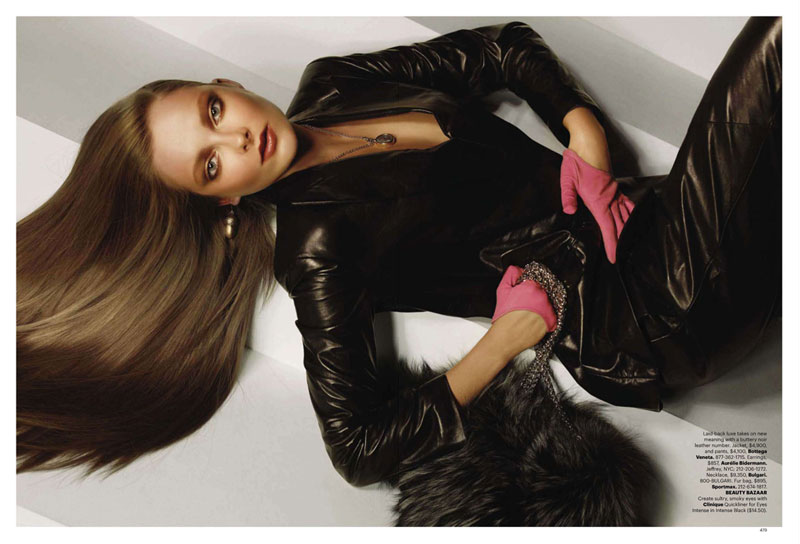
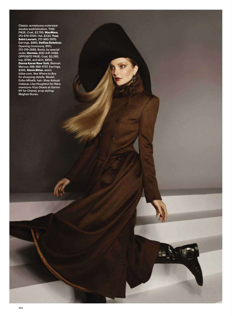
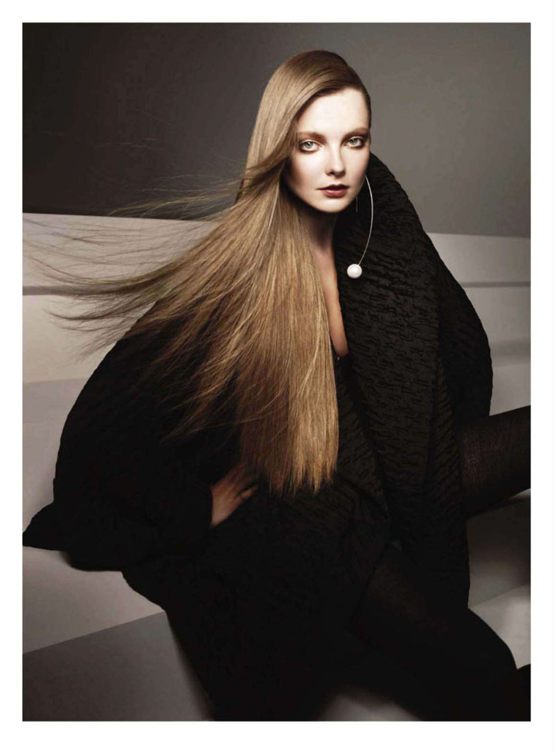
Sporting a longer and more sophisticated ‘do, Eniko Mihalik takes to the pages of September’s Harper’s Bazaar US in some of this season’s most luxe looks. Lensed by Glen Luchford and styled by Marie Chaix, Eniko is ready for fall in fur, knits and heavy layers.
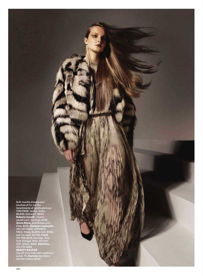
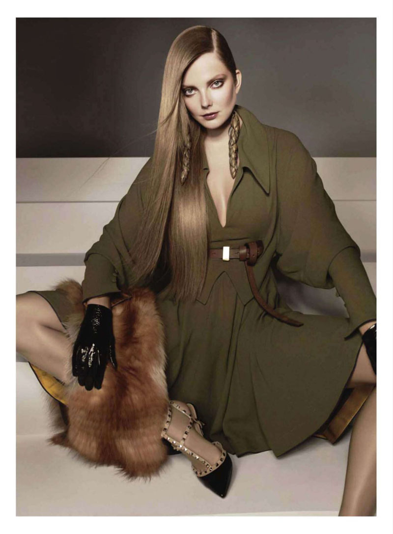
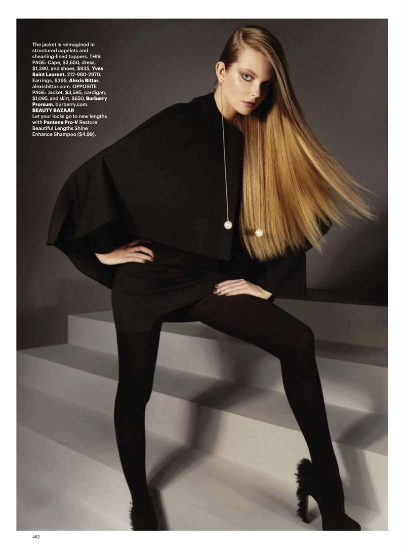
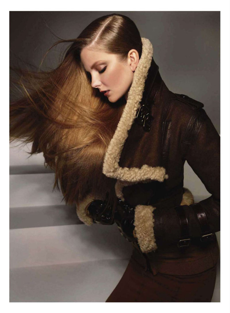



Wow! Eniko looks so sleek. I like the styling, very simplistic and refined. However, I don´t understand the purpose of the stairs in the background.
Wow! Eniko looks so sleek. I like the styling, very simplistic and refined. However, I don´t understand the purpose of the stairs in the background.
beautiful editorial but somehow feels a bit dated…the lighting and overall vibe is very similar to a f/w 1983 Salvatore Ferragamo catalog I found a while back…
http://marielscastle.blogspot.com
beautiful editorial but somehow feels a bit dated…the lighting and overall vibe is very similar to a f/w 1983 Salvatore Ferragamo catalog I found a while back…
http://marielscastle.blogspot.com
STUNNING..
STUNNING..
I'm all for the stairs and so over the couch which seems to be in every fall Ad campaign it seems. That YSL black hat in can't be $230. Love the fact that the concept is separates and ooh those Valentino shoes. I need all of it with the exception of look four because it's just too familiar.
I'm all for the stairs and so over the couch which seems to be in every fall Ad campaign it seems. That YSL black hat in can't be $230. Love the fact that the concept is separates and ooh those Valentino shoes. I need all of it with the exception of look four because it's just too familiar.
stunning!!~~~
stunning!!~~~
Nothing fancy here – and I agree – rather dated. But with a top model and well posed, sharp and varied shots it is very effective. Eniko almost disappears into the clothes. Not something I want to see all the time but quality stuff. the labels should be delighted.
Nothing fancy here – and I agree – rather dated. But with a top model and well posed, sharp and varied shots it is very effective. Eniko almost disappears into the clothes. Not something I want to see all the time but quality stuff. the labels should be delighted.
I cannot get over how beautiful that Burberry shearling leather jacket is. I keep seeing it everywhere and it is to-die-for!
I cannot get over how beautiful that Burberry shearling leather jacket is. I keep seeing it everywhere and it is to-die-for!
This would be a success as a look book but as an editorial, it doesn't work. An editorial is not supposed to be a display about the clothes; the clothes are supposed to be there to enhance stories, not vice versa. It looks pretty mechanical, with a mannequin who has a close resemblance to Eniko.
This would be a success as a look book but as an editorial, it doesn't work. An editorial is not supposed to be a display about the clothes; the clothes are supposed to be there to enhance stories, not vice versa. It looks pretty mechanical, with a mannequin who has a close resemblance to Eniko.
omg, these pictures are brilliant, love how sleek and clean the look are
vasilieva http://elenavasilieva.blogspot.com/
xx
omg, these pictures are brilliant, love how sleek and clean the look are
vasilieva http://elenavasilieva.blogspot.com/
xx
I dont like her : simple and ordinary face
I dont like her : simple and ordinary face
As a note to those saying it's dated or 80s looking. I think it's supposed to be, and I would not dismiss Luchford as not being aware. Look at some of his other work over the last few years. Very intentionally 80s.
As a note to those saying it's dated or 80s looking. I think it's supposed to be, and I would not dismiss Luchford as not being aware. Look at some of his other work over the last few years. Very intentionally 80s.
Gorgeous, gorgeous styling and hair. The classic woman is back and DO I love it!
Gorgeous, gorgeous styling and hair. The classic woman is back and DO I love it!
Good use of hair.
Good use of hair.
There are no pictures I could ever hate with her in it. Fantastic as always!
Maybe the pictures were supposed to create the atmosphere of the 80s, I agree with "anon".
There are no pictures I could ever hate with her in it. Fantastic as always!
Maybe the pictures were supposed to create the atmosphere of the 80s, I agree with "anon".
WOW beautiful!
WOW beautiful!
It's safe to say I feel I *need* those Valentino and YSL shoes after seeing this editorial. Eniko's face is so delicate, with no exaggerated features, yet exceptionally expressive, something very refreshing these days.
It's safe to say I feel I *need* those Valentino and YSL shoes after seeing this editorial. Eniko's face is so delicate, with no exaggerated features, yet exceptionally expressive, something very refreshing these days.
Love it, enough said. <3
Love it, enough said. <3
Apesar de ter achado meio simplório a eniko sempre salva..great model!!!!!1