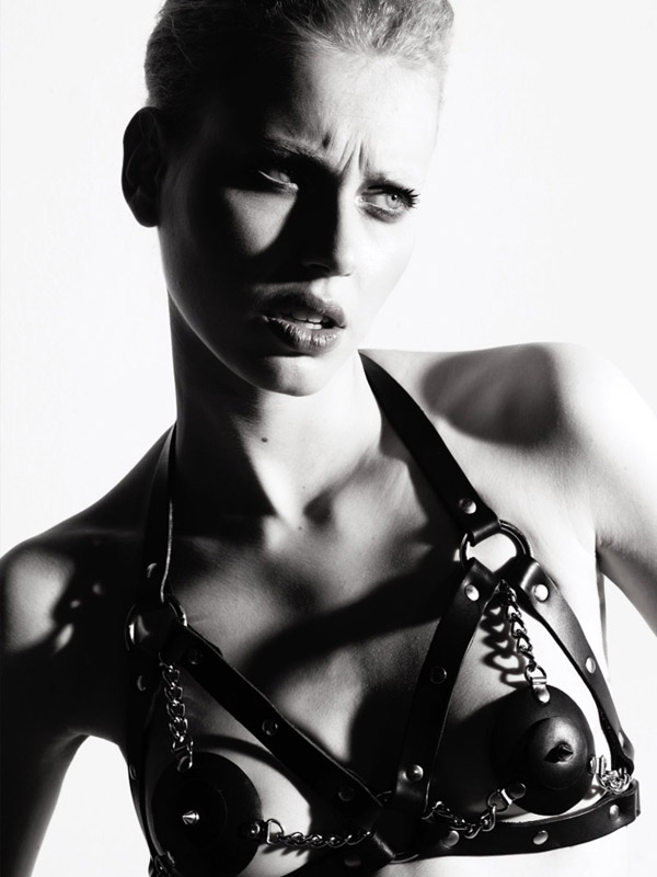
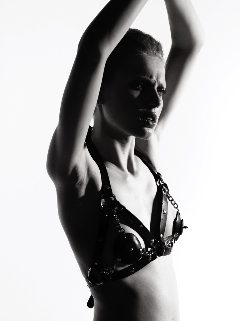
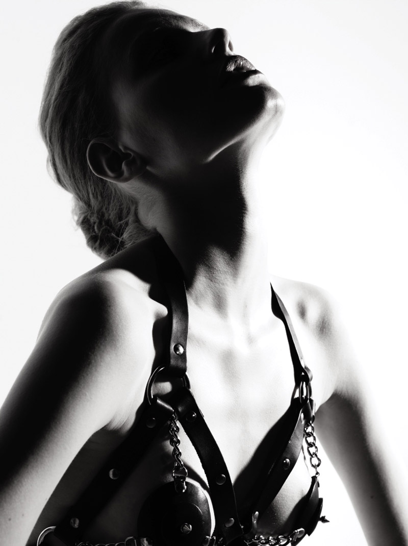
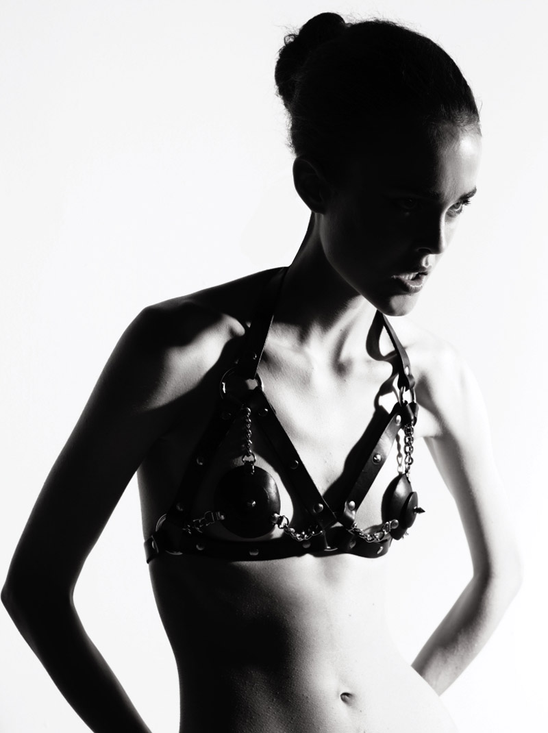
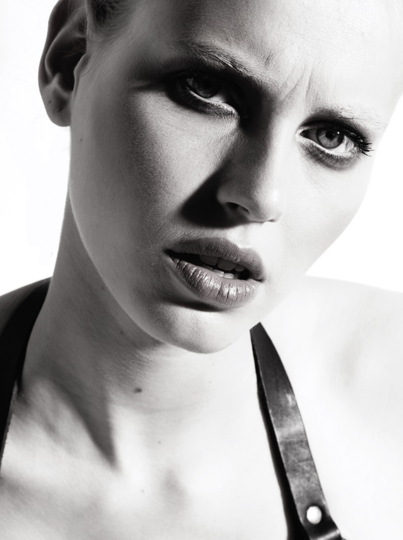
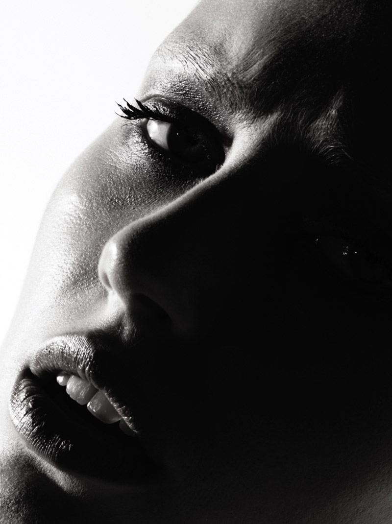
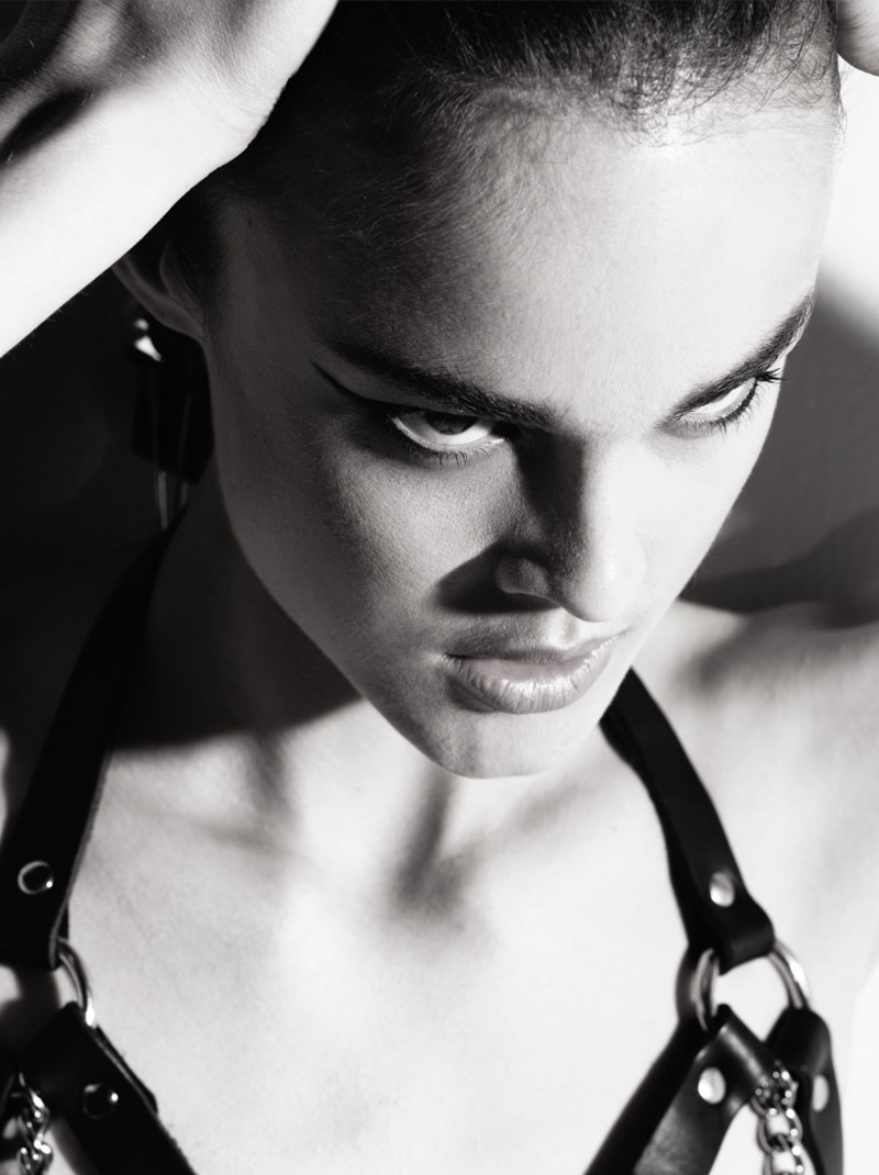
Continuing their fascination with all things leather and bondage, photographer duo Herring & Herring captures Annaleis Smith and Lisette (Ford Models) in a series risque images for the fall-winter issue of Jimon. Strapped into garments made of hard leather and chains, the sexy duo dons mussed hair and makeup courtesy of Naomi Porto and Bryan Z.
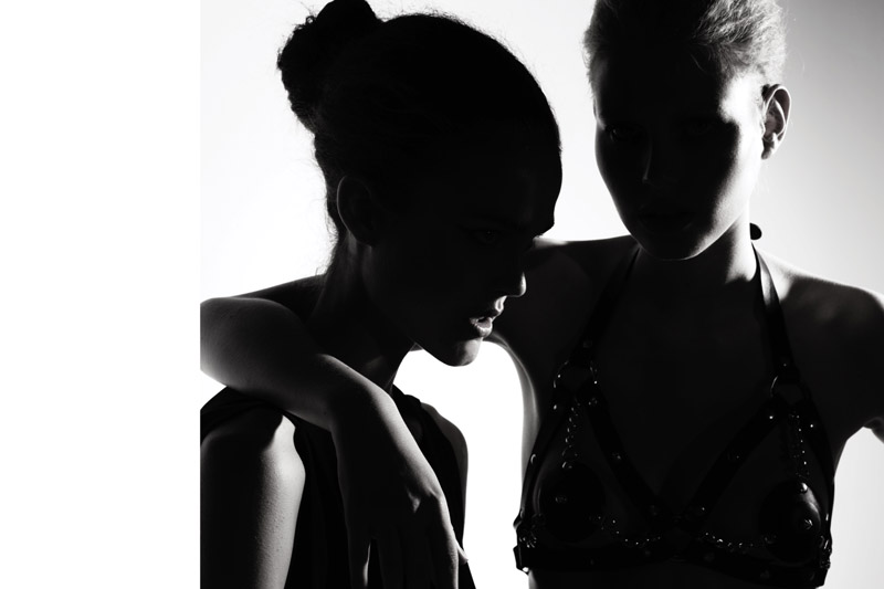
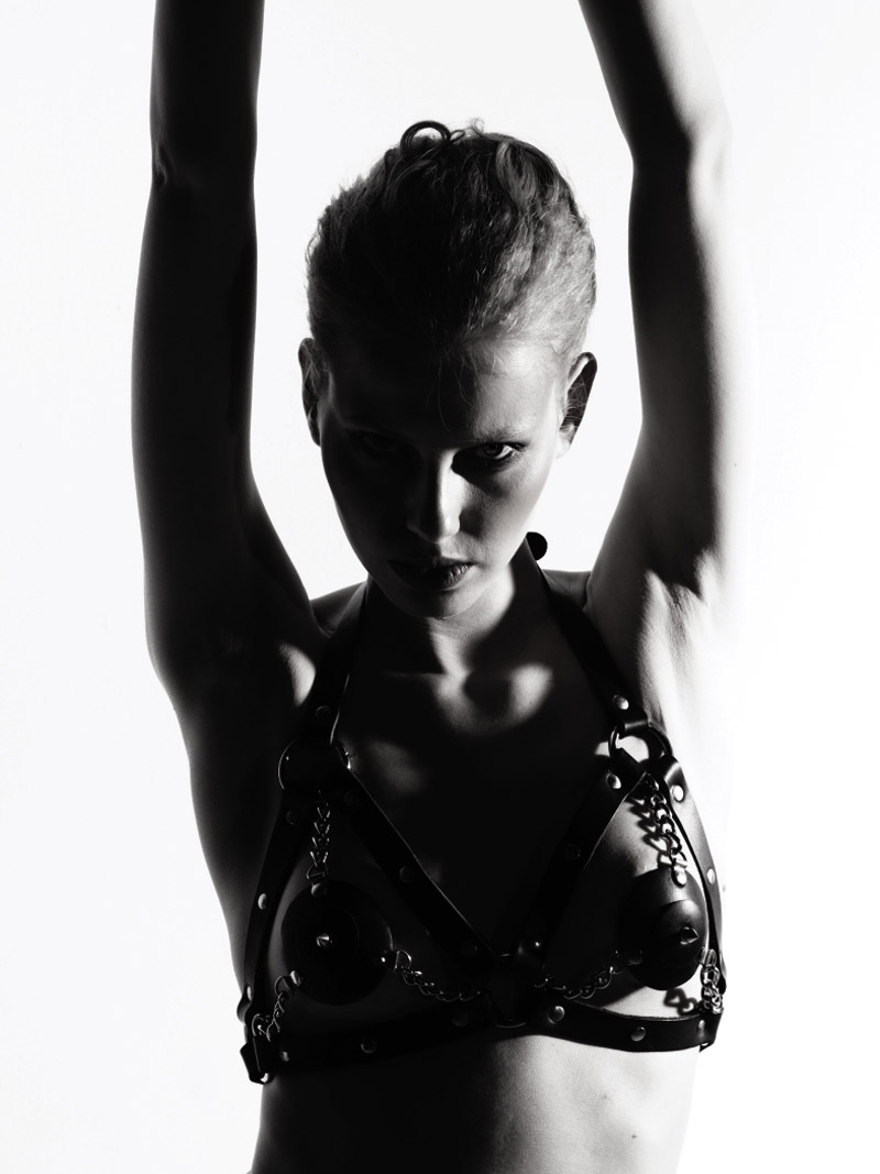
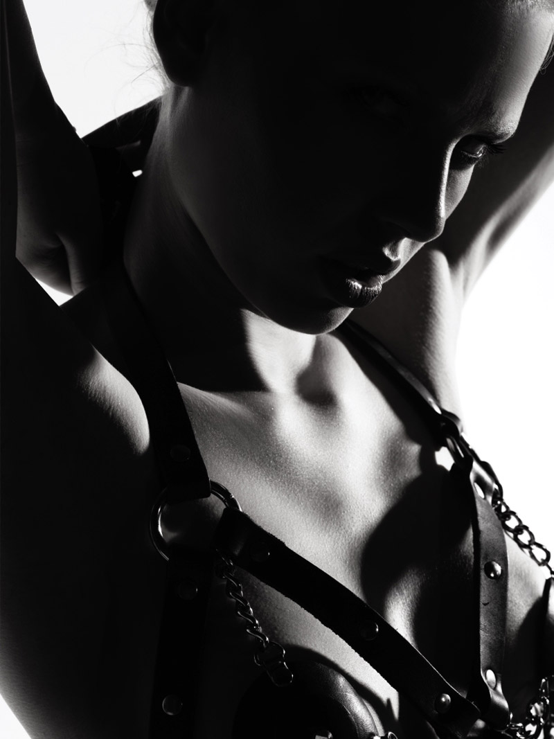

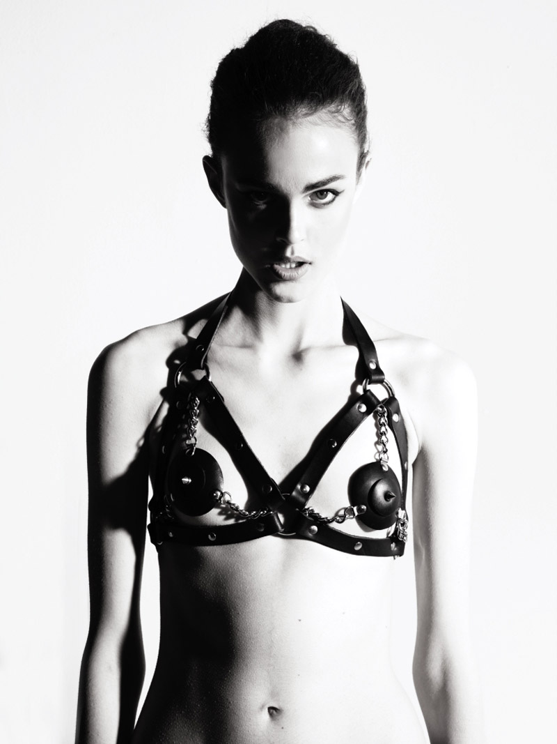



sorry to say that, but this harness thing is getting a bit boring to me.
xo
szucs
http://iiiinspired.blogspot.com/
http://agnesszucs.blogspot.com/
i think this is more about photography and portraiture rather than a fashion story. I think its beautiful and very strong. The lighting is fantastic, and the blond model’s expressions are on point.
this looks to me more like a test-shoot for new girls
this looks to me more like a test-shoot for new girls
this looks to me more like a test-shoot for new girls
Looks like a Model Mayhem test for a bad girl that THINKS she is a model.
Looks like a Model Mayhem test for a bad girl that THINKS she is a model.
they should have chosen someone with bigger bobs, to fill it out
they should have chosen someone with bigger bobs, to fill it out
yeeeeez, omg is that a boring story isn`t it? not even sexy nor…nothing….
sorry, what was that… I fell asleep.
Here’s an idea. If you’re going to be showing off a bra, how about choosing women to wear it who actually have breasts? Maybe, I’m crazy, though.
please kill me now….
please kill me now….
It’s sad to see someone’s efforts degraded by so much negativity. Unless the photographer submitted this to FGR, he shouldn’t be blamed for the repetitiveness of the shots. He had obviously meant this to be nothing more than a test. The problem is that FGR keeps displaying these tests. Their intention behind this is good, but simple tests are not meant to be seen in this light, on a site where Roversi editorials are featured. You can’t showcase a Roversi editorial and then have that followed by tests. Perhaps you can create a spotlight feature where you showcase up and coming talent. In this instance, it frees you up to showcase their better work and do them more justice. As such, this kind of exposure has a negative impact on a photographer. Displaying repetitive images from tests does not bring favorable exposure to anyone. It’s not just about getting your name out there. It’s getting it out there properly. Otherwise, unfiltered exposure has never done anyone much good.
This is a strong, and powerful shoot. Ok granted, it’s the same ol’ thing. But perhaps the focus of this ad is on the versatility of the model. She has a nice face. If they changed the clothes it would be better, fresher. But this ed is strong.