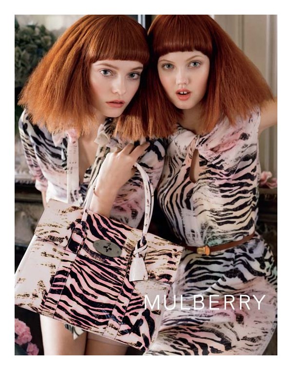
Mulberry’s spring 2011 campaign is a colorful affair with models Lindsey Wixson and Nimue Smit surrounded in a room of flowers and sunlight lensed by Tim Walker. Wearing the label’s girly and elegant designs, the model pairing stuns in the latest campaign styled by Edward Enninful. (Fashionista)
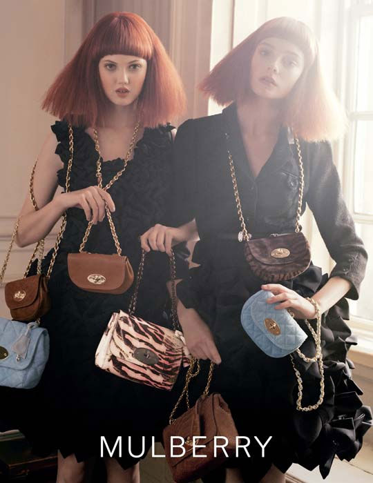
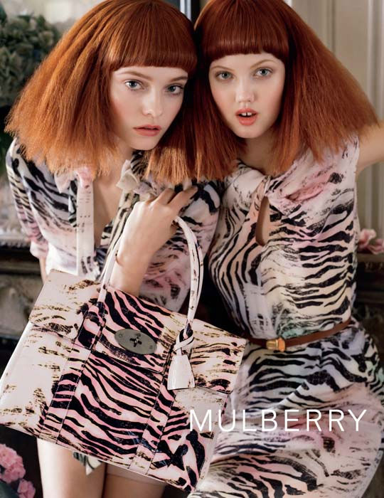
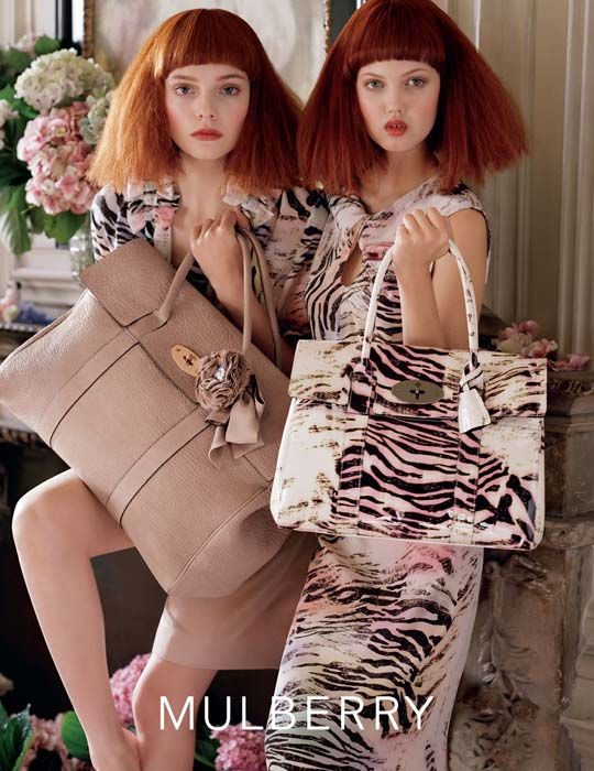
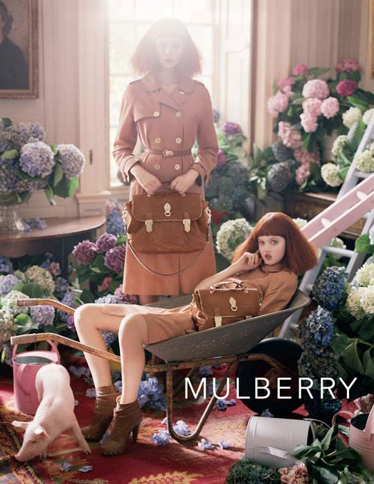
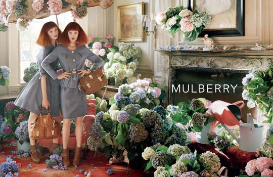
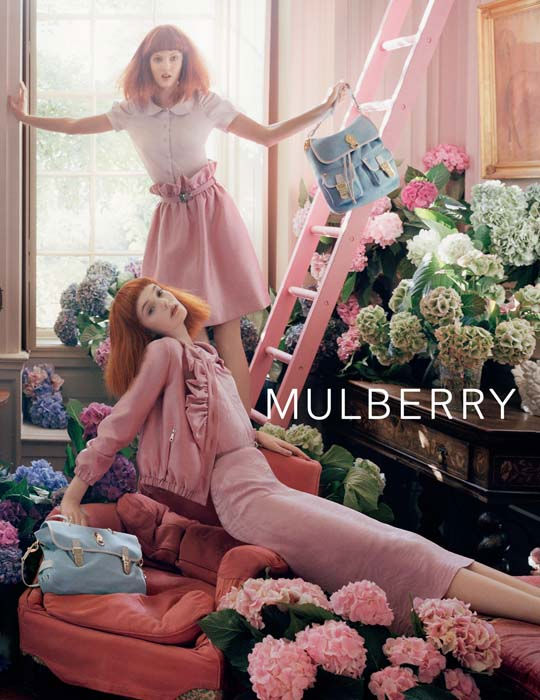




Why has Lindsey on every picture her mouth open? xx
Lovely Pastel colors…and the hair is Grace Coddington + Karen Elson
http://cito-gene.blogspot.com/
tim<3
I’ve kind of keep noticing that…
1. Lindsey has no expression and all mouth in each picture. I’m serious.
2. Why does the light hit Nimue’s face sometimes? Like it’s meant to be focused on Lindsey instead.
3. Lindsey has either awkward or predictable poses in each picture yet again. Tsk tsk.
I have no hate for Lindsey,I kind of like her sometimes. But I just think…she can also sometimes ruin things.
We are twins. I am especially mad about the sun blocking out Nimue in some shots. I like Lindsey (sometimes) but Nimue is one of my favorites and I hate to see that they intentionally tried to make Lindsey outshine her.
We are twins. I am especially mad about the sun blocking out Nimue in some shots. I like Lindsey (sometimes) but Nimue is one of my favorites and I hate to see that they intentionally tried to make Lindsey outshine her.
I’ve kind of keep noticing that…
1. Lindsey has no expression and all mouth in each picture. I’m serious.
2. Why does the light hit Nimue’s face sometimes? Like it’s meant to be focused on Lindsey instead.
3. Lindsey has either awkward or predictable poses in each picture yet again. Tsk tsk.
I have no hate for Lindsey,I kind of like her sometimes. But I just think…she can also sometimes ruin things.
it looks like a bit forced, some it’s true that some of lindsey’s poses are a bit awkward, and the light sometimes it’s a bit too much, like if they didn’t really think about it
tim walker+ mulberry could have been way more amazing!
wow, lindsey looks terrible..who decided those pictures of her were good? I really dislike her here.
wow, lindsey looks terrible..who decided those pictures of her were good? I really dislike her here.
Nimue blows Lindsey away here, really..
Nimue blows Lindsey away here, really..
i love lindsey
Lindsey looks amazing. Her face is defined by the doll-like round mouth and gap in her teeth, so of course she works with what makes her HER. I think she’s pretty, unique and captivating. She stands out in the sea of Soviet barbies.
Lindsey looks amazing. Her face is defined by the doll-like round mouth and gap in her teeth, so of course she works with what makes her HER. I think she’s pretty, unique and captivating. She stands out in the sea of Soviet barbies.
nice 🙂
Almost didn’t recognise Lindsey, such a chameleon.
http://lipstickboudoir.blogspot.com/
xxx
Love Nimue, she is Beautiful!!! However, Lindsay can´t close her mouth, HORRIBLE!!!!!
Love Nimue, she is Beautiful!!! However, Lindsay can´t close her mouth, HORRIBLE!!!!!
I’m not a huge fan of Lindsey, but I love the styling
love these!!!! and the pink ladder!!!!
http://whycantmybestfriendbeme.blogspot.com/
love these!!!! and the pink ladder!!!!
http://whycantmybestfriendbeme.blogspot.com/
no more lindsey wixon,please.
not to be mean but how did Lindsey become a model again? same expression and her face…….eek no comment. One of the worst so called models faces I’ve ever had to see. she looks like a fat girl on a skinny girls body. too weird.
Made med laugh – and not in a good way.
Carla Bley hair
QUOTE // http://shock-lin.blogspot.com/2011/01/double.html
QUOTE // http://shock-lin.blogspot.com/2011/01/double.html
My apologies for those of you who absolutely *adore* Lindsey, but I honestly cannot fucking stand her.