
Hermès goes into the shadows for its spring 2011 campaign starring Jacquelyn Jablonski. Photographed by Nick Knight, Jacquelyn dons the label’s western inspired garb for the new season.
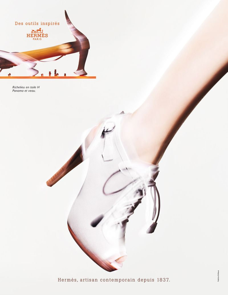
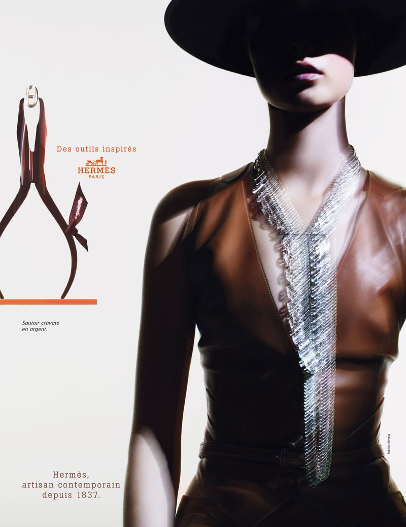
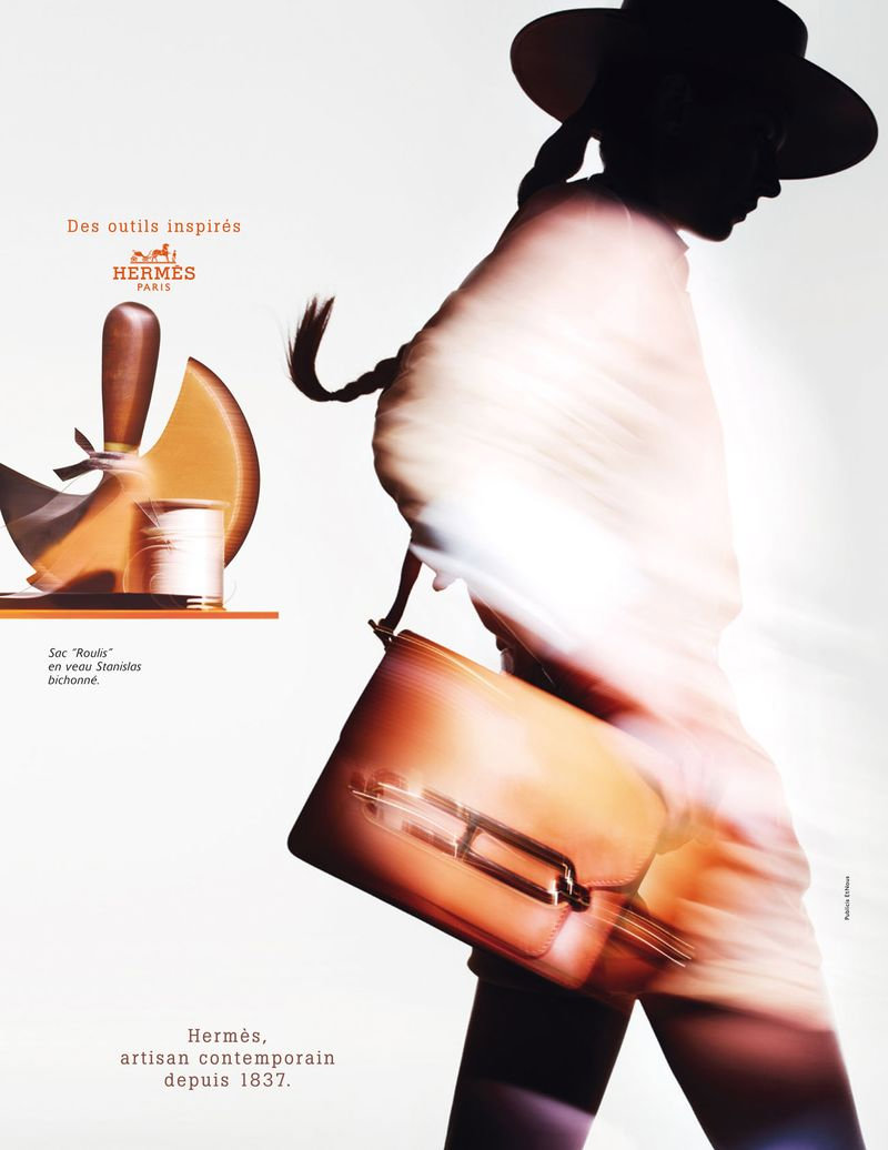
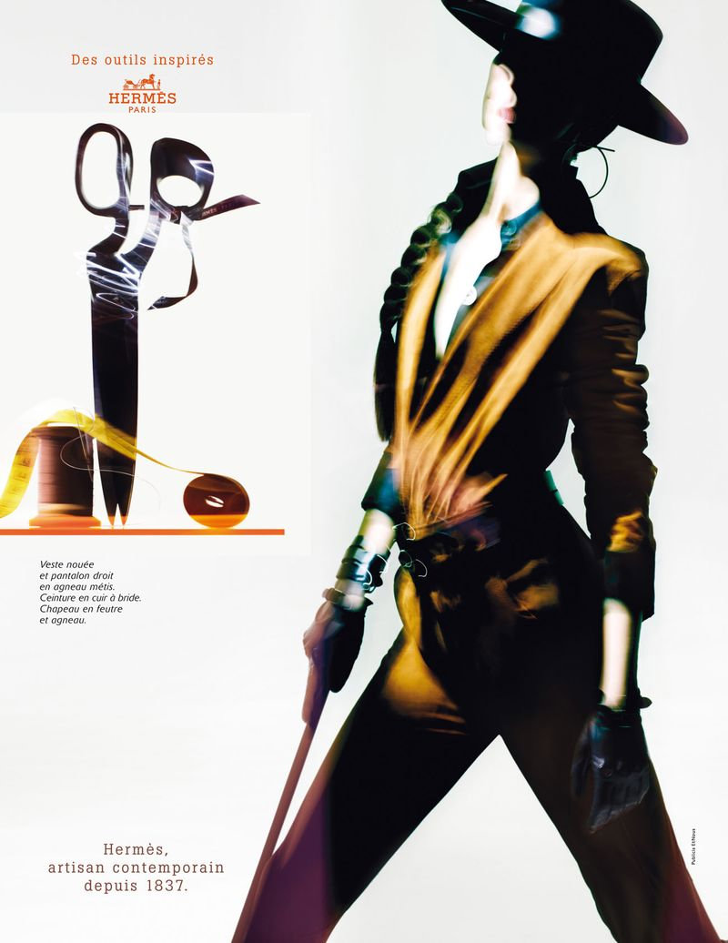
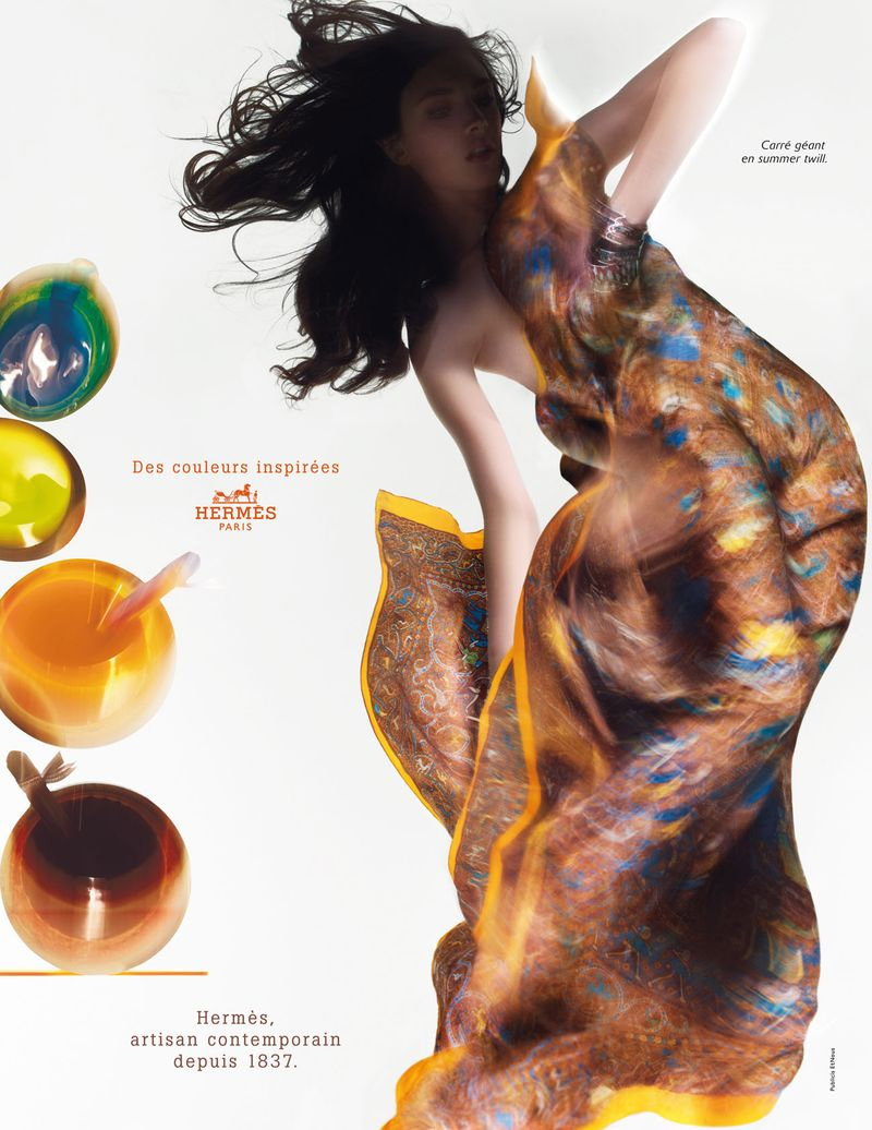

Hermès goes into the shadows for its spring 2011 campaign starring Jacquelyn Jablonski. Photographed by Nick Knight, Jacquelyn dons the label’s western inspired garb for the new season.


Comments are closed.
Absolument horrible!
Just like your spelling.
C’est français…
Just like your spelling.
Absolument horrible!
I am not so sure about it as a campaign, but I’m thrilled for Jacquelyn!
I am not so sure about it as a campaign, but I’m thrilled for Jacquelyn!
I am not so sure about it as a campaign, but I’m thrilled for Jacquelyn!
for an ad this is very disappointing… i can’t see the clothes or the model.
These resembles those 60’s ads, and I actually quite like them.
oh, no… blurs again… i’m not sure i like these so much… but i actually like the one you chose as your cover, because it has nice colors, and looks lik a painting.
agnes
http://iiiinspired.blogspot.com/
http://agnesszucs.blogspot.com/
oh, no… blurs again… i’m not sure i like these so much… but i actually like the one you chose as your cover, because it has nice colors, and looks lik a painting.
agnes
http://iiiinspired.blogspot.com/
http://agnesszucs.blogspot.com/
Poor Jaqueline, they knew her face was going to be blurred and casted her purely on her movement.
I personally think the campaign itself looks like some local ‘luxury’ brand which advertises in a hotel magazine.
THIS IS GREAT! Where are the complaints coming from? Nick Knight is a GENIUS!
I can’t see the details. Looks like I took the pictures! My pictures always come out blurry!
http://www.justme-bluefemme.blogspot.com/
wow~ looks like they were taken by you?… too bad, u r not NICK KNIGHT
Idiot
I usually like Hermes campaigns, but this one is pretty disappointing. Bring back Karlie and Roversi!
I love it! just feels like too much text or something tho. The images standing alone would’ve been better
campaign is about to give people the concept and spirit of the brand. for this point, i think Nick Knight did a great job. best Hermes campaign so far. for those people who want to see the details of the clothes, i think you should just go to Hermes stores to have a close look.
I liked Karlie’s campaign more, but I couldn’t agree more with the rest!
Poor Jaquelyn, she is barely there…reminiscent about the strong-themed Hermes campaigns
http://cito-gene.blogspot.com/
Nick is an amazing Photographer. This is not a catalogue, it is an image oriented campaign and thus does not have to be sharp!
True it is not a product catalogue but giving the spirit of the DNA of the brand
Jacquelyn is wayyyyyyyyyyyyy to gorgeous to be blurred like that. I was so excited when she was cast in a campaign, but this is seriously not worthy of her beauty.
I liked Karlie’s ads wayyy better.
Jacquelyn is wayyyyyyyyyyyyy to gorgeous to be blurred like that. I was so excited when she was cast in a campaign, but this is seriously not worthy of her beauty.
I liked Karlie’s ads wayyy better.
Like someone said, BLURS may not be exceptional for a clothing ad, but THESE BLURS I think really exaggerates the clothes. I think they all look stunning, either way.
This is a “clear” kind of blurry though. I like the artistic thought put into this.
i’m feeling the movements… the right pieces are made to be the focal point.. who cares about the model’s face? it’s about the designs not her…
i’m feeling the movements… the right pieces are made to be the focal point.. who cares about the model’s face? it’s about the designs not her…
i’m feeling the movements… the right pieces are made to be the focal point.. who cares about the model’s face? it’s about the designs not her…
i’m feeling the movements… the right pieces are made to be the focal point.. who cares about the model’s face? it’s about the designs not her…