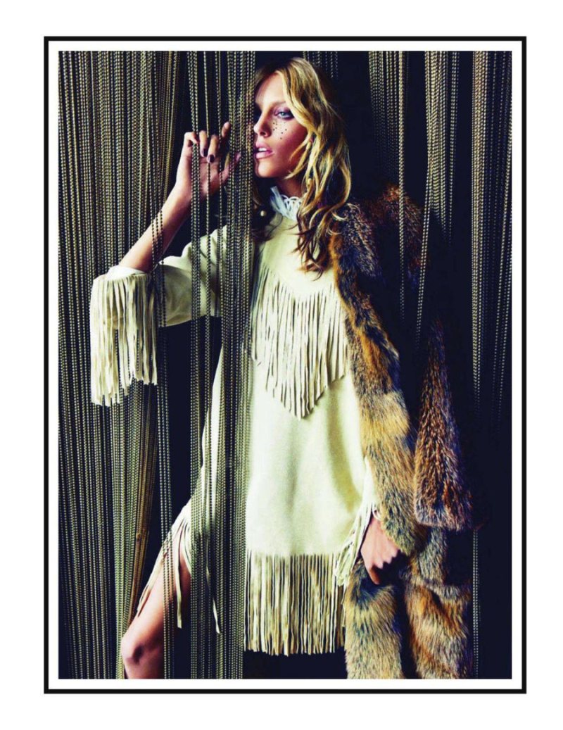
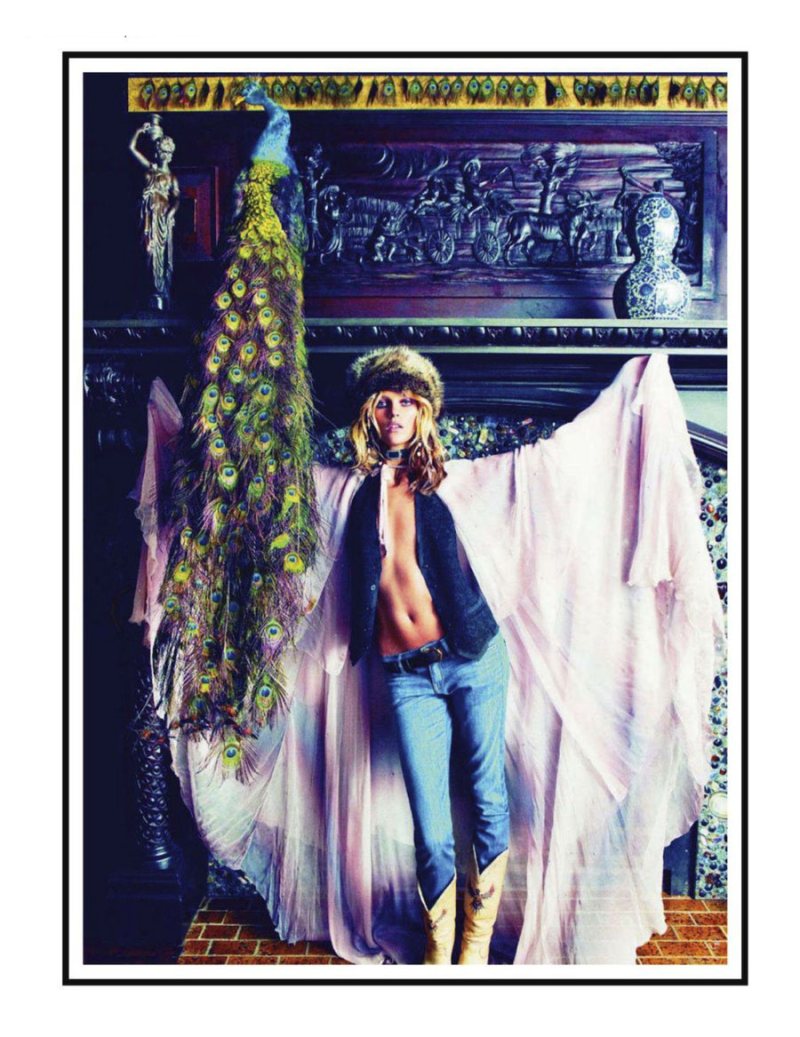
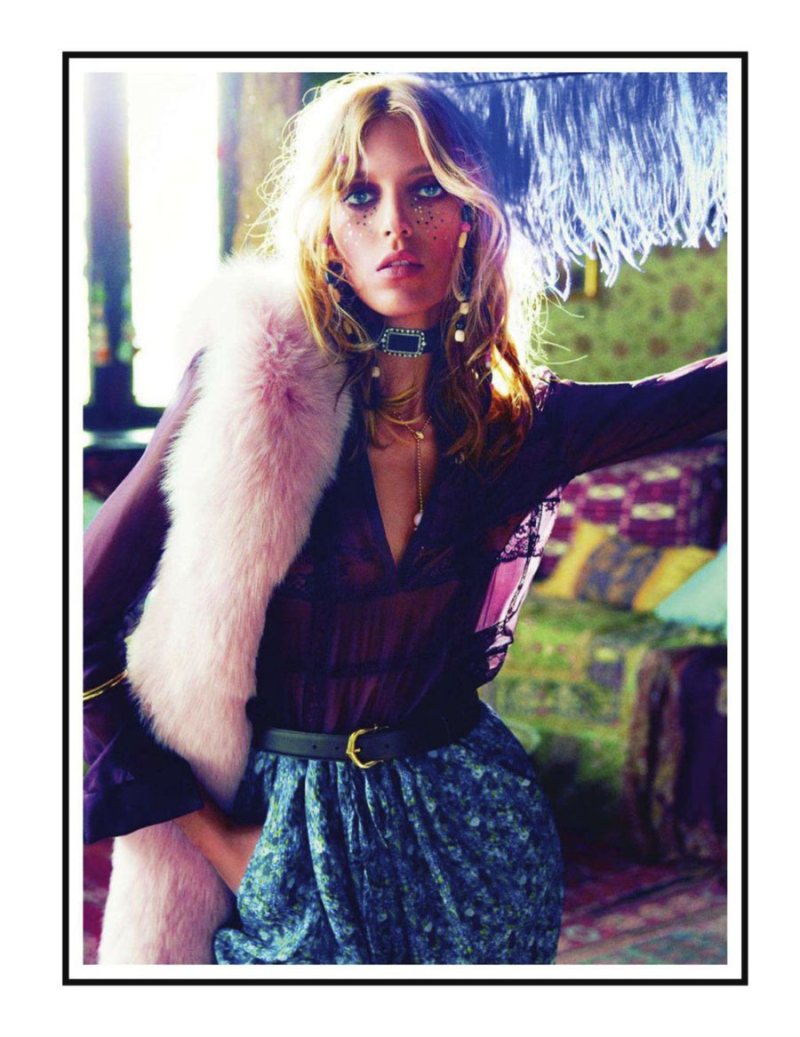
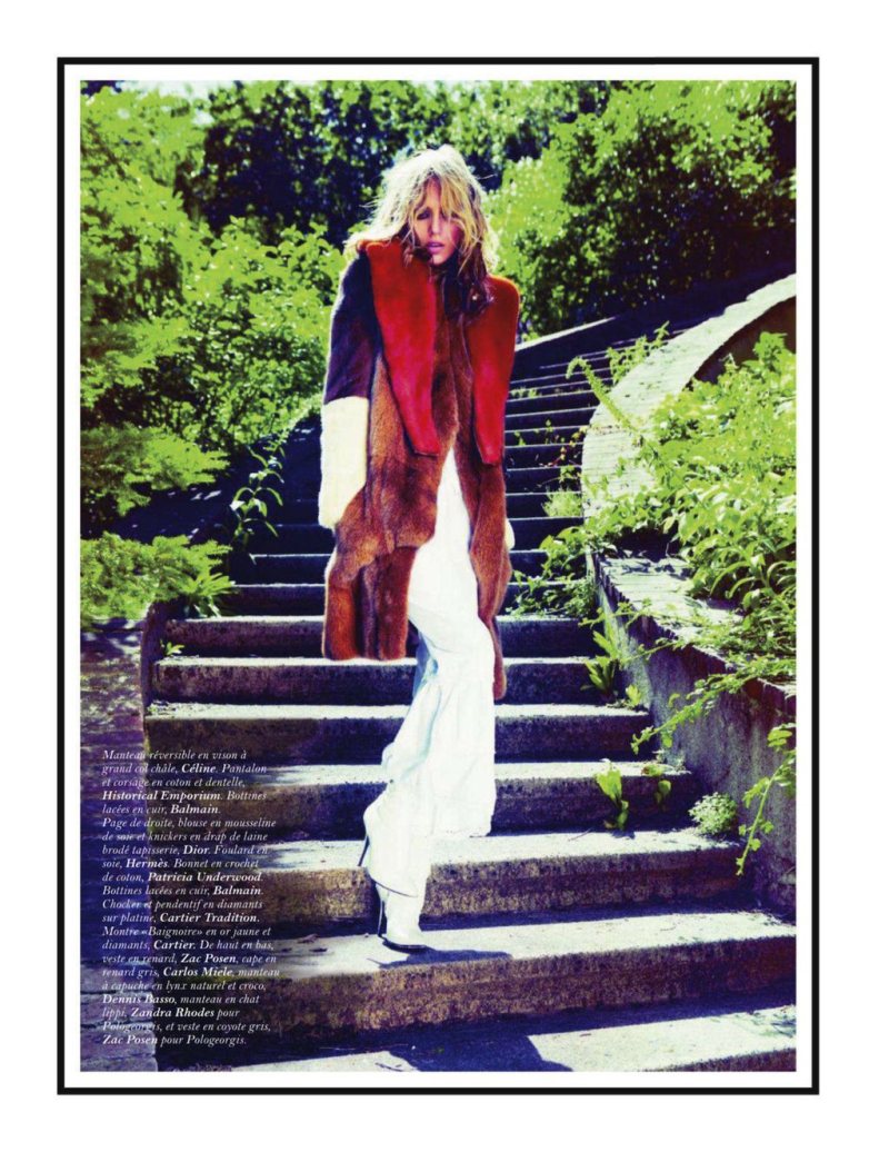
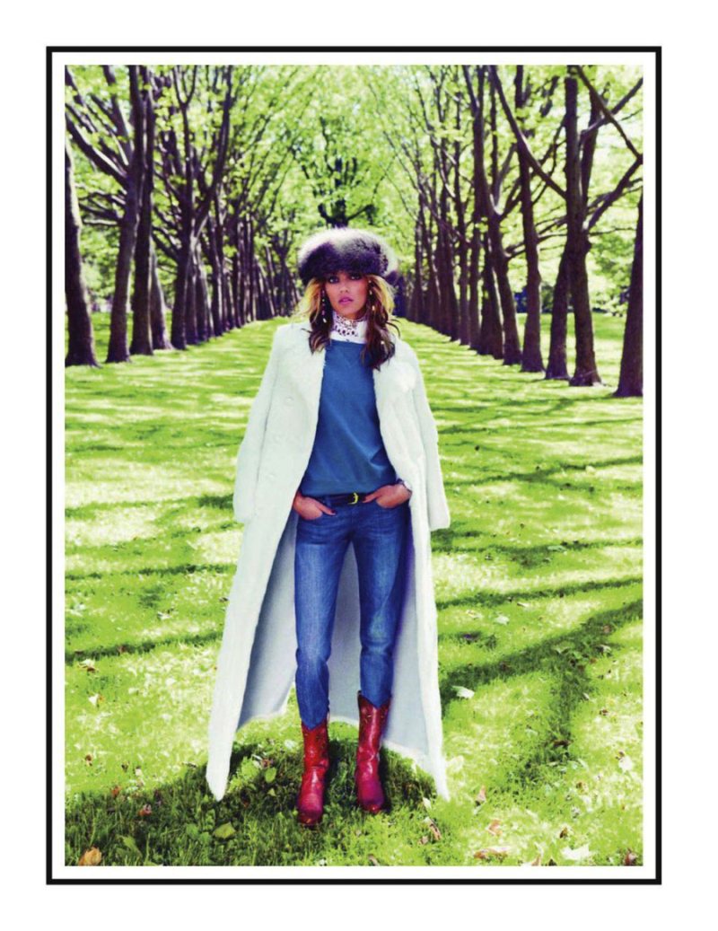
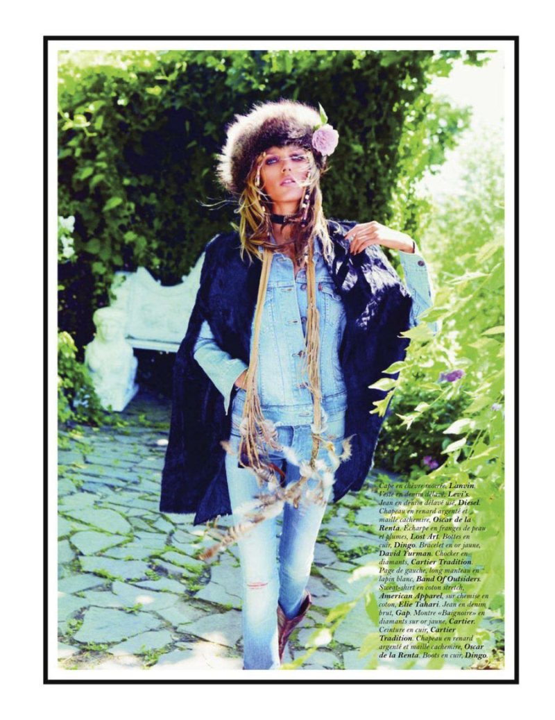
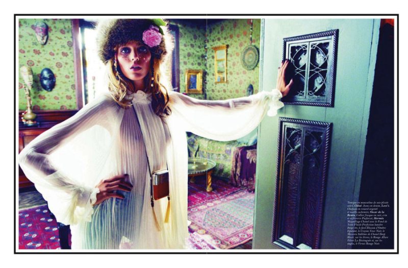
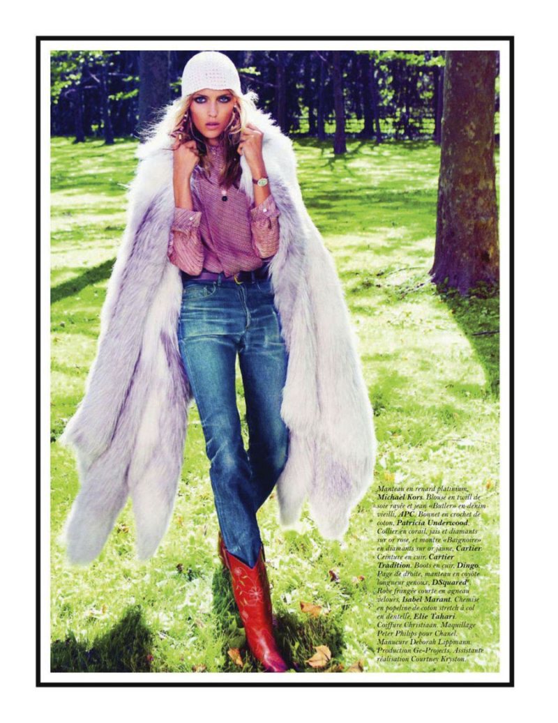
Hippe Living – Captured by Inez van Lamsweerde and Vinoodh Matadin, model Anja Rubik goes bohemian for the September issue of Vogue Paris. Swathed in a mix of denim, furs and floral prints styled by Melanie Ward, Anja is beautifully care free in designs from the likes of Lanvin, Michael Kors, Balmain and Zac Posen in a colorful, outdoor setting.


this had so much potential. disappointed.
I agree 100%.
My thoughts exactly.
I love Anja Rubik but “fur is for beautiful animals and ugly people”. She should not agree for shoots like this as she promotes killing animals for fur!!!
Disappointed with Inez & Vinoodh’s photography here, but Anja looks sexy in most of these.
I agree with both of you, but I guess she doesn’t pick the clothes the stylist do.. and he’s obviously expected to put fur for Fall & Winter. That is more a question of marketing rather than ethic. Besides this editorial could have been a hundred times better to look at, Hippie’s such a great theme..
There’s something I love so much about this spread … the light, the colors … beauty!
XoXo
Plami
http://fashion-thrill.blogspot.com/
Theres something not quite right here, maybe the colour treatment is a little overdone.
I like the ATTEMPT at using some of the minimalist pieces in a luxe hippie spread, but I’m not totally convinced.
Delightfully light hearted and fun! Love the makeup!
Delightfully light hearted and fun! Love the makeup!
Vogue Paris can do better!
i liked it 🙂
oh no it’s awful
oh no it’s awful
I love the photography here but THE STYLING is AWFUL ! The red boots !?
I dunno, I feel like that this is a paradigm in Melanie Wards current work for Vogue Paris. The idea and story behind the shoot (i.e. the 70’s bohemian, talitha Getty luxe feel behind this story) are so inspiring. However, the final product just falls flat. Same thing happened to the previous joan jett/80s inspired shoot. Whether it is because they just feel a bit to literal, or because the styling is off, the images just fall flat.
I’m no sure why but I expect more from Vogue Paris. Let’s step it up ladies!
just a thought, maybe because anja/inez/vinoodh have done a ridiculous amount of work already, and we’ve seen their style and anja’s face so many freaking times at this point, it’s going to be hard to be ‘wow’ed’ by much… been a huge fan of them but maybe it’s time to give some other photographers and models a chance in the spotlight to showcase new creativity… my general critique of fashion these days is that it’s monopolized by older people who’ve been doing it forever, we need new blood, new perspective, and new style
quite a few photos from the actual magazine spread are missing