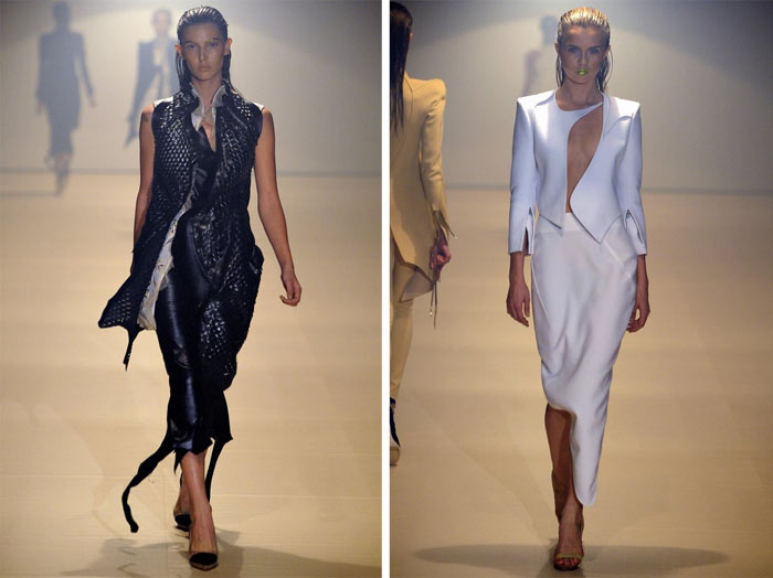
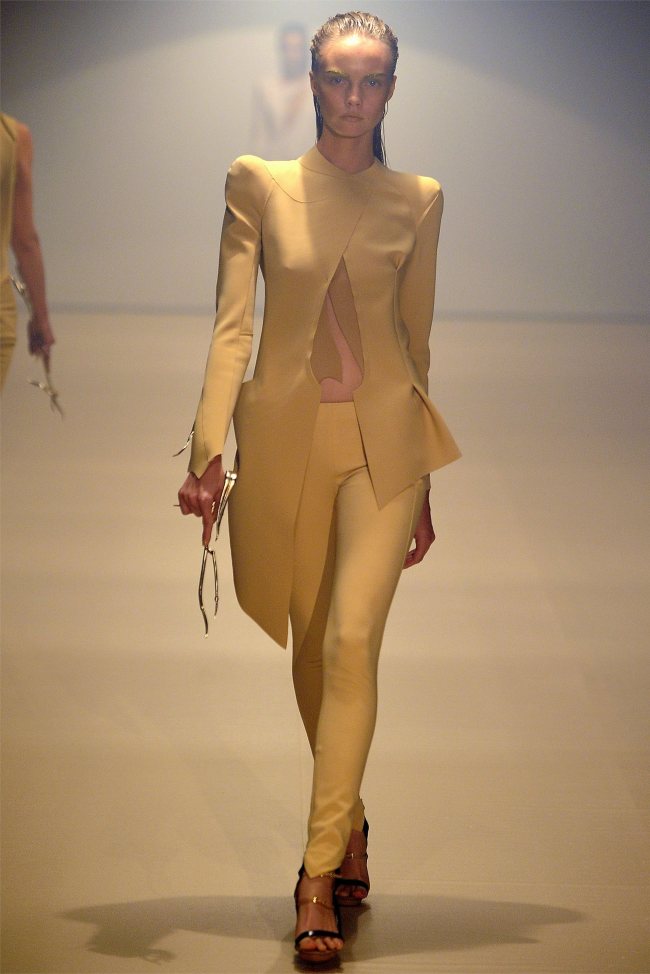
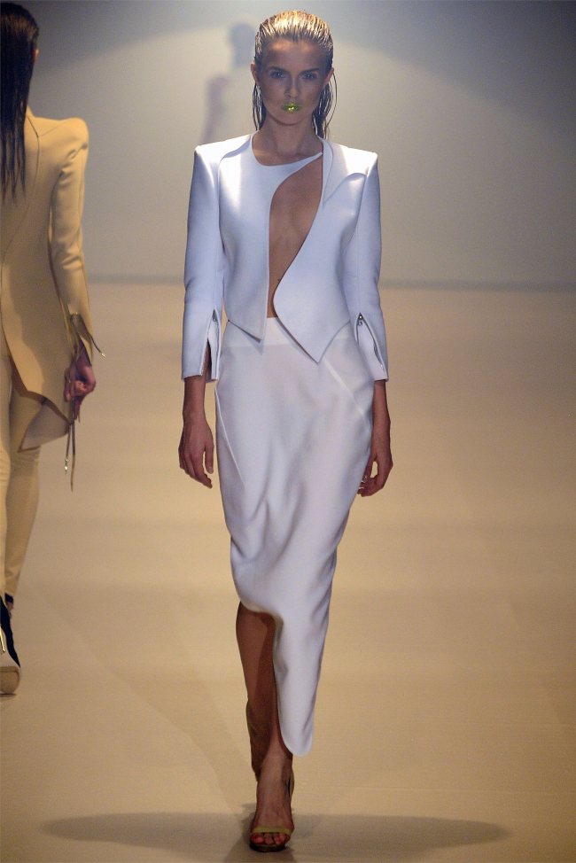
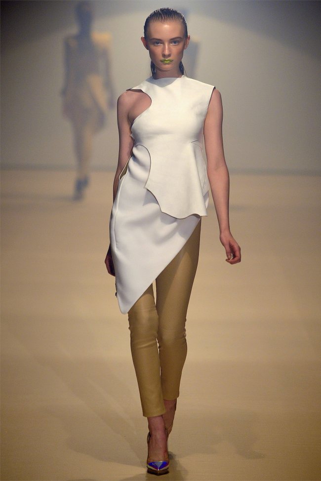
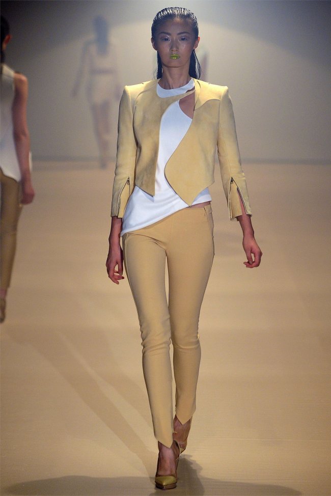
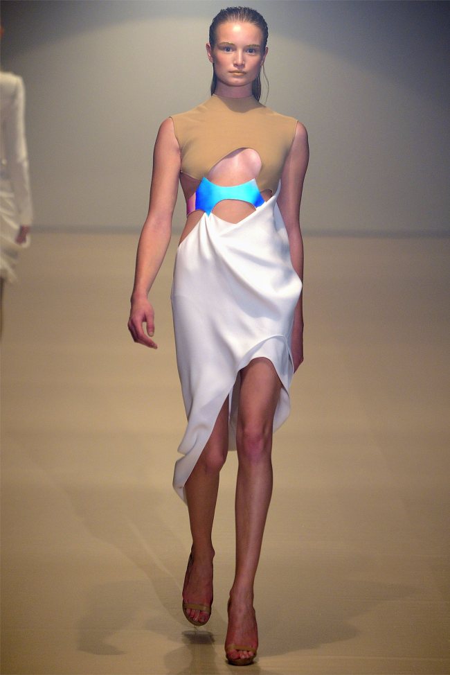
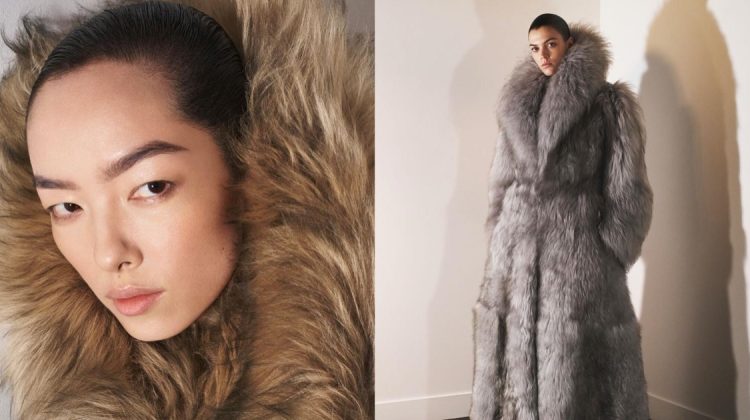
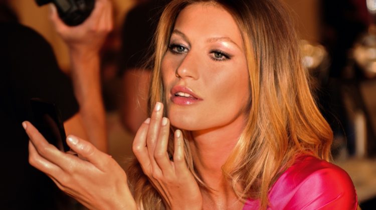
A Pared Down Mugler – After fall’s high octane showing of stage-worthy looks and snarling models, Thierry Mugler creative director Nicola Formichetti presented a toned down spring 2012 collection composed of more minimal, deconstructed looks. In hues of nude, ivory and metallic, the Mugler woman donned unconventional silhouettes with cut-outs and asymmetrical hemlines paired with lightweight outerwear. Beauty for the show included neon lips, slicked back hair and gold covered eyebrows.
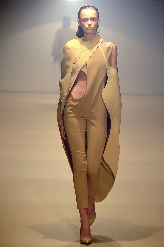
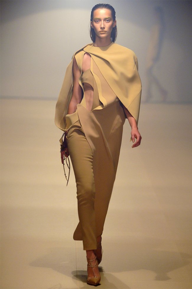
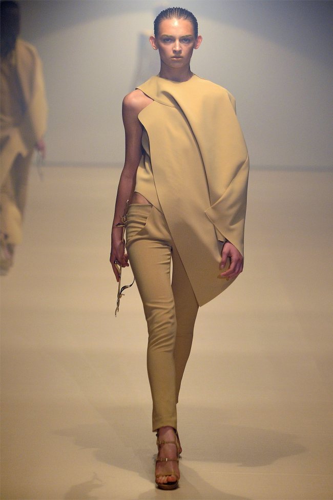
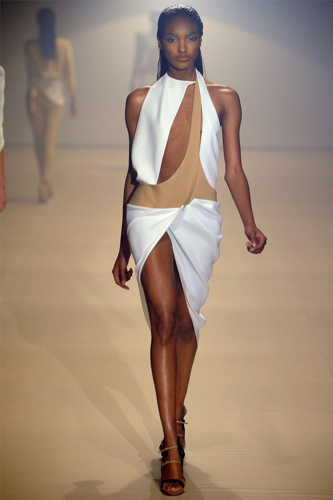
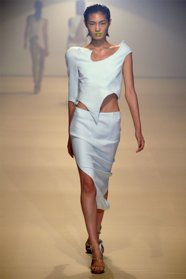
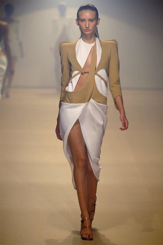
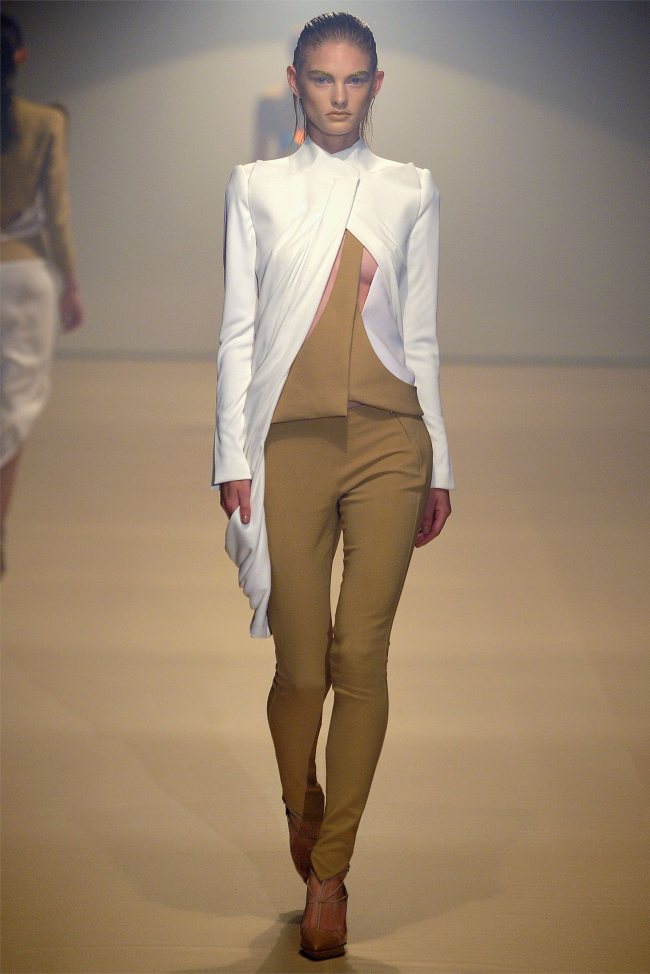



Cool. A more grown up anatomical/insect chic. I dig this monster.
Awesome photos! Love the collection!
Visit our web with the latest in fashion
http://www.perfilprivado.com/
cool, even though sometimes it looks like he’s trying too hard.
Original and interesting!
don’t like it
the shapes are amazing, but i really dislike the colours he used, particularly that shade of brownish yellow.
They are all aliens!
So 80’s Thierry Mugler.
http://tatitatistyle.blogspot.com/
So 80’s Thierry Mugler.
http://tatitatistyle.blogspot.com/
This is just ugly.
excuse-moi, was his inspiration a fried egg?
my next season favorite. mugler’s constructions are so perfect. <3
love the shapes and curves, so feminine. loving the shade of camel and the whites. remins me of The 5th Element
http://styledecorum.blogspot.com/
Seems a bit forced…..but we do love the aliens!
http://www.tinyfrockshop.com
I just love it! The colours are so pretty! There is an article about the launch of the collection with the help of GAGA there: http://canyouearme.co.uk/blog/2011/10/02/lady-gaga-for-mugler/
Have a look!
x