
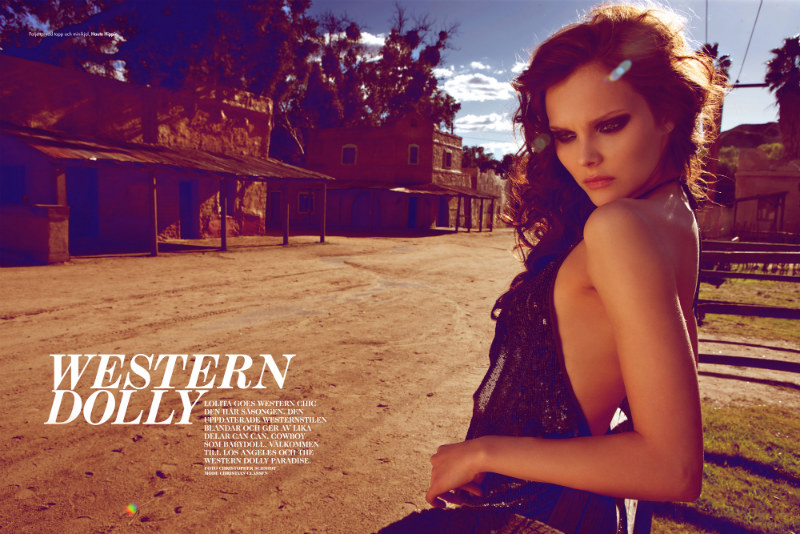
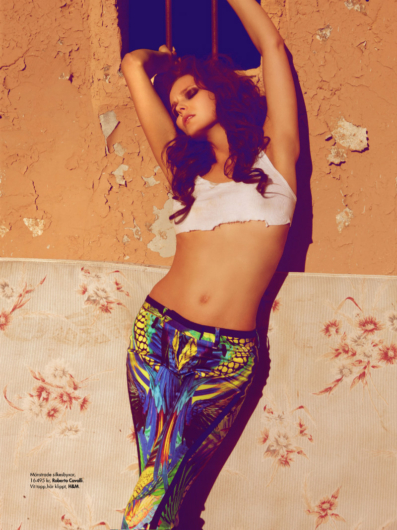
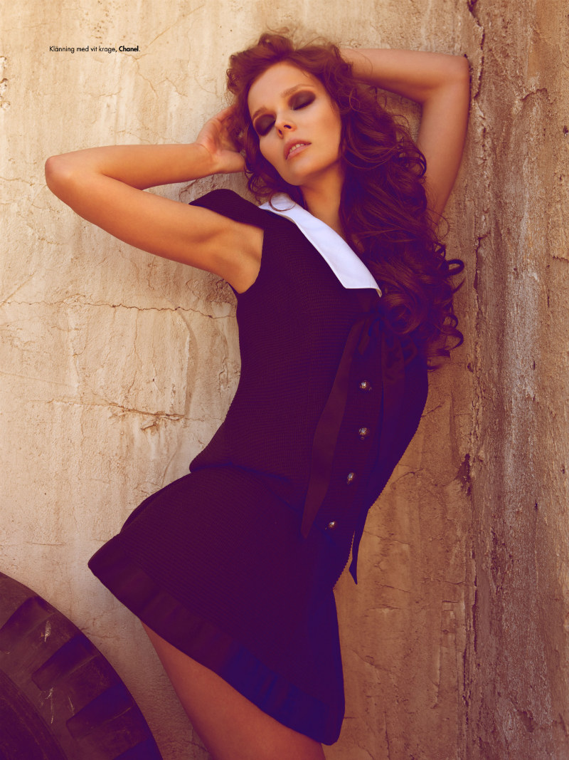
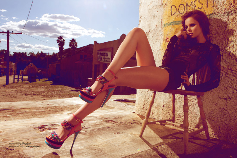
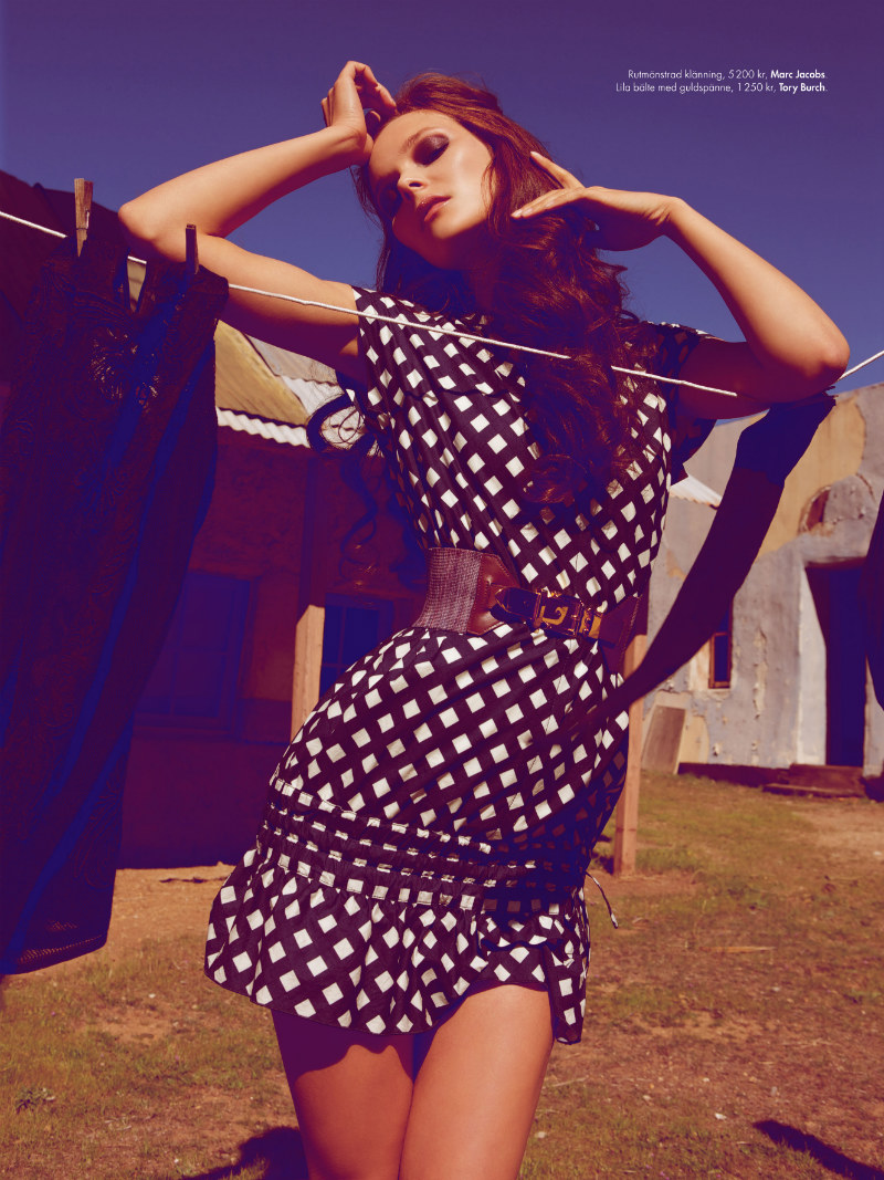
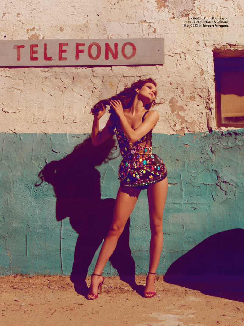
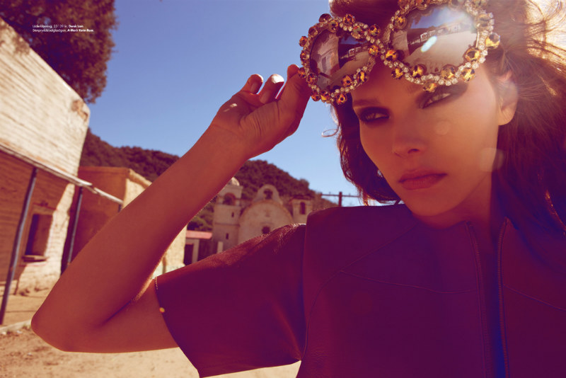
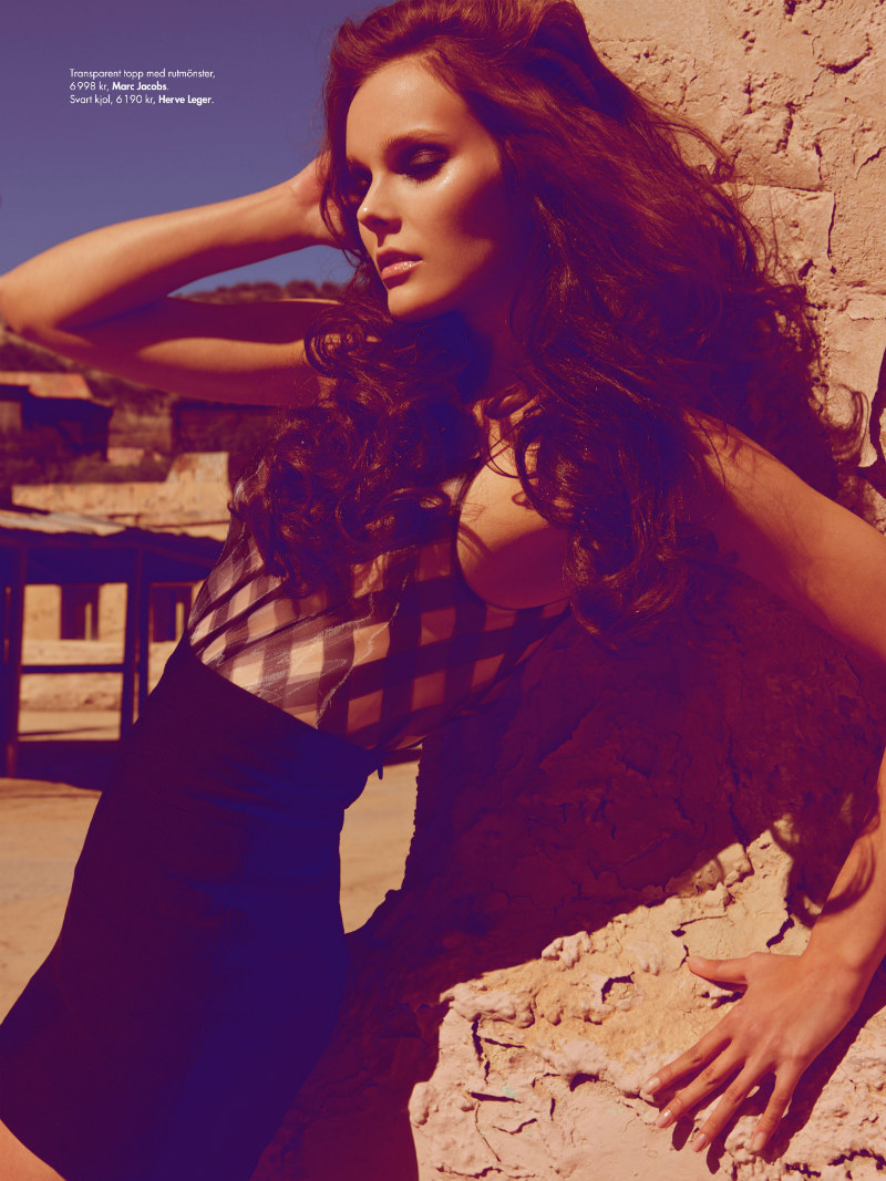
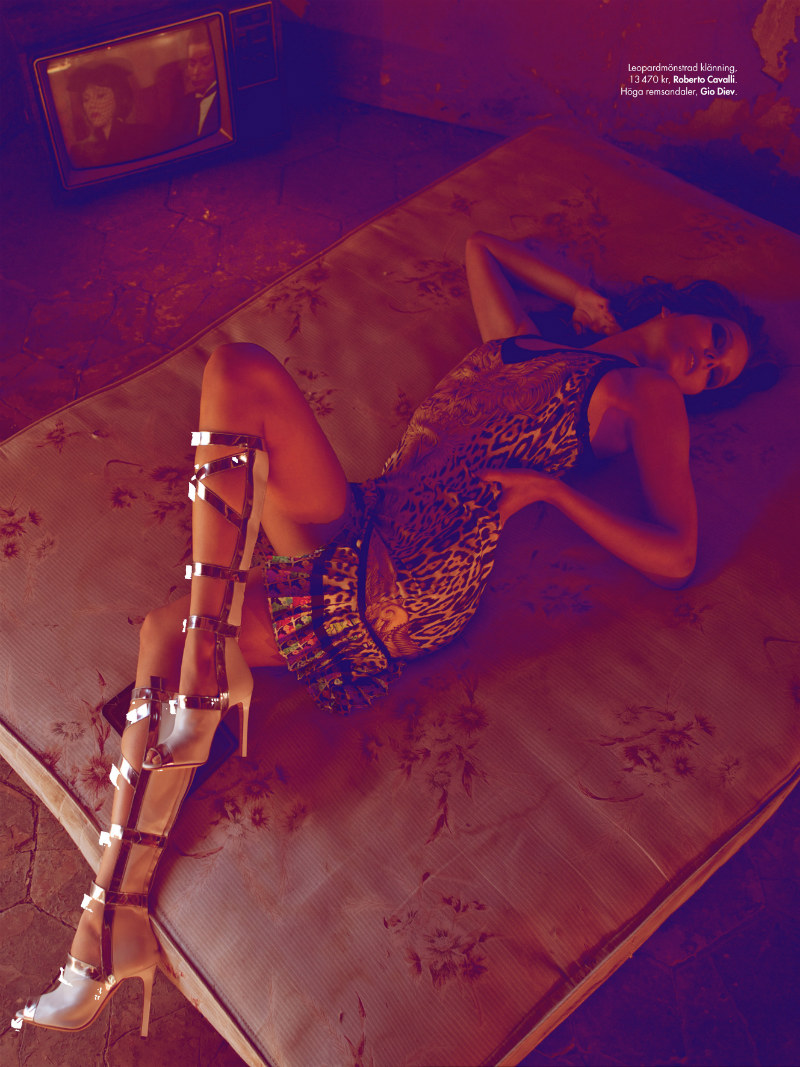
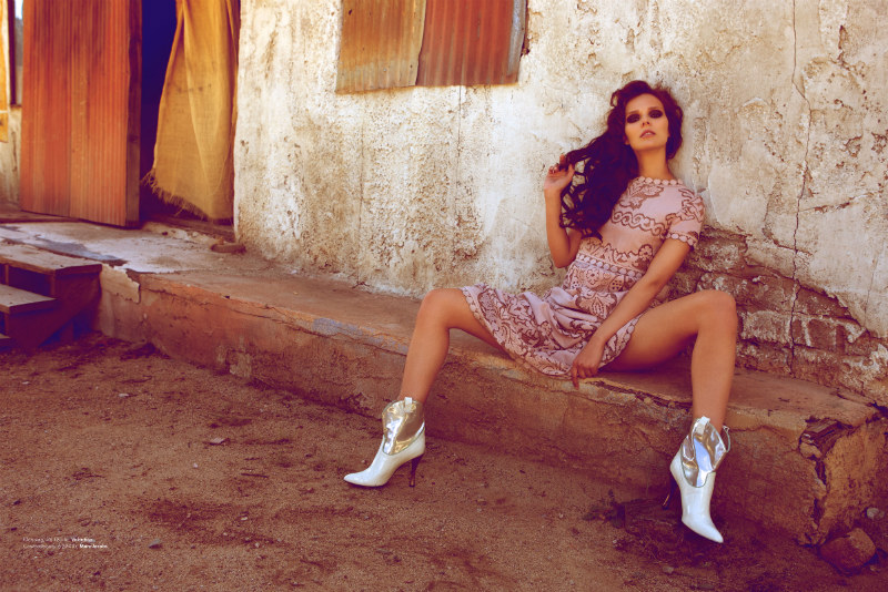
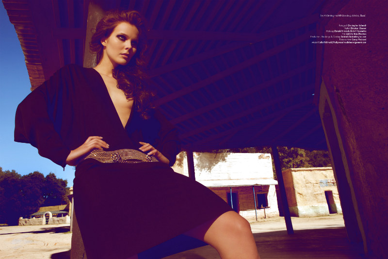
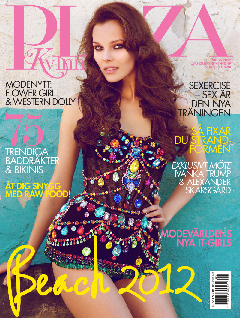
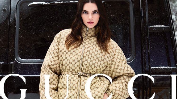
Western Dolly – The May cover story for the latest Plaza Kivinna finds Christian Classen. Merging playful Lolita with western attitude, photographer Christopher Schmidt captures Julia in sultry looks from the likes of Roberto Cavalli, Derek Lam, Gucci, Chanel, Marc Jacobs, Dolce & Gabbana and Valentino in an old ghost town. / Production by Gabriel Rey
Cover


Fantastic editorial1 The shoes in the first photo are magnificent, to die for!:)
How many times can she throw her head back? I’m a big fan of her but not this editorial.
I think this would have been more successful if the model’s poses fit in with the surroundings or interacted with them in some way. It just looks like she’s a regular model who got plunked down into the old west.
photography is bad. clothes are good and model is sexy but doesn’t make sense in the setting ur right, she’s just in model poses randomly
camilla akrans called and wants her blue shadows back.
Styling is beautiful and I love that it’s not literal western. The patterns mixd with the cover sparkling number are sensational. Makeup is great, hair should have had more of a Dolly inspiration. I love the model but not in this story. With the same poses over and over it looks overly directed by a photographer or art director. Horrible photography and retouching looks cheap and tawdry. I like the first shot, cover, and with the cowboy boots in the baege dress.
I agree. It’s the overused “sexy” posing and tacky developments that make this a missed opportunity to me. Fashion and beauty are good, that body suit is perfect.
I like it all. cool stuff. shoes are fun
Absolutely love it!
The garments are beautiful but the photography sucks. Could have been really cool and would have liked to see more candid off moment shots within the town to utilize such a great space. This looks like an amateur or test shoot with great runway garments because it lacks story, drama, originality, and industry standard shooting. Images and poses seem repetitive and the color wash knocked off from the likes Camilla Akrans is nothing original nor does it add; but only distracts and lessens the quality of work. Great styling can’t carry a shoot alone as seen above.
Photography: D (above)
Model: C+ (too many of same poses)
Styling: A- (great looks)
H/M: A (beautiful)
Retouching: C- (cheap unoriginal)
Location: B+ (love the location but wish more interaction off moment)
The tones aren’t doing the editorial justice, but the location and styling is amazing.