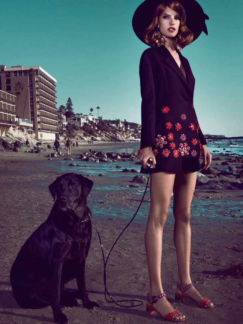
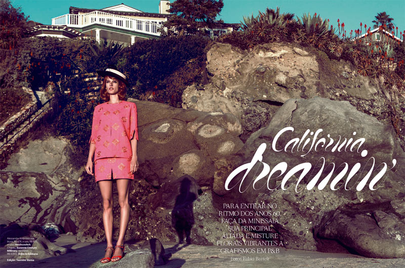
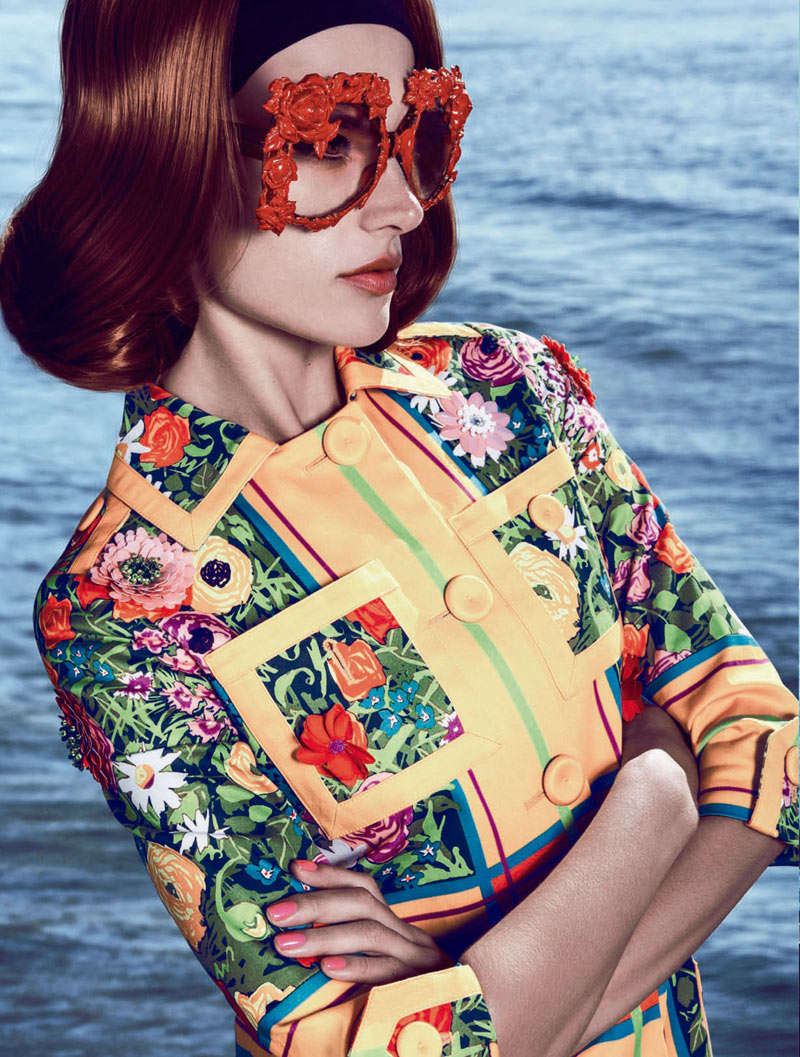
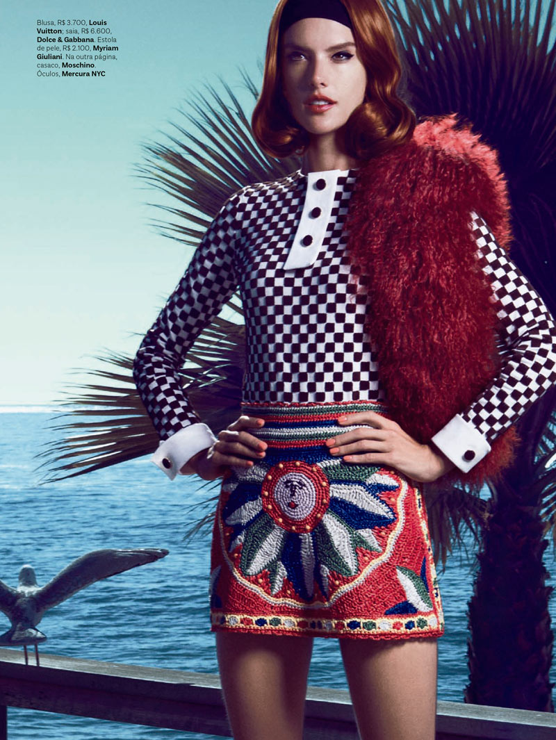
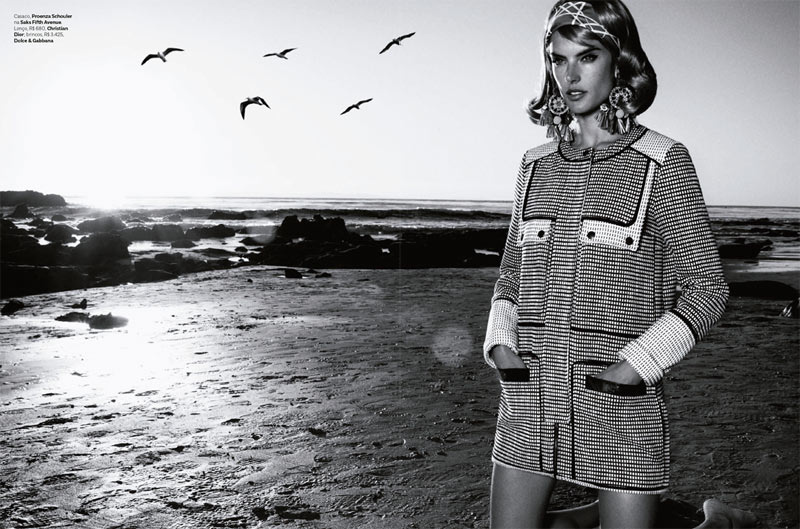
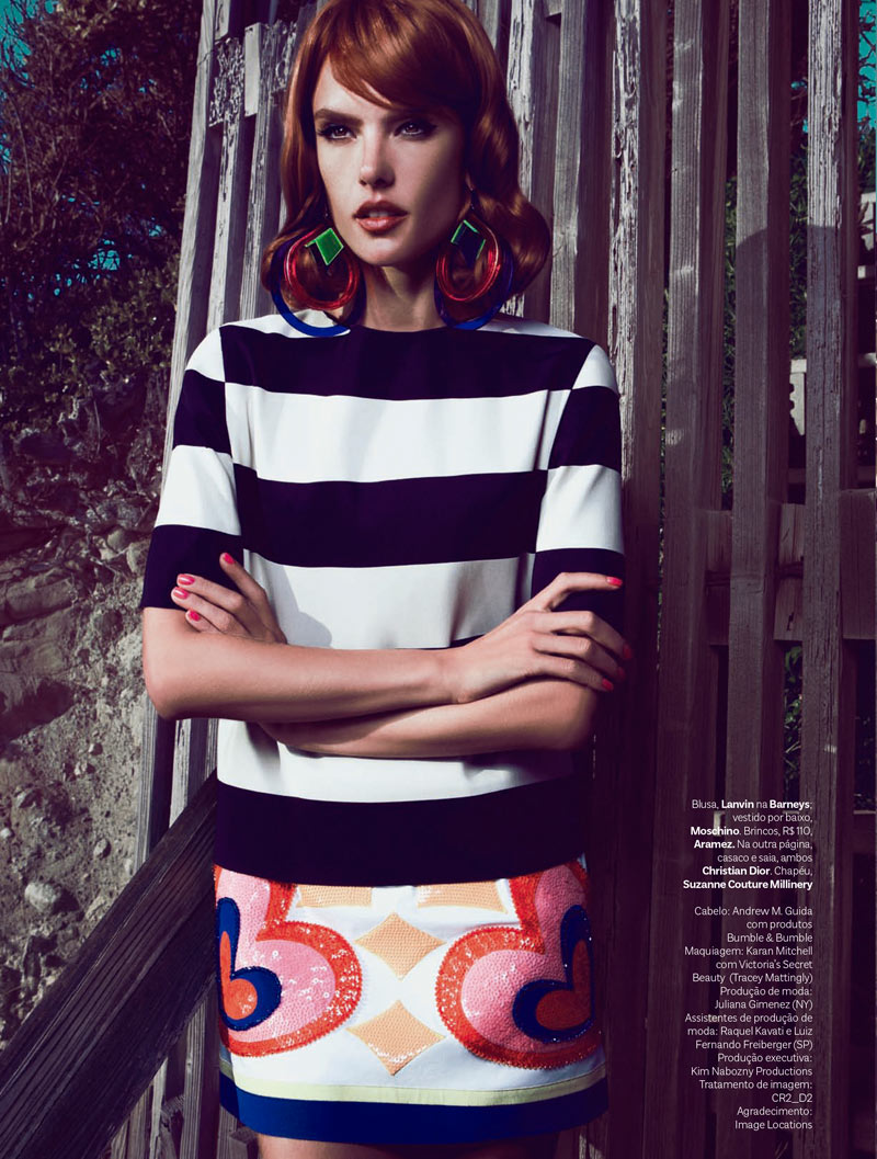
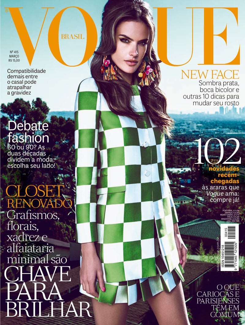
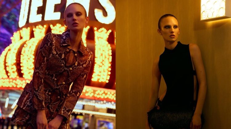
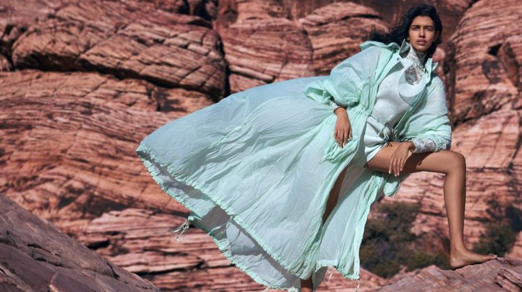
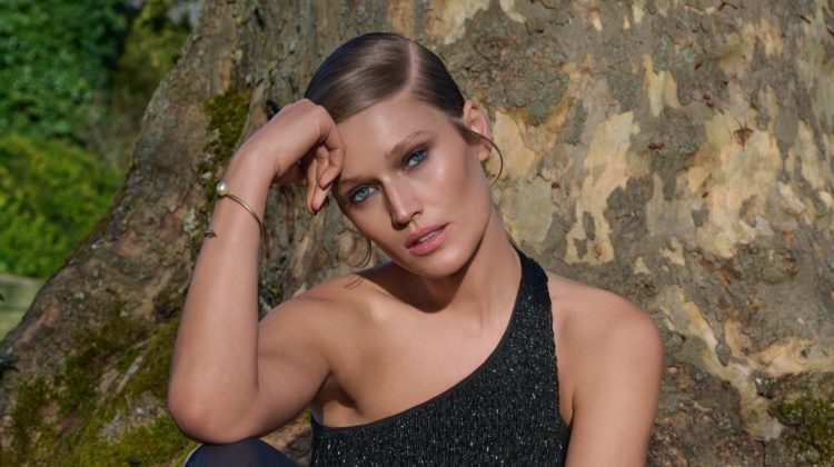
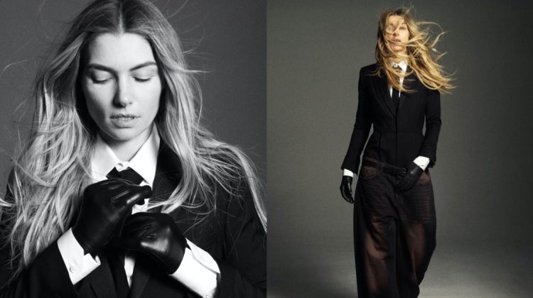
California Dreamin’ – Alessandra Ambrosio gets retro chic for the March cover story of Vogue Brazil. Photographed by Fabio Bartelt and styled by Yasmine Sterea, the Brazilian beauty travels to Santa Monica, California, in designs from the likes of Moschino, Versus, Balmain and Lanvin. Hair stylist Andrew M. Guida and makeup artist Karan Mitchell create an auburn coif and coral lips for Alessandra.


6 thoughts on “Alessandra Ambrosio is California Dreaming for Vogue Brazil's March Cover Story”
Comments are closed.
she’s soo slender. how fun to see her doing high-fashion stuff.
http://youareashootingstar.blogspot.com/
I like the styling very much..but the wig is too fake and it doesn’t make sense that her hair in the cover is different from the one in the photo series..!
i agree with fatima. But I think they did that because they wanted readers to immediately recognize alessandra and be more likely to pick it up. marketing tactic! it’s nice to see alessandra do something different, but I think she often has the same face in these photos. and i think she and the photographer relied too much on her thinness to make the shot which is sorta annoying because that shouldn’t at all make a shot. but the colors are fantastic.
http://twitter.com/dcmathew
What a great blog. I love this post and the style the most. I love the photos. They are clear and of great quality. Great job. Hope you get to see little bit of me.
http://aeroplaneandapparel.blogspot.com
so bad!!! from styling to photography …
Cool sunnies! Wish the wig had been used on the cover, too.