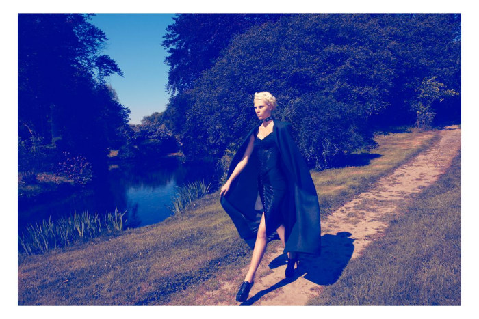
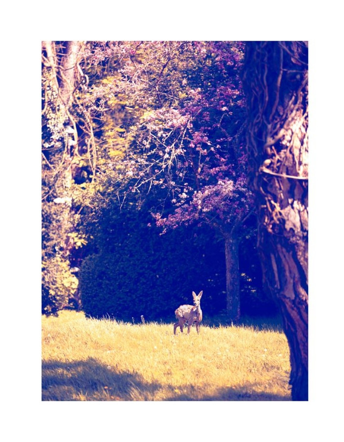
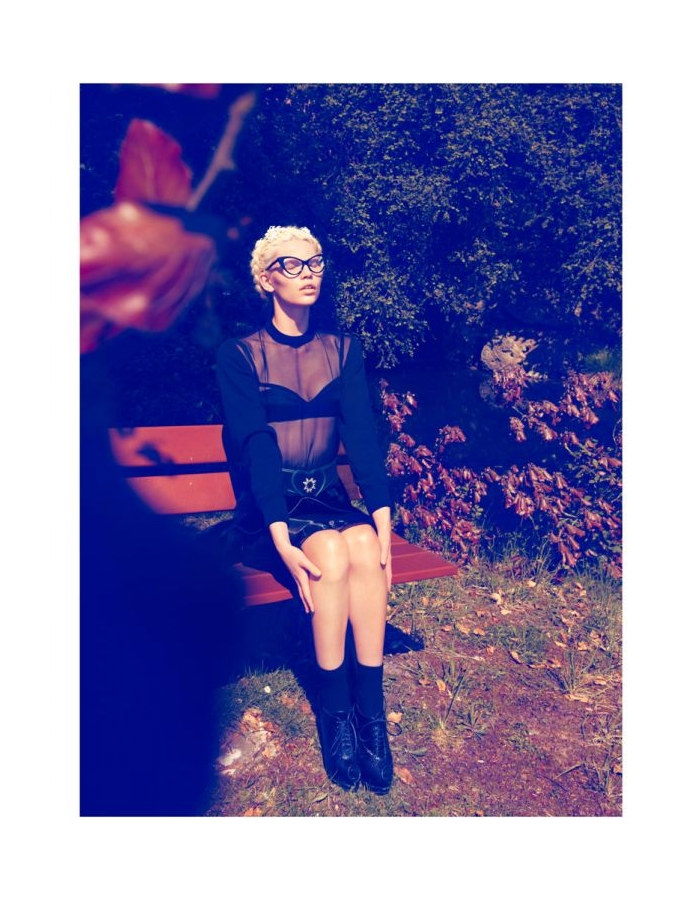
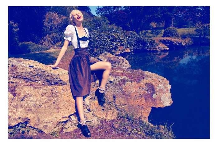
Countryside Blues – Camilla Akrans teams up with stylist Sissy Vian for a strictly seductive story in the August issue of Vogue Japan. Starring Aline Weber as a braid wearing diva, the countryside and all its beauty serves as the perfect backdrop to the elegant designs of Max Mara, Moschino, Dolce & Gabbana and many more.
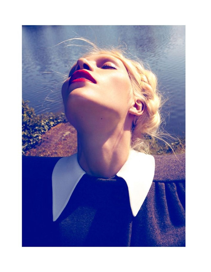
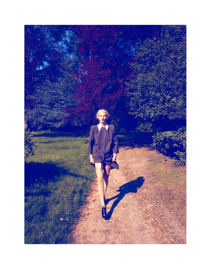
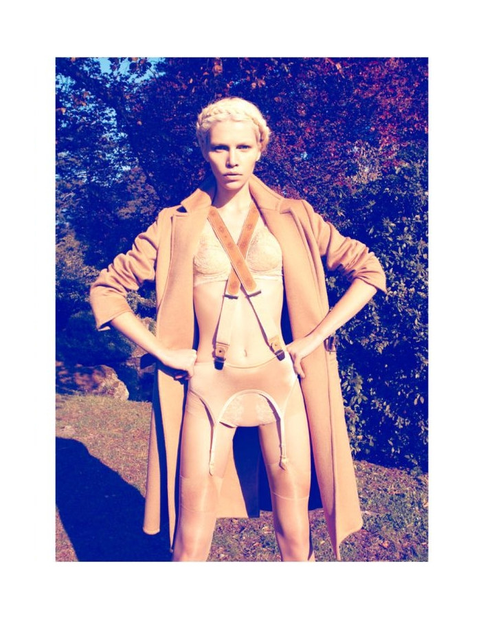
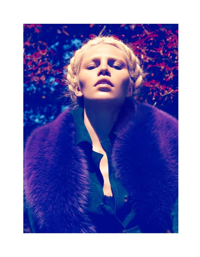
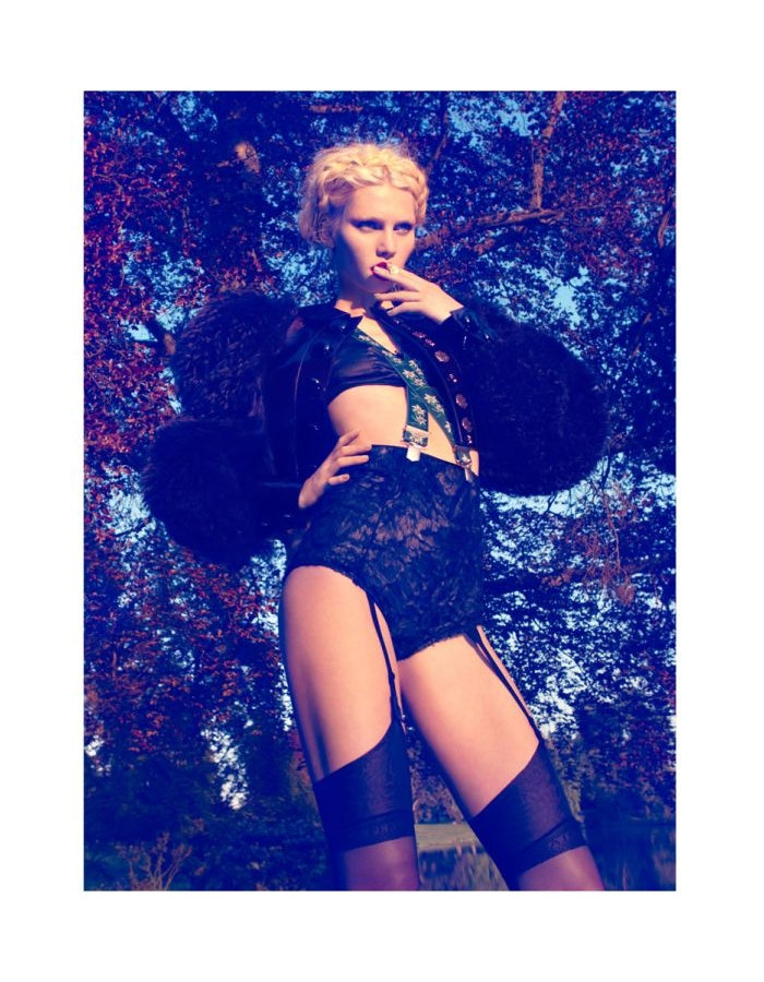
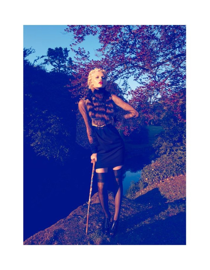
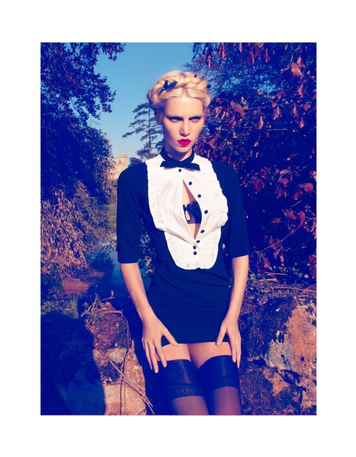
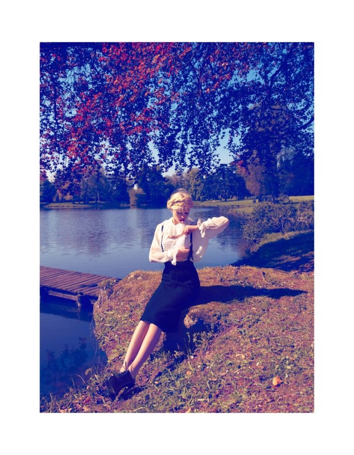
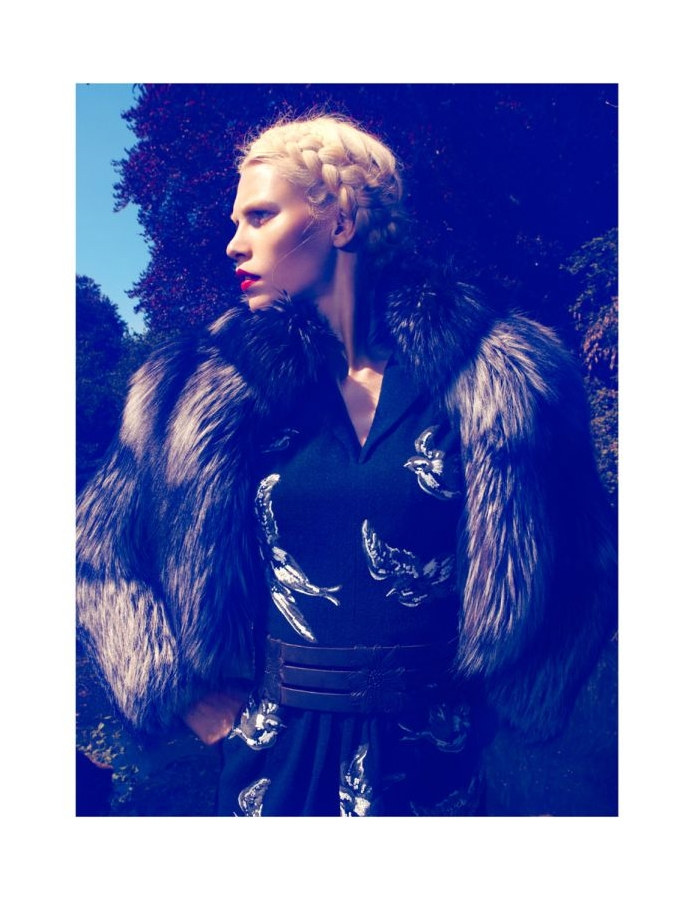
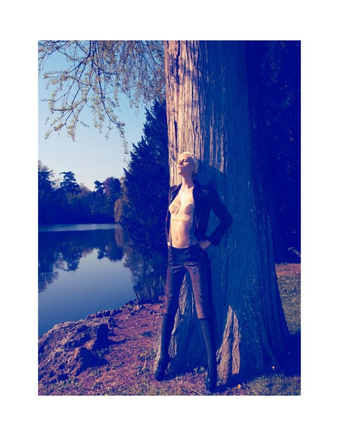
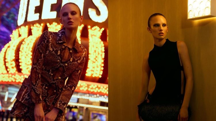
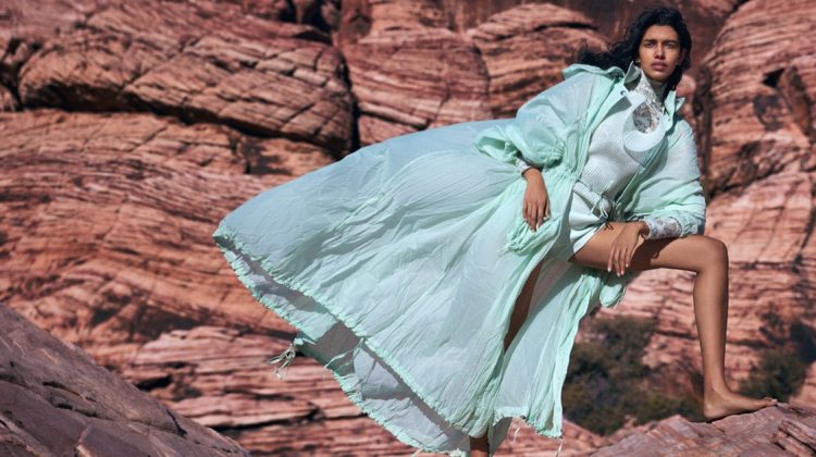
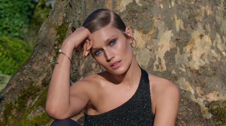
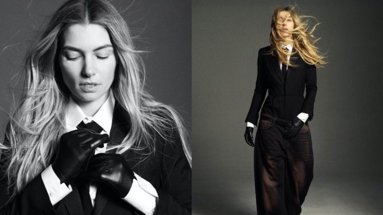
I don’t know, I’m finding it difficult to see past that garish blue colour, plus the fact that she looks so much like Lara Stone.
I like how this might be a story of a sensuous woman who is performing for her voyeur.
I like how this might be a story of a sensuous woman who is performing for her voyeur.
i really, really hate all this hue. ruins the whole ed for me, even though i like aline.
The colors are hurting my eyes.
The colors are hurting my eyes.
the color is awful
the color is awful
Aline looks fabulous to me (though yes, very Lara), but the photography is so not good. I think Camilla needs to try something different, we’ve seen this from her a million times and the blue filters look horrible. The Givenchy shot is nice, I’m pretty partial to that collection so I’m probably biased.
Aline looks fabulous to me (though yes, very Lara), but the photography is so not good. I think Camilla needs to try something different, we’ve seen this from her a million times and the blue filters look horrible. The Givenchy shot is nice, I’m pretty partial to that collection so I’m probably biased.
I think the color filter is trying to distract from the fact that these fall fashion photos were shot in the spring. Even the deer is still shedding its winter fur!
Only Camilla Akrans editorial I have liked in a WHILE!
Only Camilla Akrans editorial I have liked in a WHILE!
This one is impressive! j’aime
I think the Camilla Akrans blue/violet/purplish hues are a bit overdone/past overdue…
so lame…. i think akrans doesn’t know how to reinvent herself….
Camilla, trying to be Mert/Marcus, trying to be Helmut Newton.
Camilla Akrans is Camilla Akrans, and Mert&Marcus are
Mert&Marcus…This blue color is her signature, and she deserves an
award for it! Not only the blue color, but all her other color schemes
in other editorials, are phenomenal!
NONE of you can achieve these colors!!! I have read 100’s of posts in so
many blogs by photographers who are dying to know the technique she’s
using to achieve these colors!! you are just jealous of her…
How many of you would have the balls to present such color schemes to their clients?! She’s an artist and she can do whatever she wants to her photos, as long as the client is happy! None of you have the right to judge her…especially that her work is representing
the clients she works for; I don’t think
that any of you understands fashion or fashion photography more than
VOGUE!
*cough* weirdo *cough*