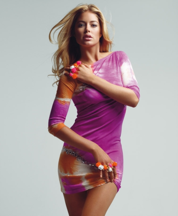
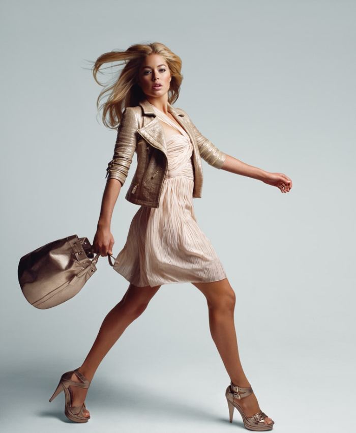
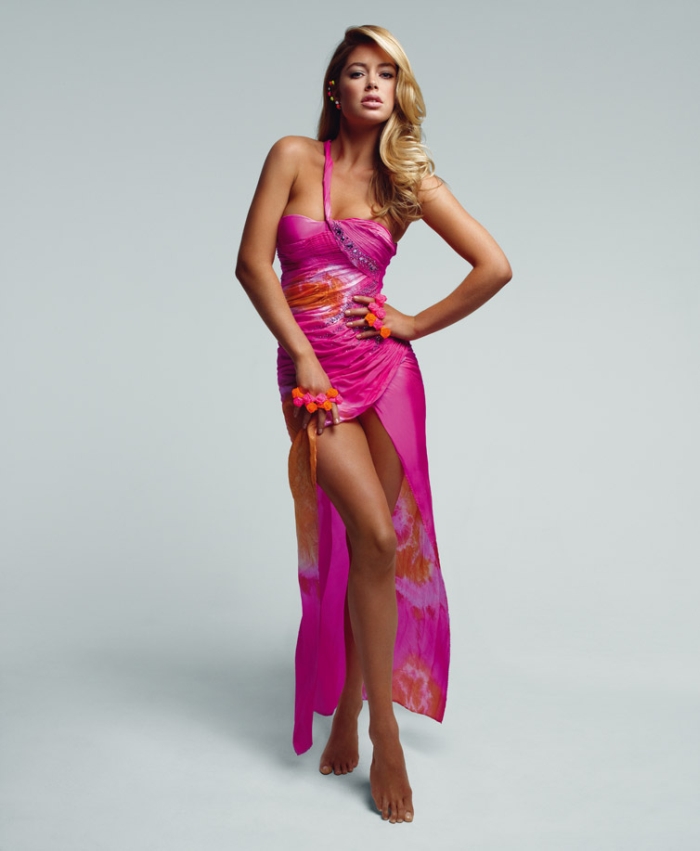
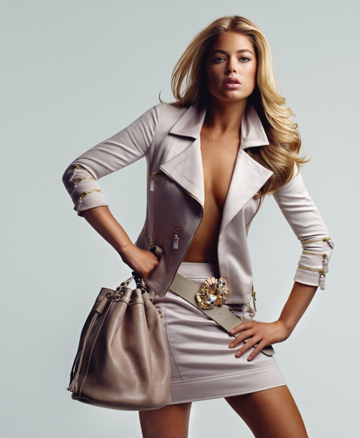
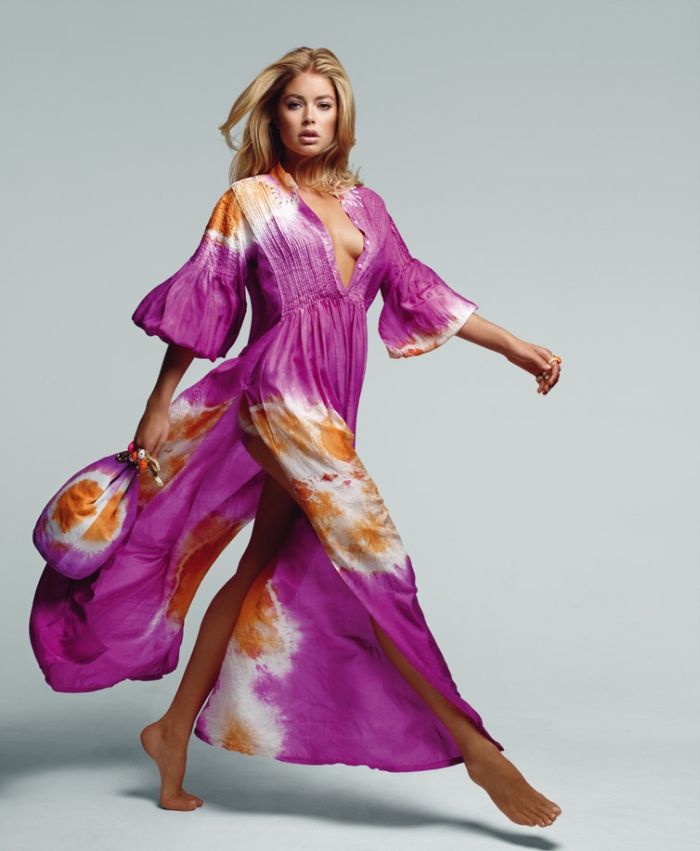
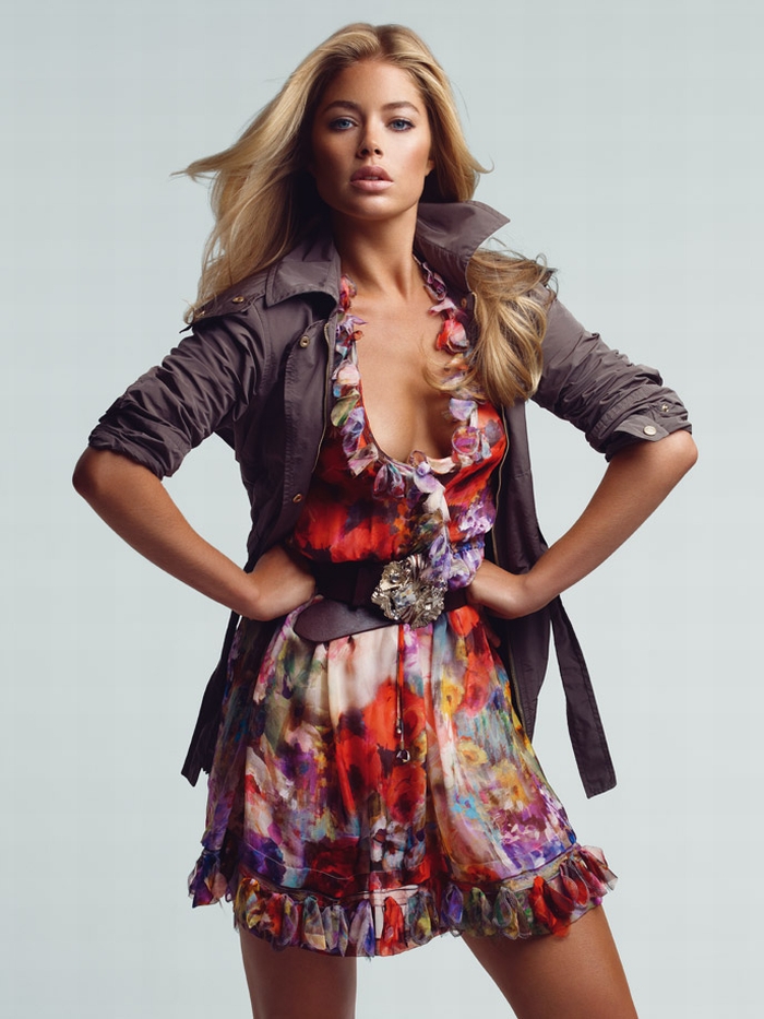
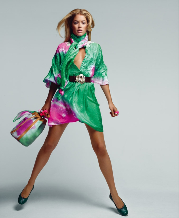
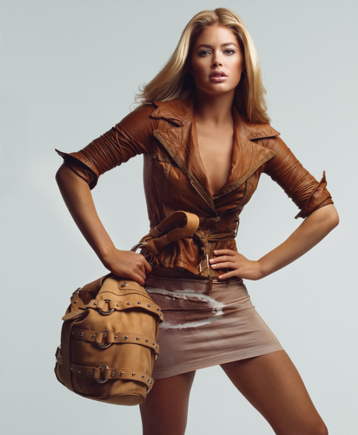
Representing the bohemian carefree spirit of their collection, Doutzen Kroes goes barefoot for the latest campaign from Blumarine. Photographed by Patrick Demarchelier, the Victoria’s Secret model brings her own brand of sexy to the colorful advertisements.

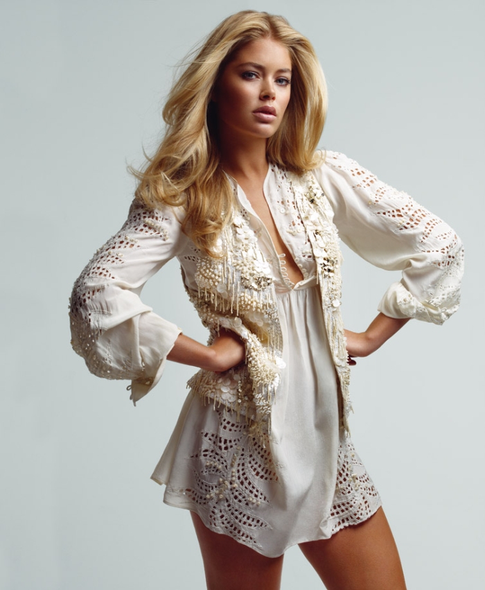
Doutzen is so beautiful. Nice, easy campaign.
Doutzen is so beautiful. Nice, easy campaign.
weird denise richards looking ass
You took the words right outta my keyboard. XD
You took the words right outta my keyboard. XD
weird denise richards looking ass
You took the words right outta my keyboard. XD
She is so gorgeous. I love the clothing and the style. The photos are beautiful. xo
She is so gorgeous. I love the clothing and the style. The photos are beautiful. xo
wtf blumarine?
after all those beautiful campaigns they come up with this?
makes it look cheap!
wtf blumarine?
after all those beautiful campaigns they come up with this?
makes it look cheap!
So cheap, So simple…
So cheap, So simple…
i agree. it looks cheap-ish. its not cause of doutzen. she's pretty but it looks like she's wayyy too airbrushed and her pose is slightly too posey. and i must say, whenever i see her pictures, i always feel dissapointed cause she almost always gives that same old slightly parted lips pose. yes doutzen, you're very sexy and gorgeous but you can definitly do better!
Agreed. But some of the bags there were definitely covetable.
Agreed. But some of the bags there were definitely covetable.
i agree. it looks cheap-ish. its not cause of doutzen. she's pretty but it looks like she's wayyy too airbrushed and her pose is slightly too posey. and i must say, whenever i see her pictures, i always feel dissapointed cause she almost always gives that same old slightly parted lips pose. yes doutzen, you're very sexy and gorgeous but you can definitly do better!
Agreed. But some of the bags there were definitely covetable.
total bore this campaign and her face is bloated.
total bore this campaign and her face is bloated.
She has the same face in each and every pic. Disapointing campaign
She has the same face in each and every pic. Disapointing campaign
she's amazing!
she's amazing!
She's the Goddess.
And I like the simple/empty background for a change … so the focus is on the model/clothing.
I'm 100% sure this collection will sale like a rocket.
She's the Goddess.
And I like the simple/empty background for a change … so the focus is on the model/clothing.
I'm 100% sure this collection will sale like a rocket.
i love doutzen, but this is snooze city every face is the same and overly airbrushed she doesn't need the air brushing she is already flawless!
i love doutzen, but this is snooze city every face is the same and overly airbrushed she doesn't need the air brushing she is already flawless!
i love doutzen, but this is snooze city every face is the same and overly airbrushed she doesn't need the air brushing she is already flawless!
Sub-par, looks more like a catalog than editorial.
Sub-par, looks more like a catalog than editorial.
Sub-par, looks more like a catalog than editorial.
i love doutzen, but this is snooze city every face is the same and overly airbrushed she doesn't need the air brushing she is already flawless!
i love doutzen, but this is snooze city every face is the same and overly airbrushed she doesn't need the air brushing she is already flawless!
i love doutzen, but this is snooze city every face is the same and overly airbrushed she doesn't need the air brushing she is already flawless!
The hair, the skin and her body… amazing!
The hair, the skin and her body… amazing!
The hair, the skin and her body… amazing!
I expect more from Blumarine. They had some greaaaaaat campaigns in the 90s. Doutzen's so pretty in the last picture, though. For the clothes, they should have gone with less slick finishing in these photos.
I expect more from Blumarine. They had some greaaaaaat campaigns in the 90s. Doutzen's so pretty in the last picture, though. For the clothes, they should have gone with less slick finishing in these photos.
I expect more from Blumarine. They had some greaaaaaat campaigns in the 90s. Doutzen's so pretty in the last picture, though. For the clothes, they should have gone with less slick finishing in these photos.
i'm sorry but does her face look EXACTLY the same in a majority of these pictures? Doutzen is one of my favorites…she can do better than this
i'm sorry but does her face look EXACTLY the same in a majority of these pictures? Doutzen is one of my favorites…she can do better than this
i'm sorry but does her face look EXACTLY the same in a majority of these pictures? Doutzen is one of my favorites…she can do better than this
Yuck!!! She looks specially trashy in the second pic after the cut, so Mariah Carey-esque, it’s not her fault… but I used to LOVE Edita Vilkeviciute’s ads, I would’ve kept her for this campaign.
Yuck!!! She looks specially trashy in the second pic after the cut, so Mariah Carey-esque, it’s not her fault… but I used to LOVE Edita Vilkeviciute’s ads, I would’ve kept her for this campaign.
Yuck!!! She looks specially trashy in the second pic after the cut, so Mariah Carey-esque, it’s not her fault… but I used to LOVE Edita Vilkeviciute’s ads, I would’ve kept her for this campaign.
pink&orange tie-dye with rhinestones and cheap looking fabric? it's that what it's come to, Blumarine? really? Doutzen didn't deserve this, seriously.
pink&orange tie-dye with rhinestones and cheap looking fabric? it's that what it's come to, Blumarine? really? Doutzen didn't deserve this, seriously.
pink&orange tie-dye with rhinestones and cheap looking fabric? it's that what it's come to, Blumarine? really? Doutzen didn't deserve this, seriously.
i don't like this. they made her look like denise richards. she is so much better than this.
i don't like this. they made her look like denise richards. she is so much better than this.
Why didn't they shoot outside instead? Looks like a something from a mailordercatalog…
Why didn't they shoot outside instead? Looks like a something from a mailordercatalog…
Why didn't they shoot outside instead? Looks like a something from a mailordercatalog…
the same face in every pic
the same face in every pic
the same face in every pic