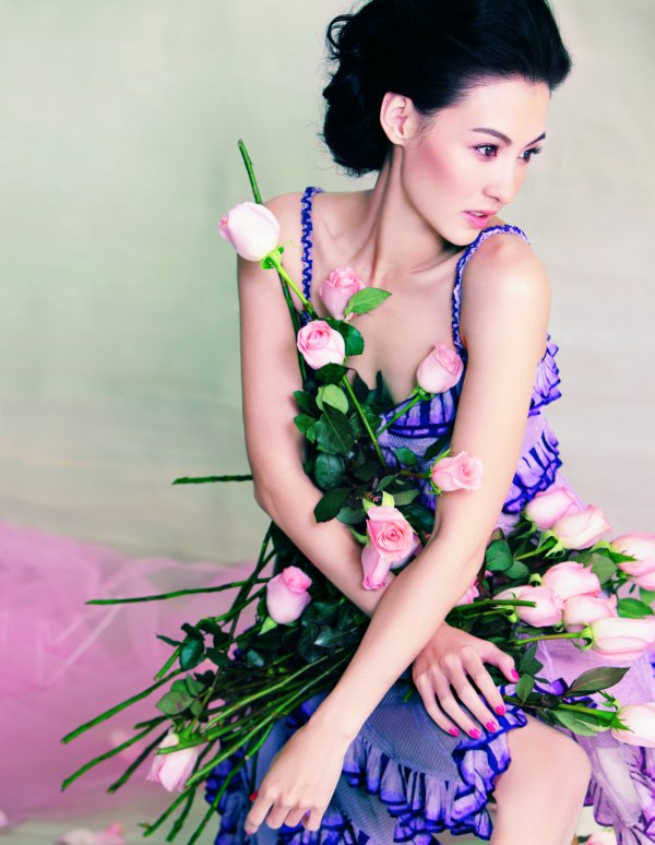
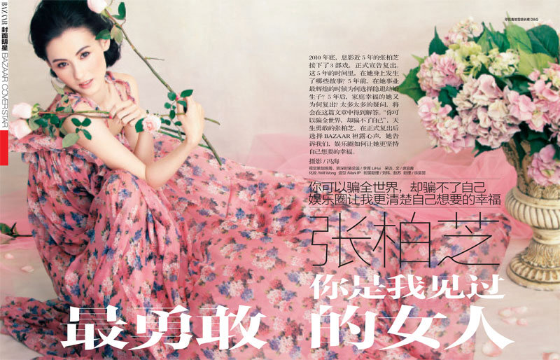
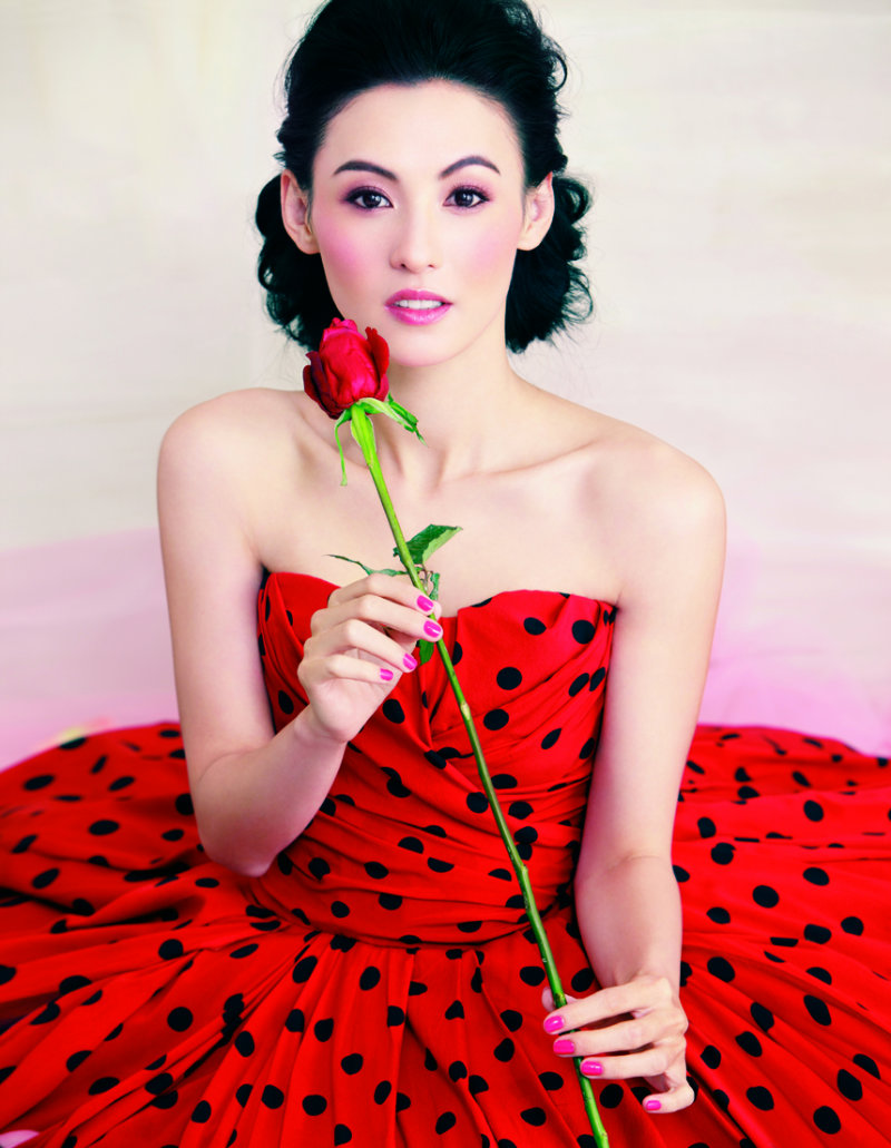
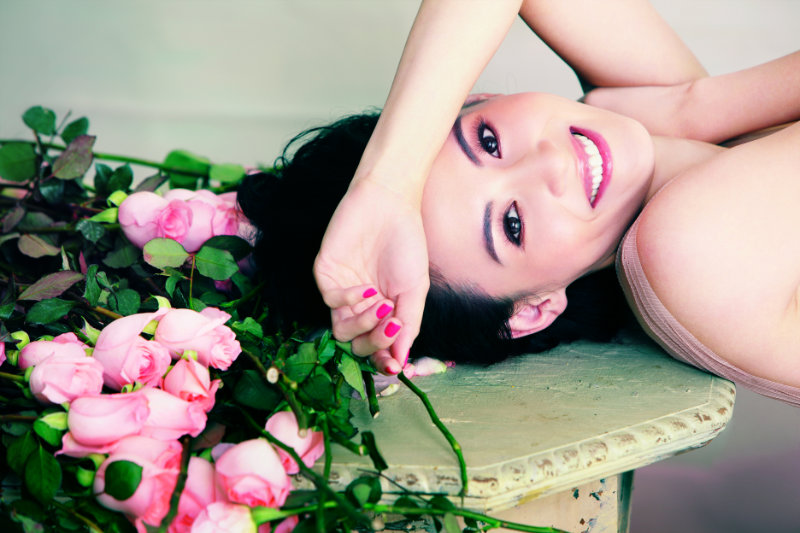
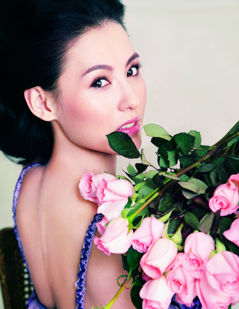
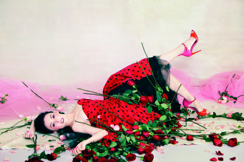
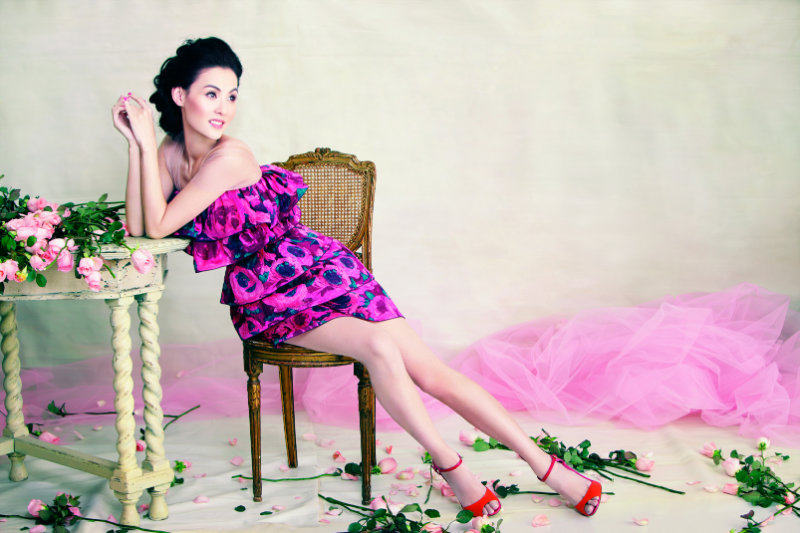
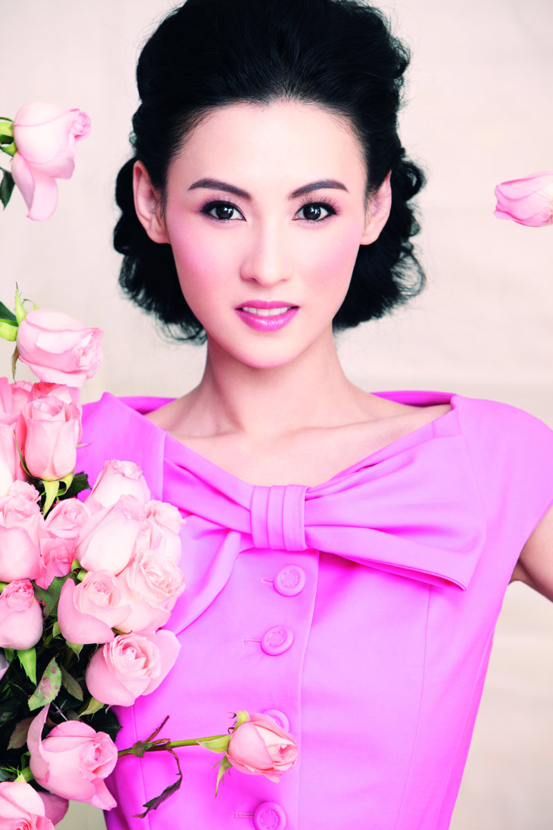
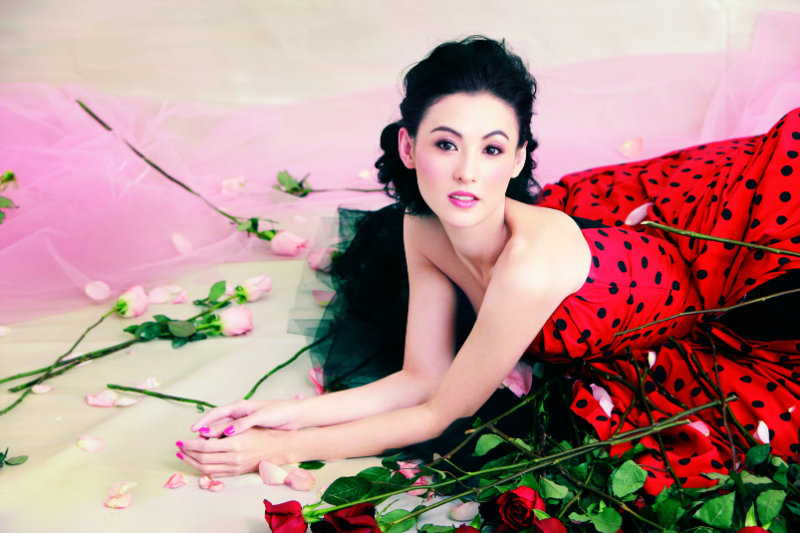
Flowers bloom for Harper’s Bazaar China’s February cover shoot starring Hong Kong actress Cecilia Cheung. Photographed by Feng Hai and styled by fashion editor Li Hui, Cecilia dons springs most romantic and feminine looks from labels such as Dior, Lanvin for H&M and Dolce & Gabbana.




adorable!
adorable!
First few where ok then it got a bit tacky cliche for me near the end. And not really too sure if it’s a pink filter or it’s the makeup but some are a bit too saturated.
First few where ok then it got a bit tacky cliche for me near the end. And not really too sure if it’s a pink filter or it’s the makeup but some are a bit too saturated.
Such a tacky editorial.
Agree! I love Cecilia, but the whole idea of this shoot is just tacky and full of cheese!
http://cito-gene.blogspot.com/
Agree! I love Cecilia, but the whole idea of this shoot is just tacky and full of cheese!
http://cito-gene.blogspot.com/
This is such a difference from the normal editorial, she’s not selling her body like a lot of models try and do. But I wouldn’t wear any of those clothes.
17andalwaysdreaming.blogspot.com
in some pictures the background looks so weird.. like they didnt pay attention to it all or the studio was just crap..
she’s really pretty but i think the MUA overdone it with the pink on her face
HB’s selling roses but not clothes
HB’s selling roses but not clothes
HB’s selling roses but not clothes
Looks like Sears catalog!
Looks like Sears catalog!
Looks like Sears catalog!
Agree with Jinhuan Shen… too much pink makeup plus a weird pink-ish cast in all photos.
tacky.
Agree with Jinhuan Shen… too much pink makeup plus a weird pink-ish cast in all photos.
tacky.
Agree with Jinhuan Shen… too much pink makeup plus a weird pink-ish cast in all photos.
tacky.
Agree with Jinhuan Shen… too much pink makeup plus a weird pink-ish cast in all photos.
tacky.
Definitly, My asiatic favourite model
Definitly, My asiatic favourite model
I think she should close her mouth…
I think she should close her mouth…
agree
agree
agree
agree
agree
I think she should close her mouth…
She is one of the most beautiful mums in Hong Kong.(she has 2 sons,very lovely!)
Not in a very good reputation, but there is no doubt for her beauty.
She acts very well too.
http://travelerofstyle.blogspot.com/
Kinda corny, but I do like the Lavin HM dress…it photographs beautifly 🙂
Kinda corny, but I do like the Lavin HM dress…it photographs beautifly 🙂
cheese
I wonder how much they charge for prom portraits.
somehow missed this earlier. I do believe though that the sort-of tackiness inspired by the Chinese propaganda posters was the idea behind this. Quite ironic they are indeed… The eye makeup, the color choices, the setting (think artist Qi Zhilong) reflects that very very well… It has to be appreciated the way it is. Love it.