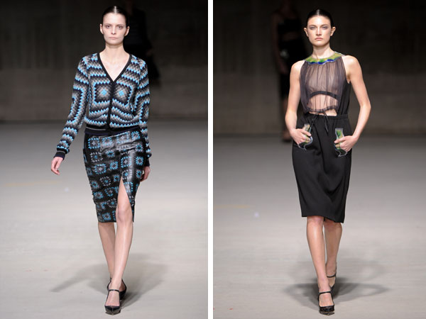
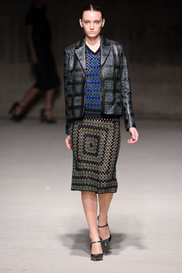
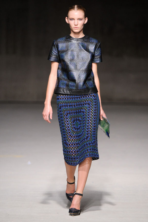
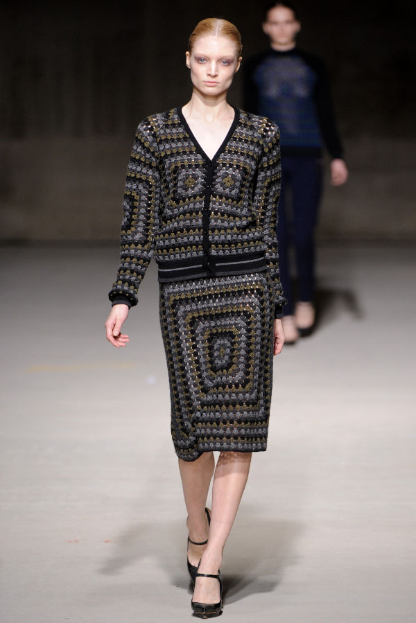
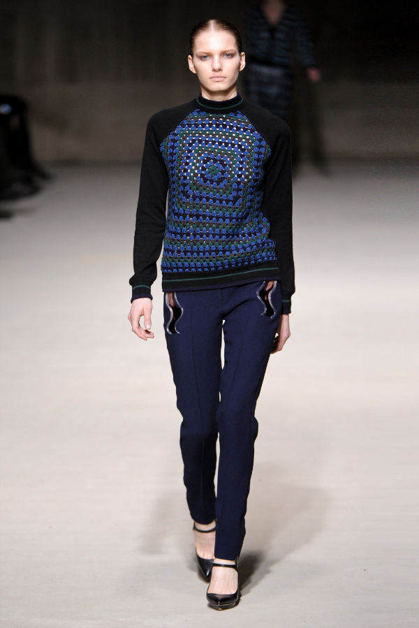
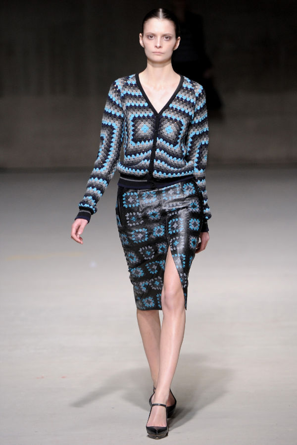
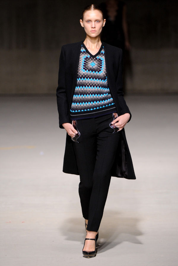
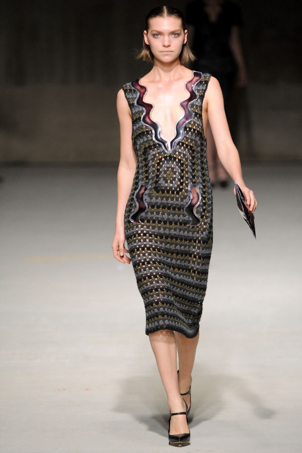
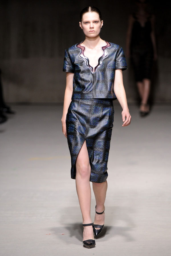
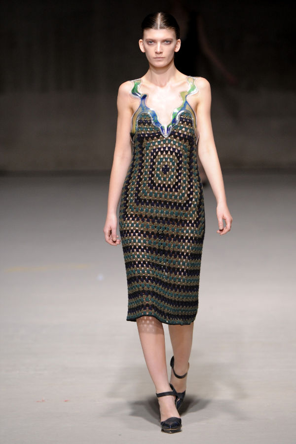
Christopher Kane was inspired by lollipops and pencil cases from his boyhood days for the fall 2011 collection from his eponymous label. Featuring crocheted pieces with geometric patterns, plastic accents for a water-like affect and neon hues, models took to the runway in shimmering and sheer dresses for a new kind of minimal from the Scottish designer.

Wow I love this! We have seen a lot of geometric patterns this season, but this collection manages to stand out.
The wavy V-neck and all the other plastic accents are super funky!
Wow I love this! We have seen a lot of geometric patterns this season, but this collection manages to stand out.
The wavy V-neck and all the other plastic accents are super funky!
Wow I love this! We have seen a lot of geometric patterns this season, but this collection manages to stand out.
The wavy V-neck and all the other plastic accents are super funky!
Missoni?
The plastic accents look childish to me… I don’t really like this at all :/
it’s interesting how the knit patterns can create an architecture or structure on the body, without any.
http://www.bloglovin.com/blog/2105842/cito-gene
Just ugly. He’s losing his edge.
Just ugly. He’s losing his edge.
Wow, he is just brimming with ideas. I feel like he had 2 great themes here, the crotchet and the plastic encased liquid, but should perhaps have stuck to just one of those for the collection. I loved the sequinned pieces at the end, they looked beautiful.
Wow, he is just brimming with ideas. I feel like he had 2 great themes here, the crotchet and the plastic encased liquid, but should perhaps have stuck to just one of those for the collection. I loved the sequinned pieces at the end, they looked beautiful.
Wow, he is just brimming with ideas. I feel like he had 2 great themes here, the crotchet and the plastic encased liquid, but should perhaps have stuck to just one of those for the collection. I loved the sequinned pieces at the end, they looked beautiful.