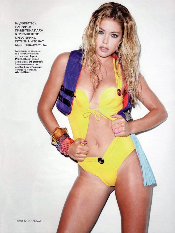
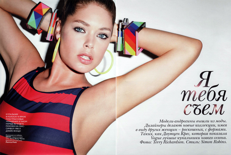
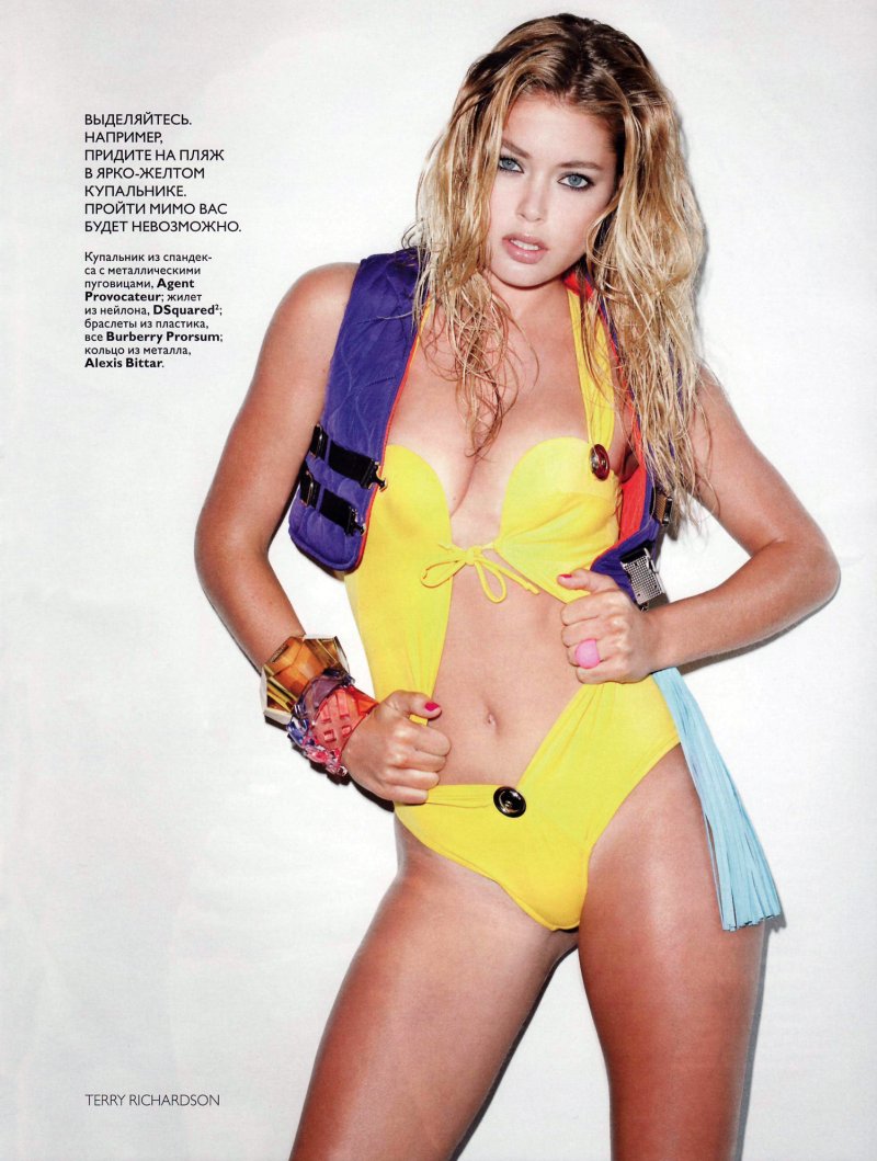
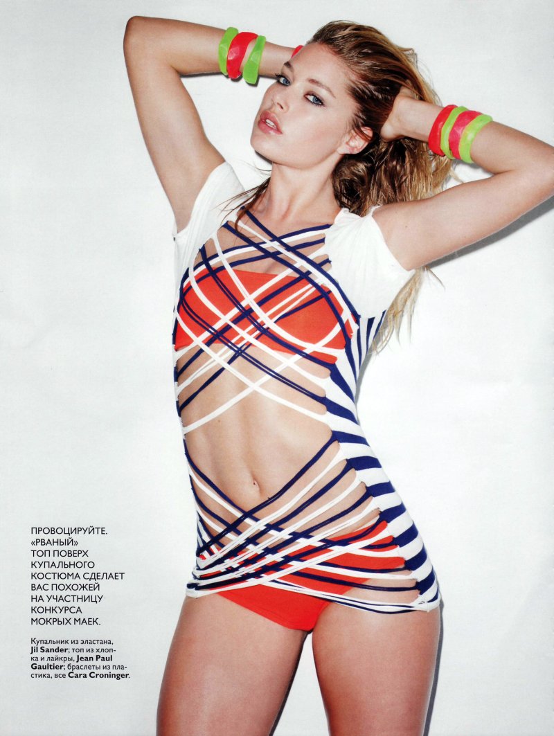
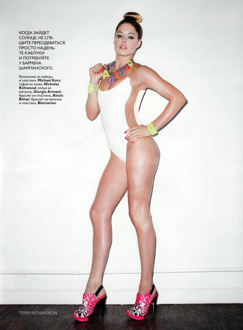
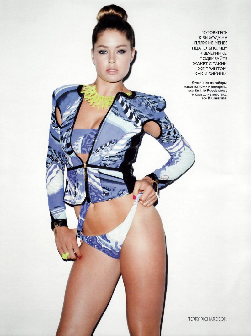
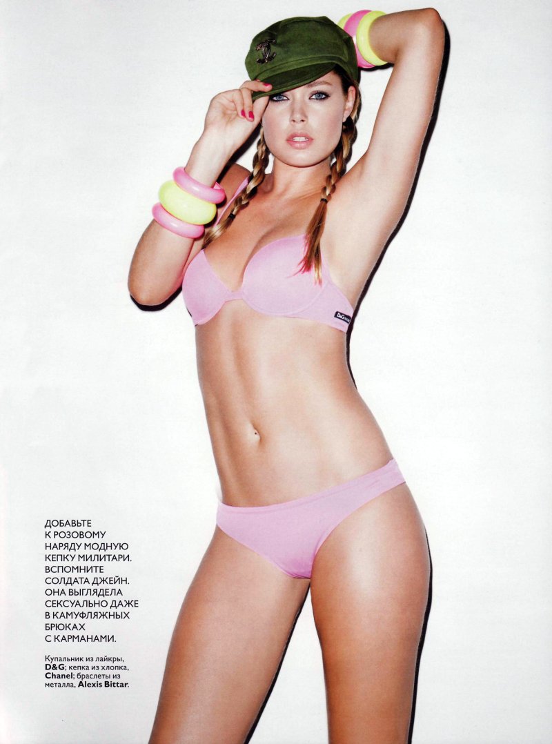
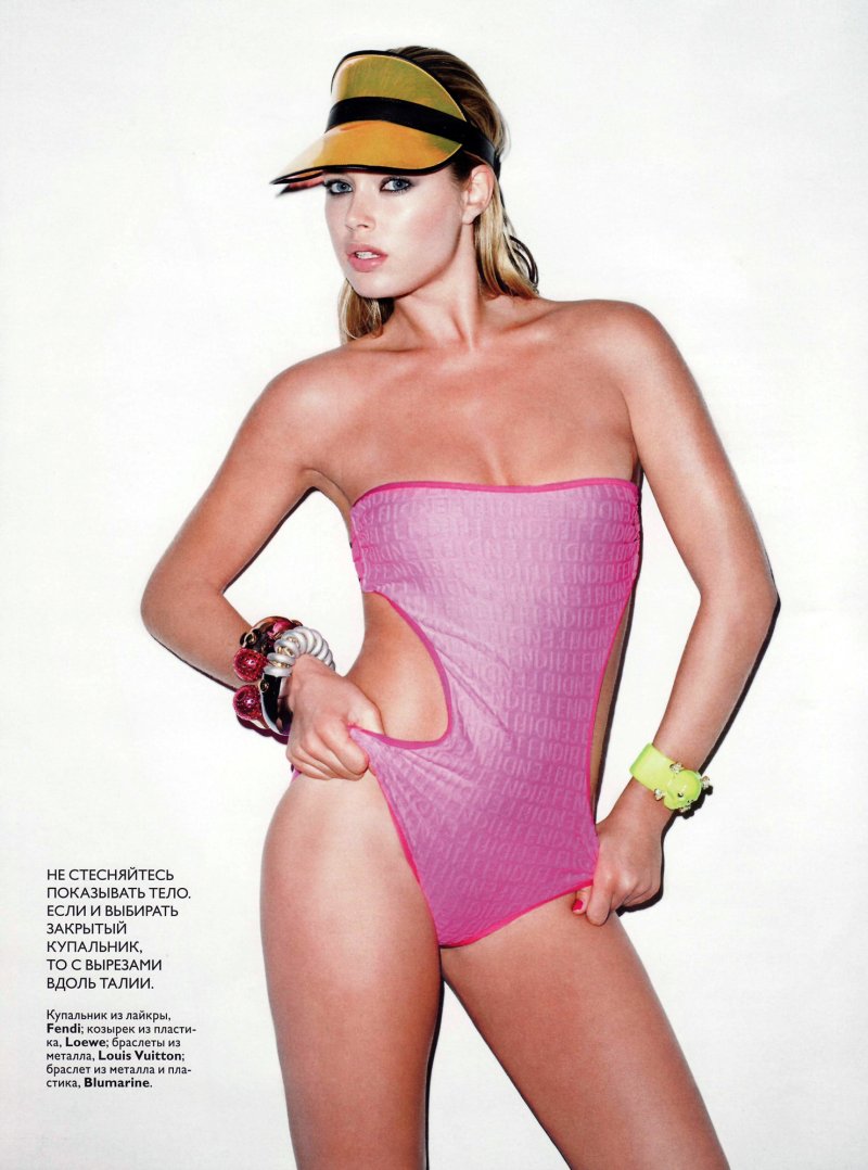
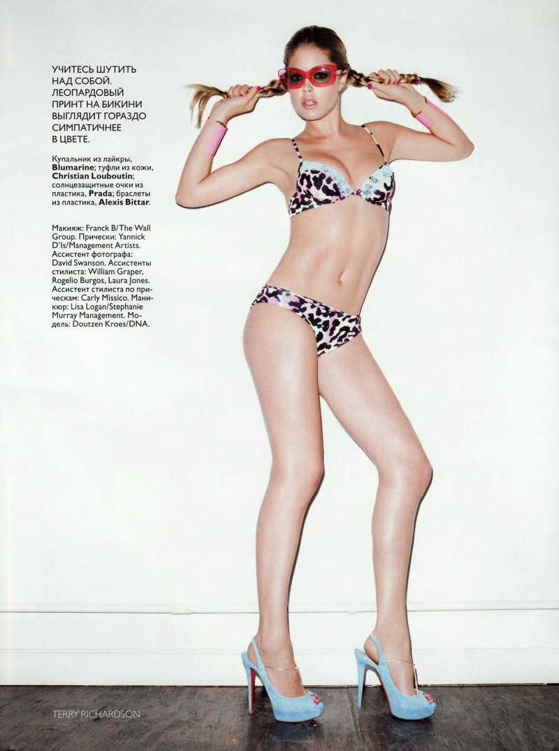
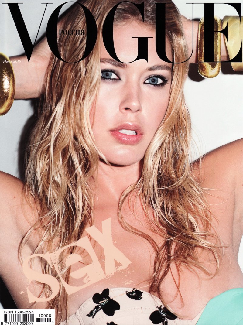
Terry Richardson captures Doutzen Kroes for the second time this month with the June cover shoot of Vogue Russia. The raunchy story is worlds apart from the duo’s collaboration in American Vogue which was more sweet than sexy despite the similar theme. Styled by Simon Robins, the story takes a few cues from the 90s with its bright colors and oversize accessories from labels such as Agent Provocateur, Burberry and Jil Sander.
source | NeverDrinkAgain @ tfs

The cover is so greasy and oily for Doutzen. She looks really uncomfortable.
The cover is so greasy and oily for Doutzen. She looks really uncomfortable.
The cover is so greasy and oily for Doutzen. She looks really uncomfortable.
i agree, very stiff….it's a sure thing that she's gorgeous but not born for swimsuits…………and I also see the resemblance with the cover of Lilly Donaldson by Marcin Tyszka for The Last Magazine ->http://frillr.com/files/images/The%20Last%20Magaz…
Marcin's got one up on Terry there…
Marcin's got one up on Terry there…
It was actually Maciek Kobielski that shot Lily for Last. The images are definitely similar though, even down to the gold bracelets!
It was actually Maciek Kobielski that shot Lily for Last. The images are definitely similar though, even down to the gold bracelets!
i agree, very stiff….it's a sure thing that she's gorgeous but not born for swimsuits…………and I also see the resemblance with the cover of Lilly Donaldson by Marcin Tyszka for The Last Magazine ->http://frillr.com/files/images/The%20Last%20Magaz…
i agree, very stiff….it's a sure thing that she's gorgeous but not born for swimsuits…………and I also see the resemblance with the cover of Lilly Donaldson by Marcin Tyszka for The Last Magazine ->http://frillr.com/files/images/The%20Last%20Magaz…
Marcin's got one up on Terry there…
It was actually Maciek Kobielski that shot Lily for Last. The images are definitely similar though, even down to the gold bracelets!
Is it just me or is there something very different about her face in these? I wouldn'tve recognized this as her if I didn't already know. Maybe it's the liner…
Yeah…well that's what I thought. Her body is totally gorgeous (though her skin looks crap in this lighting) but her face looks way different, maybe the liner it making her eyes too small or something, I don't know.
Yeah…well that's what I thought. Her body is totally gorgeous (though her skin looks crap in this lighting) but her face looks way different, maybe the liner it making her eyes too small or something, I don't know.
Is it just me or is there something very different about her face in these? I wouldn'tve recognized this as her if I didn't already know. Maybe it's the liner…
Is it just me or is there something very different about her face in these? I wouldn'tve recognized this as her if I didn't already know. Maybe it's the liner…
Yeah…well that's what I thought. Her body is totally gorgeous (though her skin looks crap in this lighting) but her face looks way different, maybe the liner it making her eyes too small or something, I don't know.
Boycott Terry.
Yep. Agree.
Agree too. His photography is barely acceptable here, but is usually vile.
Doutzen is very pretty though. Great body.
Agree too. His photography is barely acceptable here, but is usually vile.
Doutzen is very pretty though. Great body.
Yep. Agree.
agreed, he's the biggest creep in the industry.
agreed, he's the biggest creep in the industry.
Boycott Terry.
Boycott Terry.
Yep. Agree.
Agree too. His photography is barely acceptable here, but is usually vile.
Doutzen is very pretty though. Great body.
agreed, he's the biggest creep in the industry.
the bangles in the 1st and 2nd pic are gorge
the bangles in the 1st and 2nd pic are gorge
the bangles in the 1st and 2nd pic are gorge
Doutzen looks like Claudia on the cover… http://www.chungkitblog.wordpress.com
Doutzen looks like Claudia on the cover… http://www.chungkitblog.wordpress.com
Doutzen looks like Claudia on the cover… http://www.chungkitblog.wordpress.com
Just no.. I will say it time and time again but Terry is the most repetive and shit photographer around. He made a beauty like Doutzen look incredibly butch.
Just no.. I will say it time and time again but Terry is the most repetive and shit photographer around. He made a beauty like Doutzen look incredibly butch.
Could this be more boring. He only knows how to pose models one way. I am sick to death of his photography and his lighting and the shadows in the back just make her legs look bad. he has no clue how to make a woman look beautiful. Boycott Terry Richardson.
Could this be more boring. He only knows how to pose models one way. I am sick to death of his photography and his lighting and the shadows in the back just make her legs look bad. he has no clue how to make a woman look beautiful. Boycott Terry Richardson.
Could this be more boring. He only knows how to pose models one way. I am sick to death of his photography and his lighting and the shadows in the back just make her legs look bad. he has no clue how to make a woman look beautiful. Boycott Terry Richardson.
Very Terry and very Russian, but not good at all!
Very Russian? Uh…
Very Russian? Uh…
Very Terry and very Russian, but not good at all!
Very Terry and very Russian, but not good at all!
Very Russian? Uh…
I understand that sexuality definitely has a place in fashion, but looking at this spread makes me feel like I'm looking at child pornography or something; it just feels wrong and makes me uncomfortable. It's a shame for Doutzen, and I don't see any talent on Terry's part.
I understand that sexuality definitely has a place in fashion, but looking at this spread makes me feel like I'm looking at child pornography or something; it just feels wrong and makes me uncomfortable. It's a shame for Doutzen, and I don't see any talent on Terry's part.
her legs look weird and i don't like the lighting… or the styling…
her legs look weird and i don't like the lighting… or the styling…
her legs look weird and i don't like the lighting… or the styling…
she looks uncomfortable/stiff/questioning in some of them, and her face is like "am i doing this right?"
she looks uncomfortable/stiff/questioning in some of them, and her face is like "am i doing this right?"
she looks uncomfortable/stiff/questioning in some of them, and her face is like "am i doing this right?"
this is very stiff, she doesnt look comfortable at all and the quality of the photo is not the best..I don't like it that much
this is very stiff, she doesnt look comfortable at all and the quality of the photo is not the best..I don't like it that much
this is very stiff, she doesnt look comfortable at all and the quality of the photo is not the best..I don't like it that much
im sorry but her face is far too wide and big now! I dont like it. does not photograph well for fashion.
im sorry but her face is far too wide and big now! I dont like it. does not photograph well for fashion.
im sorry but her face is far too wide and big now! I dont like it. does not photograph well for fashion.
what? i am confussssed.
what? i am confussssed.
what? i am confussssed.