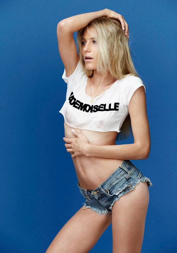
A.Y. Not Dead’s latest campaign can’t be described as any thing less than pure sexy. Featuring a barely clad Dree Hemmingway lensed by Sebastian Faena, the sexy images showcase the label’s denim looks as well as Dree’s smoldering gaze.
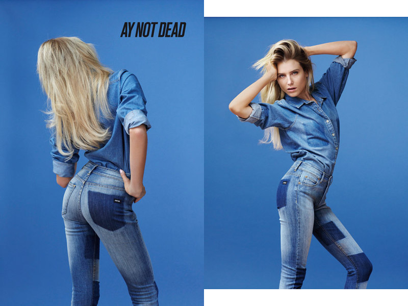
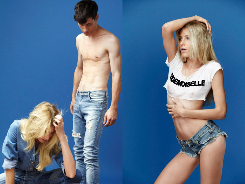
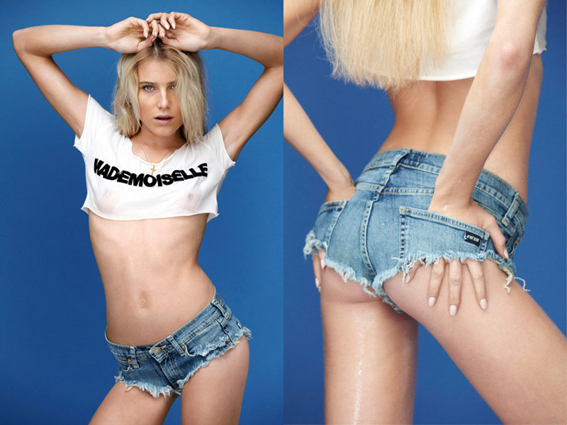
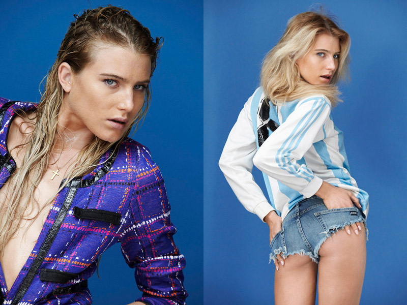
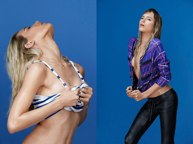
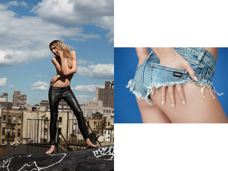

A.Y. Not Dead’s latest campaign can’t be described as any thing less than pure sexy. Featuring a barely clad Dree Hemmingway lensed by Sebastian Faena, the sexy images showcase the label’s denim looks as well as Dree’s smoldering gaze.


Comments are closed.
I love dree she is incredible and looks amazing (always) but Im not a big fan of hot pants
I love dree she is incredible and looks amazing (always) but Im not a big fan of hot pants
eek! I find Dree to be more of a hot girl than a model…also her face even her mouth look the same in every shot!
eek! I find Dree to be more of a hot girl than a model…also her face even her mouth look the same in every shot!
ugh
ugh
Pretty tasteless… Also, what's up with her bellybutton?!
Pretty tasteless… Also, what's up with her bellybutton?!
I think it's a bit trashy, especially with all the shots of her basically non-existent shorts.
I think it's a bit trashy, especially with all the shots of her basically non-existent shorts.
I like the appeal. She fits the script.
I like the appeal. She fits the script.
I much prefer Willy's editorial work personally.
Wrong page.
I much prefer Willy's editorial work personally.
Wrong page.
I love Dree but she looks the same in every shot here. I get so bored with the slightly-parted-lips loo; it's not bad in moderation but there are more ways to look sexy!
I love Dree but she looks the same in every shot here. I get so bored with the slightly-parted-lips loo; it's not bad in moderation but there are more ways to look sexy!
bad casting, we all know Gisele/Naomi could've pulled of those shorts
http://www.collaborationetc.wordpress.com
bad casting, we all know Gisele/Naomi could've pulled of those shorts
http://www.collaborationetc.wordpress.com
An example of a better model to have chosen for these shots would have been bar or any other fuller size model because in these shots they are trying to show off a woman's figure such as her butt and boobs and to be honest Dree lacks butt and boobs which on the first picture just looks horrible. I feel as if I'm looking at the face of a 20 year old but the body of a 11-14 year old girl with no sex appeal. these photos aren't sexy.
I love Dree but not in this she would do better in more high fashion ads.
I think this looks trashy and tacky. We should not encourage grown women to wear booty shorts. They are disgusting after age 16.
I think this looks trashy and tacky. We should not encourage grown women to wear booty shorts. They are disgusting after age 16.
I've noticed a slew of regulars who always post hate. On the upside I am SO thrilled Sebastian has once again compelled people into reaction. THAT is the art of creation.
or he has done his usual work which doesn't seem to be well received.. considering this is a campaign to sell clothes you might want the majority of people to like it and subsequently buy the clothes.
sebastian continued the the argentina sexy-popular idea of the footballers wives story for v that was extremely well received
but this is just a lookbook that's getting way much more attention than it should
It looks just very trashy to me…
XoXo
Fiamma
http://fashion-thrill.blogspot.com/
It looks just very trashy to me…
XoXo
Fiamma
http://fashion-thrill.blogspot.com/
@Stephen; I'd like to spread some love here but honestly? T R A S H
@Stephen; I'd like to spread some love here but honestly? T R A S H
STRIPPER WEAR, this is a big FAIL! Dree can look really great but this is just sad
STRIPPER WEAR, this is a big FAIL! Dree can look really great but this is just sad
This is awful she looks very trashy and not stylish– She can look amazing but this is just awful
This is awful she looks very trashy and not stylish– She can look amazing but this is just awful
wrong wrong wrong
wrong hair&makeup, wrong photoshop…
wrong wrong wrong
wrong hair&makeup, wrong photoshop…
This is porn
This is porn
LOL, Dree.
LOL, Dree.
entire spread seems so forced. ramming 'buy it cuz it's sex' down people's throats (or eyes, rather)
entire spread seems so forced. ramming 'buy it cuz it's sex' down people's throats (or eyes, rather)
I find everything about this campaign to be repulsive.
I find everything about this campaign to be repulsive.
Ernest would be disappoint.
Ernest would be disappoint.
They probably had to airbrush away her ribs which were probably showing pretty badly in that shot. I mean I love thin model and everything but holy lord Dree Hemingway is beyond unhealthy, her eyes have bags around them, she has NO chest, and overall she is unhealthy looking