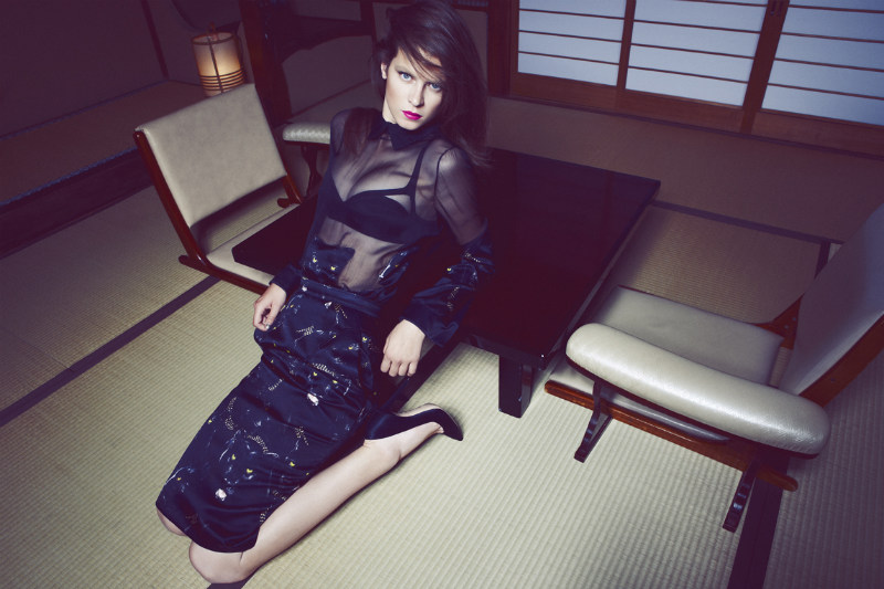
Eden Clark by Nagi Sakai for Flair November 2011

Deja

/

Published October 20, 2011

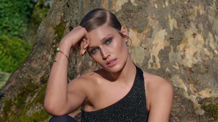
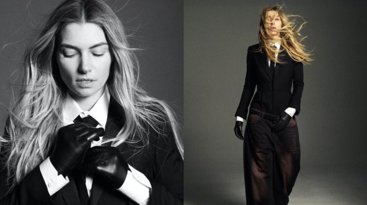
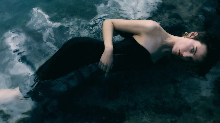
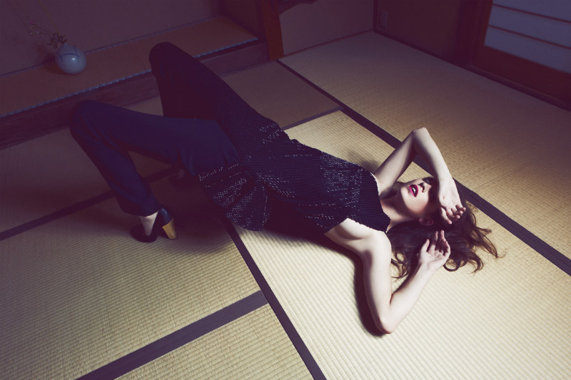
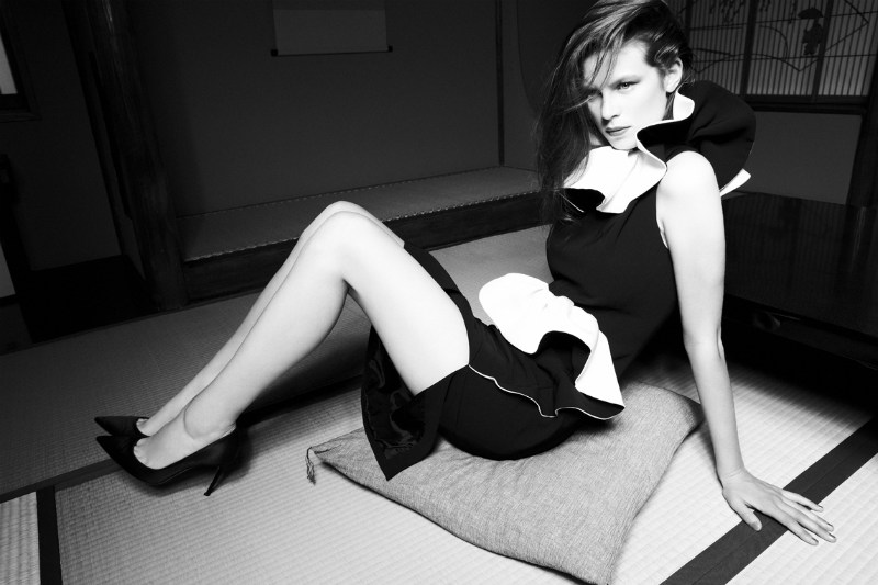
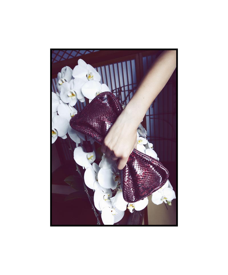
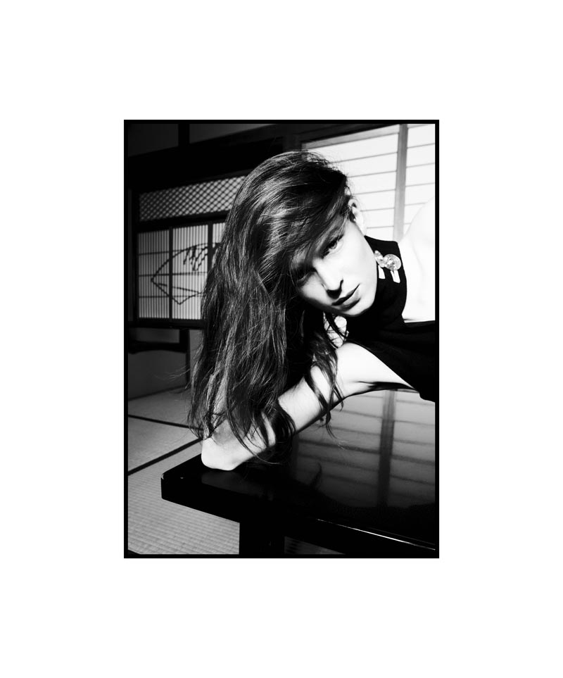
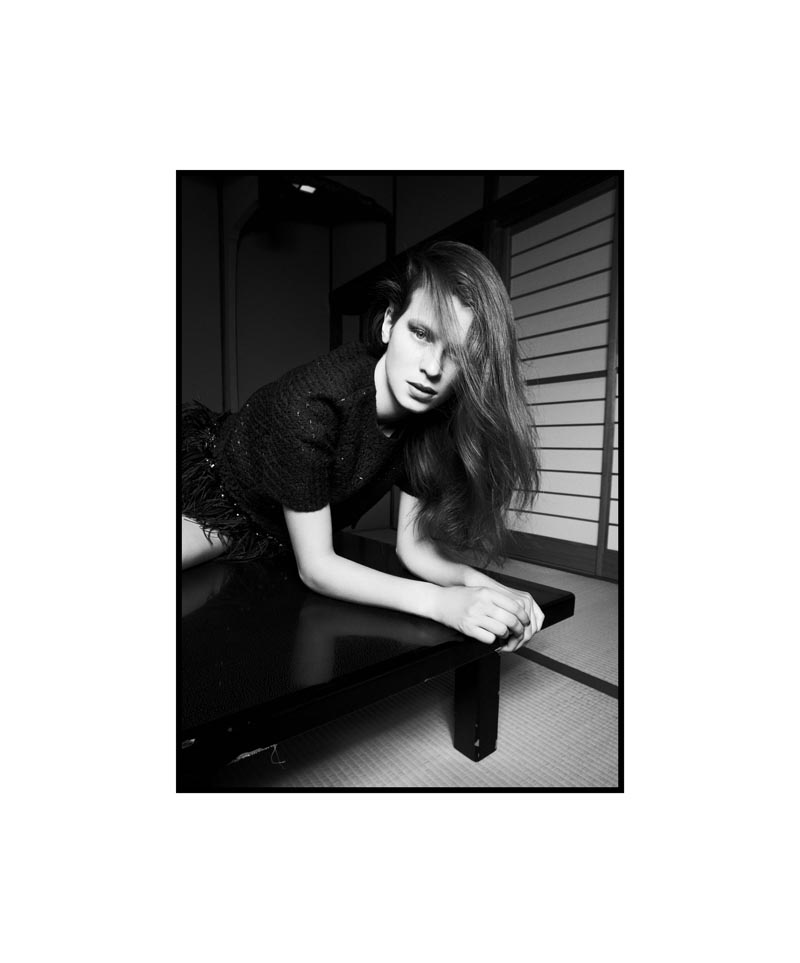
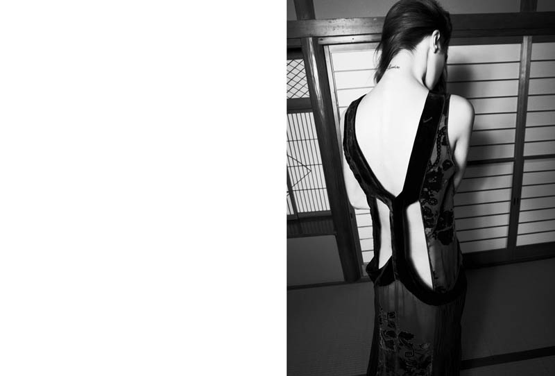
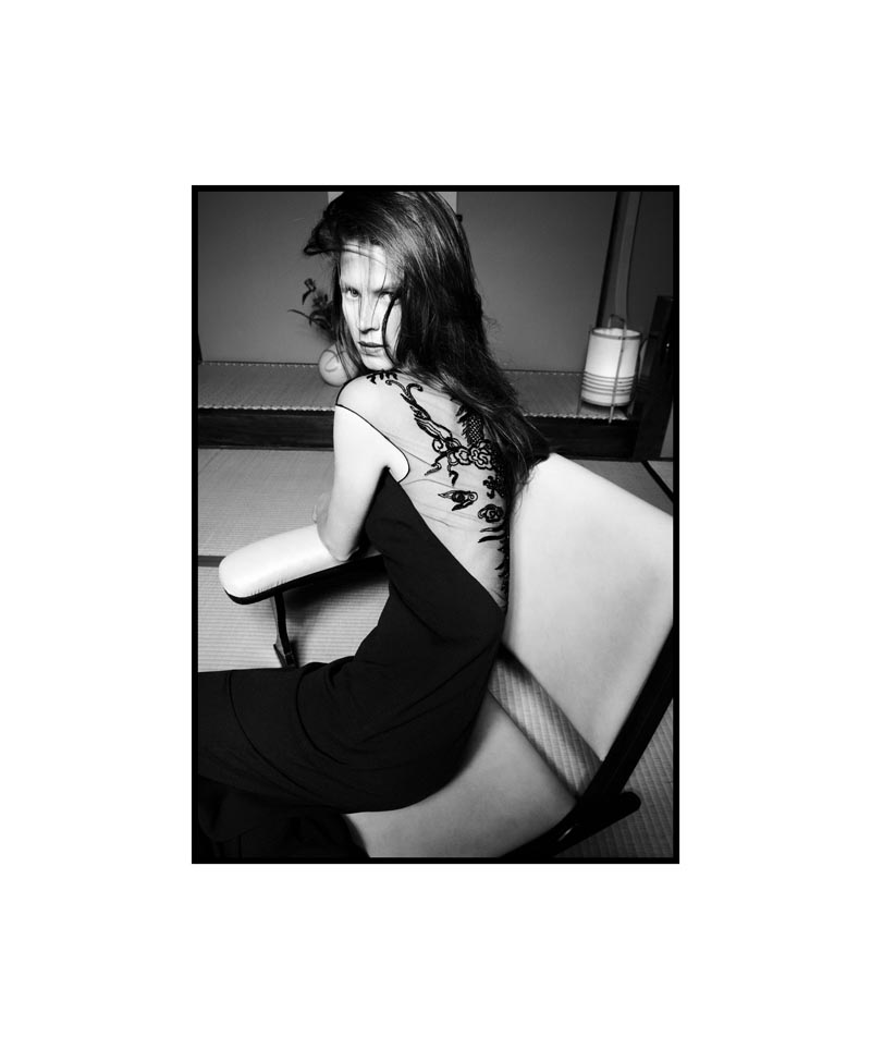
Cherry Blossom Girl – Model Eden Clark goes to Japan for this spread from the latest issue of Flair Magazine shot by Nagi Sakai. Styled by Vittoria Cerciello, Eden’s structured and peek-a-boo looks evoke Eastern motifs amidst a tatami matted room with elegant screen doors. A candy-colored lip and easy hair by Michiru and Toshihiko Shingu give the images a stylishly serene finish.

Recent Updates

Naomi-Campbell-V-Magazine

Naomi Campbell Wows in Dolce & Gabbana for V Magazine

Naomi Campbell, the legendary face, graces not one but two covers of V Magazine’s Winter 2024 issue, V151. Shot by ...
Jana-Julius-Numero-Netherlands

Jana Julius Rocks Daring Beach Style in Numéro Netherlands

Photographer Stockton Johnson heads to the beach for the October 2024 issue of Numéro Netherlands. An editorial called Rebel Tide ...
Exclusive: Mathilda & Arifi by Jø Cheung in 'I Went Dancing with My Sister'

Exclusive: Mathilda & Arifi by Jø Cheung in ‘I Went Dancing with My Sister’

Photographer Jø Cheung explores familial connections for FGR's most recent exclusive. Models Mathilda Forssbeck and Arifi star as two siblings ...
Aishwarya-Gupta-Editorial

Aishwarya Gupta Embraces Power Dressing for Marie Claire Arabia

Aishwarya Gupta means business in the September 2024 issue of Marie Claire Arabia. Photographer Ekin Can Bayrakdar captures the model ...
Sol Jeong Shines in Vogue Hong Kong Beauty

Sol Jeong Shines in Vogue Hong Kong Beauty

Sol Jeong graces the pages of Vogue Hong Kong's recent beauty supplement. The editorial, photographed by the duo Stephen and ...
Sherry Shi Rocks the Fall Collections for SCMP Style

Sherry Shi Rocks the Fall Collections for SCMP Style

Captured by the lens of David Roemer (Atelier Management), the September 2024 issue of SCMP Style heralds the arrival of ...

4 thoughts on “Eden Clark by Nagi Sakai for Flair November 2011”

  1. I think it’s a cool concept, but the angles are extremely strange in some these photos, to the point where you can’t highlight the clothes. And in some of the black and white shots, you cannot see the clothes clearly. Once again, I love the styling and the concept, but I don’t think it was pulled together well. 

Comments are closed.