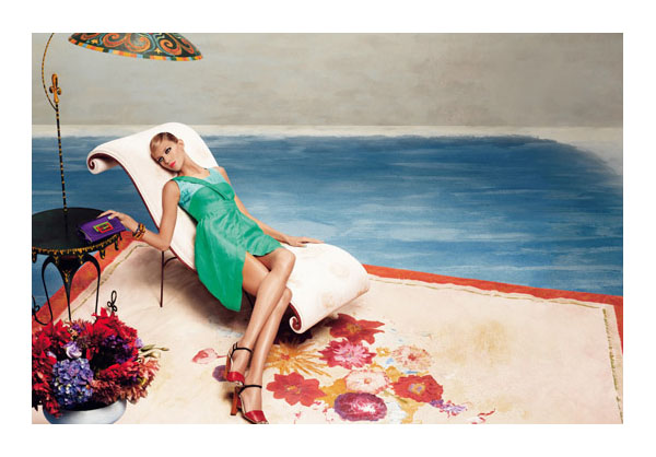
As with many campaigns this season, Fendi’s spring 2011 campaign follows in the footsteps of fall 2010 with Anja Rubik in a picturesque setting akin to a work of art. Photographed by Karl Lagerfeld, the Fendi woman isn’t afraid of bold colors or dramatic shapes for the spring as shown by these uniquely stunning images.
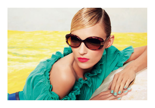
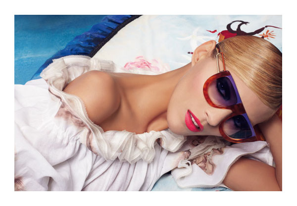
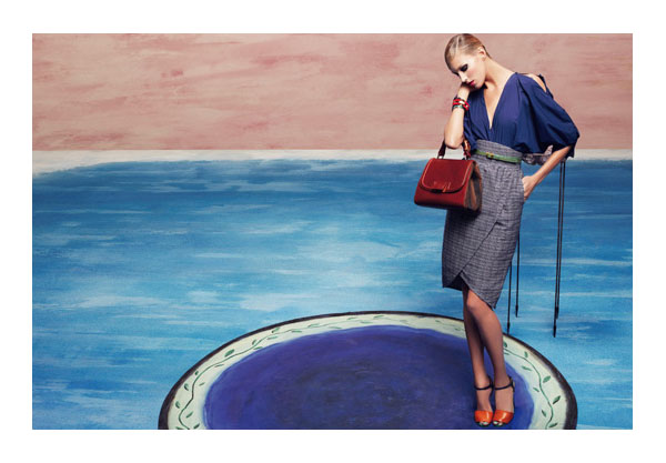
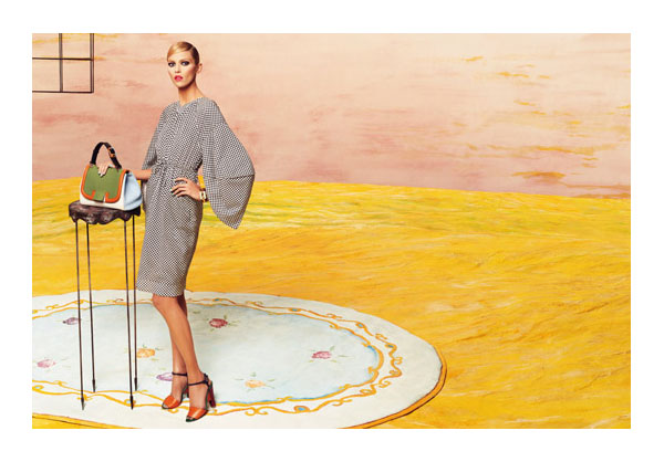
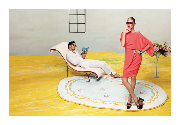
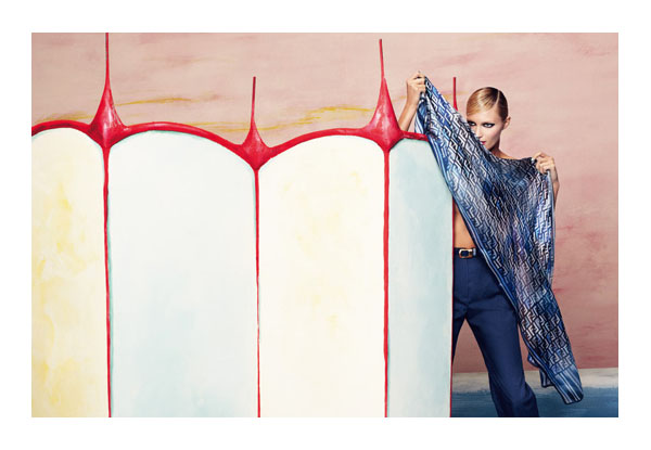
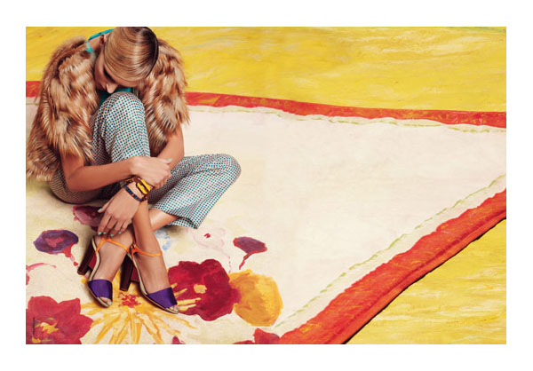
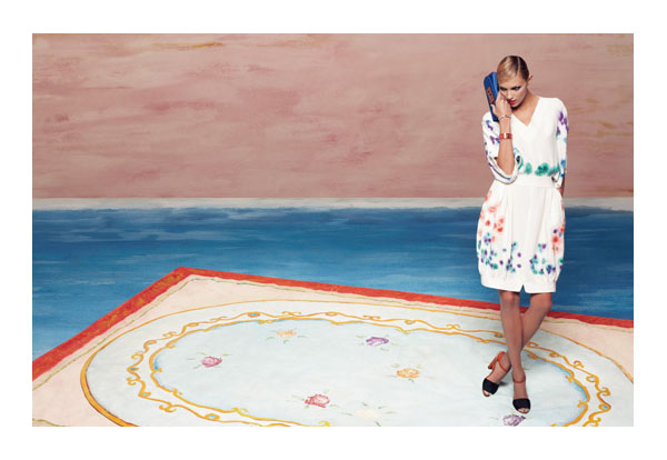
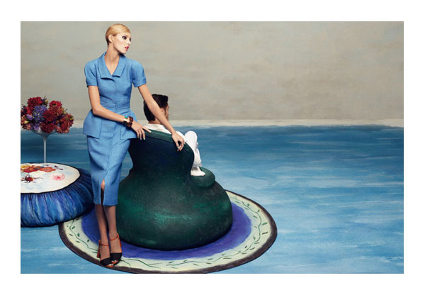
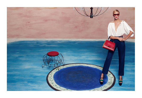
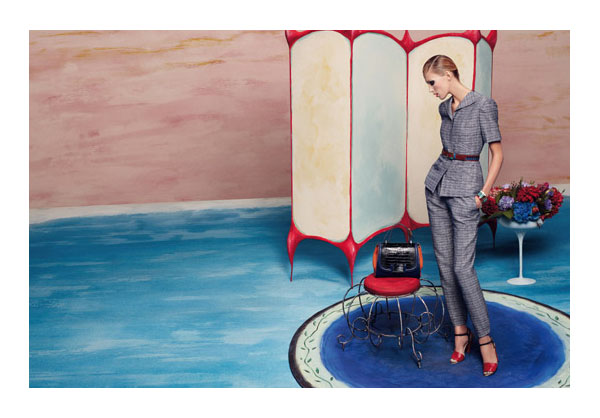
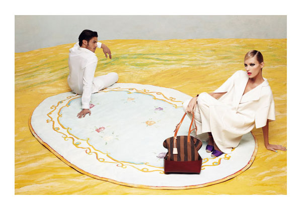
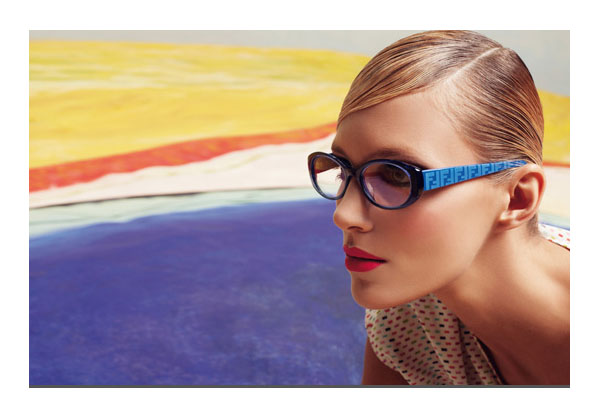
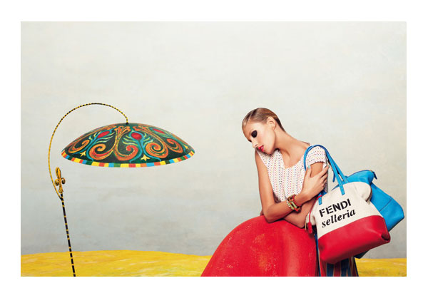
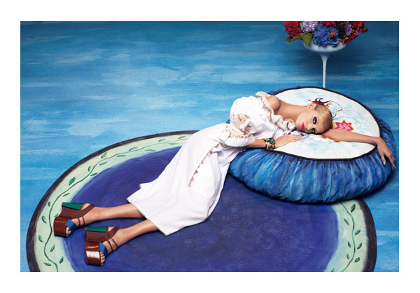


With all those ideas, good strong colors, a great model you would think that the shoot would be exciting and engaging.
It’s not.
At all.
Instead it looks old fashioned, unemotional, distant. And the Clothes! Trite and uninteresting.
Agree. Can’t they come up with something better than THIS?
Agree. Can’t they come up with something better than THIS?
It’s just an okay campaign. Nothing really jumps at me, which is a shame because Anja Rubik is a great model.
I love how this campaign has pictorial elements and challenges the norms of usual perspective employed in advertisements
The only Fendi Ad in recent memory that has interested me was Jessica Stam for the fall 09 collection. That was beautiful.
The only Fendi Ad in recent memory that has interested me was Jessica Stam for the fall 09 collection. That was beautiful.
Serious. I think this concept sounds great on paper, but it has no real spark or charm. Just kind of flat.
Serious. I think this concept sounds great on paper, but it has no real spark or charm. Just kind of flat.
This is lovely…with the fun and vibrant colors, this stands alone to me among other campaigns…
http://cito-gene.blogspot.com/
This is lovely…with the fun and vibrant colors, this stands alone to me among other campaigns…
http://cito-gene.blogspot.com/
wow love it absolutely!
http://www.mewmew-angelica.blogspot.com
i kinda like it
a retrospective image mixing photograph and oil, with fashion and living models.
this was probably a dream of Mr. Lagerfeld.
i kinda like it
a retrospective image mixing photograph and oil, with fashion and living models.
this was probably a dream of Mr. Lagerfeld.
i kinda like it
a retrospective image mixing photograph and oil, with fashion and living models.
this was probably a dream of Mr. Lagerfeld.
I really like how it’s like she’s a part of the painting. That said, Anja’s poses are terrible.
I really like how it’s like she’s a part of the painting. That said, Anja’s poses are terrible.
The could’ve probably used a more vivacious model but I think the pictures are amazing nonetheless.