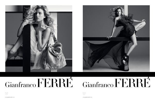
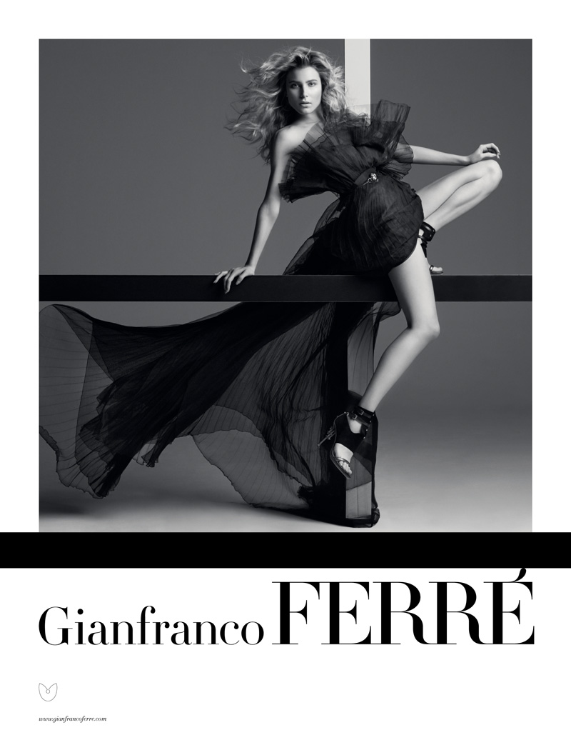
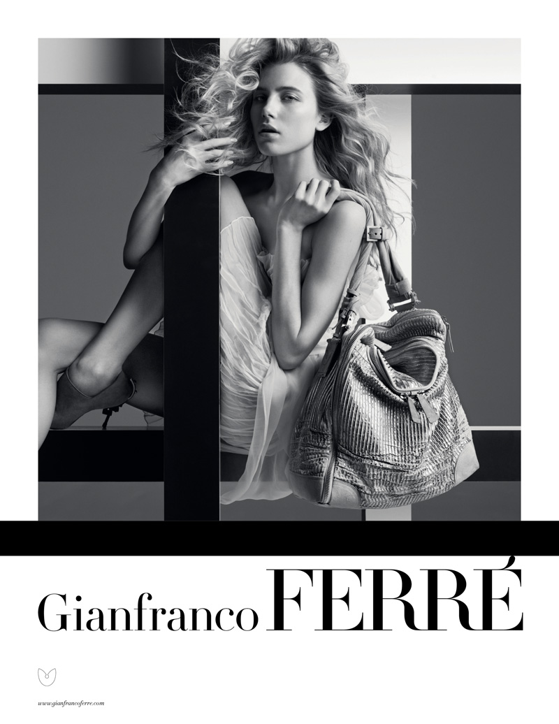
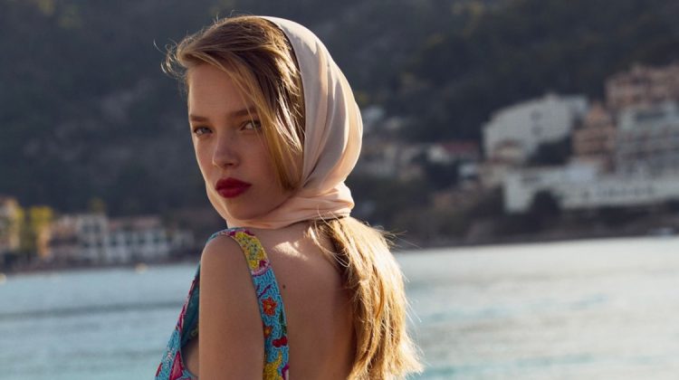
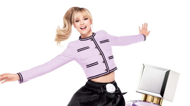
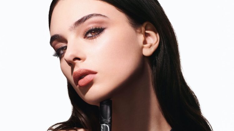
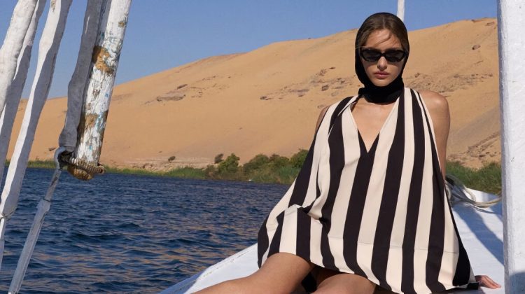
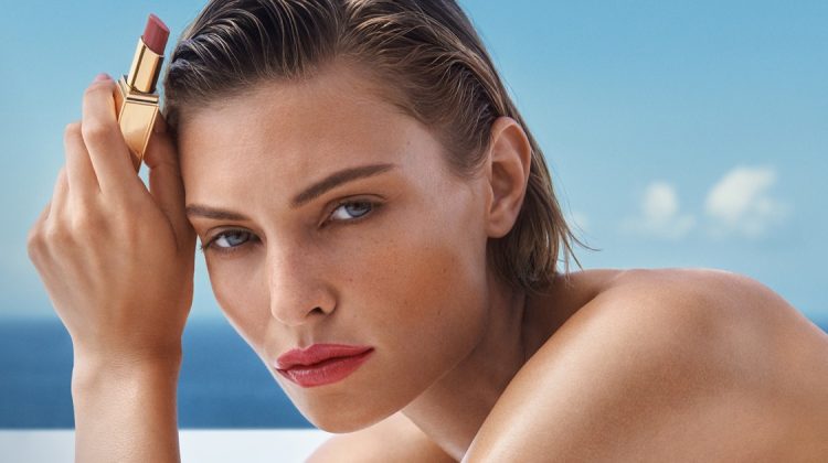
Dree Hemingway grabs her third campaign of the season with Gianfranco Ferré’s most recent ads. Photographed by Inez van Lamsweerde and Vinoodh Matadnin with art direction by Michael Amzalag and Mathias Augustyniak, the advertisements go for a more classic style as they juxtapose fluid fabrics with the stark contrast of a studio background.
Why the f*ck is she getting a lot of campaigns? She is really not that photogenic and is not really anything special. So overrated.
Why the f*ck is she getting a lot of campaigns? She is really not that photogenic and is not really anything special. So overrated.
I'm not really a fan of hers all that much. But this works for me.
They made her look elongated and the simplicity does add a nice touch.
I'm not really a fan of hers all that much. But this works for me.
They made her look elongated and the simplicity does add a nice touch.
I didn't like Dree at first, but I think she is really growing on me. I love the simplicity of these ads too.
I didn't like Dree at first, but I think she is really growing on me. I love the simplicity of these ads too.
too normal is her face. but i have to say that the pictures are really good.
too normal is her face. but i have to say that the pictures are really good.
Without the Hemingway name, which is not her birth name, she would be just another unremarkable face.
Without the Hemingway name, which is not her birth name, she would be just another unremarkable face.
Dree Hemingway is perfect on this photo.. real good photocall
Dree Hemingway is perfect on this photo.. real good photocall