
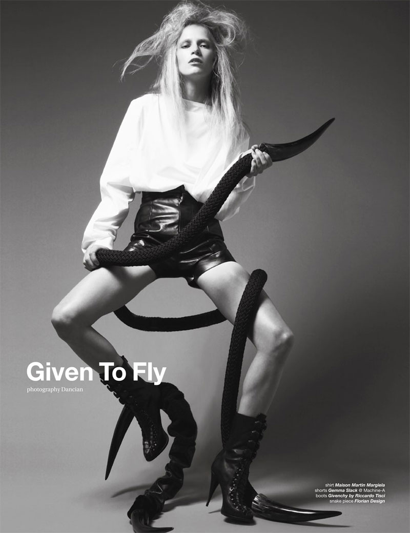
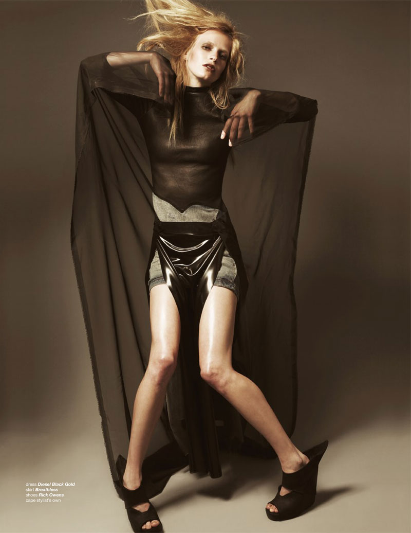
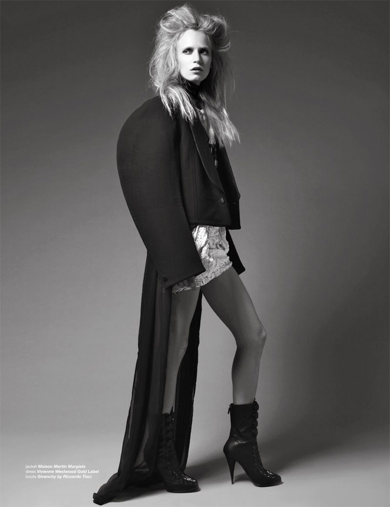
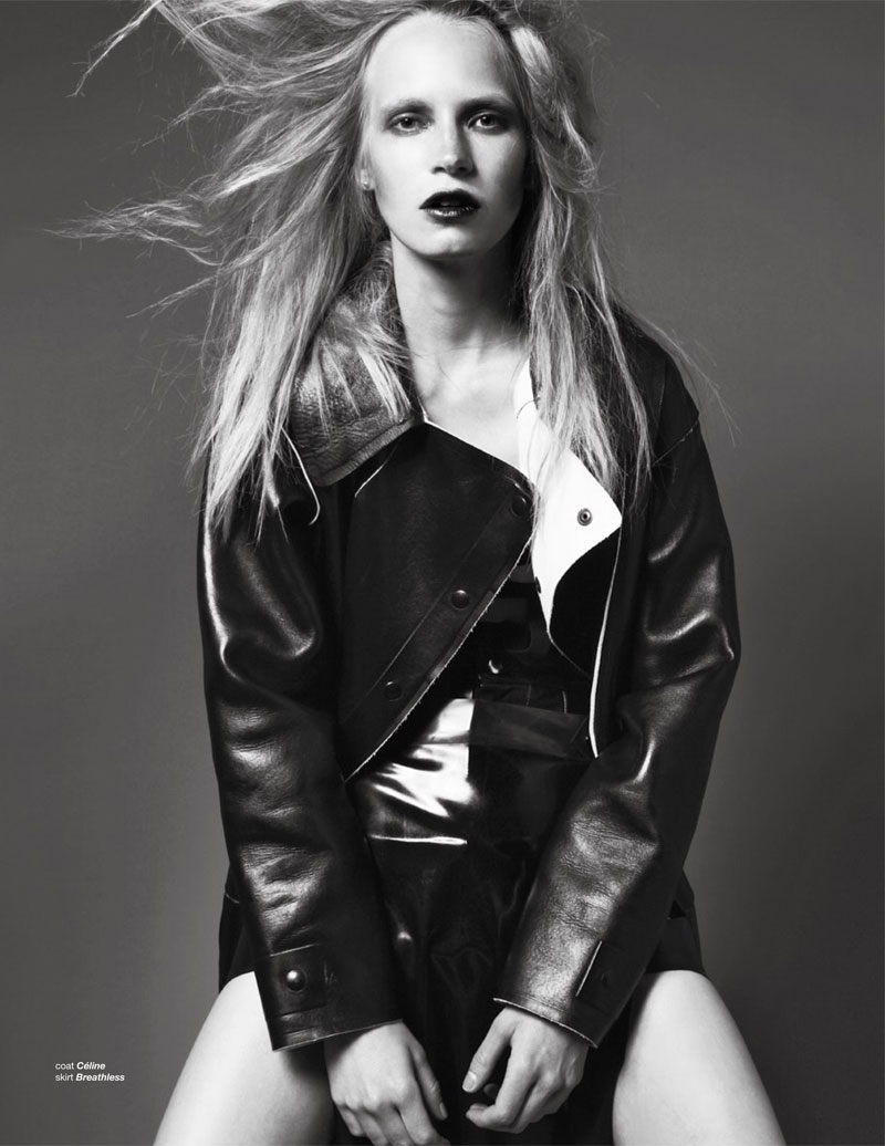
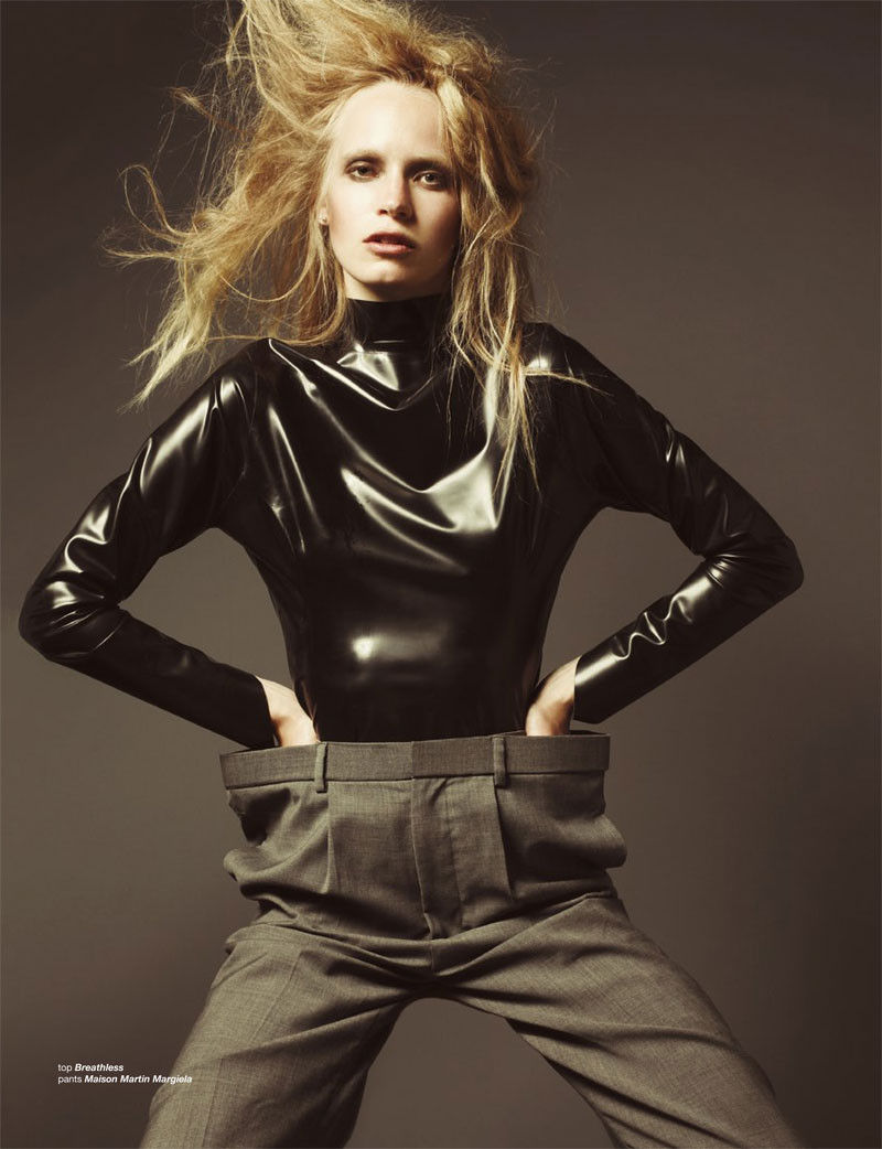
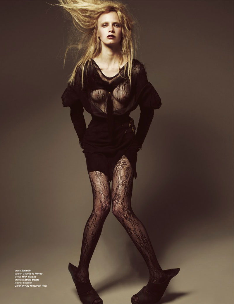
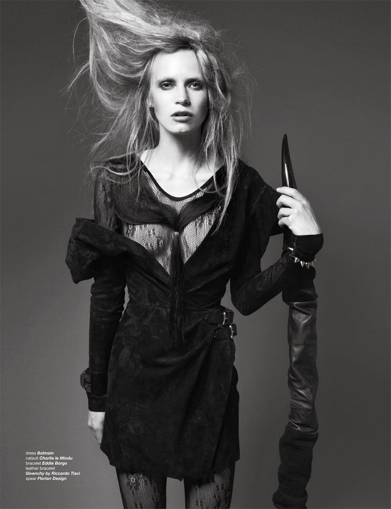
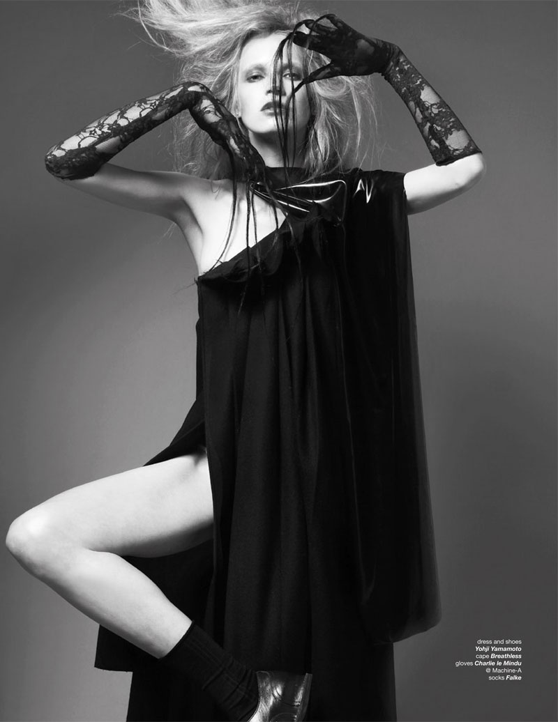
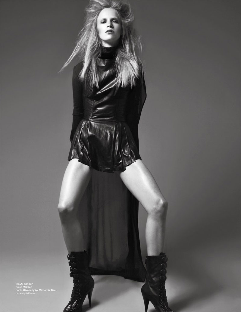
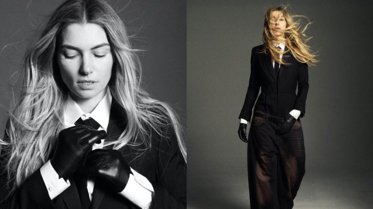
Jenny Sinkaberg is certainly no wallflower for her latest work in Zoo Magazine’s fall issue. Photographed by Dancian and styled by Jo Barker, Jenny sports a rebellious wardrobe of leather, lace and black. Featuring the likes of Yohji Yamamoto, Balmain and Givenchy, the Given to Fly features wild hair paired with even wilder poses.
could be an amazing work if she had’nt always that same boring face
there’s something so awkward about her posing.
there’s something so awkward about her posing.
How does an editorial like this ever get approved for publication. It’s sloppy. They didn’t even bother cleaning her toes in the color shot with the shoes. Get a manicurist. This reflects badly not only on their team but the people at Zoo.
i just looked through your comments and you are kinda bitter towards everything huh? maybe look at the positives rather than bad mouth everything…. or post something you have done…
Next time when you sit in front of an editor, advise them to look at your work positively instead of giving you an honest critic. You can also ask them to show you work they have shot, and if you still don’t like their reply, you can just call them bitter. I give credit when I see good work, so please forgive me if I have higher standards than you do. What positives have you mentioned about this work? You actually like this? You think this cool and done well? What do you like about it?
i just looked through your comments and you are kinda bitter towards everything huh? maybe look at the positives rather than bad mouth everything…. or post something you have done…
I think you missing the point. They meant to be awkward, real and not perfect. I personally love them and love the crazy hair.. Probably a bit too arty for you to understand.. sorry
Now I would call Roversi’s light painting work on Polaroid arty. If you want to take it a step further and bring painting into the picture, we can talk about Francis Bacon’s “arty” work. How did you make this statement and not feel embarrassed?
are you an editor? do you have the credentials to back up your statements? i would love to hear ideas about bacon and why in particular you brought him up? the point i am trying to make is this is a forum to explore what has been published recently, to discuss it positively in the most part, i am sure the photographer, model, stylist, hair stylist or make up artist may see your insightful and completely off point comments, do you want them to retouch away her normal toes, send us a picture of your freshly cleaned toes ferdinand….. as for the editorial itself, i agree it is not the best most interesting spread i have seen but it also is far from sloppy and unfit for publication, basically if you dont like it move on to something you do and let us all know you actually do like something!
Dancian, the photographer who shot this editorial, normally does good work. Everybody is entitled to a hiccup. I wasn’t suggesting they Photoshop anything. I don’t like overly retouched work. Nonetheless, her face has been retouched, so the realism that Paul Morris alludes to has already been crossed. When filmmakers make average movies, their work gets critiqued heavily, not only by critics but the public at large. Why should fashion avoid criticism? Criticism is necessary, without which no one will ever strive to improve a product. This is largely the reason why average editorials get published more often than not. I don’t feel the need to present credentials to random people on-line. We can pretend I’m anything you like, it doesn’t matter. I like many editorials. Hundreds of editorials shot but unknowns and by masters such as Roversi, Avedon, Penn, etc. You haven’t yet mentioned what you think is great about this story? What did you take away from it? Did it inspire anything or was this just a wardrobe display for window shoppers?
oi ferdinand, if your such an educated knowledgeable big shot, what on earth are you doing on here arguing the toss with these people, shouldn’t you be doing something more important and worthwhile, like curating a retrospective on jumped up, self important, fashion wannabe’s throughout history. thankyou and goodnight ..
oi ferdinand, if your such an educated knowledgeable big shot, what on earth are you doing on here arguing the toss with these people, shouldn’t you be doing something more important and worthwhile, like curating a retrospective on jumped up, self important, fashion wannabe’s throughout history. thankyou and goodnight ..
oi ferdinand, if your such an educated knowledgeable big shot, what on earth are you doing on here arguing the toss with these people, shouldn’t you be doing something more important and worthwhile, like curating a retrospective on jumped up, self important, fashion wannabe’s throughout history. thankyou and goodnight ..
oi ferdinand, if your such an educated knowledgeable big shot, what on earth are you doing on here arguing the toss with these people, shouldn’t you be doing something more important and worthwhile, like curating a retrospective on jumped up, self important, fashion wannabe’s throughout history. thankyou and goodnight ..
thats exactly what it is, its a fashion magazine, to sell clothes, read an art magazine that displays art photography if you want that…
thats exactly what it is, its a fashion magazine, to sell clothes, read an art magazine that displays art photography if you want that…
are you an editor? do you have the credentials to back up your statements? i would love to hear ideas about bacon and why in particular you brought him up? the point i am trying to make is this is a forum to explore what has been published recently, to discuss it positively in the most part, i am sure the photographer, model, stylist, hair stylist or make up artist may see your insightful and completely off point comments, do you want them to retouch away her normal toes, send us a picture of your freshly cleaned toes ferdinand….. as for the editorial itself, i agree it is not the best most interesting spread i have seen but it also is far from sloppy and unfit for publication, basically if you dont like it move on to something you do and let us all know you actually do like something!
Now I would call Roversi’s light painting work on Polaroid arty. If you want to take it a step further and bring painting into the picture, we can talk about Francis Bacon’s “arty” work. How did you make this statement and not feel embarrassed?
love this!! Jenny is great one of the most interesting faces around, less ordinary than the dolly-lookalike they’re been using in the Vogue’s and LOVEee, POPppwannabeLOVE-
especially French Vogue..
love this!! Jenny is great one of the most interesting faces around, less ordinary than the dolly-lookalike they’re been using in the Vogue’s and LOVEee, POPppwannabeLOVE-
especially French Vogue..
just weird .
just weird .
just weird .
it is 1 of the most boring editorials i have seen in a while..scrolling down the page feels like seeing the same image over and over again!
Love this a lot. Crazy but great.. Unusual..
Sory, I don’t like it…. at all. But I respect the work that’s behind this editorial, maybe the next time it’ll be better, not so ….. messy.