
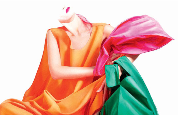
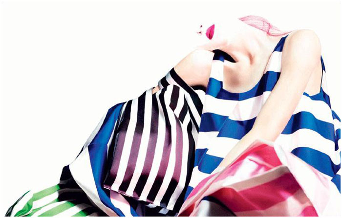
After a runway show of mass proportions and bright colors, the spring 2011 campaign from Jil Sander once again enlists Willy Vanderperre to a shoot a campaign that uses lighting to its advantage. Featuring Daria Strokous, the advertisements place focus on the collection’s striped accessories and bold palette.


I feel like I’m looking at fabric–not clothing. It’s a shame because the collection was so beautiful.
I feel like I’m looking at fabric–not clothing. It’s a shame because the collection was so beautiful.
I feel like I’m looking at fabric–not clothing. It’s a shame because the collection was so beautiful.
I feel like I’m looking at fabric–not clothing. It’s a shame because the collection was so beautiful.
Really like it. I wish I could see those beautiful voluminous skirts standing up though.
I’m liking the half head look. But do agree it just looks like fabric not clothing.
I’m liking the half head look. But do agree it just looks like fabric not clothing.
LOVE IT!
It was a terrible, unflattering collection, but these ads are quite amazing. Different from anything i’ve seen so far. MUCH MORE superior than Miranda Kerr ones.
It was a terrible, unflattering collection, but these ads are quite amazing. Different from anything i’ve seen so far. MUCH MORE superior than Miranda Kerr ones.
I’m inlove with these photos! Love the colors and the styling, even if it’s kind of hard to see clearly. But this is really my taste!
_-_-__–_–_——_—__–_
http://newspaperstories.blogspot.com/
I’m inlove with these photos! Love the colors and the styling, even if it’s kind of hard to see clearly. But this is really my taste!
_-_-__–_–_——_—__–_
http://newspaperstories.blogspot.com/
these colours are so vibrant, amazing
http://elenavasilieva.blogspot.com/
x
these colours are so vibrant, amazing
http://elenavasilieva.blogspot.com/
x
these colours are so vibrant, amazing
http://elenavasilieva.blogspot.com/
x
What a gorgeous campaign. A little 80s in its color look, but the watercolor fantasy looks beautiful.
Where did her head go?
I’M LOVING IT
I wasn’t a fan of the collection but these ads are art. bravo.
What a beautiful campaign!! It was about time to relesea a good one!!!!
I love the colors used in this… it is art!
http://www.lovelaceluxe.com
I love this campaign, though I wish there were an ad where she was standing up so we could see the clothes better. I love the half-head!
amelie-fleurjaune.blogspot.com
Very much Rothko-inspired, as for the colors…Love it!
Very much Rothko-inspired, as for the colors…Love it!
Willy Vanderperre is kind of strange.
And that’s a good thing.
And that’s a good thing.
And that’s a good thing.