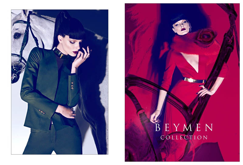
A Question of Nature – Koray Birand lenses the fall 2011 campaign from Turkish brand Beymen. Starring the lovely Jules Mordovets in equestrian inspired wear styled by Murat Türkili, tailored pants and fitted coats get paired up with nature-filled backgrounds. / Hair by Ali Yilanci, Makeup by Ali Riza Ozdemir, Production by Prodctionising
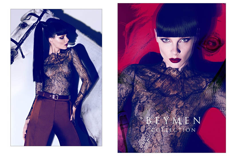
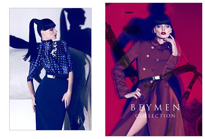
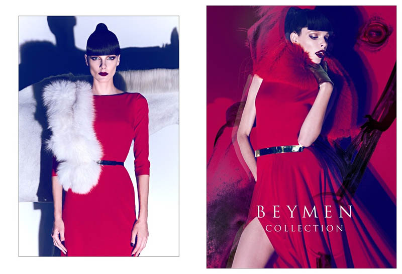
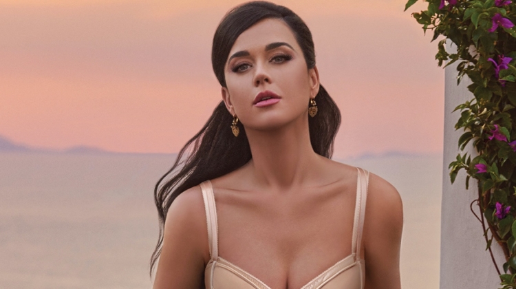
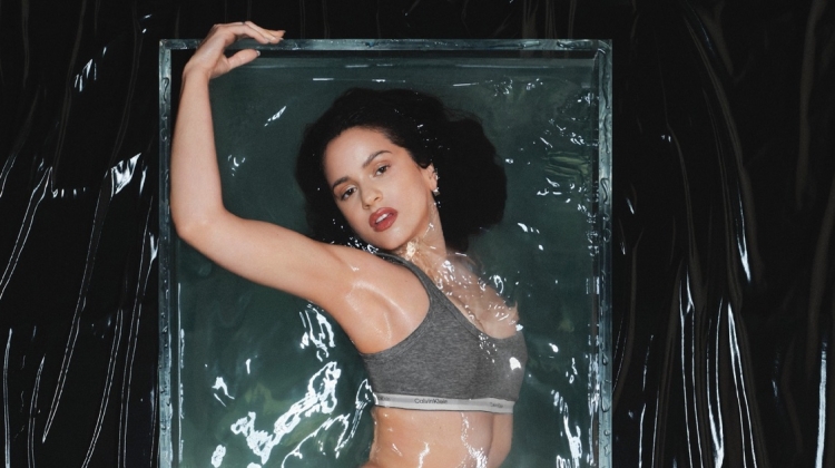
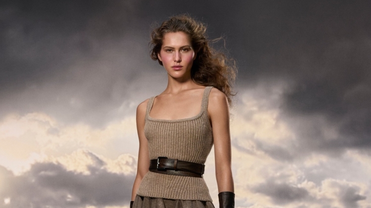
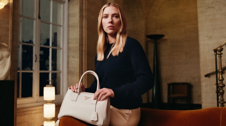

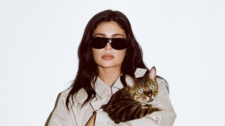
I don’t get much of an equestrian feel from the looks, for the horse to be there. Great looking clothes. Last shot is amazing -left.
Who’s copying who here? So shameless. Koray Birand vs Camilla Akrans
thank being said – i actually think this is lovely
people, give up comparing similarities of photographers work!
If you look at an Armani campaign on the back cover of Feb Italian Vogue 2000 it has colouring that would today be said looks like Camilla Akrans. Before Akrans or Mert+Marcus were on the scene.
Can we let this go please?
It’s beautiful work from a talented photographer.
It’s not the coloring I’m even referring to, more the lighting, poses, cropping. Why can’t we compare photographers work? Arent comments meant for discussion? Look through the archives and Koray and Camilla seem to be playing some kind of tag team – even up to using similar scenery. I’m quite sure Camilla is the original, and yes the colour treatment is oft similar to mert & Marcus, but its more the strong and languid poses, the shooting from low angles, the style of movement which is morw originally hers. Camilla and Koray also have less depth in their images, not always, but mert and Marcus tend to steer away from using such hard light in eds.
people, give up comparing similarities of photographers work!
If you look at an Armani campaign on the back cover of Feb Italian Vogue 2000 it has colouring that would today be said looks like Camilla Akrans. Before Akrans or Mert+Marcus were on the scene.
Can we let this go please?
It’s beautiful work from a talented photographer.
I do not see Camilla here, may be mert & marcus. Camilla started to look like Mert Marcus, Mert Marcus started to look like Camilla. Is it important. No..
Beatiful work !!
Look at Camillas editorial in Vogue Germany for Tom ford. The lighting and cropping, use of silhouette and colour treatment is incredibly similar. Koray is talented yes, still believe she should do more to make her high profile work look more her own and less influenced by Camilla.
Strange, you are so ambitious to prove what you think. But
sorry I see no resemblance here with Camilla.
Even if we see these big names getting inspired from each other.
I just enjoy the discussion, no harm in that.
I just enjoy the discussion, no harm in that.
Strange, you are so ambitious to prove what you think. But
sorry I see no resemblance here with Camilla.
Even if we see these big names getting inspired from each other.
Agree with the two comments above. Akrans didn’t invent this type of photography. Great images though.
Everyone copies everyone else. Get over it. The retouchers are probably the ones that should be given credit for making these photos look the way they look. Just go check out Beyonce’s spread in W Magazine July 2011 by Patrick Demarchelier. Don’t tell me Patrick’s old fossil ass was sitting there messing with curves so his photos would look more “Mert & Marcus” like.