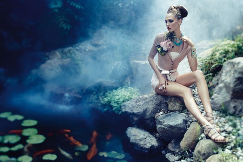
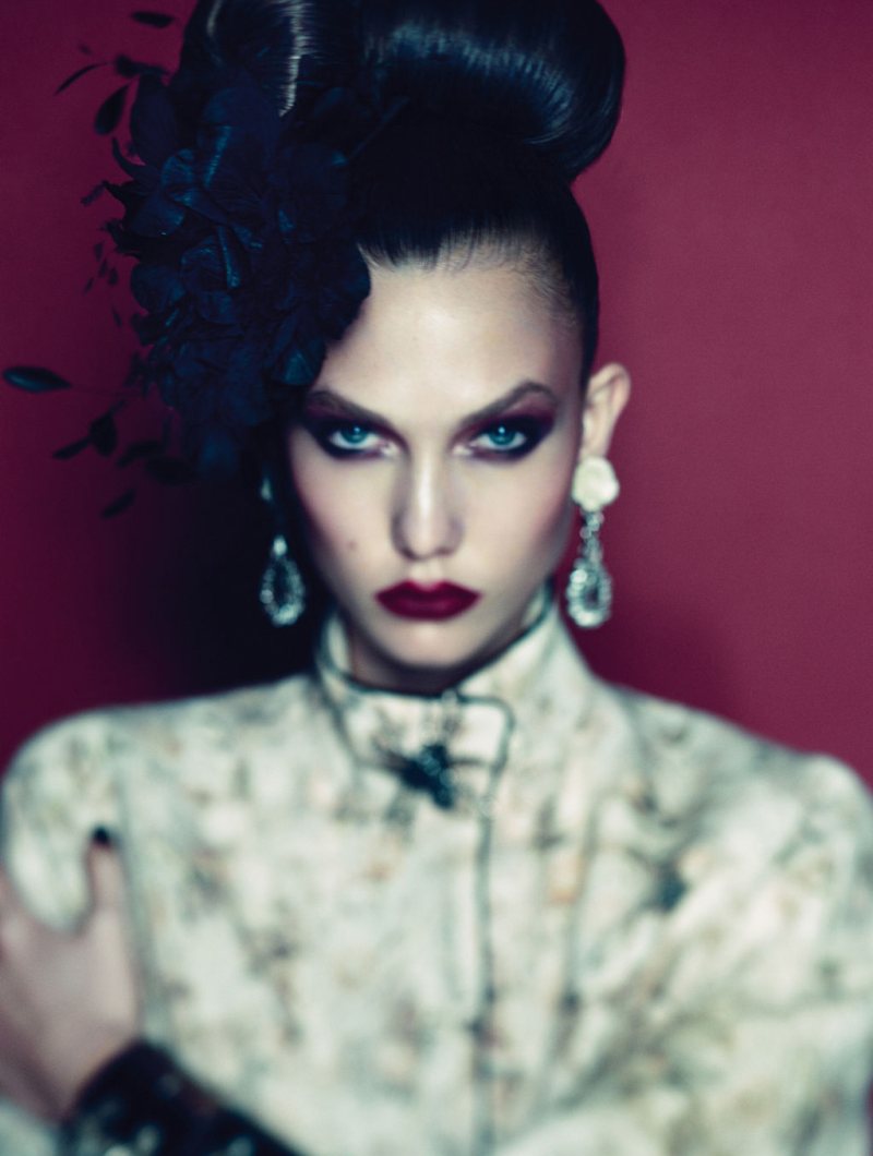
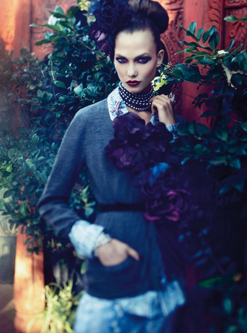
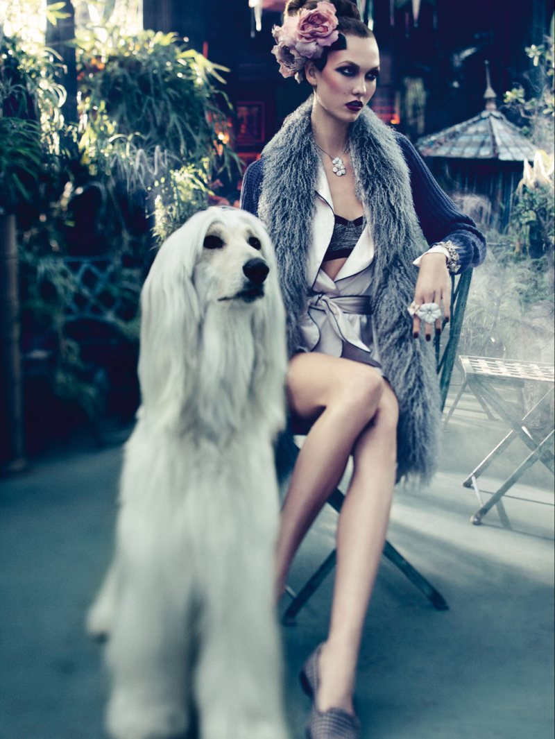
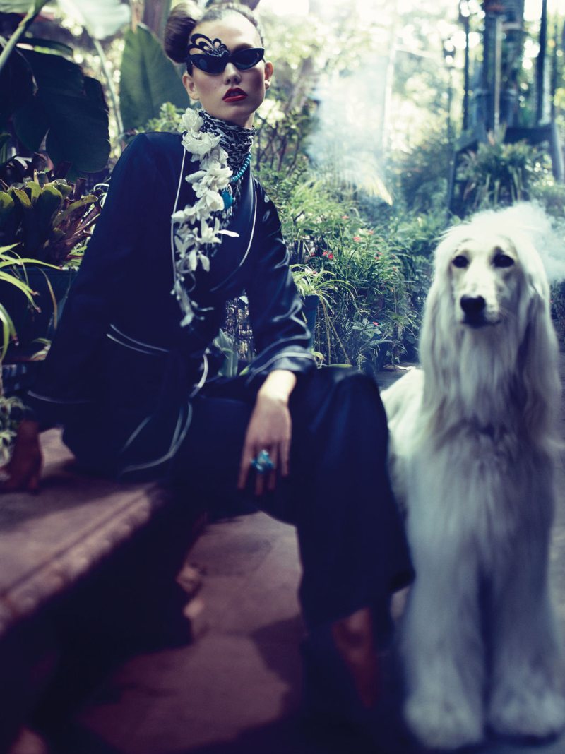
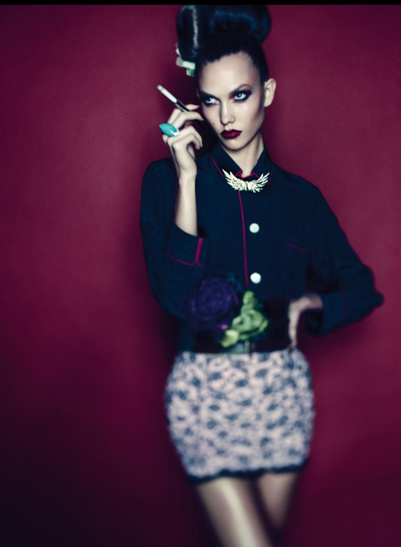
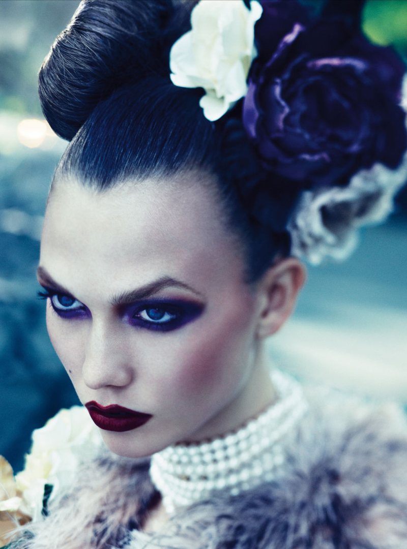
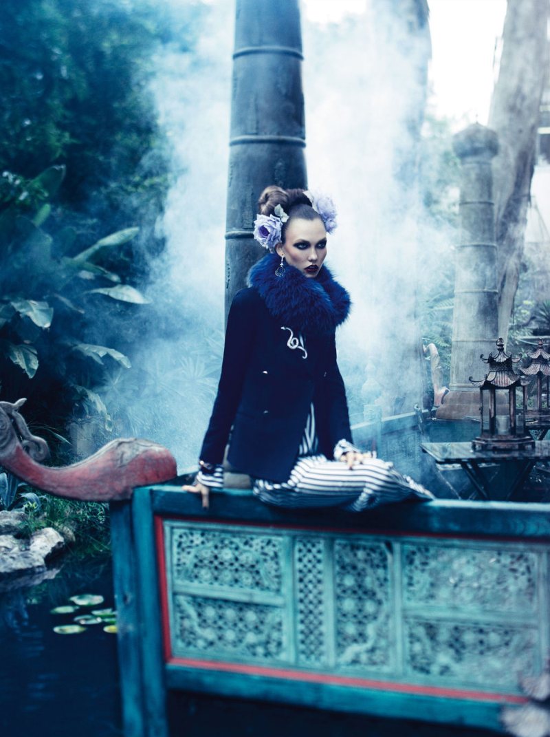
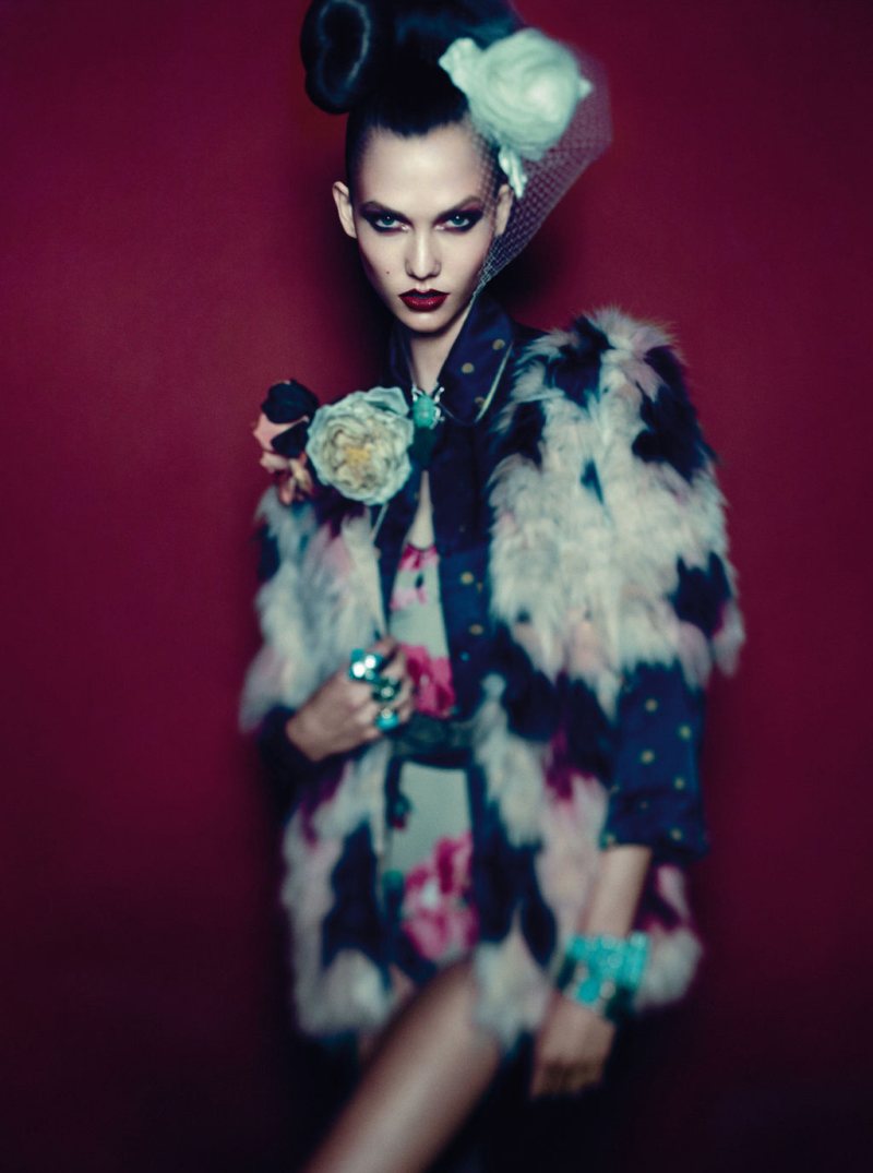
Day Dream – December cover girl Karlie Kloss takes on eastern inspired fashion for this dreamy story in Vogue Germany. Captured by Alexi Lubomirski, Karlie is an alluring vision in the designs of Chanel, Gucci, Chloé, Roberto Cavalli and others. Dripping in gems and floral accessories, the American beauty shows off a more mature side with a sophisticated front.
View more images from this shoot on Vogue.de
So stunning! Definitely see a Roversi influence.
I definitely agree with this
Not only is Karlie fabulous on the runway, but her editorials just keep getting better and better. The makeup and styling are gorgeous! I’m loving the color saturation, and how Alexi used that blurring effect, which seems so popular of late, reservedly, and to beautiful effect.
http://www.lookforthegirl.com
Ditto
WOW. SO not my style and SO SO GORGEOUS.
I LOVE HER SO MUCH
this is awesome
OMG, this looks terrific, so powerful! Karlie looks fierce as hell!
Giveaway at my blog:
http://myfashioninsider.blogspot.com/
Oh wow. I can’t fault a single shot and I love the out of focus-ness of the last one.
Strut Mode
This is a cheap blur effect done with a software filter – it bears no relationship to Roversi’s technique, and frankly is merely a gimmick in this shoot.
I think the shoot would actually look better WITHOUT the filter which serves no real purpose. Lubomirski is a better photographer than this, his shoots are usually exciting and he should, for now, stick with what he is familiar with.
Karlie continues to expand her repertoire and I admire her for it. But I am still not “engaged” by her editorial work. She remains so cool and detached, even untouchable. (The effete setting and dogs and deathly lipstick only reinforce that effect). And for god’s sake where are her endless legs? Hidden in every shot.
No, this does not work for me nor convince me of Karlie’s skill, so widely trumpeted, as a photographic model.
um…it’s called a tilt shift lens, not a filter. hold your gimmick comments to where they’re appropriate and learn something about lenses before you slam alexei or this story.
its actually a tilt-shift lens i believe.
each editorial with her looks always excellent… it’s just a pure pleasure to look at these pictures
http://www.blamethebananas.com
— Karlie Kloss.
Karlie is so naturally beautiful that I (personally) hate to see her with all that makeup. Loved her previous editorial with Testino much more.
i’m not a fan of blurrie photos, but i really liked the editorial. karlie is gorgeous as always!
I love this.
I do agree with the above comment, Karlie is naturally beautiful but makeup is also an art… It’s not just to enhance beauty. Thus, I personally feel the makeup is perfect for this editorial and its styling.
ooo i love the photos with the deep red in the background. this editorial feels completely different from most of the things ive been seeing lately, in a good way. i like that the styling is so sophisticated and luxe, but also playful and fun.
http://youareashootingstar.blogspot.com/
So beautiful and sensual!
XoXoPlamihttp://www.fashionthrill.com/
she is taking over the world
STYLE DECORUM
Oh my, I just fell in love. Amazing amzing amazing!
http://fashiomilla.blogspot.com/
I often feel that Karlie recycles the same facial expressions endlessly, and this editorial is no different. I also don’t see how a tilt-shift lens is appropriate here. There may have been a good idea initially for this editorial, but the execution is poor, in my opinion.