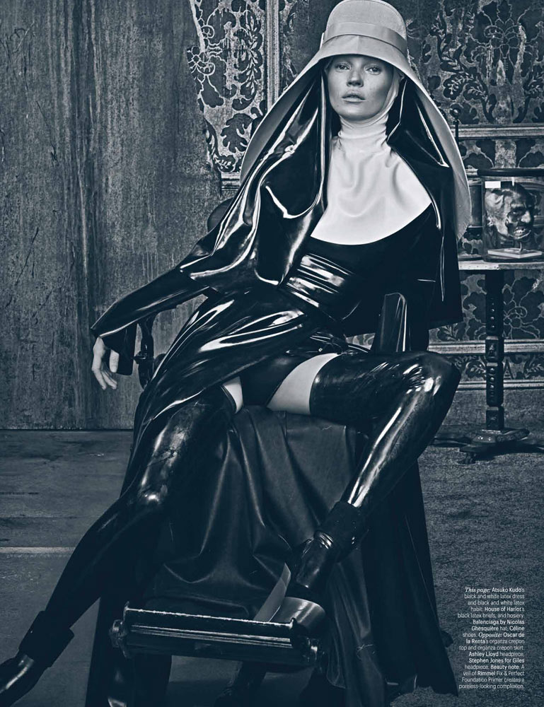
Good Kate, Bad Kate – After taking a look at the striking covers, we share the main editorial from W Magazine’s March edition starring supermodel Kate Moss as an deity-like beauty. Photographer Steven Klein and fashion director Edward Enninful team up for a darker look at the spring collections featuring pieces from labels such as Balenciaga, Jil Sander, The Row and Louis Vuitton. With the help of makeup artist Val Garland (Streeters) and hair stylist Paul Hanlon, Kate proves she’s more than just a pretty face in the haunting images. / Set design by Jack Flanagan
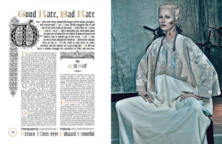
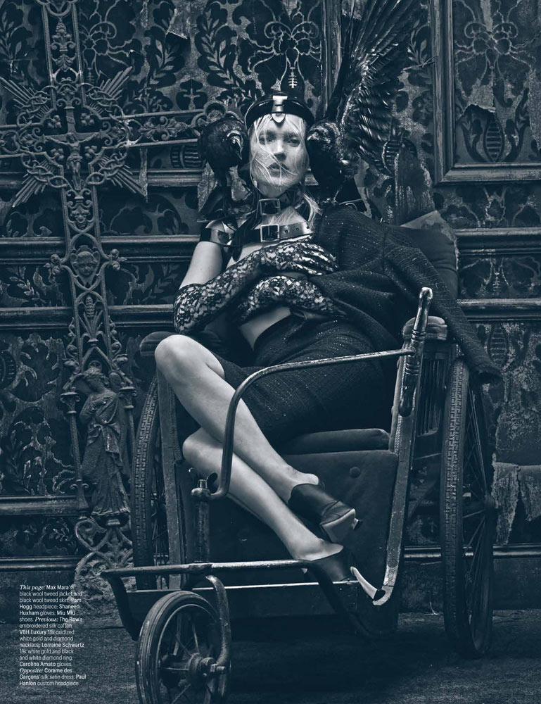
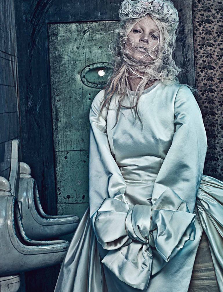
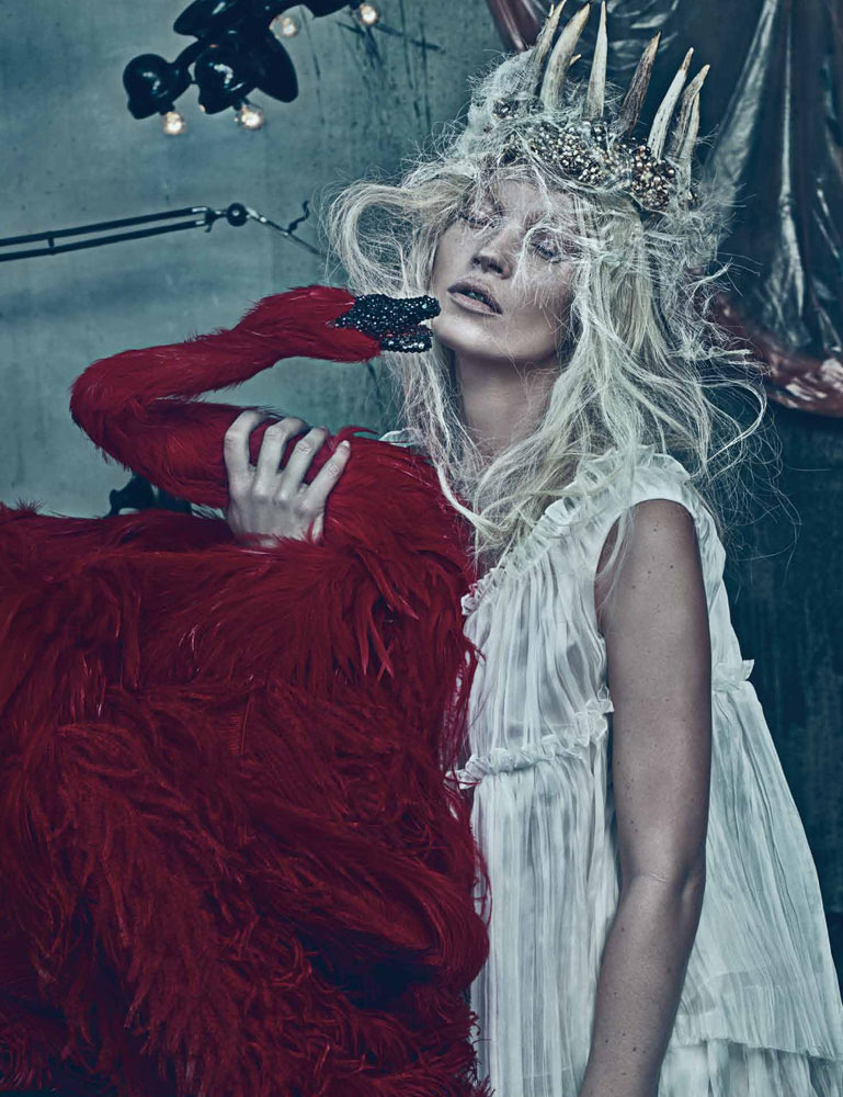
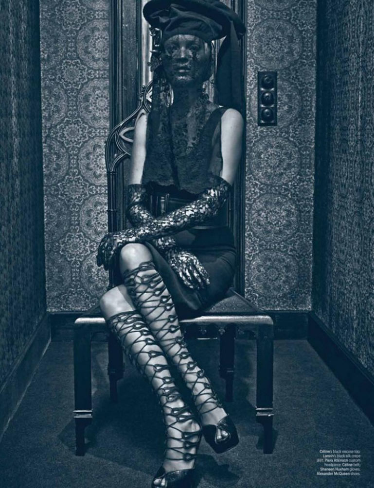
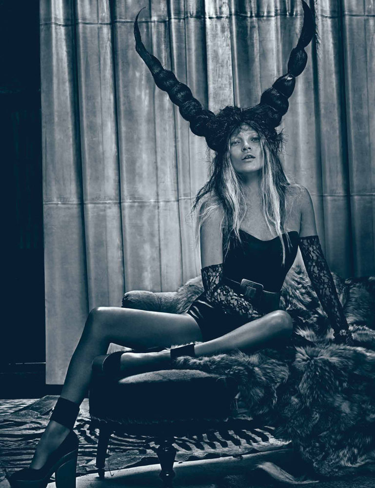
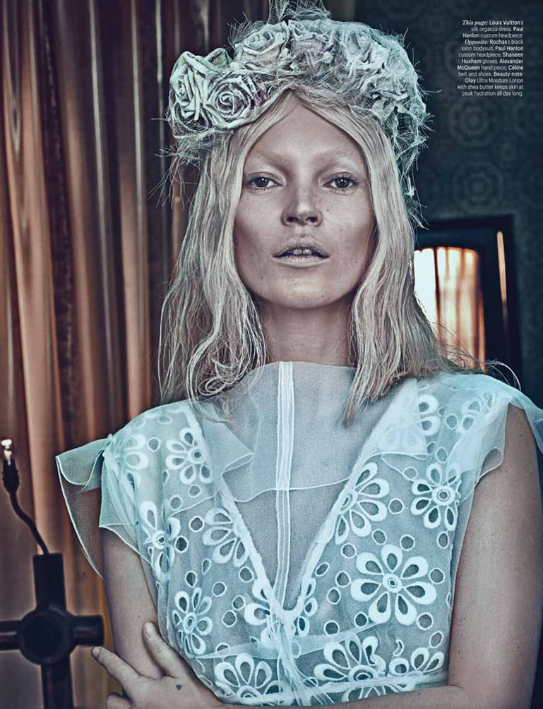
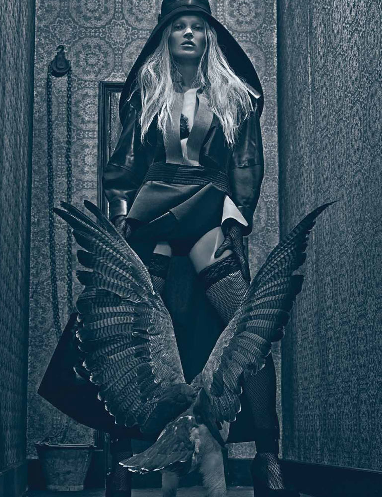
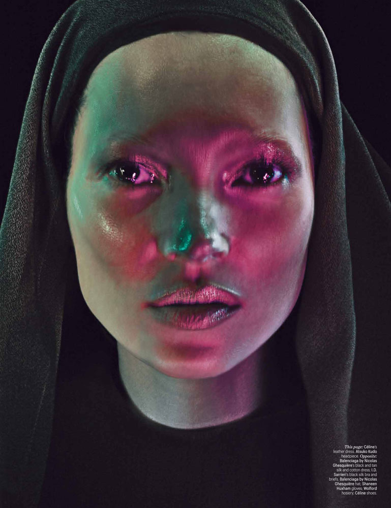
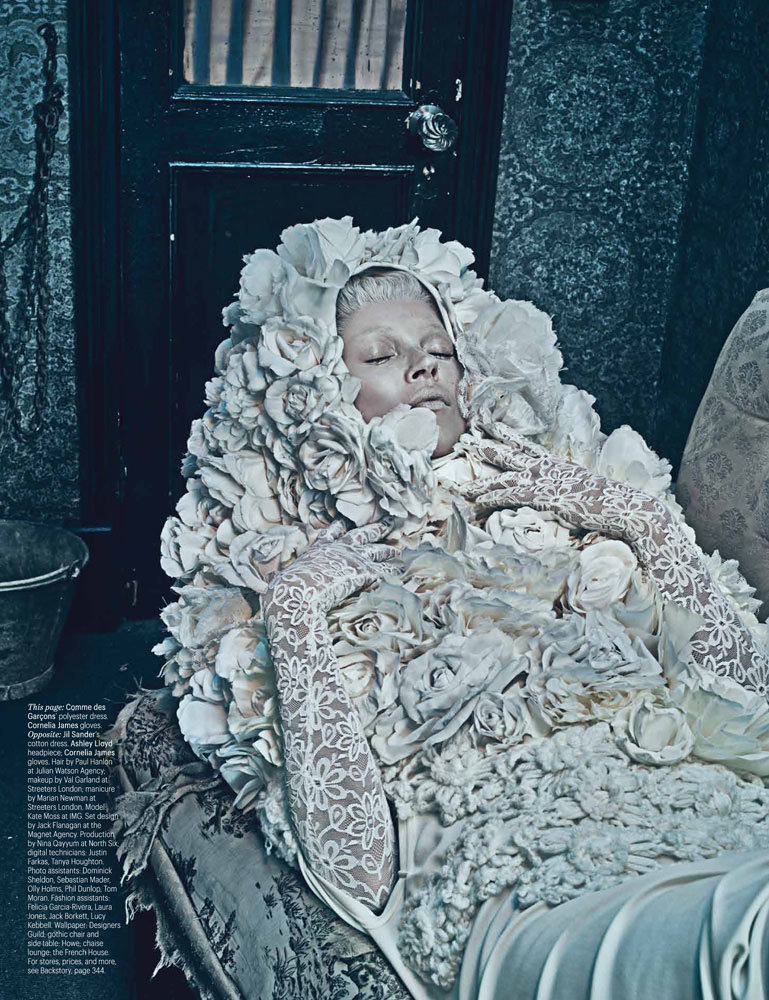
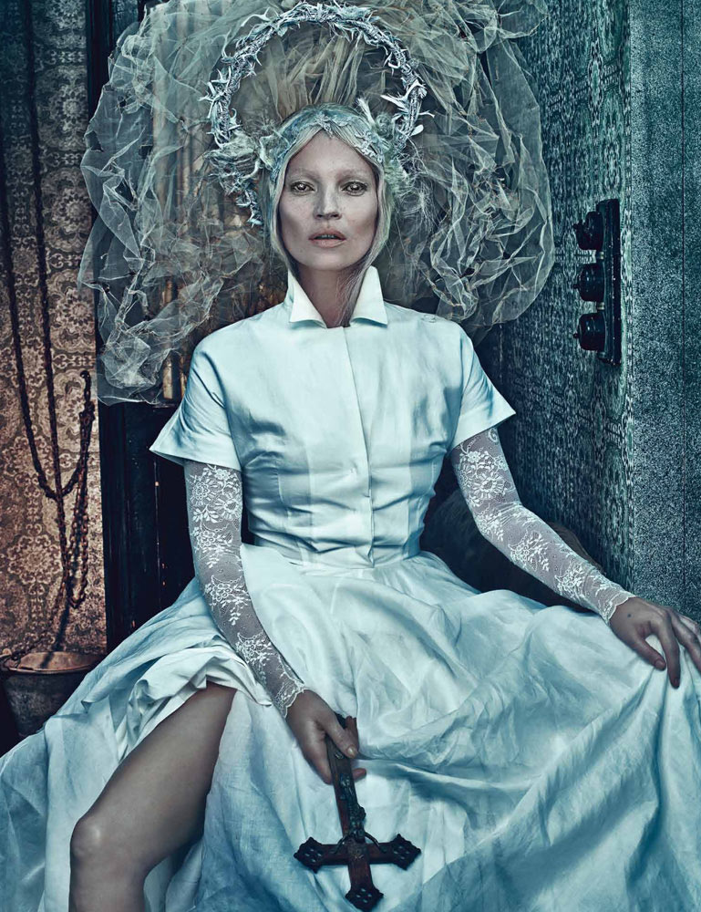


Outstanding on all counts.
She reminds me of Tilda Swinton as the Ice Queen – stunning x
http://dakotascalling.tumblr.com/
I agree. This is very Ice Queen-esque.
I hate the photo processing. The photos look like they were sharpened in iphoto.
The processing is a bit weird! Love Kate Moss though!
http://www.clarenstyson.com
Absolutely Stunning, unique and memorable. Bravo to Steven Klein.
this was cool. there was this crazy element of disease or something, bubonic plague style. i don’t know why exactly. like a scene from the 1960s german version of nosferatu. and the weird extensions coming out of her, whether horns or flowers, were both disturbing, it reminded me of demonic infections that turned a bumps and lumps into the shape of huge horns, or fungus that grew flowers (in an “if you pretend these pictures are real” way). good stuff.
excuse me, 1970s version (1979).
These are undeniably good photos but we’ve seen this picture over and over and over from Steven Klein. He’s great, but he needs to evolve!
Gorgoeus!
XoXo
Plami
http://www.fashionthrill.com/
Fascinating!
me too! i dont really like the photo processing even though some shots are really outstanding !
I bet if it was and unknown photographer and model, your positive comments would be opposite.
one of the best i’ve seen in a long time. well done