

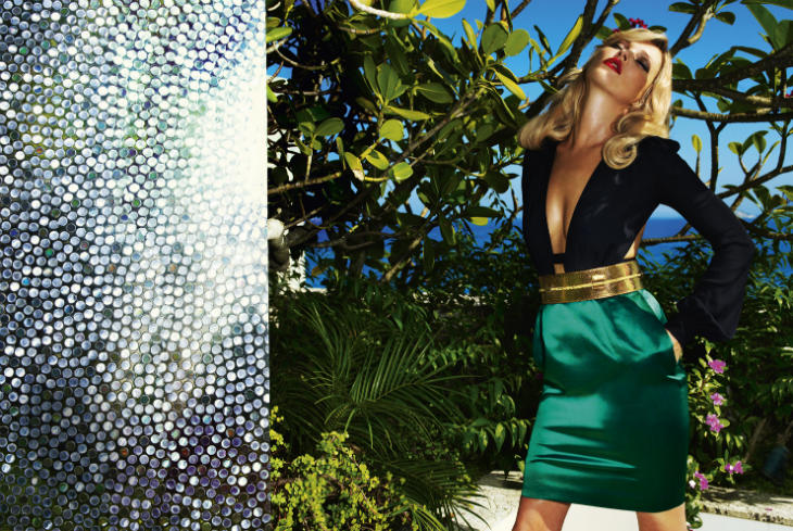
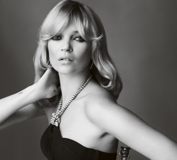
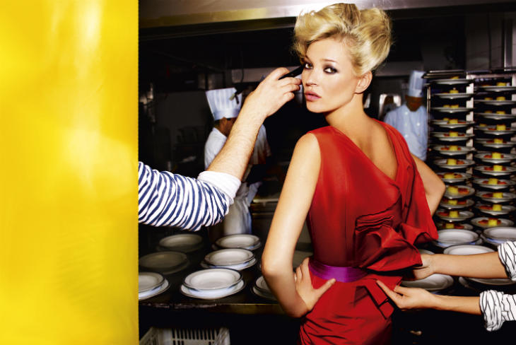
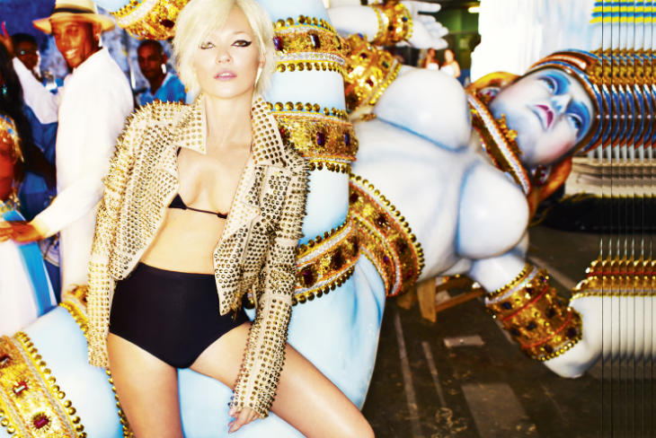
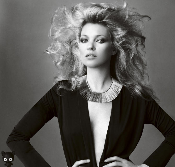
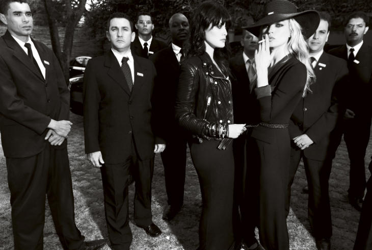
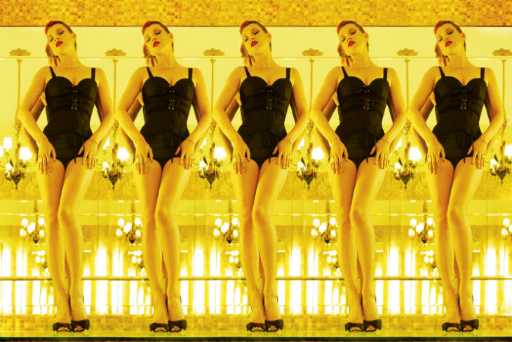
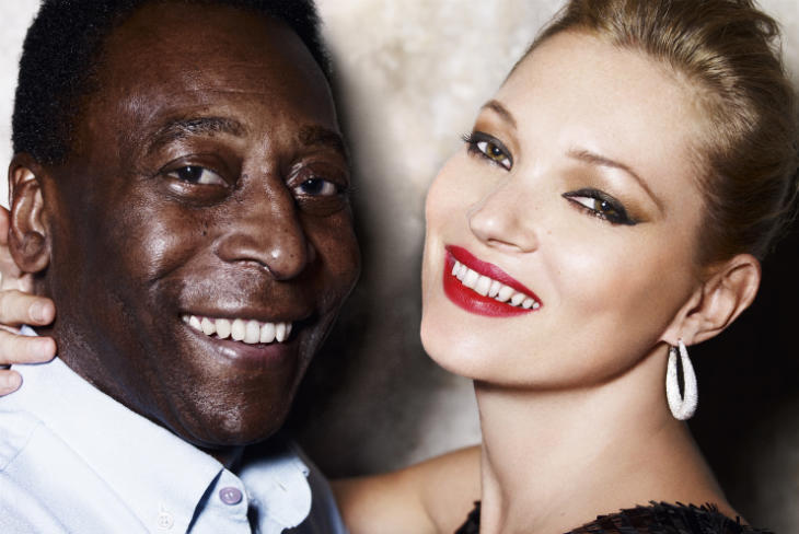
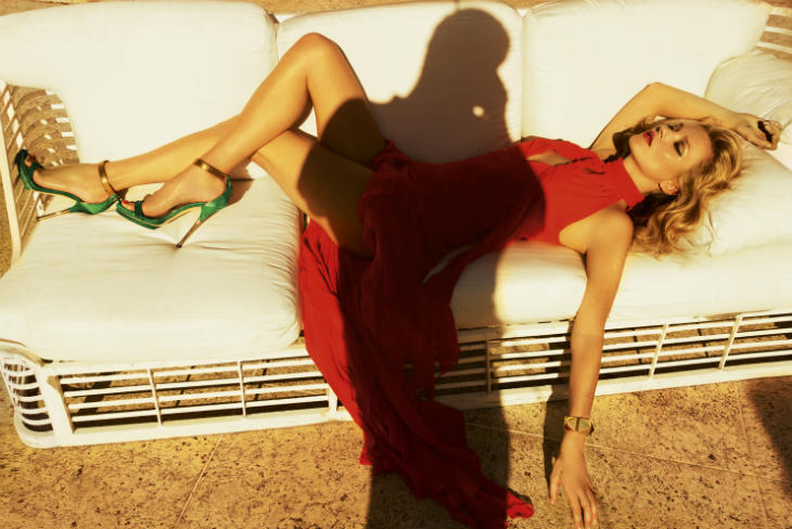
Kate Moss for Vogue Brazil May 2011 by Mario Testino
Recent Updates

Josephine Skriver’s Stunning Return to Vogue Scandinavia
Josephine Skriver takes center stage as the November 2024 digital cover star of Vogue Scandinavia. In images by Danish photographer ...

Akolde Meen Layers Up in Outerwear for Mojeh Magazine
In a recent issue of Mojeh Magazine, model Akolde Meen bundles up in voluminous outerwear for cold-weather chic. Photographer Andrew ...

Malaika Holmen Rocks the Fall Collections in Vogue Arabia
In the September 2024 issue of Vogue Arabia, Malaika Holmén steps out in style in images captured by David Roemer ...

Naomi Campbell Wows in Dolce & Gabbana for V Magazine
Naomi Campbell, the legendary face, graces not one but two covers of V Magazine’s Winter 2024 issue, V151. Shot by ...

Jana Julius Rocks Daring Beach Style in Numéro Netherlands
Photographer Stockton Johnson heads to the beach for the October 2024 issue of Numéro Netherlands. An editorial called Rebel Tide ...

Exclusive: Mathilda & Arifi by Jø Cheung in ‘I Went Dancing with My Sister’
Photographer Jø Cheung explores familial connections for FGR's most recent exclusive. Models Mathilda Forssbeck and Arifi star as two siblings ...


Some reason I was expecting something more from it if that makes sense.
Some reason I was expecting something more from it if that makes sense.
Whats up with that little plastic bear in that nice beauty shot?
The first picture after the cut is TERRIBLE… she looks like an alien, it’s too photoshopped, not even the background looks real, it’s as if all the elements were independent and they pasted them together :S yuck… the other pics are nice.
so true! it made me even not wanna look at the other photos!
The first picture after the cut is TERRIBLE… she looks like an alien, it’s too photoshopped, not even the background looks real, it’s as if all the elements were independent and they pasted them together :S yuck… the other pics are nice.
The first picture after the cut is TERRIBLE… she looks like an alien, it’s too photoshopped, not even the background looks real, it’s as if all the elements were independent and they pasted them together :S yuck… the other pics are nice.
i have a couple pictures that arent in your spread? i think there are more. hmmm….
i have a couple pictures that arent in your spread? i think there are more. hmmm….
Simplicity! 2gitanas
She doesn’t spark anymore! This isn’t that great!
used some photos from the site on this blog: http://crengux.wordpress.com/
gave the credit. Hope it’s okay(:.
Kate Moss by Mario Testino… this can never go wrong! Perfection!
XoXo
Plami
http://fashion-thrill.blogspot.com/
this is perfect 🙂 kate is perfect
I never get tired looking at her. she´s magical
I never get tired looking at her. she´s magical
The airbrushing in some of theses images is overkill… Kate is beautiful and doesn’t need such a heavy retouch.
The airbrushing in some of theses images is overkill… Kate is beautiful and doesn’t need such a heavy retouch.
The first picture with the red filter was AMAZING the rest blowwww!!!!!
kate will be always kate!
Rodrigo Santoro is the best part of Kate’s editorial!
Rodrigo Santoro is the best part of Kate’s editorial!