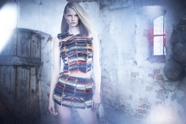
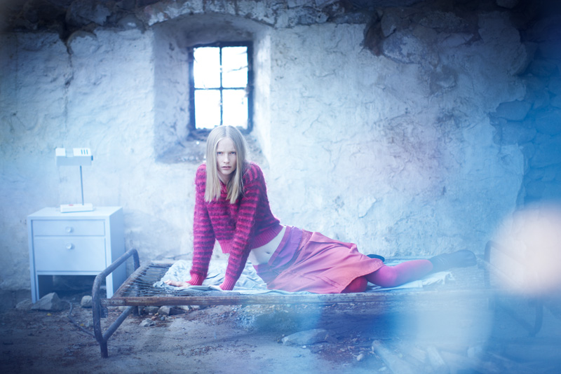
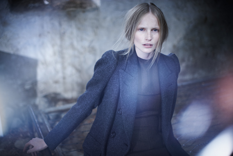
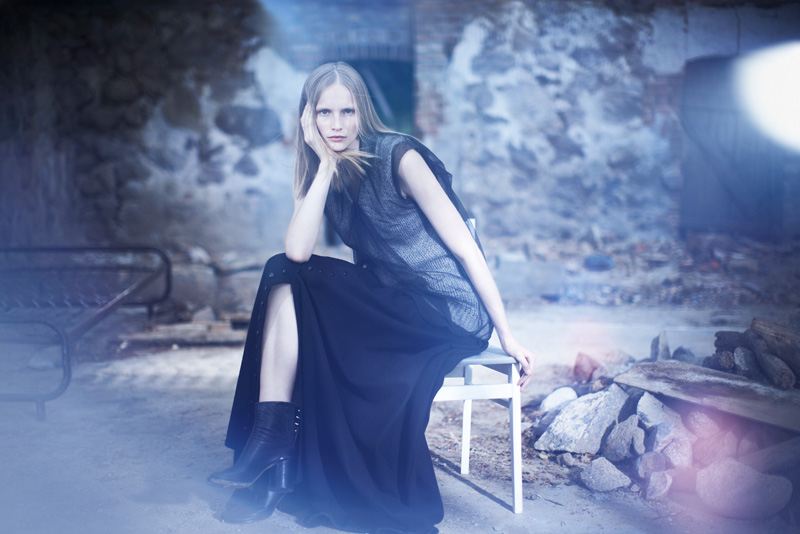
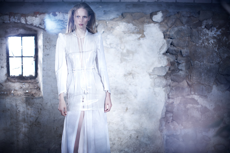
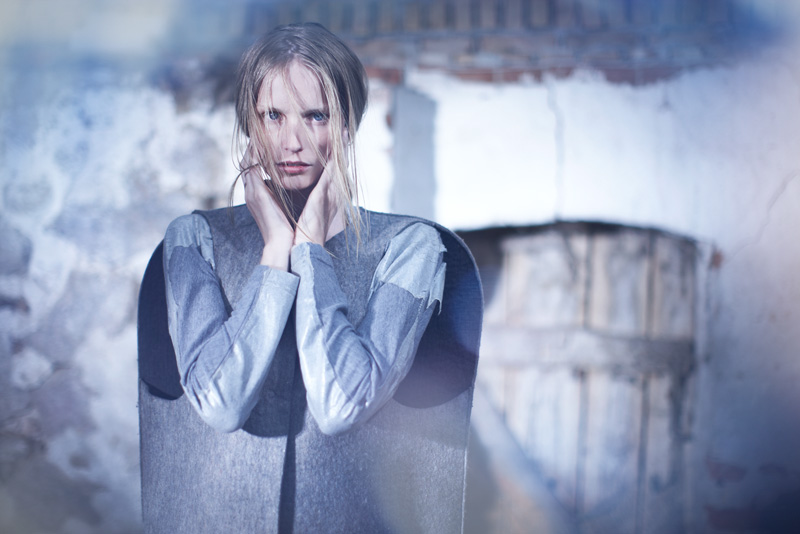
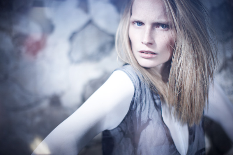
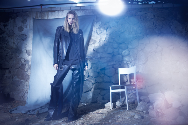
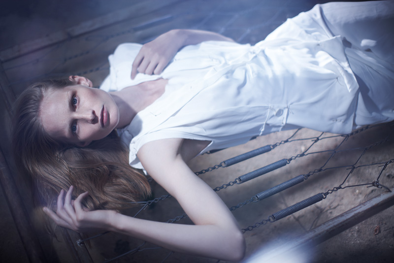
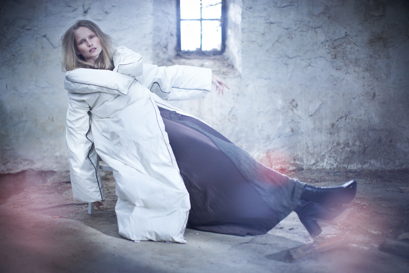
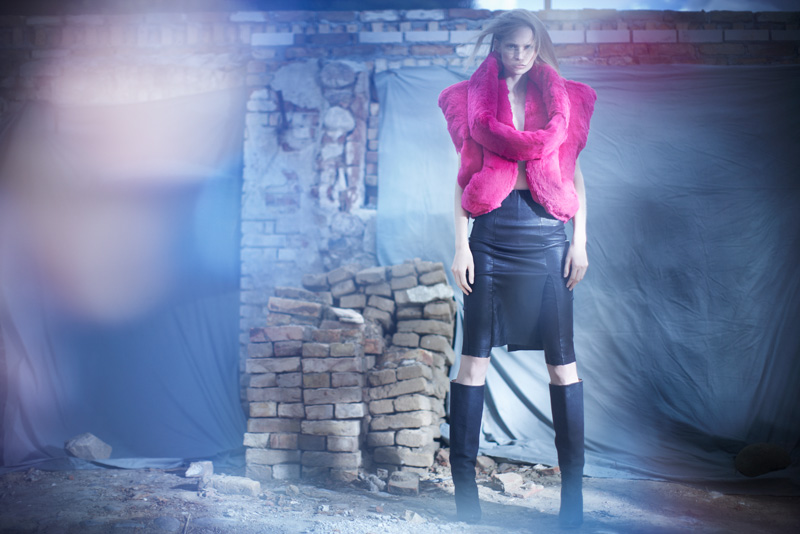
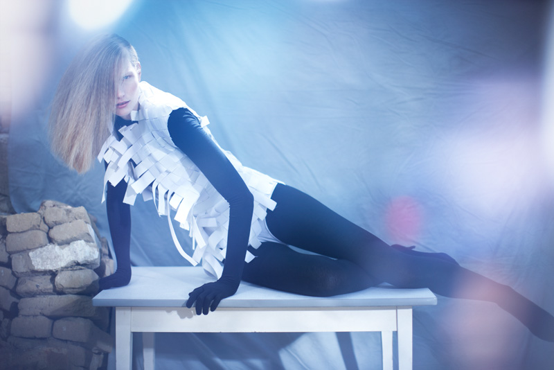
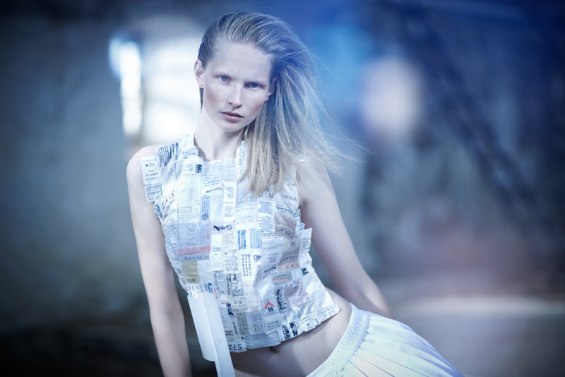
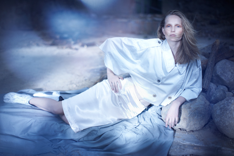
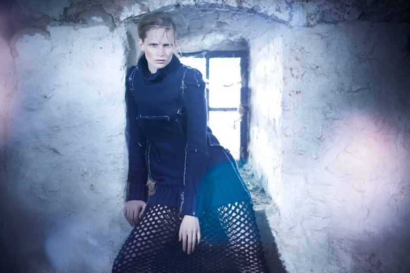
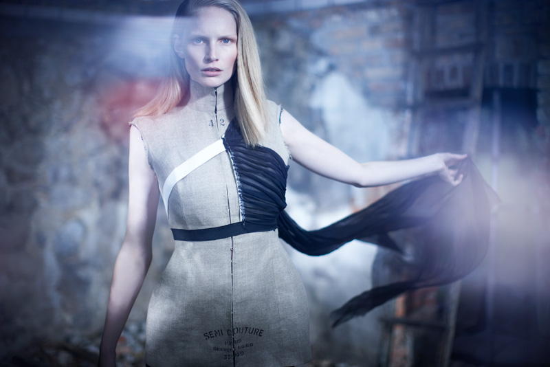
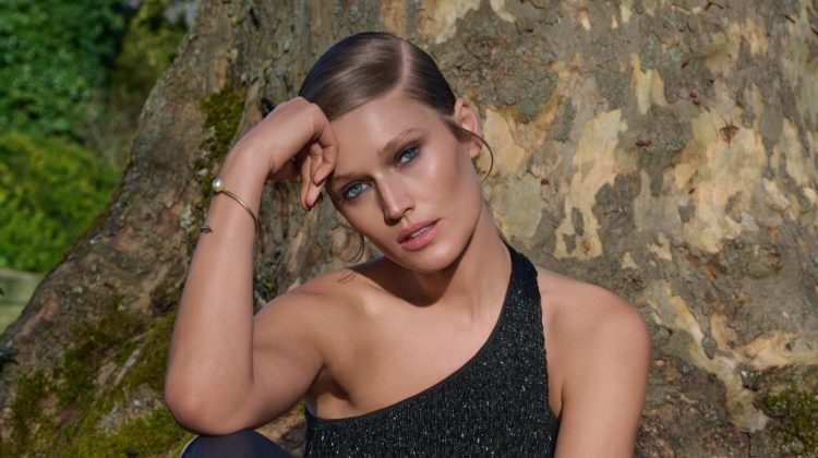
Capturing sixteen notable pieces from Maison Martin Margiela throughout the years, photographer Karel Kuehne brings a soft edge to the label’s conceptualized designs in September’s Quality Magazine. Styled by Jane Garber, model Katrin Thormann dons twenty-two years of Maison Martin Margiela in a rustic setting made of stone and wood.

I love MMM. fantastic.
I love MMM. fantastic.
Sweetheart needs to change that face up.
Nice series..I like that there are literally bricks in the “bricolage.” In regards to the previous comment, my experience is that editorials featuring various expressions tend to appear more dynamic to most view. However, not everybody thinks that way and many of us regard it as schizophrenic and contrived. In real life, people that change facial expressions and mood rapidly are always nuts. So I find it comforting when a model portrays a certain consistent manner between photographs in series. Of course, this is just my opinion and everyone is entitled to like whatever they want regardless of what I think lol
I understand what you mean, and usually I would agree with you. What bothers me about it in this instance is that while a similar expression can add to the continuity of the story, when said eyes are vacant, you might as well have a mannequin.
Also, as someone who is very expressive, but far from “nuts”, I find that statement a bit ridiculous. “Always” you say? Nothing is ever absolute.
how could a shoot featuring such outrageous clothes and such a great model turn out so boring?
Boring? Really?… take another look. This series is amazing… the lighting, the fashion, the mood… Does not get much better than this I think but of course we don’t all have to agree… Hats up is my comment. Great work.
Boring? Really?… take another look. This series is amazing… the lighting, the fashion, the mood… Does not get much better than this I think but of course we don’t all have to agree… Hats up is my comment. Great work.
how could a shoot featuring such outrageous clothes and such a great model turn out so boring?
how could a shoot featuring such outrageous clothes and such a great model turn out so boring?
it looks like a cheap catalogue for german client..
Margiela looks awesome!!! I love the dress-form-dress and that long white dress especially. What a dynamic setting and photography!
Love the lighting and setting, think it fits a Margiela retrospective quite well – more soft and poetic in comparison with that pin sharp glamour we see so much!
Rather beautiful than boring!
Love the lighting and setting, think it fits a Margiela retrospective quite well – more soft and poetic in comparison with that pin sharp glamour we see so much!
Rather beautiful than boring!
I love the setting.
boring
boring