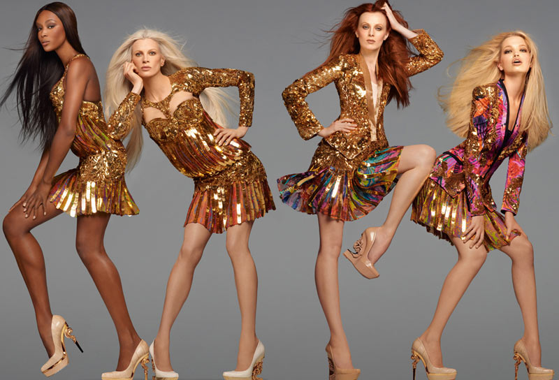
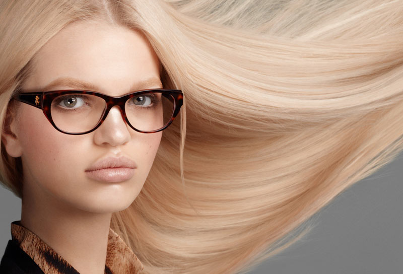
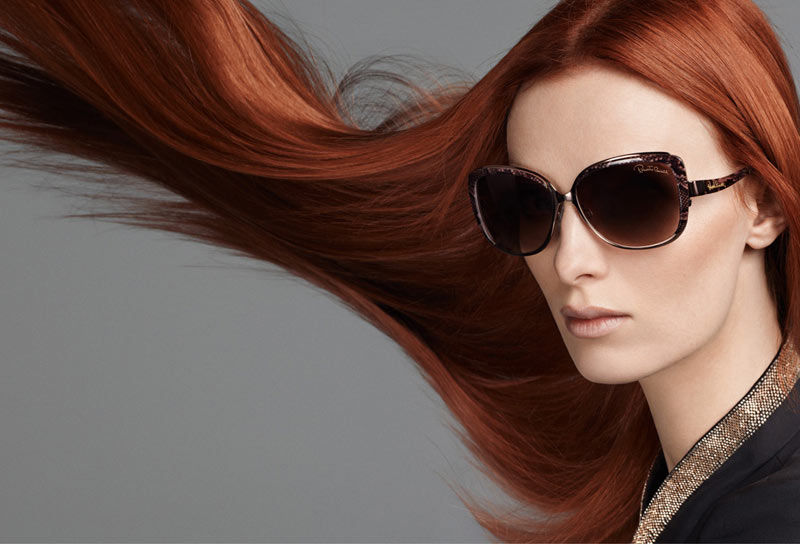
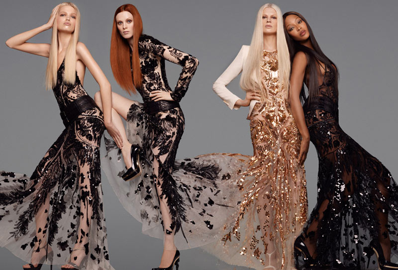
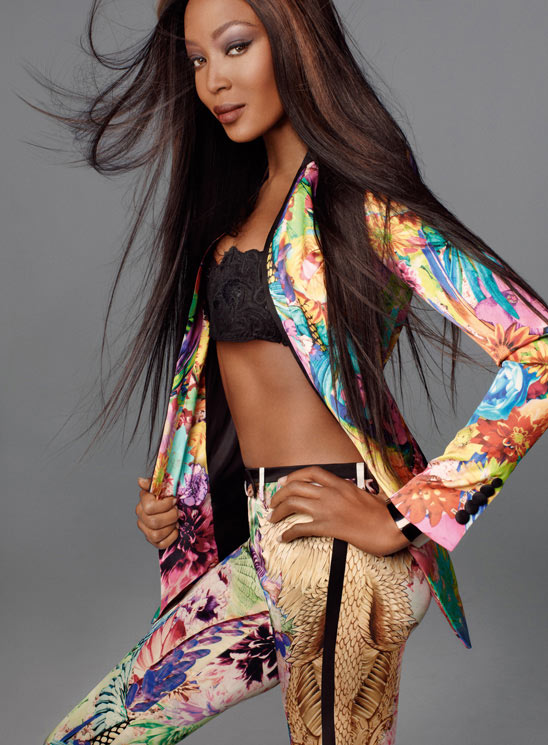
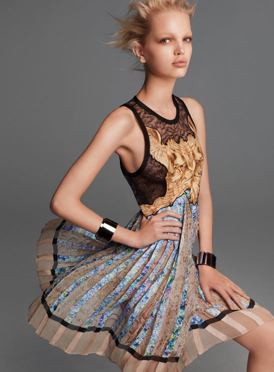
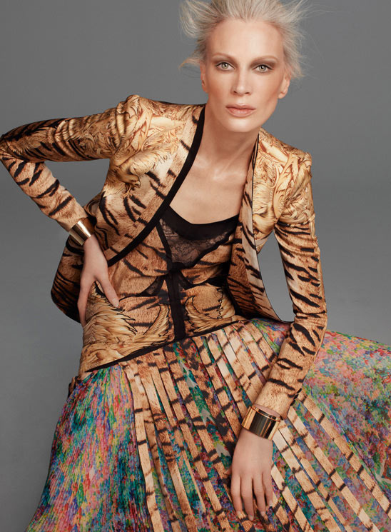
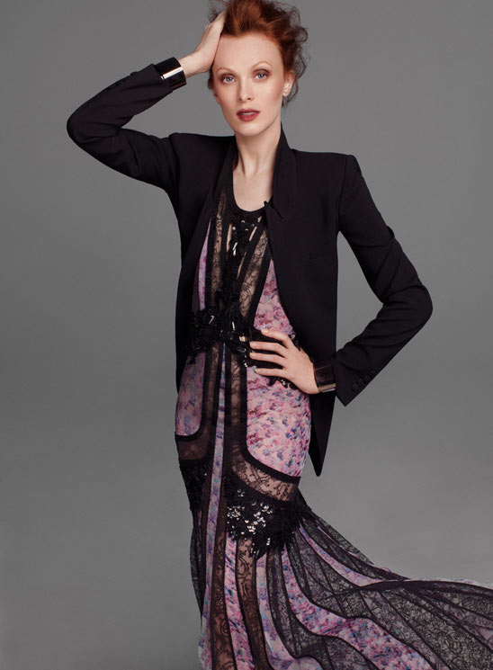
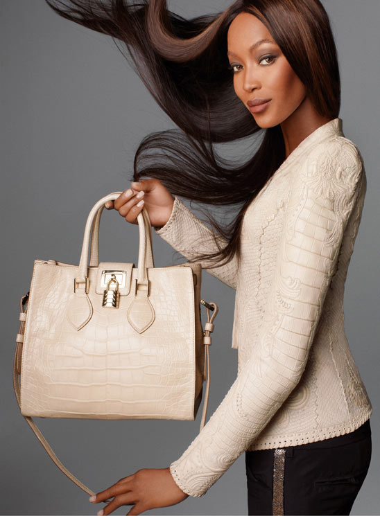
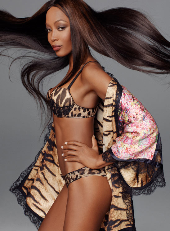
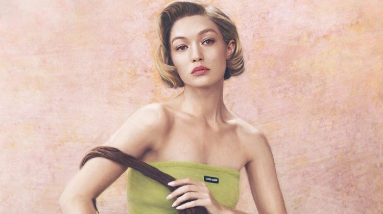
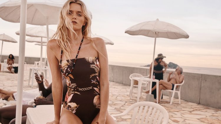
Super Spring – Roberto Cavalli enlists an all-star cast featuring Naomi Campbell, Karen Elson, Kristen McMenamy and Daphne Groeneveld for its spring 2012 campaign. Captured by Steven Meisel, the quartet sports Cavalli’s shimmering and colorful designs for the new season with windswept hair and understated makeup by Guido Palau and Pat McGrath. (Vogue Italia)



hmm
that’s what i thought after seeing this
that’s what i thought after seeing this
Daphne Groeneveld is an overrated looking troll, and ppl. need to stop hiring her! Replace her w/ Candice Swanepoel in this campaign.
The rest of the girls are looking great.
That’s unfair. She has her appeal– though I think it’s misplaced with these more seasoned players.
Daphne is fucking brilliant and if you’re gonna remark that she’s overused how bout suggesting someone besides Candice who is the most fucking overused model of the moment next to Karlie Kloss
by saying this you show you have no understanding about fashion and campaigns. Candice is a sweet young girl, why do you think she would fit here? oh wait, you don’t thnik, you just rush into judjing!
and by calling naomi and kristen “girls” you just prove you have no knowledge about what’s happening here!
naomi looks like she got bad plastic surgery
the strangest casting
Three veterans and then little Daphne- but she’s giving it, so good for her! As a side note, I think Daphne looks more like some sort of underwater creature rather than a troll, she’s the princess of Sea World.
well I’m never a fan of copycats. And this is a BLATENT Versace/Avedon rip off! (a very cheap one at that). pity to Cavalli and Meisel for being copycats. Only good thing here is Queen Naomi.
love it, especially when they are all in a row, reminds me of iconic campaigns from 80s sand 90s. Very weird choice for Daphne, she isnt a Super, nor is she really known outside the fashion world. if going for a blonde Anja Rubik or Doutzen Kroes would be perfect.
bad. looks so awkward
the grey smooth background ruins it even more. The cringeworthy fashion does not help. Not a patch on that great US 90’s Vogue editorial with Carla, Cindy, Claudia, Stephanie etc or Versace by Avedon. Only Kirsten for me has some inspiration here.
Naomi’s face is the same in each individual shot, no range at all!
The group photo with the black dresses looks incredibly awkward.
As usual maximum photoshopping. Except for Karen Elson, all the rest look like crap. Not that they ever looked differently. Naomi is almost bald and everyone knows that. Not to say that she belongs to a mental institution or behind bars.
Okay I can understand being critical to a point, but some of you are just plain rude.
<3<3<3
XoXoPlamihttp://www.fashionthrill.com/
Rip off of Avedon Versace 1990’s and very poorly done…
trying to be Avedon, Mr Meisel????