
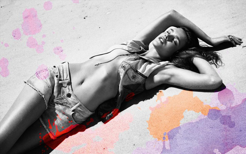
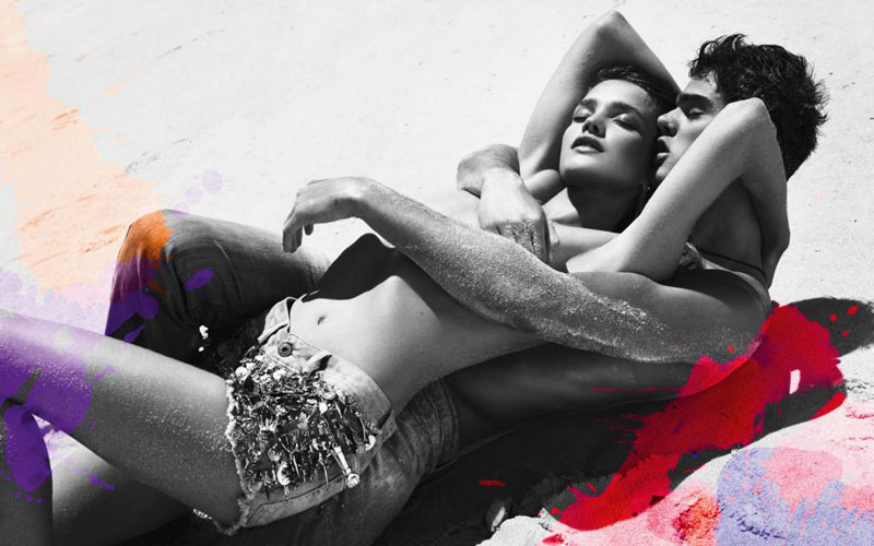
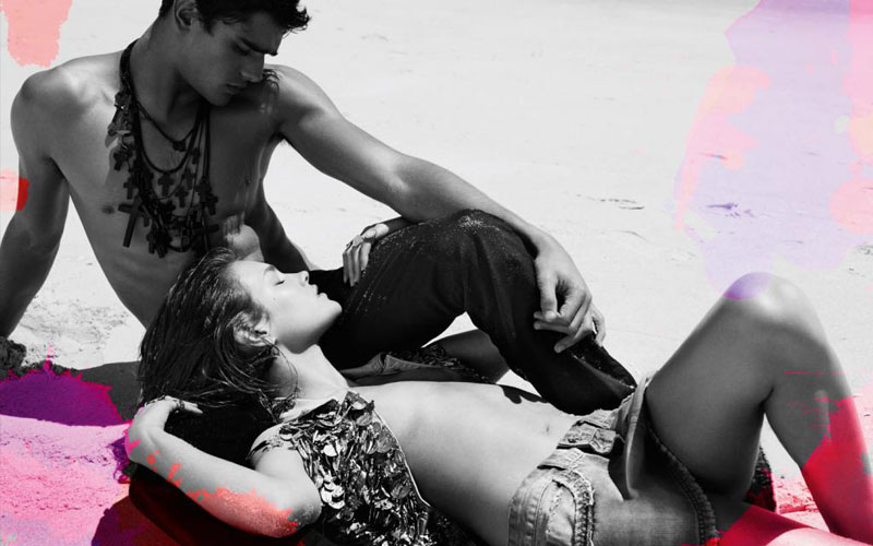
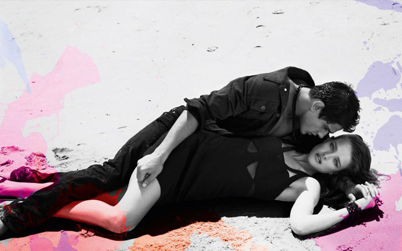
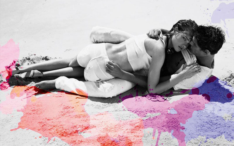
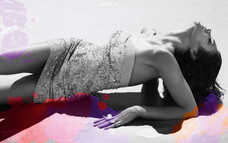
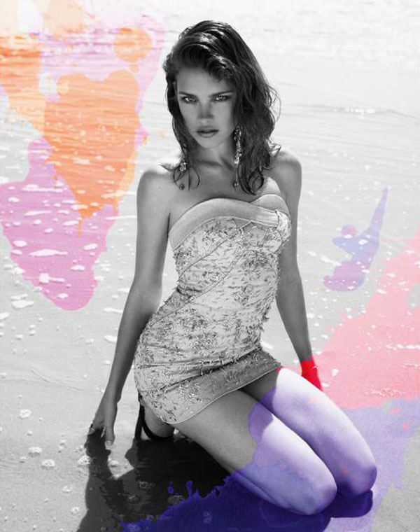
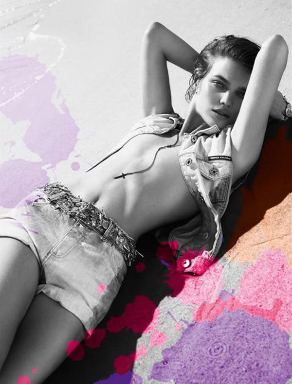
From one top model to the next, Forum enlists Russian beauty Natalia Vodianova to model their spring range. Joined by Marlon Teixeira, Natalia gets down and dirty in the sand with these black white images photographed by Mert & Marcus.
source | TFS

Black and white photos with photoshop free paint brushes you can get off the net??
An amateur student could shoot this!
Black and white photos with photoshop free paint brushes you can get off the net??
An amateur student could shoot this!
God, she's beautiful, and sexy. I love Natalia and this blog (:
G.
God, she's beautiful, and sexy. I love Natalia and this blog (:
G.
She's perfect for this campaign.
She's perfect for this campaign.
i think if they stayed only contrast b/w photos will be great
i think if they stayed only contrast b/w photos will be great
lighting is good so amateur student might not be able to shoot these.its not that easy that you might think.
lighting is good so amateur student might not be able to shoot these.its not that easy that you might think.
Just too gorgeous! Such a young and beautiful vibe. The paint splashes though , very reminiscent of an old DVF campaign no? Too similar I might say since that was fronted by Natalia too.
Just too gorgeous! Such a young and beautiful vibe. The paint splashes though , very reminiscent of an old DVF campaign no? Too similar I might say since that was fronted by Natalia too.
OMFG I LOVE THIS!!!!! great post
?leonie
http://www.monstrexi.com
OMFG I LOVE THIS!!!!! great post
?leonie
http://www.monstrexi.com
I find this boring and amateur as well. Not impressed at all. I love Natalia, but this is… lackluster.
I find this boring and amateur as well. Not impressed at all. I love Natalia, but this is… lackluster.
these are fab pictures and natalia is doing a great job, she is stunning
vasilieva http://elenavasilieva.blogspot.com/
xx
these are fab pictures and natalia is doing a great job, she is stunning
vasilieva http://elenavasilieva.blogspot.com/
xx
Love the intimacy.
Love the intimacy.
Totally agree, this is so stylized its sick. check out this charlierubinphoto.com/mixed
Totally agree, this is so stylized its sick. check out this charlierubinphoto.com/mixed
I agree with the people at the top…
At least make cool water color effects…
xoxoxo
Louise Petit
http://lepetitpetit.blogspot.com/