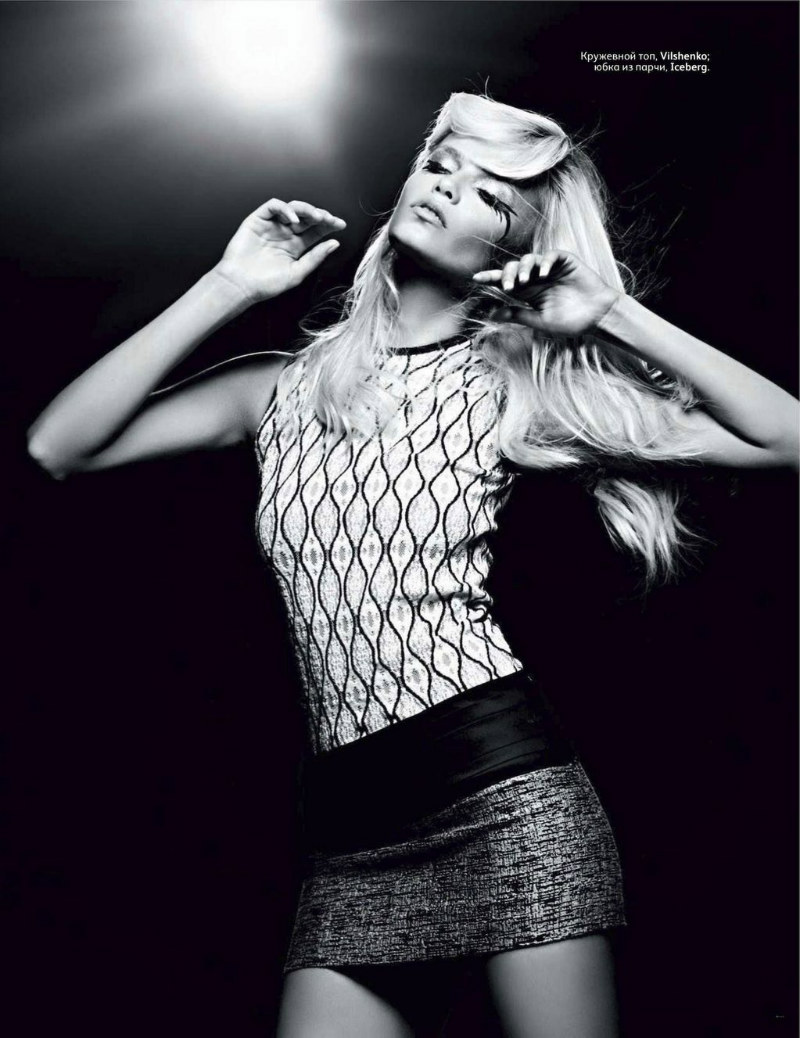
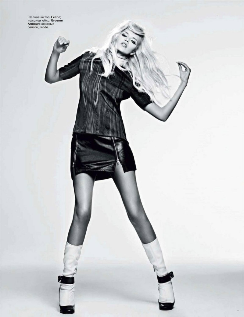
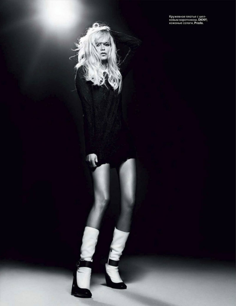
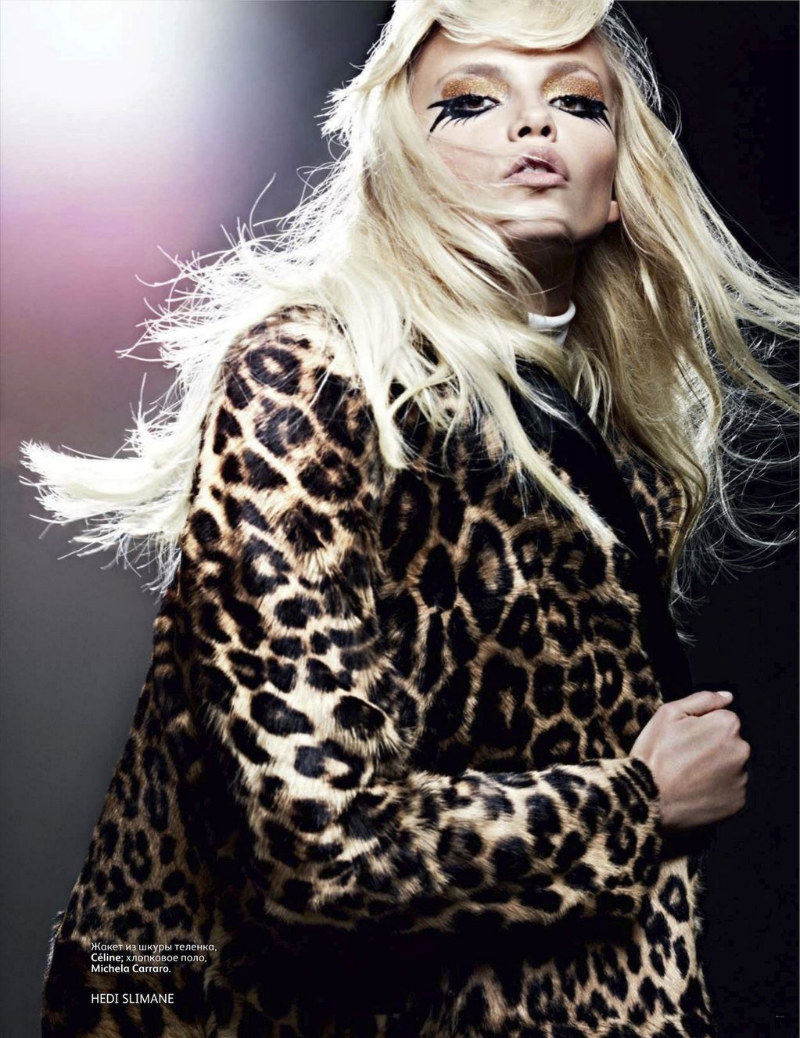
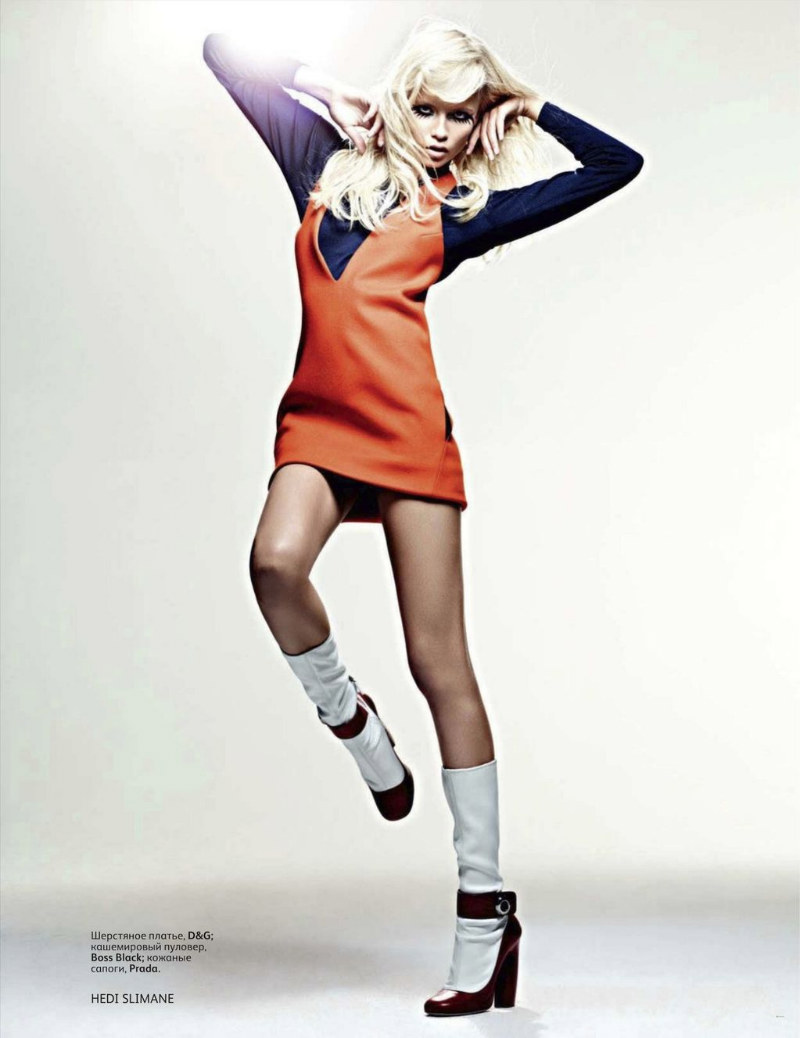
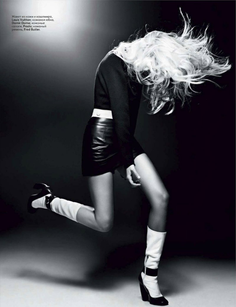
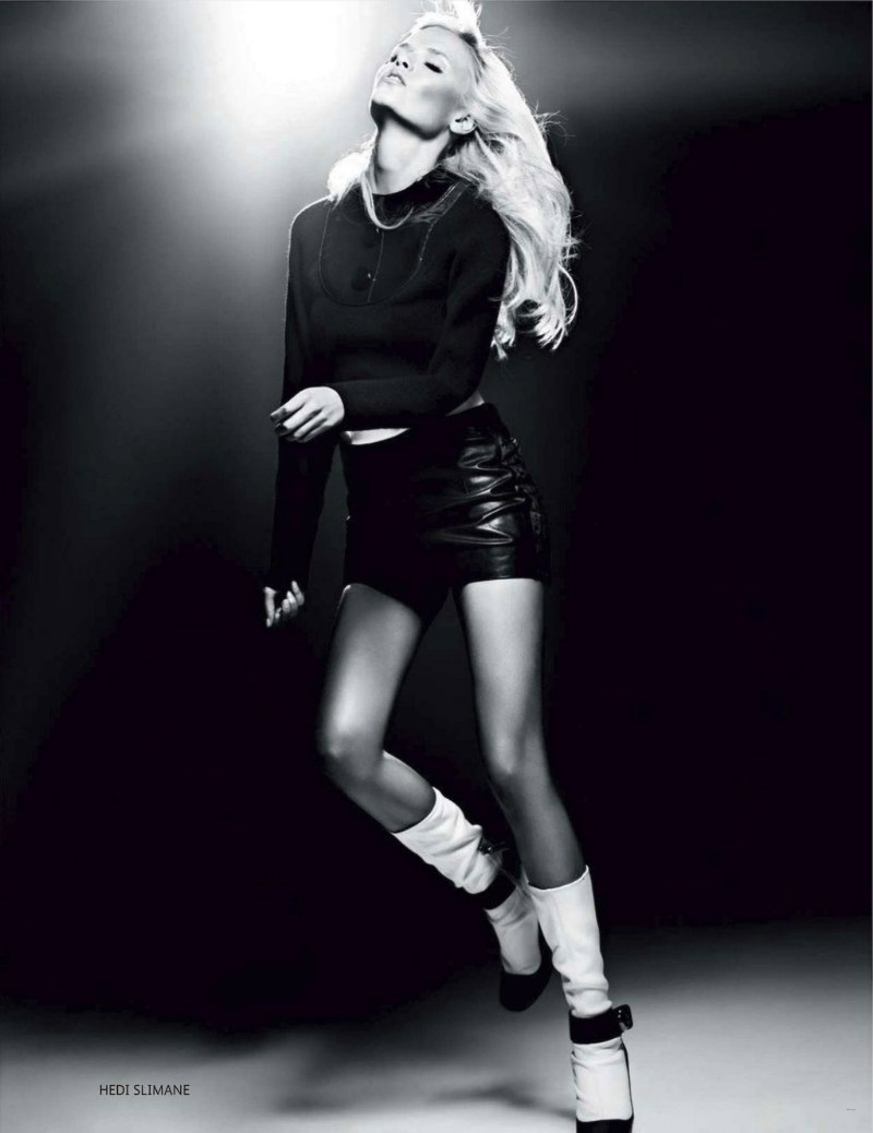
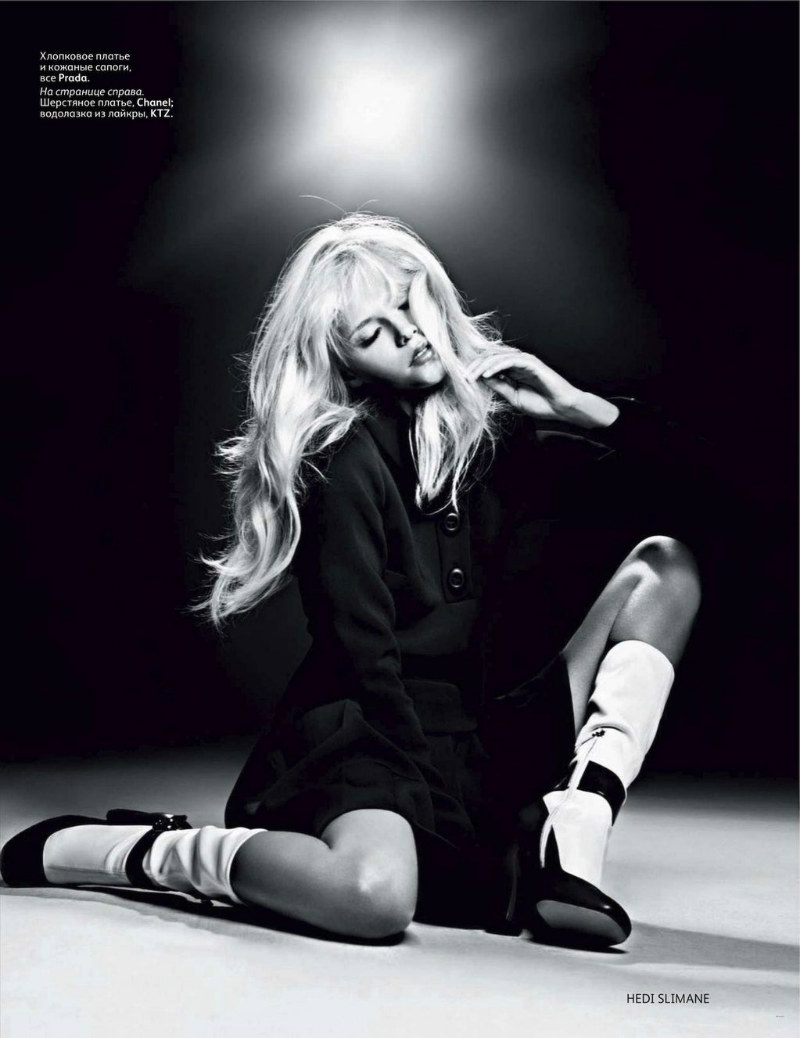
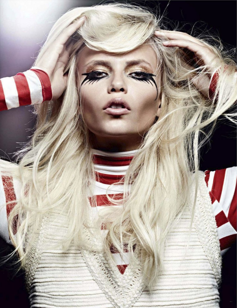
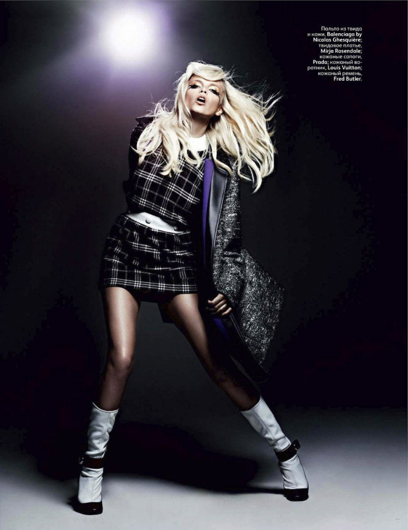
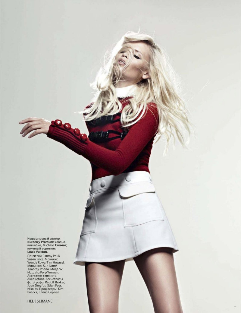
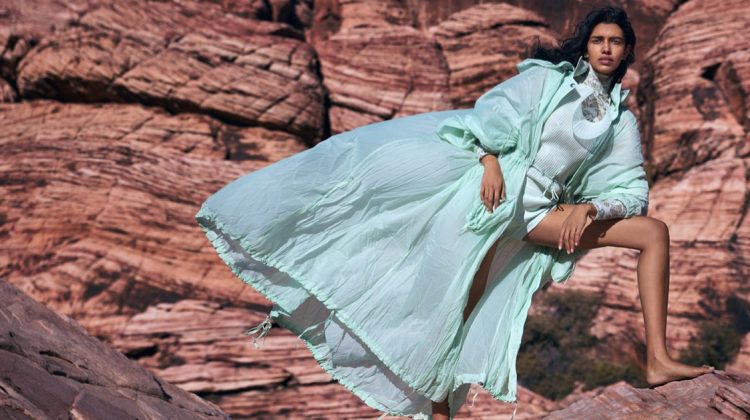
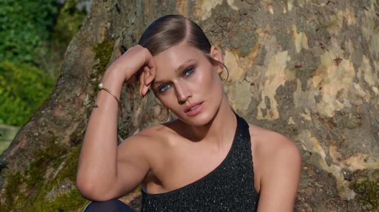
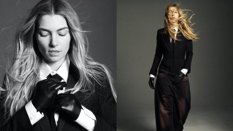
It’s a Mod World – Natasha Poly is a mad mod beauty in these images for Vogue Russia’s September issue. Lensed by Hedi Slimane and styled by Sarah Richardson, Natasha lets loose in looks from Céline, Prada, DKNY, Vilshenko, Iceberg, D&G, Louis Vuitton, Damir Doma, Chanel, Balenciaga by Nicolas Ghesquière, Burberry Prorsum and others.
Cover

source | visualoptimism @ TFS


I’m diggin it.
I’m diggin it.
I’m diggin it.
The b&w ones are nice, I don’t really like the color ones and I think she looks pretty crazed on the cover- she’s doing that weird Kate Moss lazy eye pose. Natasha can move though.
The b&w ones are nice, I don’t really like the color ones and I think she looks pretty crazed on the cover- she’s doing that weird Kate Moss lazy eye pose. Natasha can move though.
The b&w ones are nice, I don’t really like the color ones and I think she looks pretty crazed on the cover- she’s doing that weird Kate Moss lazy eye pose. Natasha can move though.
She’s so glamorous! I love this photos!
XoXoPlami http://fashion-thrill.blogspot.com/
I can’t decide who’s better: Hedi Slimane behind the camera or holding a pencil making designs.
http://www.kittenmasks.com
I can’t decide who’s better: Hedi Slimane behind the camera or holding a pencil making designs.
http://www.kittenmasks.com
wow a natasha poly sighting!
Alas this site just doesn’t work for me. Rarely do the images show. The art director at work hasn’t been able to get this site on his computer for days??? Is anyone else having this problem?
I’ve been having problems too for a couple of days. Hopefully just site maintenance.
I’ve been having problems too for a couple of days. Hopefully just site maintenance.
I’ve been having problems too for a couple of days. Hopefully just site maintenance.
I’ve been having problems too for a couple of days. Hopefully just site maintenance.
me too
I’ve been having problems as well but looks like it’s fixed. I thought it was just me!
I’ve been having problems too for a couple of days. Hopefully just site maintenance.
I’ve been having problems too for a couple of days. Hopefully just site maintenance.
I’ve been having problems too for a couple of days. Hopefully just site maintenance.
I’ve been having problems too for a couple of days. Hopefully just site maintenance.
I’ve been having problems too for a couple of days. Hopefully just site maintenance.
I’ve been having problems too for a couple of days. Hopefully just site maintenance.
I’ve been having problems too for a couple of days. Hopefully just site maintenance.
I’ve been having problems too for a couple of days. Hopefully just site maintenance.
I’ve been having problems too for a couple of days. Hopefully just site maintenance.
I’ve been having problems too for a couple of days. Hopefully just site maintenance.
I’ve been having problems too for a couple of days. Hopefully just site maintenance.
I’ve been having problems too for a couple of days. Hopefully just site maintenance.
I’ve been having problems too for a couple of days. Hopefully just site maintenance.
I’ve been having problems too for a couple of days. Hopefully just site maintenance.
I’m on a Mac at home and now, but have been desk-surfing at the office all week on PCs. I can’t even come to this site on the PCs as it won’t load and effs up the rest of my Explorer tabs.
Also, the social media floating window to the right??? On the PCs it covers the comments, no matter what I do.
Much trouble!
That black and gold makeup looks really out of place, but Natasha is amazing and makes it look good anyway!
Your one year free trial webhosting has arrived at,please check it…..
I think what’s keeping me from loving this is the repetitive proportions of the outfits.
i love everything but styling….
love everything but styling is not great…
I like it. 🙂
http://tinyurl.com/3rrlaen
I LOVE Natasha! Adding this to my FB page right now!
http://fashionbreed.org
no like!
well, what dso you guys expect when the editor-in-chief changes last autumn, this one is a horrible tasteful one!
Well what do you expect guys, the editor – in – chief has changed last autumn so the new one is horrible and tasteless one!