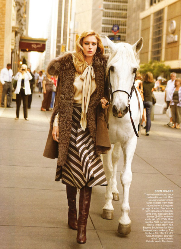
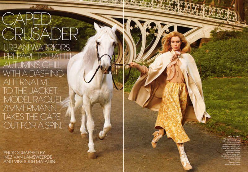
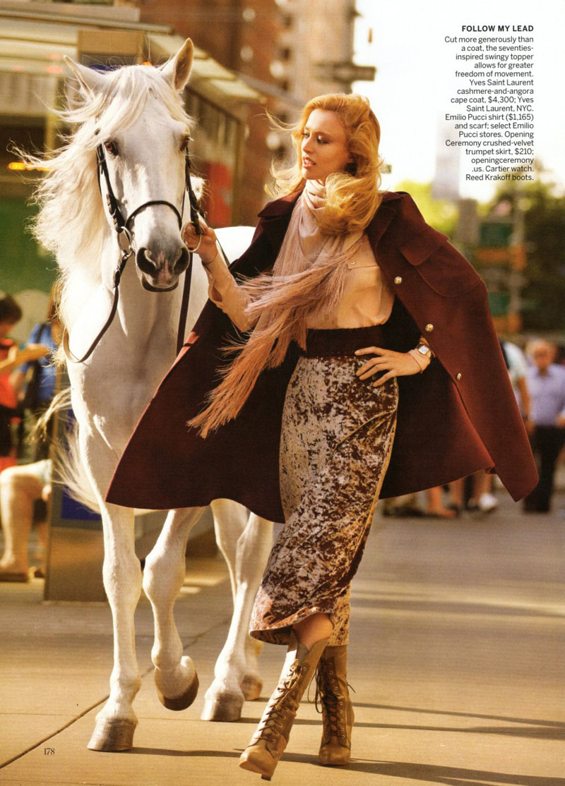
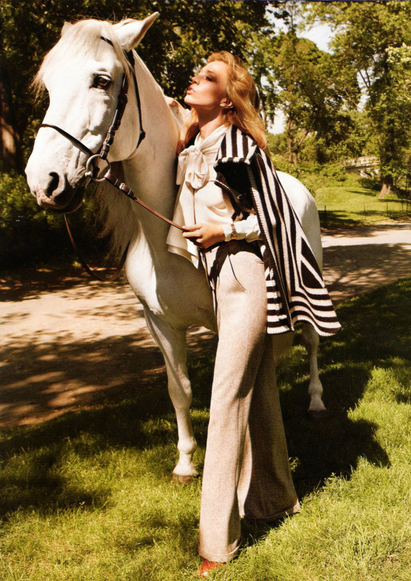
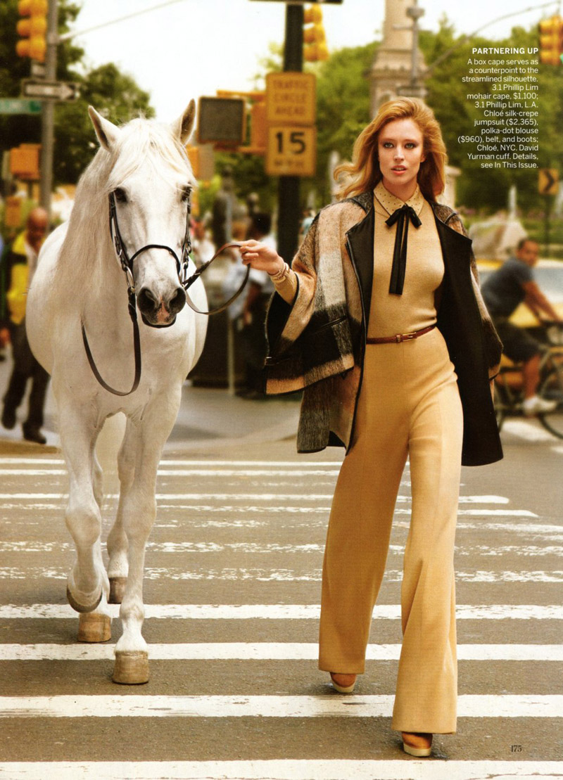
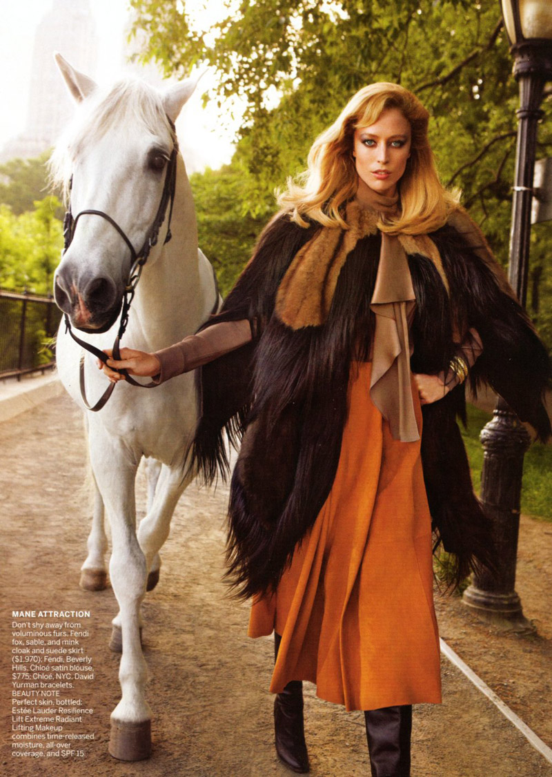
Today has been the day of the Zimmermann–Raquel Zimmermann that is. From appearances in Gucci campaigns, and now Vogue US August, Raquel continues to be one of our favorite Brazilian stunners. Lensed by Inez van Lamsweerde and Vinoodh Matadin, Raquel wanders the streets of New York with an equine companion in tow. Wearing pieces from Chloe, Yves Saint Laurent and Marc Jacobs, Raquel shines in the elegant stylings of Marie-Amelie Sauvé with The Cape Crusader.


wow, she's actually a stunner!
wow, she's actually a stunner!
wow, she's actually a stunner!
I'm sorry, but I think the horse looks better than her 🙂
nice styling though
I'm sorry, but I think the horse looks better than her 🙂
nice styling though
I'm sorry, but I think the horse looks better than her 🙂
nice styling though
Snoozefest.
Snoozefest.
Snoozefest.
i always thought raquel looked like a horse HAHA
aaahahhhahahhaahahhahahahaahhahahahahahahah, lol epic.
what is this, 4chan?
no…just thought that comment was funny
I agree, she is very horsey.
She reminds me of Princess Anne. Once you see it, you can't un-see it.
I agree, she is very horsey.
She reminds me of Princess Anne. Once you see it, you can't un-see it.
no…just thought that comment was funny
what is this, 4chan?
aaahahhhahahhaahahhahahahaahhahahahahahahah, lol epic.
hahaha you're so right
hahaha you're so right
i always thought raquel looked like a horse HAHA
i always thought raquel looked like a horse HAHA
aaahahhhahahhaahahhahahahaahhahahahahahahah, lol epic.
what is this, 4chan?
no…just thought that comment was funny
I agree, she is very horsey.
She reminds me of Princess Anne. Once you see it, you can't un-see it.
hahaha you're so right
styling is very one-note. I understand consistency but the silhouette is one note. as if all of the pieces can be completely interchanged without making any difference. And I love the second shot with everyone in the background staring and that one woman taking pictures.
http://collaborationetc.wordpress.com/
i love the Chloe look, so classic. the horse is great!!!
i love the Chloe look, so classic. the horse is great!!!
i love ollie the horse.
i love ollie the horse.
I'll never tire of seeing Raquel
I'll never tire of seeing Raquel
I'll never tire of seeing Raquel
she's gorgeous. these looks get me excited for fall fashion…
http://style-haus.blogspot.com/
she's gorgeous. these looks get me excited for fall fashion…
http://style-haus.blogspot.com/
she's gorgeous. these looks get me excited for fall fashion…
http://style-haus.blogspot.com/
Sorry to be one of ‘those’ people, but I’m not loving all the fur in this… if Chanel can go faux, surely the other houses can follow their lead ..
Sorry to be one of ‘those’ people, but I’m not loving all the fur in this… if Chanel can go faux, surely the other houses can follow their lead ..
Sorry to be one of ‘those’ people, but I’m not loving all the fur in this… if Chanel can go faux, surely the other houses can follow their lead ..
why can't she be on the horse or something? and the woman taking a picture in the second photo kind of ruins it.
why can't she be on the horse or something? and the woman taking a picture in the second photo kind of ruins it.
why can't she be on the horse or something? and the woman taking a picture in the second photo kind of ruins it.
This campaign looks so "old'!
This campaign looks so "old'!
This campaign looks so "old'!
She's so gorgeous with that horse, love the lyrical text starting with caped crusader 😀
She's so gorgeous with that horse, love the lyrical text starting with caped crusader 😀
Raquel is so glamourous!!!!
check out our fashion and lifestyle blog The Mint's Tint
Raquel is so glamourous!!!!
check out our fashion and lifestyle blog The Mint's Tint
Raquel is so glamourous!!!!
check out our fashion and lifestyle blog The Mint's Tint
BOOOOOORING
BOOOOOORING
This is boring because, once again, we find a subject in an editorial that may actually be a human being whose living and breathing somewhere. It throws the viewer off because we've come to appreciate the fact that most of the work being shot these days employs mannequins. Very lifelike mannequins. But mannequins nonetheless. There's also life happening behind her and around her, which is distracting. It would be much better to shoot this against a white backdrop, where she can pose freely and make faces that one would decipher as early onset of insanity and suggest a shrink to boot. Too many no-nos: Model looking human; model interacting with another living thing; model surrounded by other living beings (passerby).
This is boring because, once again, we find a subject in an editorial that may actually be a human being whose living and breathing somewhere. It throws the viewer off because we've come to appreciate the fact that most of the work being shot these days employs mannequins. Very lifelike mannequins. But mannequins nonetheless. There's also life happening behind her and around her, which is distracting. It would be much better to shoot this against a white backdrop, where she can pose freely and make faces that one would decipher as early onset of insanity and suggest a shrink to boot. Too many no-nos: Model looking human; model interacting with another living thing; model surrounded by other living beings (passerby).
This is boring because, once again, we find a subject in an editorial that may actually be a human being whose living and breathing somewhere. It throws the viewer off because we've come to appreciate the fact that most of the work being shot these days employs mannequins. Very lifelike mannequins. But mannequins nonetheless. There's also life happening behind her and around her, which is distracting. It would be much better to shoot this against a white backdrop, where she can pose freely and make faces that one would decipher as early onset of insanity and suggest a shrink to boot. Too many no-nos: Model looking human; model interacting with another living thing; model surrounded by other living beings (passerby).
I love the Chloé look too but I'm extremely bored of the Raquel in Chloé look and editorials of this persuasion..it's all starting to blur together to be honest.
I love the Chloé look too but I'm extremely bored of the Raquel in Chloé look and editorials of this persuasion..it's all starting to blur together to be honest.
I love the Chloé look too but I'm extremely bored of the Raquel in Chloé look and editorials of this persuasion..it's all starting to blur together to be honest.
The horse is so not into her.
The horse is so not into her.
The horse is so not into her.