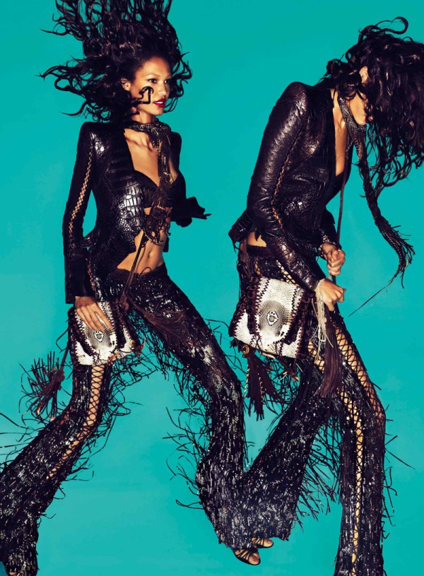
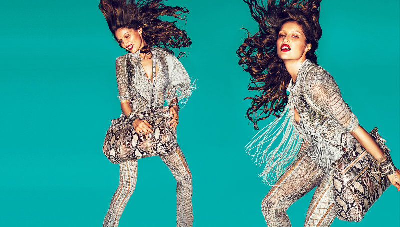
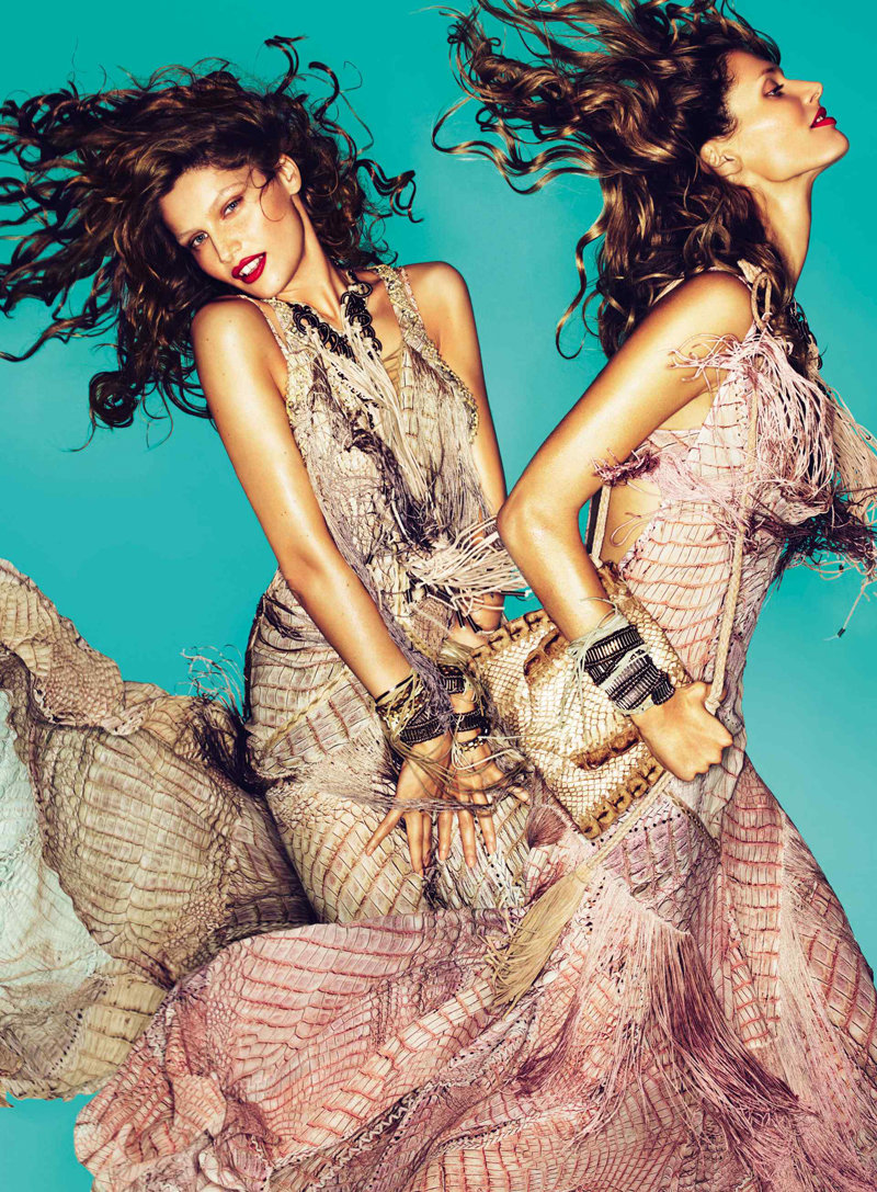
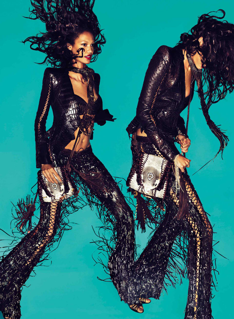
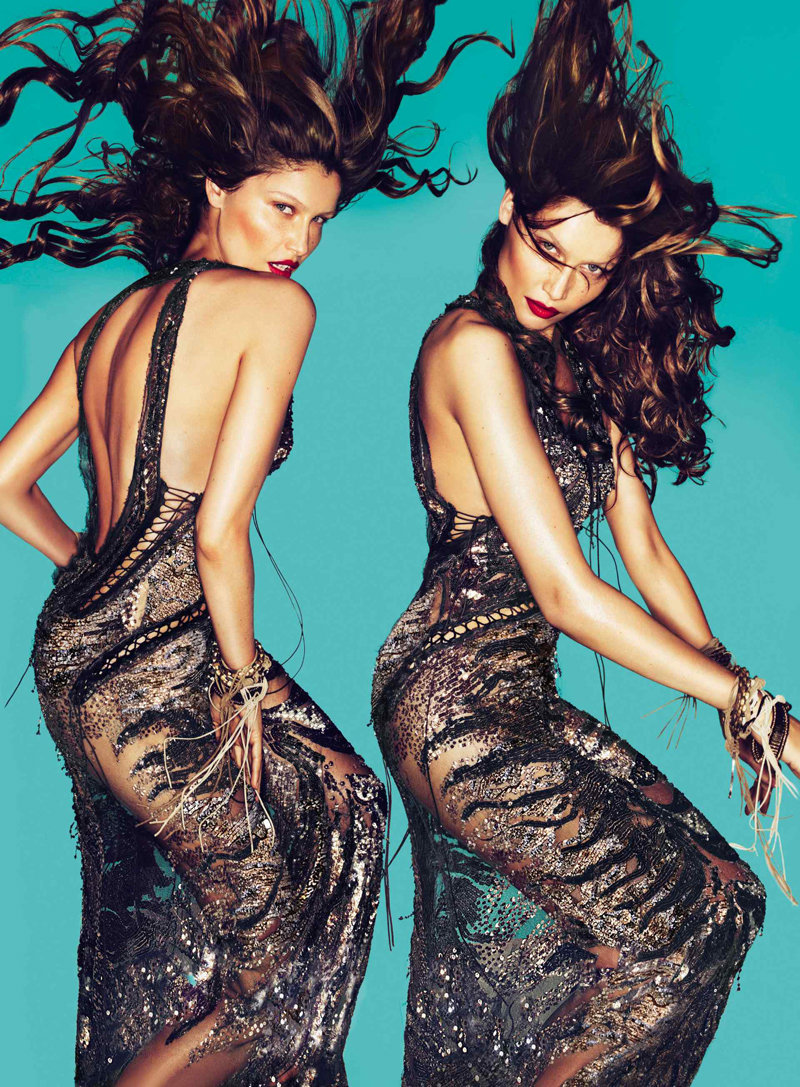
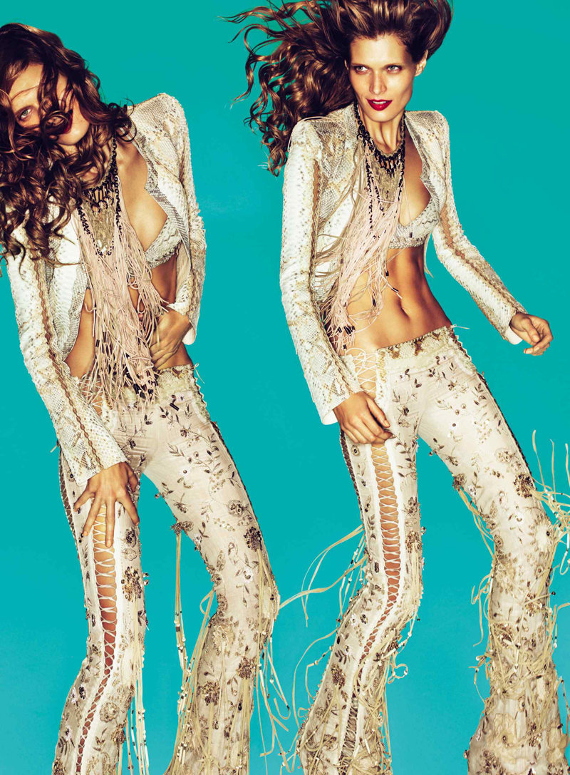
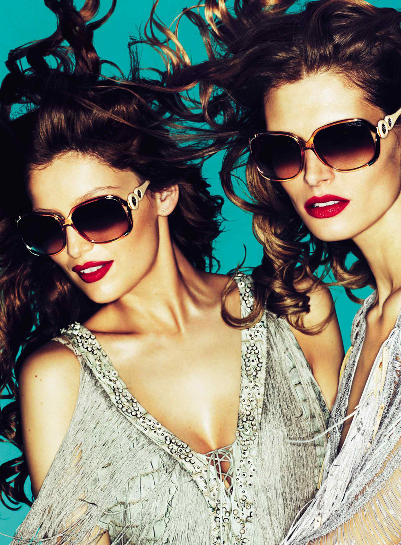
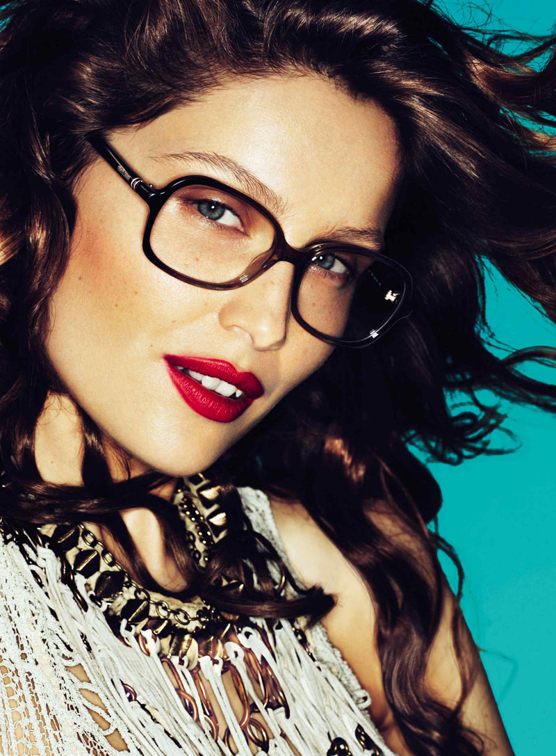
Following up the release of Just Cavalli, Roberto Cavalli’s spring 2011 mainline campaign appears online with models Laetitia Casta, Joan Smalls and Malgosia Bela rocking out in front of a vibrant turquoise backdrop. Photographed by Mert & Marcus, the trio sports fringe, leather and the signature Cavalli prints.


Am a teensy bit skeptic…but I think it turned out good! And the models look great.
Am a teensy bit skeptic…but I think it turned out good! And the models look great.
Am a teensy bit skeptic…but I think it turned out good! And the models look great.
perhaps the best part about this is the use of blue negative space and the doubling of images. fucking love it.
perhaps the best part about this is the use of blue negative space and the doubling of images. fucking love it.
am absolutely LOVING this! Esp Laetitia and Joan! High energy, fun movement, and simple negative space. Love the color scheme, too. A+ for me.
am absolutely LOVING this! Esp Laetitia and Joan! High energy, fun movement, and simple negative space. Love the color scheme, too. A+ for me.
yes, this is fierce
Love all of it except for the clothes, Cavalli is not my thing.
Took the words right out of my mouth!
joan takes a lot of photo this season!
so unstoppable!
i love joan,i really do but i’m beginning to get worried.Her career is too dependent on Mert and Marcus.What if she runs out of favors with them,then what? I think she should try and diversify.
it isn’t a wearable collection, but i like it very much
http://www.mewmew-angelica.blogspot.com
I like this a lot!! great models!! Malgosia is everywhere this season, i´m so glad!!
Love this! Very strong!
But either i’ve seen this before (likely enough scenario) and forgot that i have, or this is very similar to another campaign.
It’s not bad, but nothing really interesting. ~
Even though I absolutely LOATHED this collection, the ad campaign is better than anything Cavalli has done lately. Remember that TAN mess that was Fall 2010? Gross.
I do like the blue. Very nice contrast with (trashy) 70’s clothes.
Even though I absolutely LOATHED this collection, the ad campaign is better than anything Cavalli has done lately. Remember that TAN mess that was Fall 2010? Gross.
I do like the blue. Very nice contrast with (trashy) 70’s clothes.
very sexy, and blocking with the background, new, nice!
Laetitia is absolutely flawless.
this campaing is a big shit! with this dresses, you can do a lot of cool things! but this blu background is very ugly!
I don’t lilke!