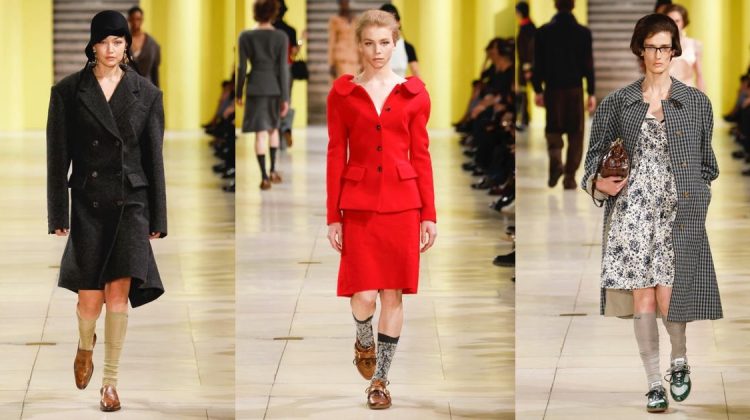
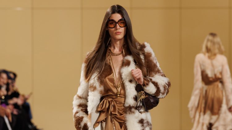
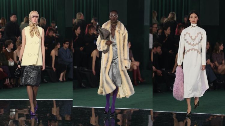
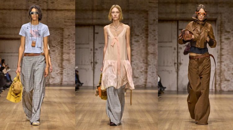
13 thoughts on “Rodarte Spring 2012 | New York Fashion Week”
I pretty much love it all!
Sooo happy Vlada was in it!!!
WTH??? it’s like 80s fashion gone bad.. like it wasn’t bad enuff the first time.. 🙁
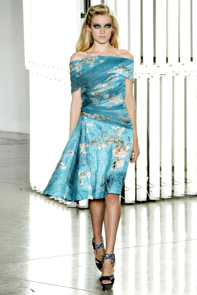
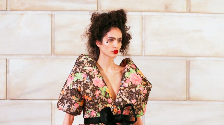
I like how they used Van Gogh, but I feel that to make it work the make-up should have been much softer…
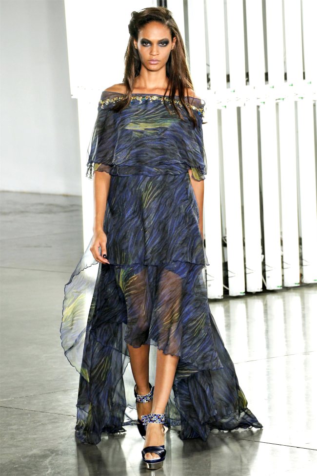
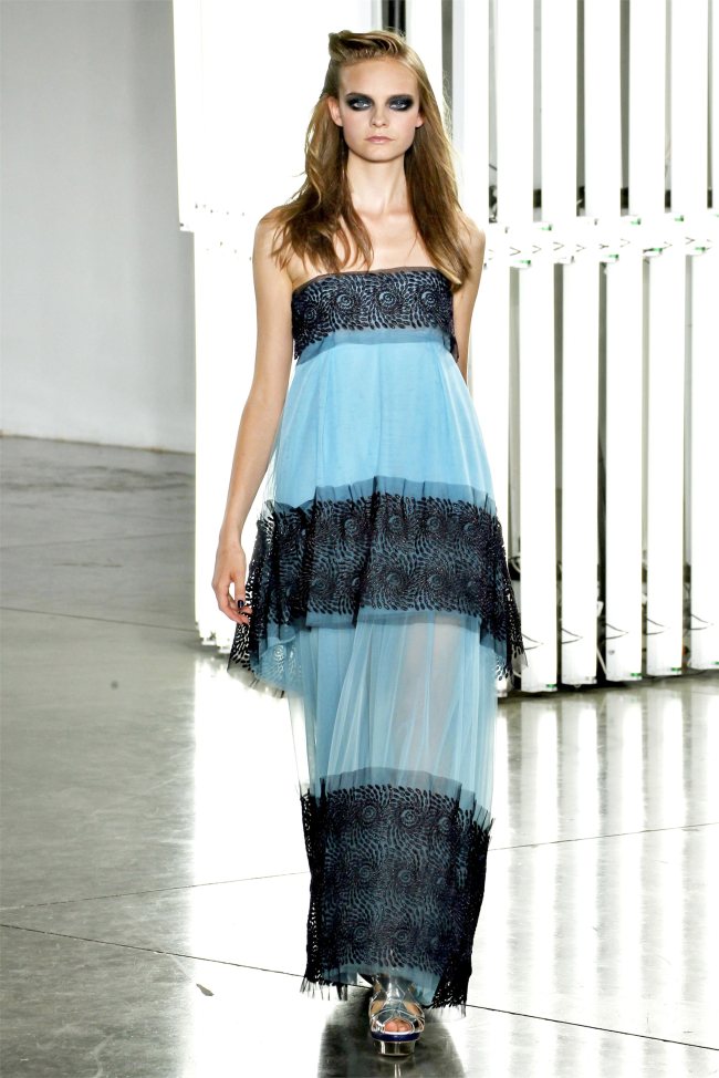
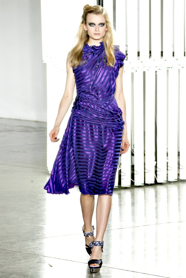
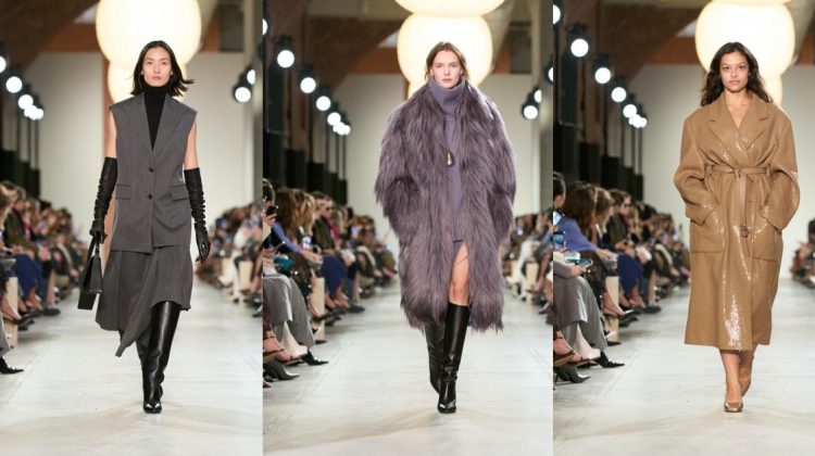
I love this collection, especially the featured blue dress.
fuck that makeup sucks
omg… the makeup draws the eye away from the awesome color palette used. Oh, and I agree… the 80s ripoffs are atrocious! Ew ew ew! The only time it looked presentable was on the lady in the first pic on the 3rd page. She rocks the “sunken eyesockets” look… other models are drowning in that black hole.
I have mixed feelings. At it’s best this collection offers dreamy fantasy, lovely looks in dazzling colors. However, while I adore Van Gogh, it seems that they mostly used the inspiration in obvious ways, and that they missed the unsettling aspects of Van Gogh’s work. It’s Van Gogh Disneyfied.
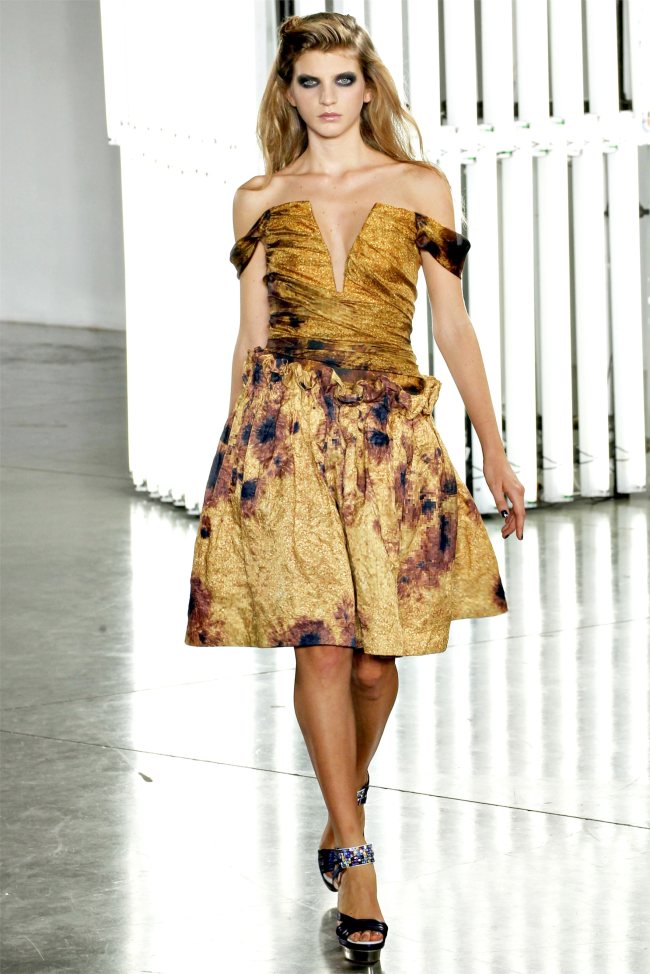
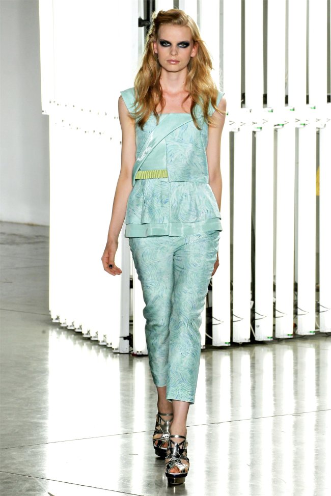
Also, some looks are too boxy or shapeless, and I don’t think the star shoes suit the collection at all.
Charming, but not their best.
Agreed with you about their van gogh reference. very obvious, not true to him in spirit though
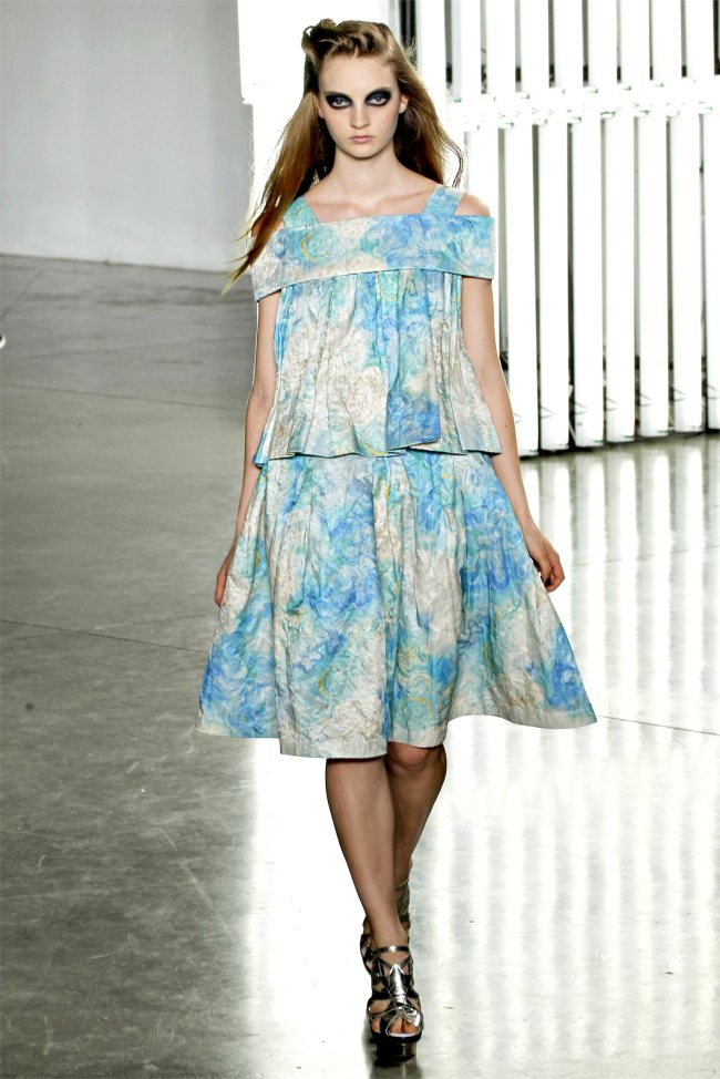
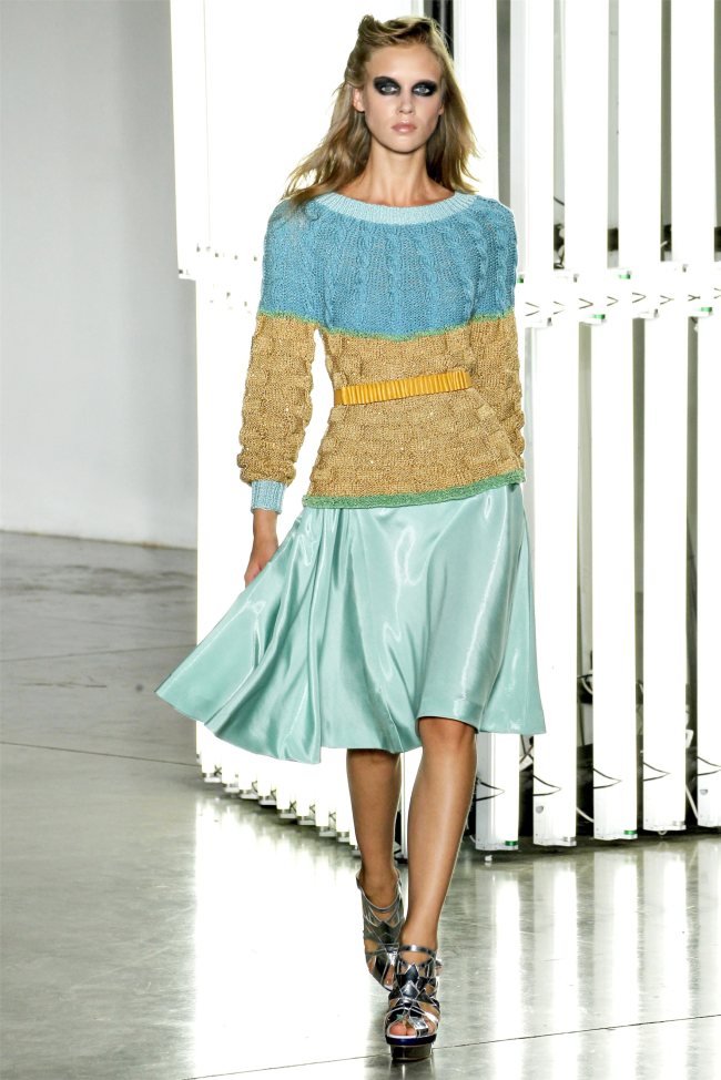
There are many aspects of this that I love – the pleating, the gathering, some of the prints, but it feels very streamlined to me. I miss Rodarte’s days of 9 zippers on a dress and confusing details – what happened to that kind of chance-taking and spontaneity?
I pretty much love it all!
Sooo happy Vlada was in it!!!
WTH??? it’s like 80s fashion gone bad.. like it wasn’t bad enuff the first time.. 🙁
I like how they used Van Gogh, but I feel that to make it work the make-up should have been much softer…
I love this collection, especially the featured blue dress.
fuck that makeup sucks
omg… the makeup draws the eye away from the awesome color palette used. Oh, and I agree… the 80s ripoffs are atrocious! Ew ew ew! The only time it looked presentable was on the lady in the first pic on the 3rd page. She rocks the “sunken eyesockets” look… other models are drowning in that black hole.
I have mixed feelings. At it’s best this collection offers dreamy fantasy, lovely looks in dazzling colors. However, while I adore Van Gogh, it seems that they mostly used the inspiration in obvious ways, and that they missed the unsettling aspects of Van Gogh’s work. It’s Van Gogh Disneyfied.
Also, some looks are too boxy or shapeless, and I don’t think the star shoes suit the collection at all.
Charming, but not their best.
Agreed with you about their van gogh reference. very obvious, not true to him in spirit though
There are many aspects of this that I love – the pleating, the gathering, some of the prints, but it feels very streamlined to me. I miss Rodarte’s days of 9 zippers on a dress and confusing details – what happened to that kind of chance-taking and spontaneity?
Beautiful everything: colors, patterns, shapes! Except make-up 🙁
http://www.facebook.com/STYLISMATIC
Beautiful everything: colors, patterns, shapes! Except make-up 🙁
http://www.facebook.com/STYLISMATIC
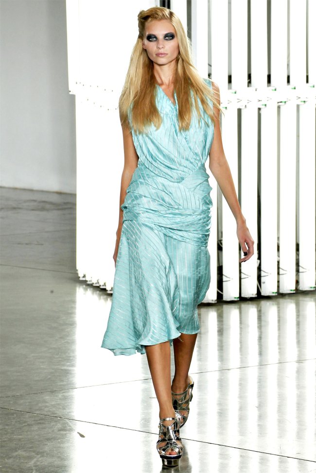
The color palette is so amazing! I hate those school marm prints from the 80’s but somehow they made them gorgeous!
http://www.tinyfrockshop.com