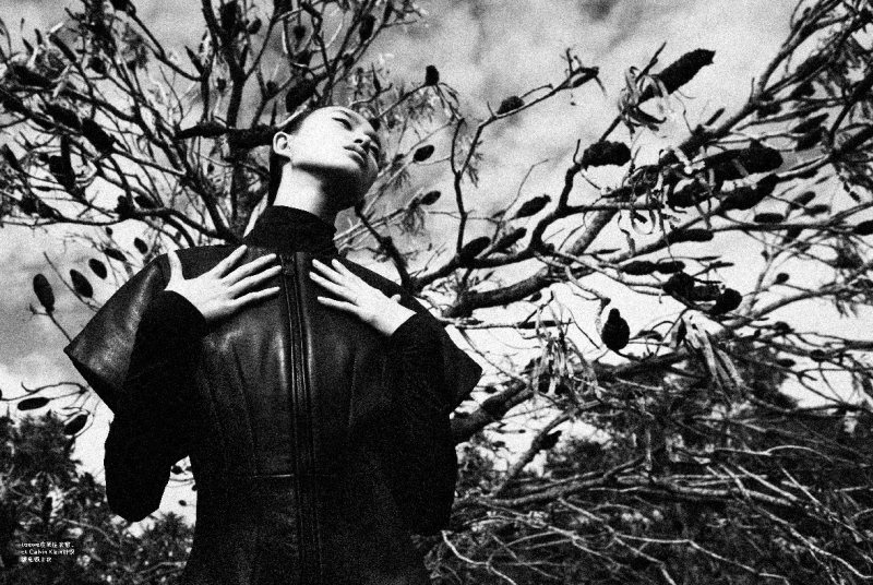
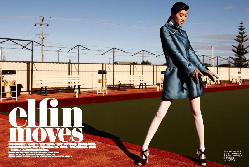
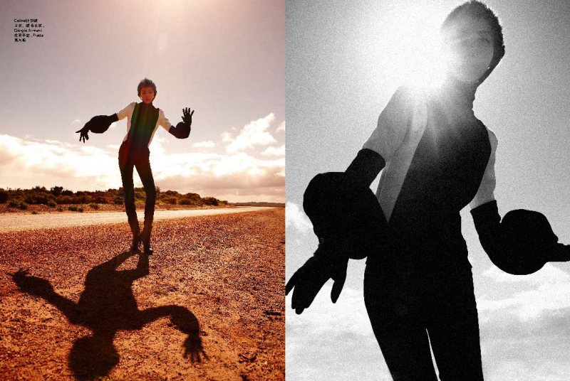
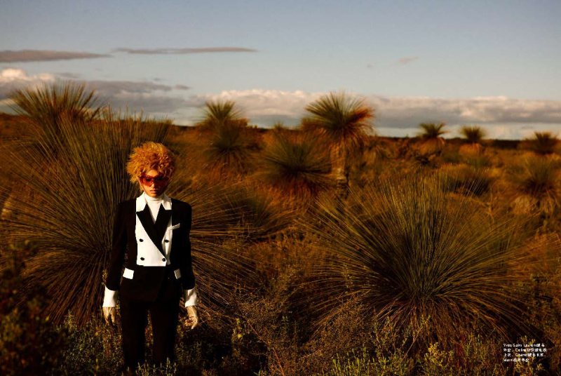
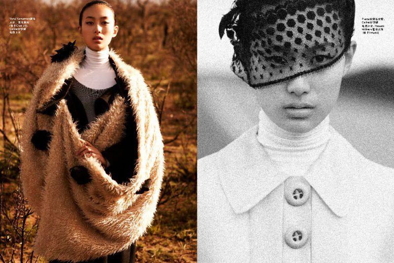
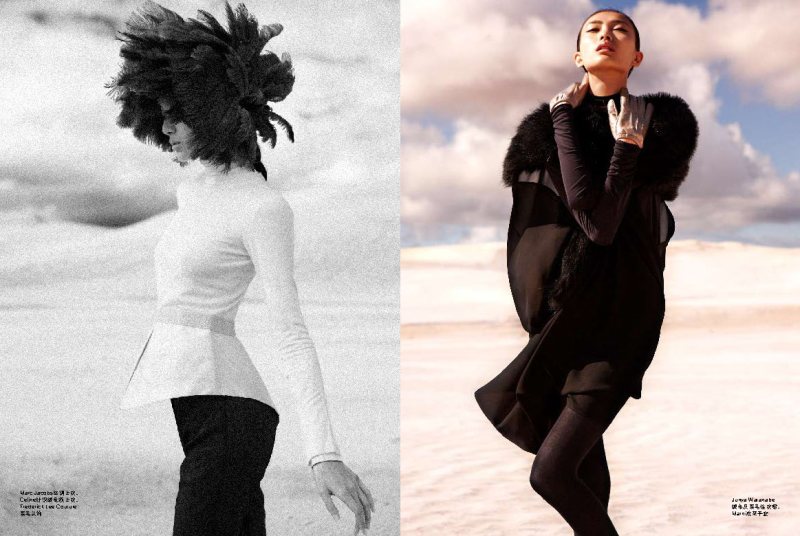
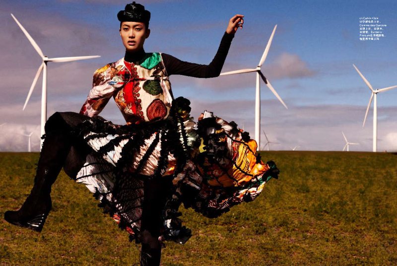
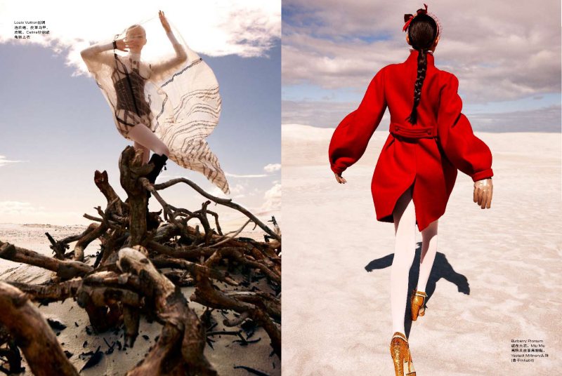
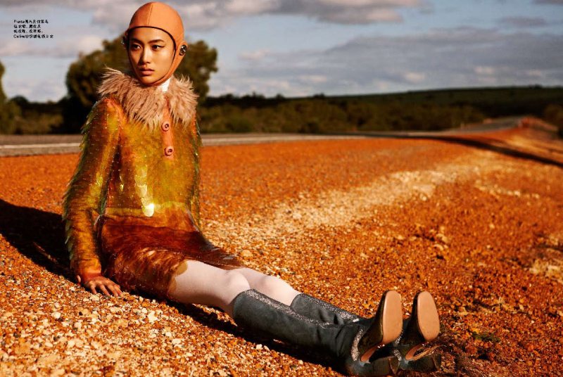
Elfin Moves – Shu Pei is a cross between futuristic traveler and elfin fairy in the October issue of Nuyou Singapore. In front of Wee Khim’s lens, Shu Pei goes from grassy knoll to desert landscape in the stunning portraits. Styled by Johnny Khoo in fall looks from the likes of Prada, Louis Vuitton and Yves Saint Laurent, the Chinese beauty wows with sleek hair by Dexter Ng and minimal makeup by Cindy Goh.




unimpressed. these had the potential to be so much more awesome.
so true. so meh
http://www.styledecorum.com/
unimpressed. these had the potential to be so much more awesome.
unimpressed. these had the potential to be so much more awesome.
unimpressed. these had the potential to be so much more awesome.
Actually loving it, good scenery.
Actually loving it, good scenery.
Actually loving it, good scenery.
Yeah, the locations are pretty cool. I also like her poses.
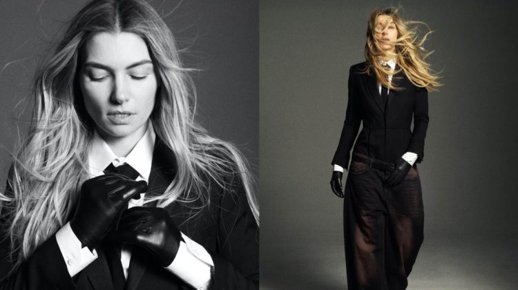
The fourth shot is interesting. But I agree with the first comment could have been way better. Her poses are probably what let this down she didn’t do anything else other then front on stuff and looks like she is struggling with something more dramatic.
The fourth shot is interesting. But I agree with the first comment could have been way better. Her poses are probably what let this down she didn’t do anything else other then front on stuff and looks like she is struggling with something more dramatic.
The fourth shot is interesting. But I agree with the first comment could have been way better. Her poses are probably what let this down she didn’t do anything else other then front on stuff and looks like she is struggling with something more dramatic.
The fourth shot is interesting. But I agree with the first comment could have been way better. Her poses are probably what let this down she didn’t do anything else other then front on stuff and looks like she is struggling with something more dramatic.
Pure Beauty!
XoXo
Plami
http://www.fashionthrill.com/
Pure Beauty!
XoXo
Plami
http://www.fashionthrill.com/
Beautiful, but could be better. I agree with @ef548d6603b9da670c1f971b003d5b21:disqus and @d8f44ba7c68f769d375a32a6a3fe6844:disqus , it has the potential.
http://www.style-abuse.blogspot.com
Brilliant.