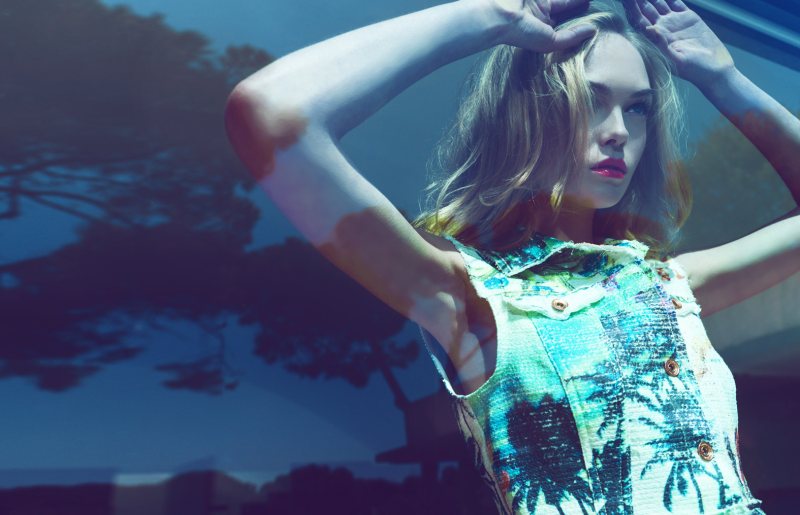
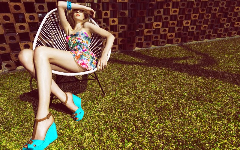
Siri Tollerod for Stradivarius “Brighten Me Up” Summer 2012 Campaign by Nico

Joanna Elizabeth

/

Published May 7, 2012

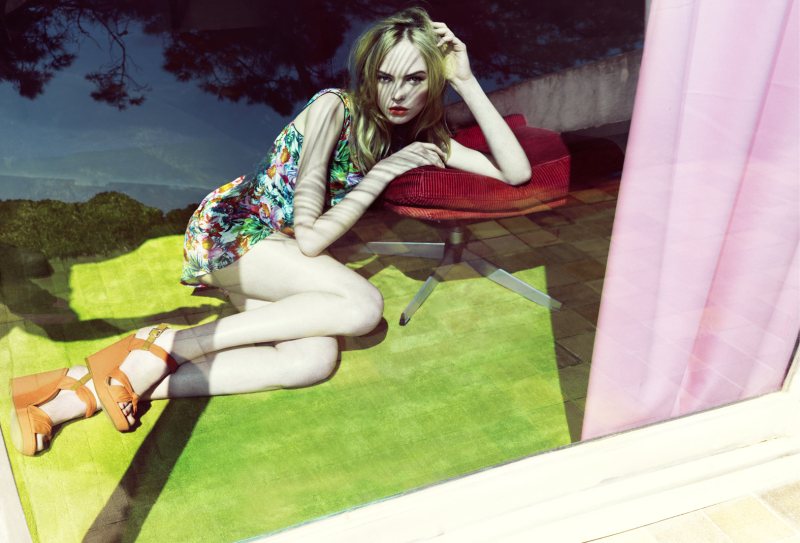
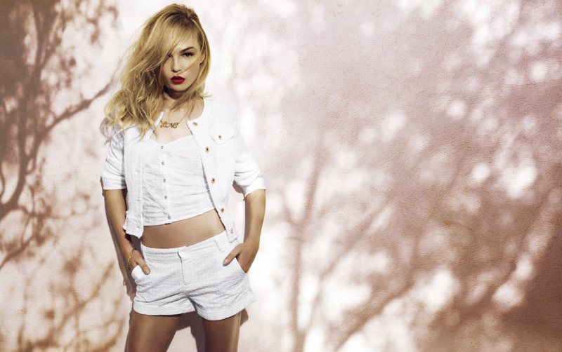
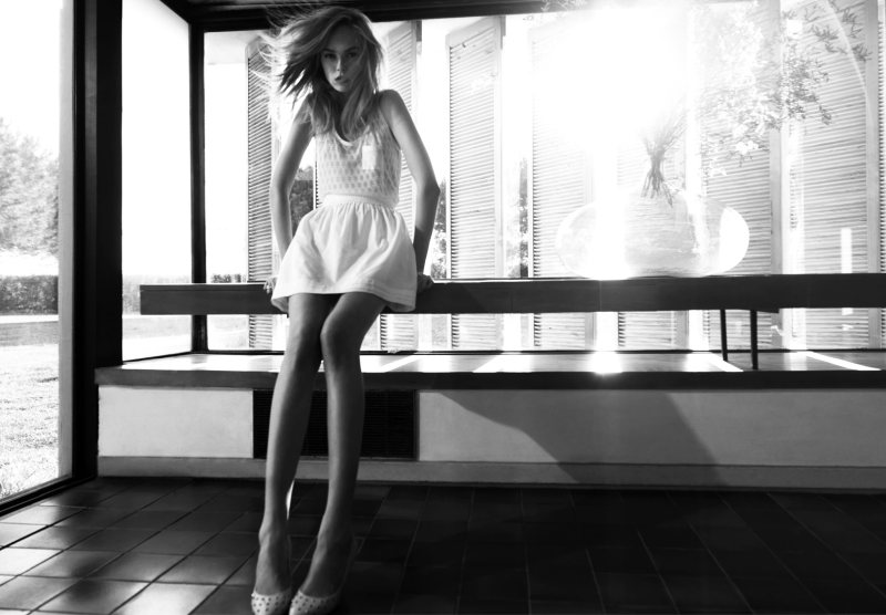
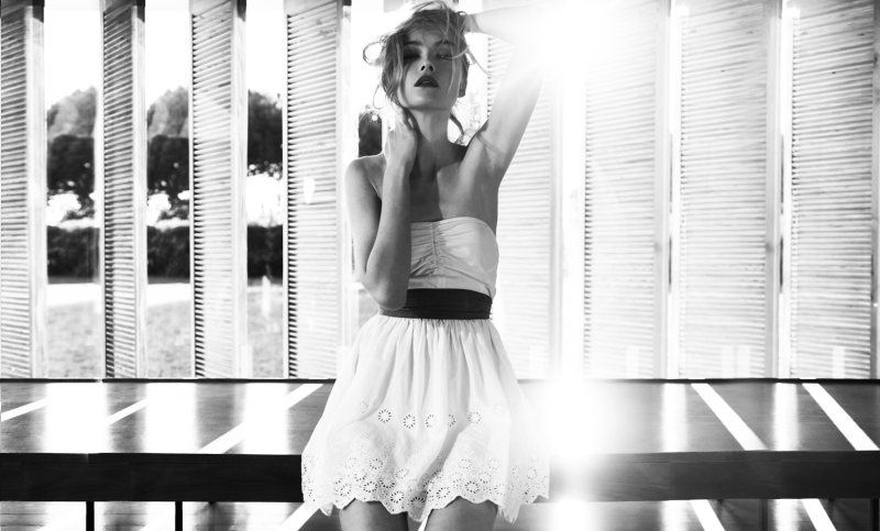
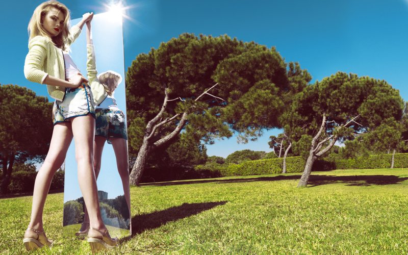
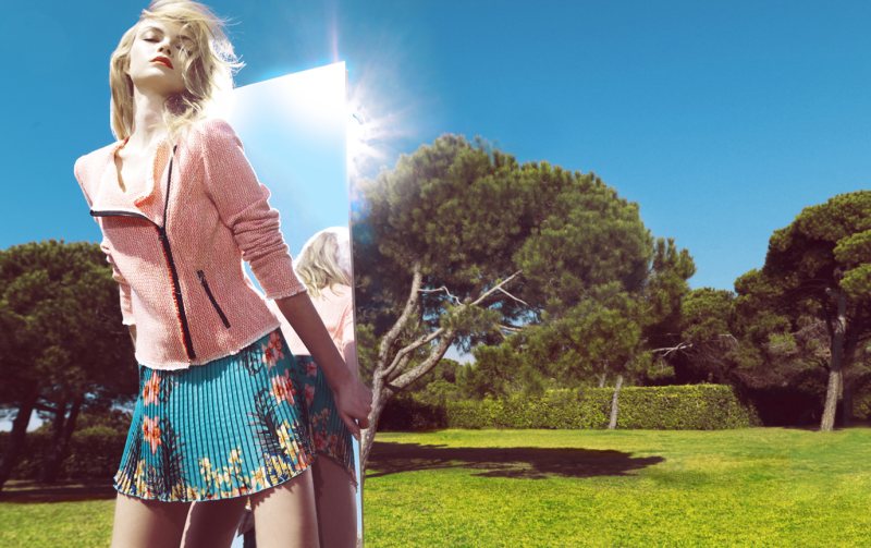
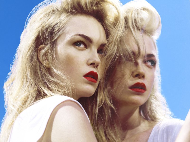
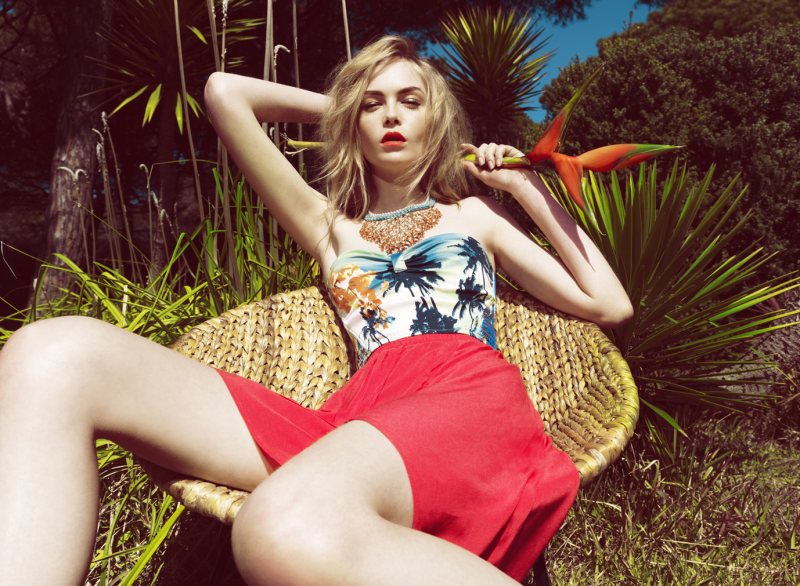
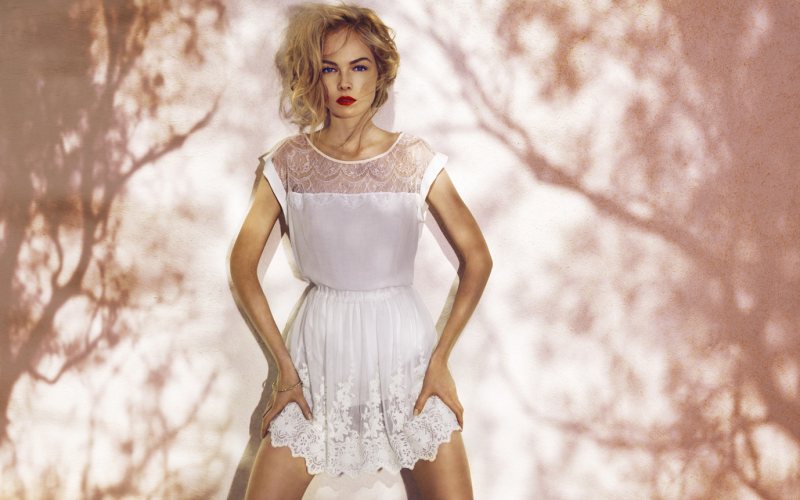
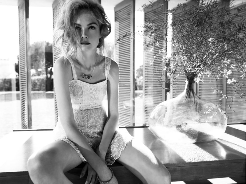
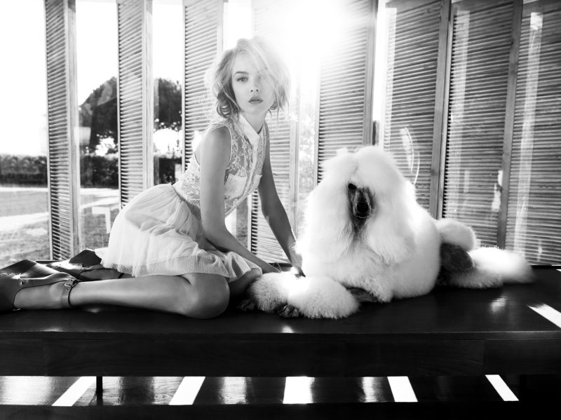
Brighten Me UpSiri Tollerod is tapped for Spanish label Stradivarius’ latest summer campaign titled, Brighten Me Up. In front of Nico’s lens, Siri wears feminine and flirty looks of the season styled by Lidia Aguilera. On beauty are hair stylist Karim B and makeup artist Sonia Peña.
Recent Updates

Charli-XCX-Acne-Studios-Spring-2025

Charli XCX Strips Down for Acne Studios Spring 2025 Ad

Charli XCX is taking the fashion world by storm, and she has recently been announced as the face of Acne ...
Chanel-Cruise-2025-Campaign

Chanel’s Cruise 2025 Campaign Escapes to the Sea

Sun-drenched style takes center stage in Chanel’s cruise 2025 campaign, shot on location in the breathtaking South of France. Behind ...
Dolce-Gabbana-Skims-2024

Kim Kardashian’s SKIMS & Dolce & Gabbana Exude Italian Chic

Dolce & Gabbana and Skims are teaming up for an unforgettable collaboration. This limited-edition line is deeply rooted in the ...
Giorgio-Armani-Neve-Winter-2024

Giorgio Armani Neve Brings Chilly Style to the Winter Season

Giorgio Armani Neve’s fall-winter 2024-2025 collection is a stylish storm that’s about to hit the slopes. The collection features women’s ...
Emily-Ratajkowski-Intimissimi

Emily Ratajkowski is Intimissimi’s New Ambassador (Photos)

Emily Ratajkowski is joining forces with Intimissimi, the Italian lingerie powerhouse, as the brand’s new ambassador. This exciting partnership marks ...
Valentino-Holiday-2024

Valentino Holiday 2024 Campaign: An Ode to Extravagance

Valentino is raising the bar with a Holiday 2024 campaign that dazzles. Part of the Avant Les Débuts series, the ...

5 thoughts on “Siri Tollerod for Stradivarius “Brighten Me Up” Summer 2012 Campaign by Nico”

  1. I like the first three pics they fit in together then it changed into something else it’s not cohesive. And then she has a mirror in a big backyard doesn’t really fit in with rest. I don’t mind the wide angle but it just looks like three dif shoots or ideas going on separated for me they look good but together not so much.

Comments are closed.