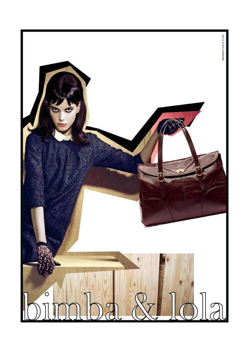
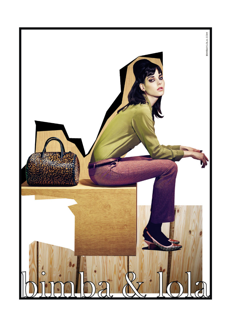
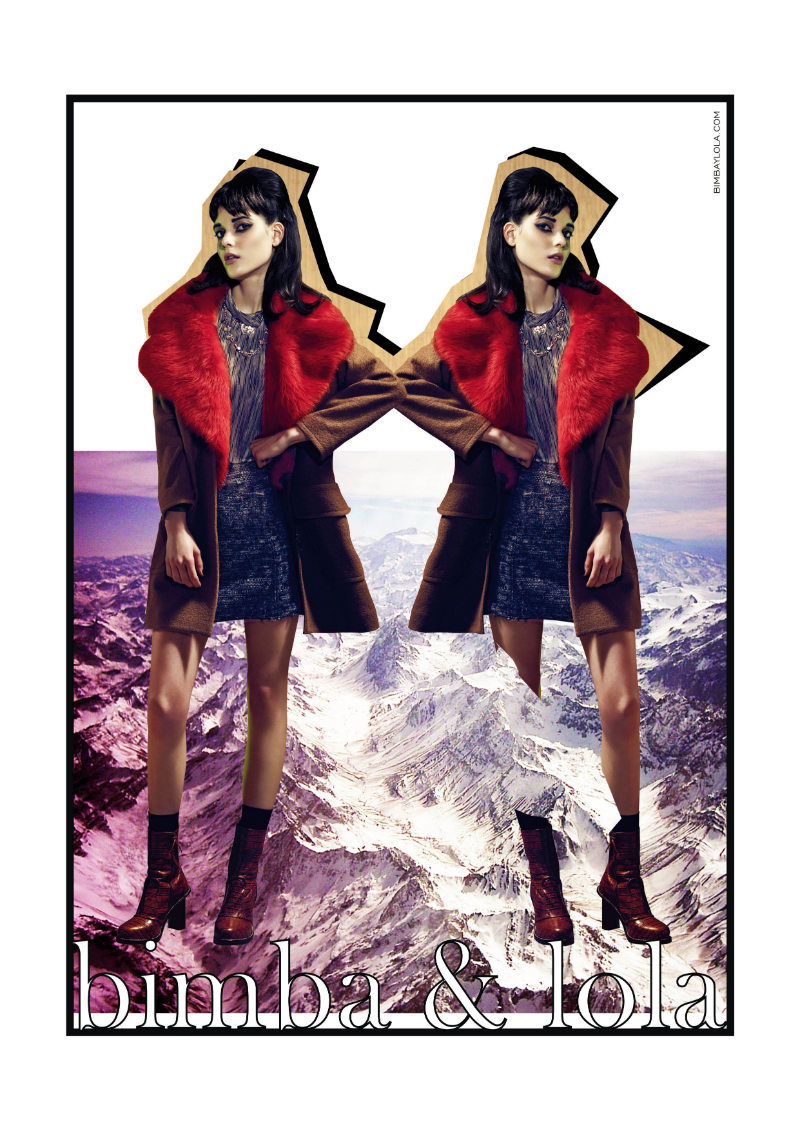
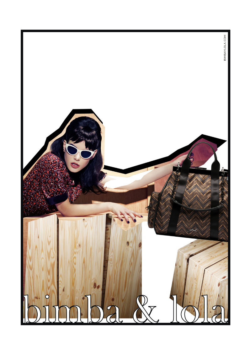
Tati Cotliar for Bimba & Lola Fall 2011 Campaign by Xevi Mutané

Joanna Elizabeth

/

Published July 28, 2011

’50s CollageTati Cotliar serves as the face of Bimba & Lola’s fall 2011 campaign donning the collection’s mix of 1950’s elegance with rockabilly appeal. Photographed by Xevi Mutané, Tati stars in scrapbook style images with an attitude of youthful rebellion.


Recent Updates

Versace-Spring-Summer-2025

Versace’s Spring 2025 Campaign Shows the Art of Lounging

Versace sets a luxurious mood for its spring-summer 2025 campaign. Photographed by Mert & Marcus, the campaign features models Mona ...
Chloe-Sevingny-Jimmy-Choo-Spring-2025

Chloe Sevigny is Iconic in Jimmy Choo Spring 2025 Ad

Chloe Sevigny brings an effortless edge to Jimmy Choo’s spring 2025 campaign, stepping into the world of Hyper Glamour. The ...
Dolce-Gabbana-Spring-Summer-2025

Dolce & Gabbana’s Spring 2025 Campaign is a Vintage Dream

Dolce & Gabbana’s spring-summer 2025 channels vintage glamour with a series of black-and-white images captured by photographer Steven Meisel. The ...
Kate-Moss-Isabel-Marant-Spring-2025

Kate Moss is Rock Chic in Isabel Marant Spring 2025 Ad

Kate Moss proves once again why she’s a fashion icon in Isabel Marant’s spring-summer 2025 campaign. The incomparable 90s supermodel ...
Max-Mara-Spring-Summer-2025

Max Mara’s Spring 2025 Campaign is All About Clean Tailoring

Max Mara channels intellectual sophistication with its spring-summer 2025 campaign, starring model Vittoria Ceretti. Inspired by the mathematical genius of ...
Emily-Ratajkowski-Kurt-Geiger

Emily Ratajkowski is Retro Glam in Kurt Geiger Spring 2025 Ad

Emily Ratajkowski lights up Palm Springs in Kurt Geiger’s spring-summer 2025 campaign. The images blend bold colors, vintage aesthetics, and ...

13 thoughts on “Tati Cotliar for Bimba & Lola Fall 2011 Campaign by Xevi Mutané”

  1. I like the collaging, but the typeface is horrible!!  The font makes the whole ad look cheap.

  2. The “scrapbook effect” was done so poorly. Looks like a middle school project instead of an ad campaign.

  3. The “scrapbook effect” was done so poorly. Looks like a middle school project instead of an ad campaign.

Comments are closed.