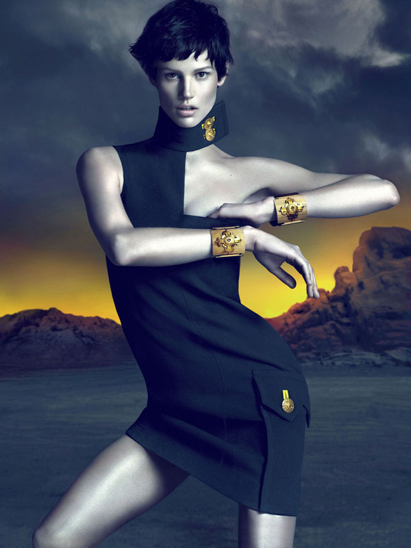
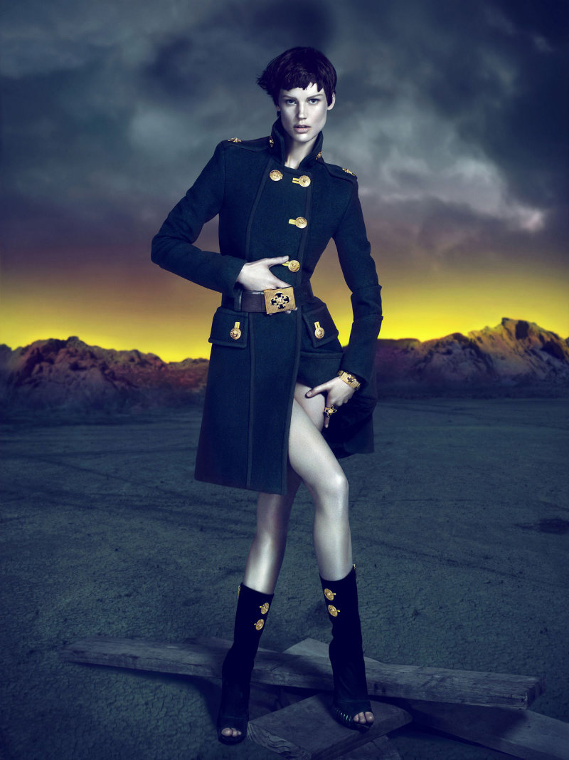
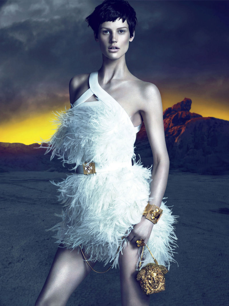
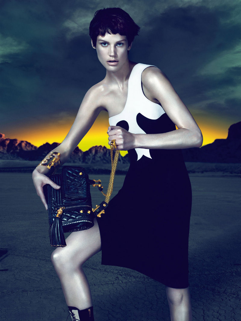
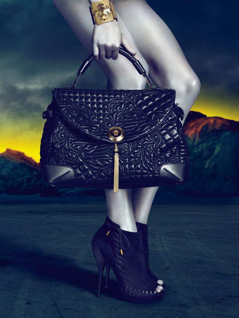
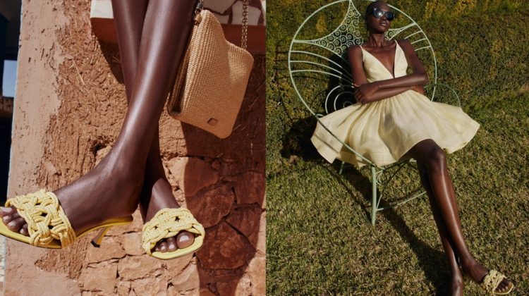
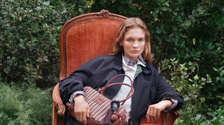
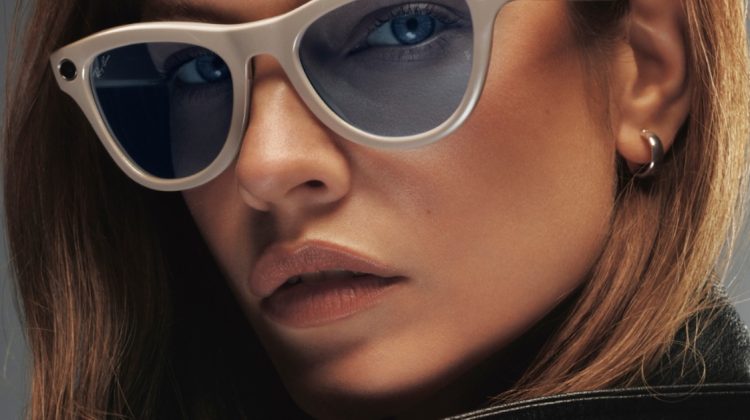
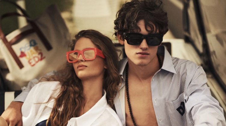
Fire & Ice – Versace’s fall 2011 campaign delivers a sense of drama with model Saskia de Brauw posing in a desolate location of setting sun and barren landscape. Photographed by Mert & Marcus, Saskia sports the luxury label’s military accents and feminine frocks with a cool and androgynous beauty.
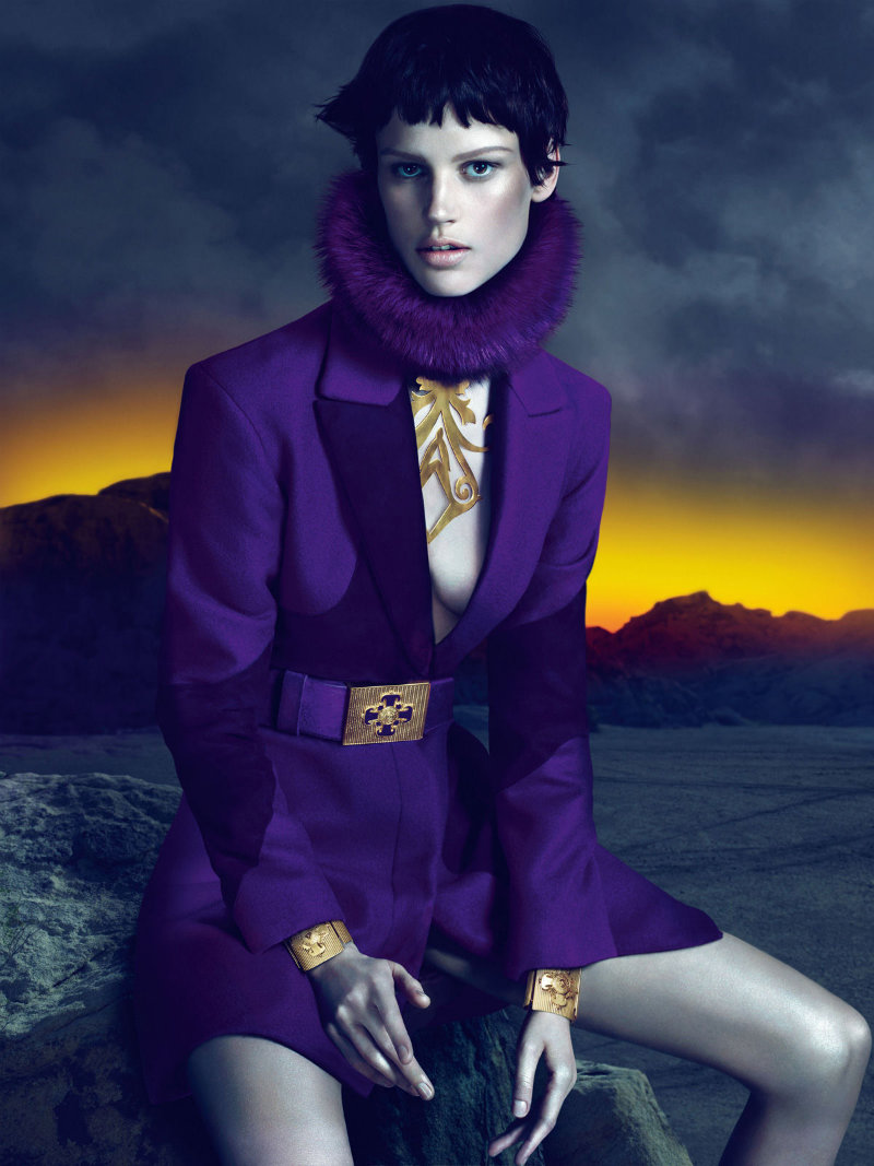
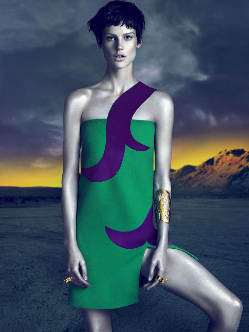

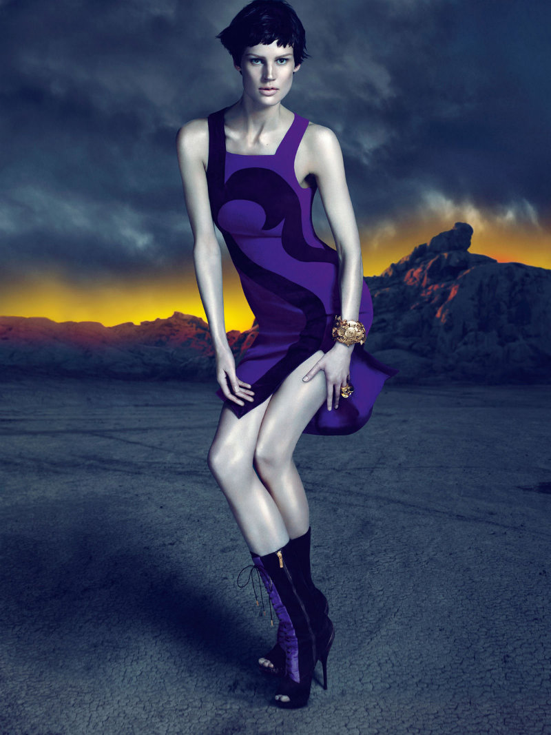
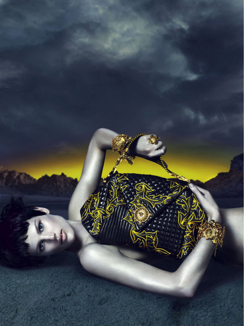
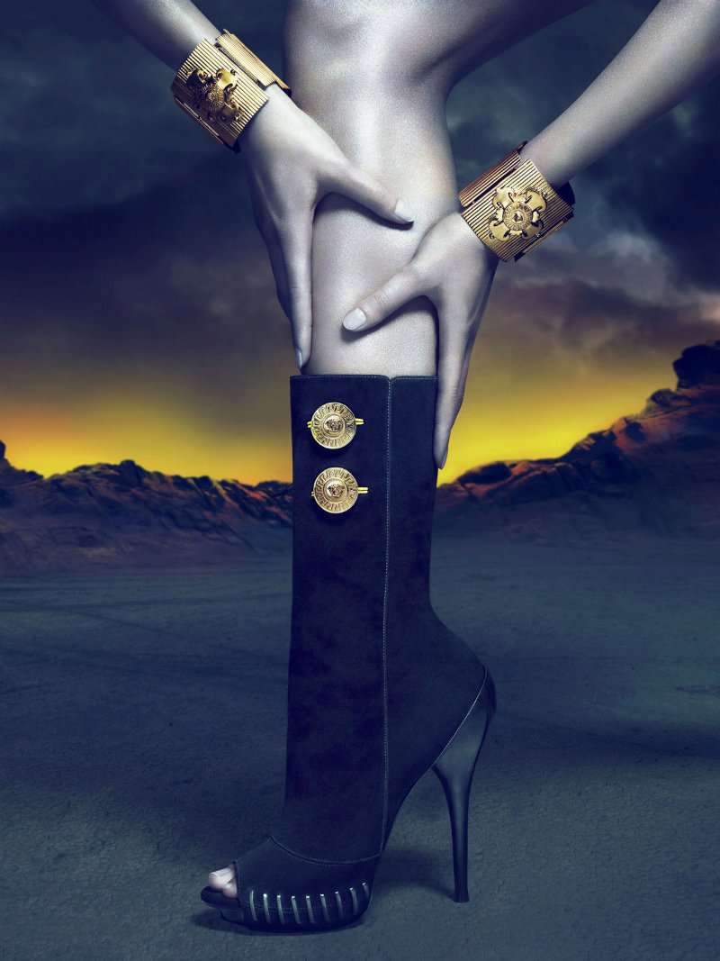
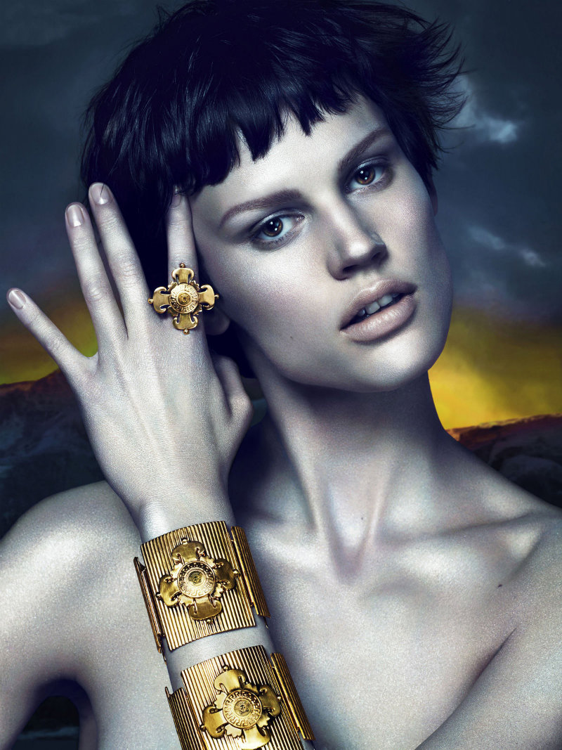
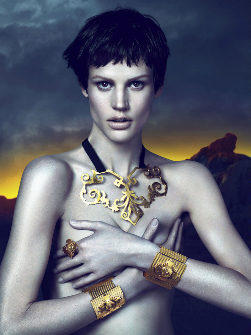

Saskia looks so good here, incredibly sexy.
That last shot is sick.
That last shot is sick.
RIP Versace
RIP Versace
perfection!!!!
http://www.spotmag.blogspot.com
perfection!!!!
http://www.spotmag.blogspot.com
perfection!!!!
http://www.spotmag.blogspot.com
love versace
?leonie
http://www.monstrexi.com
It reminds me Cavalli´s spring summer 10 campaign… in spite of I like it
I want to dislike it, but I really do love it.
I want to dislike it, but I really do love it.
I want to dislike it, but I really do love it.
Ok, it’s a new direction, but not Versace AT ALL, i love Saskia de Brauw and Mert and Marcus work but where is the sexyness, the lightness, the joie de vivre…? I really don’t understand this apocalypse, moon mood.
edgy and chic, doesn’t exactly look like versace from the first sight, great stuff though, saskia is really rocking these looks
http://elenavasilieva.blogspot.com/
x
oh my god amazing pics love it 🙂
sooooooooo amazing!!!
i love this campaing a lot! (not totally pleased with the colors, maybe.)
i think it’s Very versace… i quite liked the ads in the nineties.
and i love the return of those golden ornaments and patterns that used to adorn Versace scarves.
xoxo
agnes
http://iiiinspired.blogspot.com/
http://agnesszucs.blogspot.com/
Versace like it should be. Well done! (despite photoshopping saskia a different face..still pretty though 🙂
it’s fabulous. good for them
it’s fabulous. good for them
wonderful work with light, perfect sense of beuaty…:)
wonderful work with light, perfect sense of beuaty…:)
why those pictures seems so fake to me? too much photoshop!!!!!! everything seems to be in the same dimension, i mean the model and acessories, mostly purses…as a matter of fact, those purses were shot and put in a different picture in a very very very ridiculous way. I like those colours. I love the model. And the styling. But….is that really necessary?