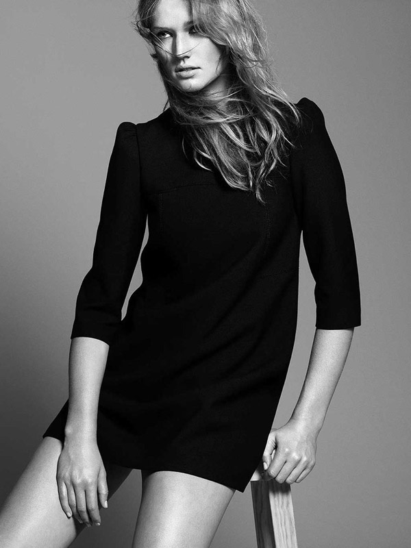
Even more campaign madness this Friday as we take a look at Zara’s fall 2010 advertisements. Featuring Toni Garrn donning the label’s knits and tailored jackets, the minimalism and chic collide in the studio images shot by David Sims.
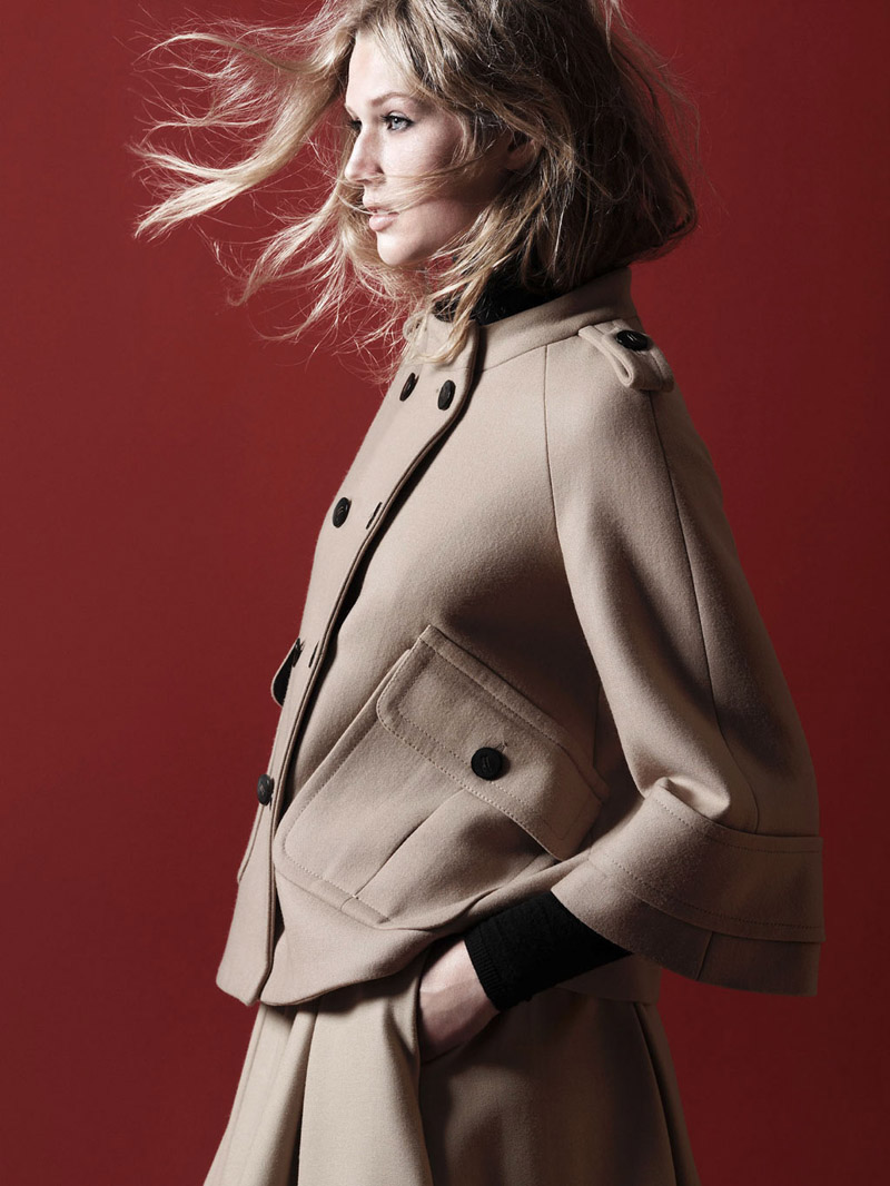

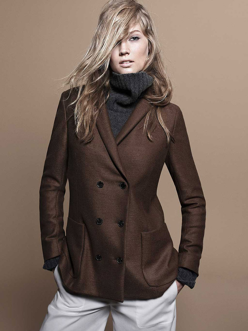
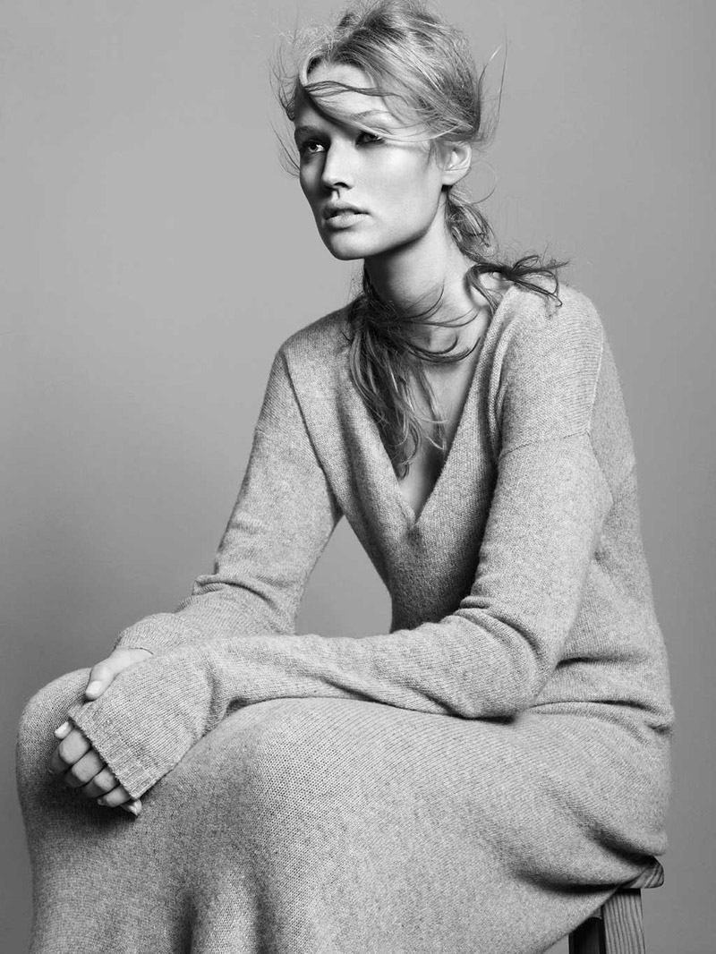
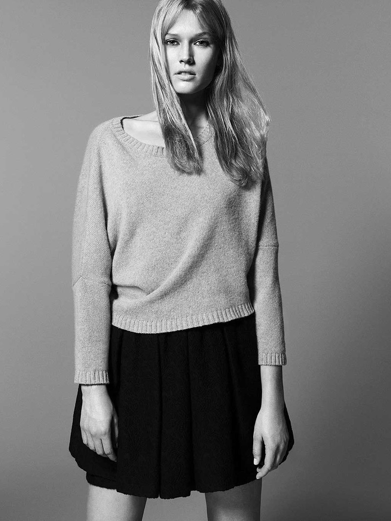
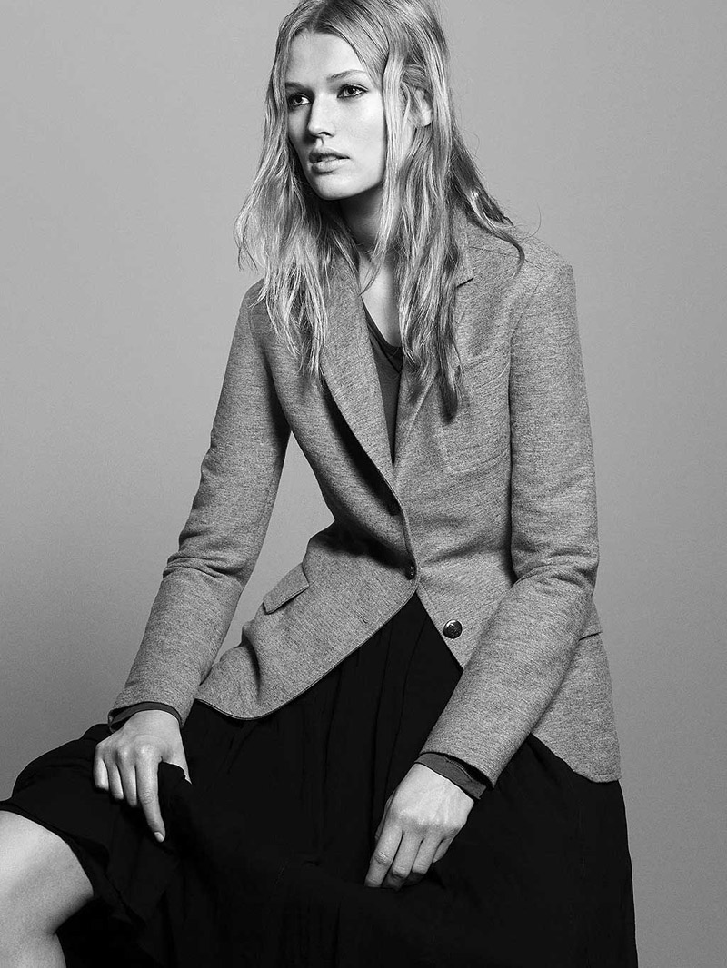
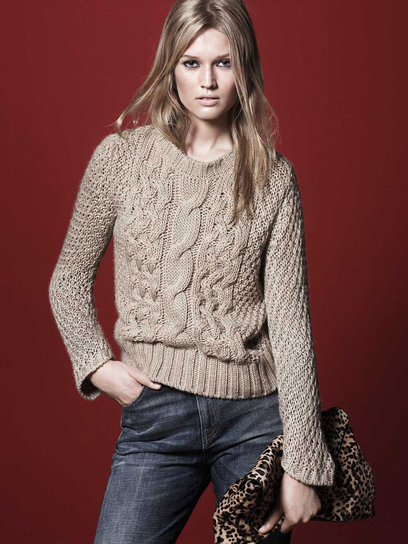
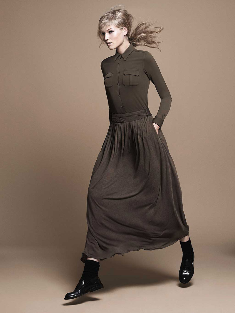
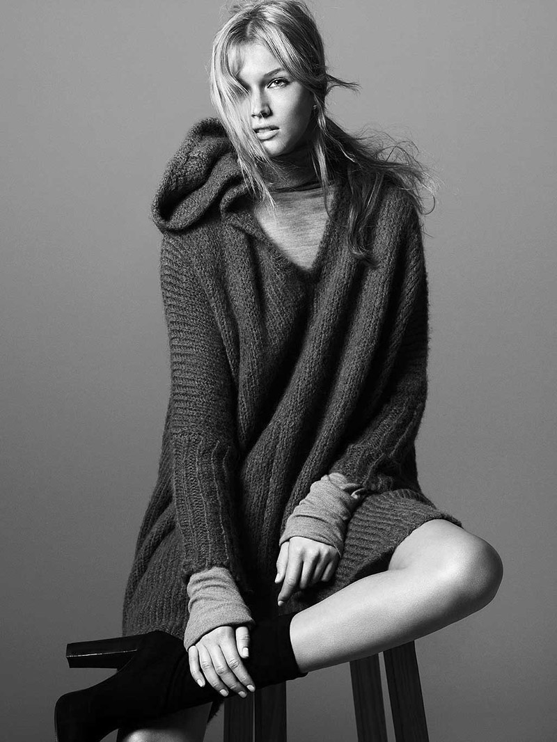


Even more campaign madness this Friday as we take a look at Zara’s fall 2010 advertisements. Featuring Toni Garrn donning the label’s knits and tailored jackets, the minimalism and chic collide in the studio images shot by David Sims.


Comments are closed.
Sims,love Your works.
Sims,love Your works.
wow sims and toni should usually be a winner but this looks rushed and unfinished, really disappointing!!
i think its mostly sims who is at fault and the hair, which comes back to sims
wow sims and toni should usually be a winner but this looks rushed and unfinished, really disappointing!!
i think its mostly sims who is at fault and the hair, which comes back to sims
the hair is great! i don't understand edward?
the hair is greasy in some then dry and brittle looking in others, half way between done and undone, if they wanted to have a kind of messy look this missed the point, if they wanted it to be a certain style that also missed, as always this is just my opinion, and i think it looks a little unpolished conceptually… in a few ways, one being the hair, the other the light, the other the post production… toni looks beautiful as always i just think the campaign is disappointing.
i agree, the hair looks poor
i dont like it, looks cheap
i dont like it, looks cheap
She is GORGEOUS !!! no meter in what she dress up!!!
She is GORGEOUS !!! no meter in what she dress up!!!
love these looks for fall!
http://style-haus.blogspot.com/
love these looks for fall!
http://style-haus.blogspot.com/
The clothes are simply awful and I don't really like her hair,it looks greasy. Definitely not a good campaign..
The clothes are simply awful and I don't really like her hair,it looks greasy. Definitely not a good campaign..
i love her look
i love her look
the really should have soften that thing between her nose and mouth.
the really should have soften that thing between her nose and mouth.
Amazing?!?! Umm are you using one of those 'vision impaired' computers or something? Obviously another person who loves the idea of the industry but has nooo idea what the fuck you're looking at.
Don't get me wrong, Sims has kept up his end of the deal but his team need to be shot!
(Lay off the smart sharpen!)
a photographer is somewhat the director when it comes down to it so some of the blame lies with sims to an extent, i mean art directors, sure but somewhere in there sims was clearly somewhere else
i see a cheapest way of wearing Marc Jacobs fall .
http://www.cestunmirage.wordpress.com
i see a cheapest way of wearing Marc Jacobs fall .
http://www.cestunmirage.wordpress.com