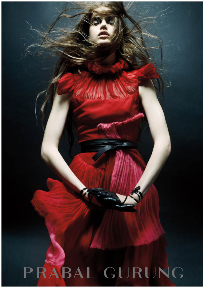
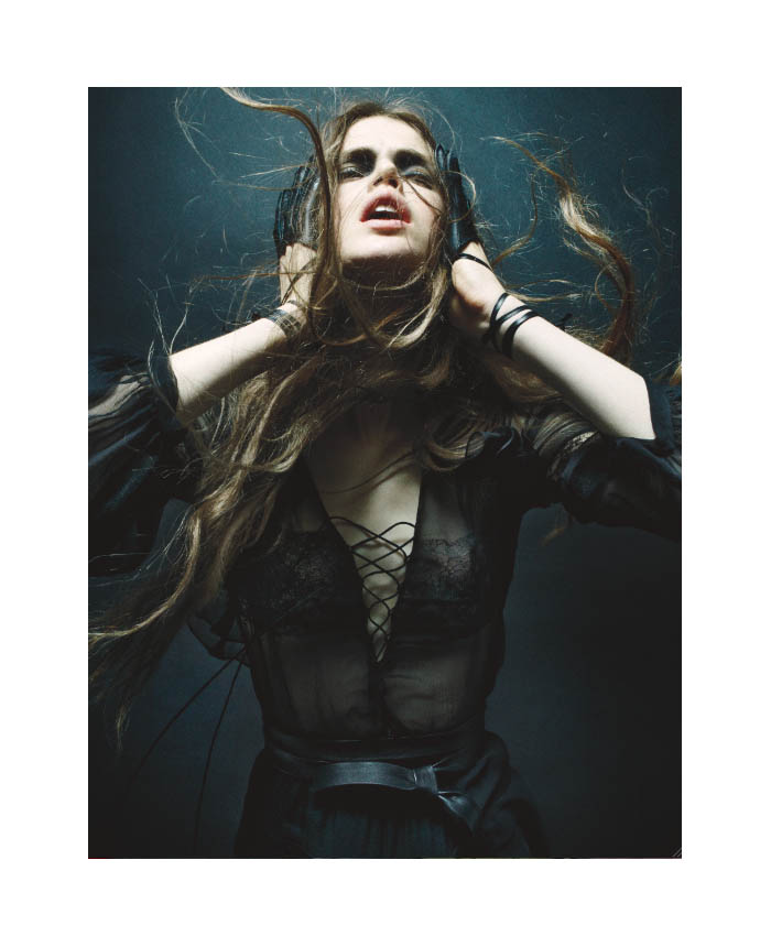
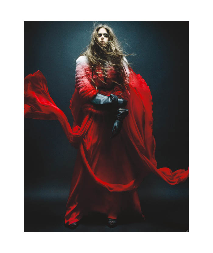
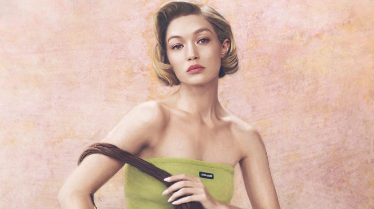
Ascension – Rising to the top of the ranks, Prabal Gurung releases an online only campaign for his fall 2011 collection starring Julia Saner. Photographed by Daniel Jackson and styled by Tiina Laakkonen, the photographs capture the dark elegance of the autumn collection perfectly.




I really like Prabal Gurung, and his Fall 2011 collection, but I don’t think the dark photos show it off in the best way.
I really like Prabal Gurung, and his Fall 2011 collection, but I don’t think the dark photos show it off in the best way.
I don’t think this could be any better. Stunning.
I don’t think this could be any better. Stunning.
Beautiful! They look like movie stills actually.
such a shitty job
such a shitty job
I’m incredibly impressed with Julia here, I think I’m finally convinced of her modeling abilities.
I’m incredibly impressed with Julia here, I think I’m finally convinced of her modeling abilities.
stunning image but horrible logo… its like from the 70s…
stunning image but horrible logo… its like from the 70s…
stunning image but horrible logo… its like from the 70s…
Julia Saner is amazing!! Would love to see her in a magazine cover though, she’d be perfect!
http://www.saptodjojokartiko.wordpress.com
Julia Saner is amazing!! Would love to see her in a magazine cover though, she’d be perfect!
http://www.saptodjojokartiko.wordpress.com
I think it looks more like an editorial than a campaign but I love it anyway.
I think it looks more like an editorial than a campaign but I love it anyway.
I think it looks more like an editorial than a campaign but I love it anyway.
I like them but feel like maybe the beautiful colors in this could have popped more.
ARE YOU ALL BLIND, THIS IS REALLY BAD PHOTOGRAPHY AND HORRIBLE STYLING. THINK GUYS: THIS IS SUPPOSED TO SELL THINGS, TO INSPIRE, TO GIVE THE BRAND A PUSH AND WANNA MAKE US BUY THIS. THESE IMAGES ARE JUST INTROVERT AND BAD LIGHT. I MUST SAY DAN JACKSON HAVE SOMETIMES LOST IT IN THE LAST YEAR OR SO, HOPE HE WILL FIND THE GLOW AGAIN. THIS IS NOT GOOD. // MARY USA
what nonsense, maybe the feeling the designer and photographer wants is exactly what the pictures are like?
Not everything has to be out and shouting like Hilfiger or just a product shot like Donna Karan, maybe they want something deeper, more complicated…
what nonsense, maybe the feeling the designer and photographer wants is exactly what the pictures are like?
Not everything has to be out and shouting like Hilfiger or just a product shot like Donna Karan, maybe they want something deeper, more complicated…
what nonsense, maybe the feeling the designer and photographer wants is exactly what the pictures are like?
Not everything has to be out and shouting like Hilfiger or just a product shot like Donna Karan, maybe they want something deeper, more complicated…
Very beautiful!
XoXo
Plami
http://fashion-thrill.blogspot.com/
Very beautiful!
XoXo
Plami
http://fashion-thrill.blogspot.com/
Very beautiful!
XoXo
Plami
http://fashion-thrill.blogspot.com/
Very Interesting.
Very Interesting.