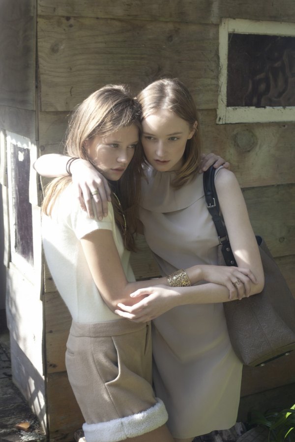
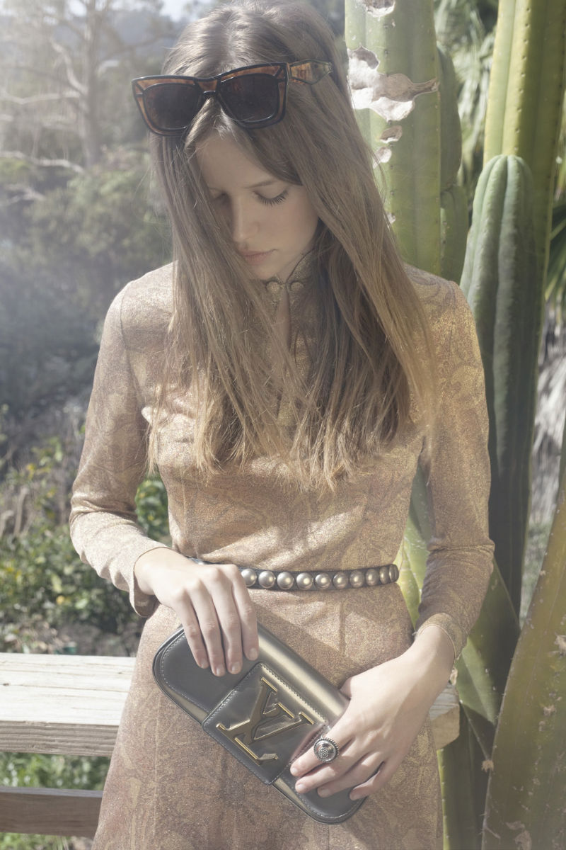
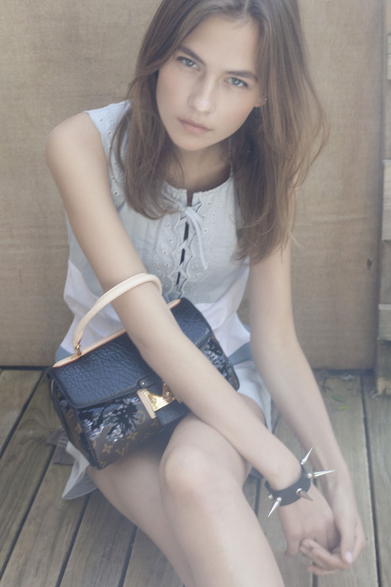
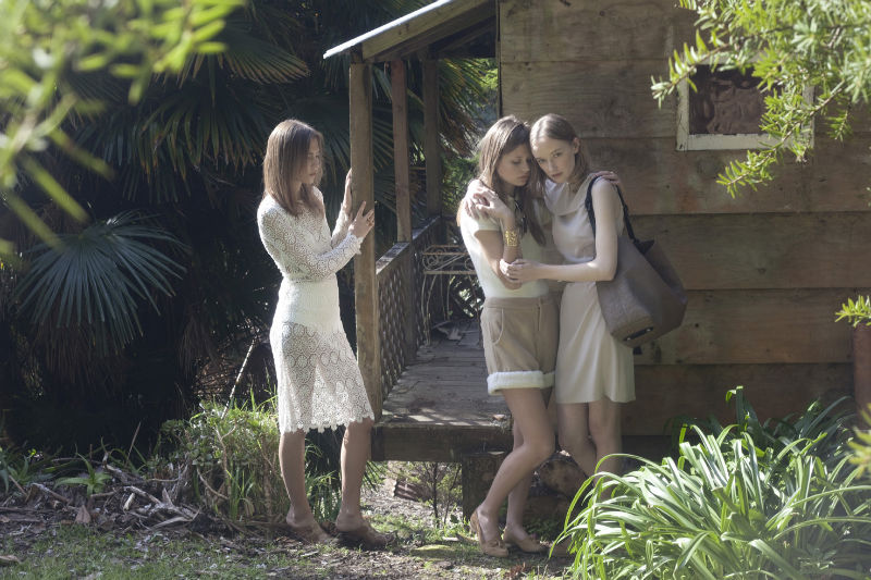
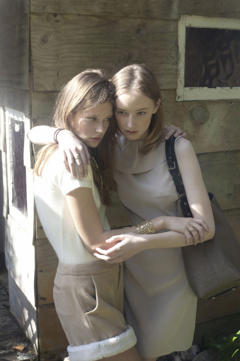
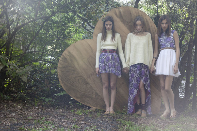
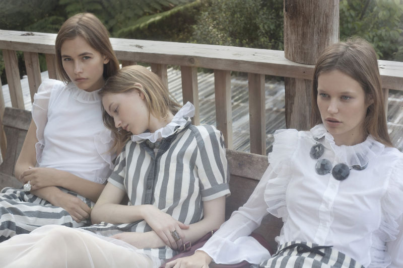
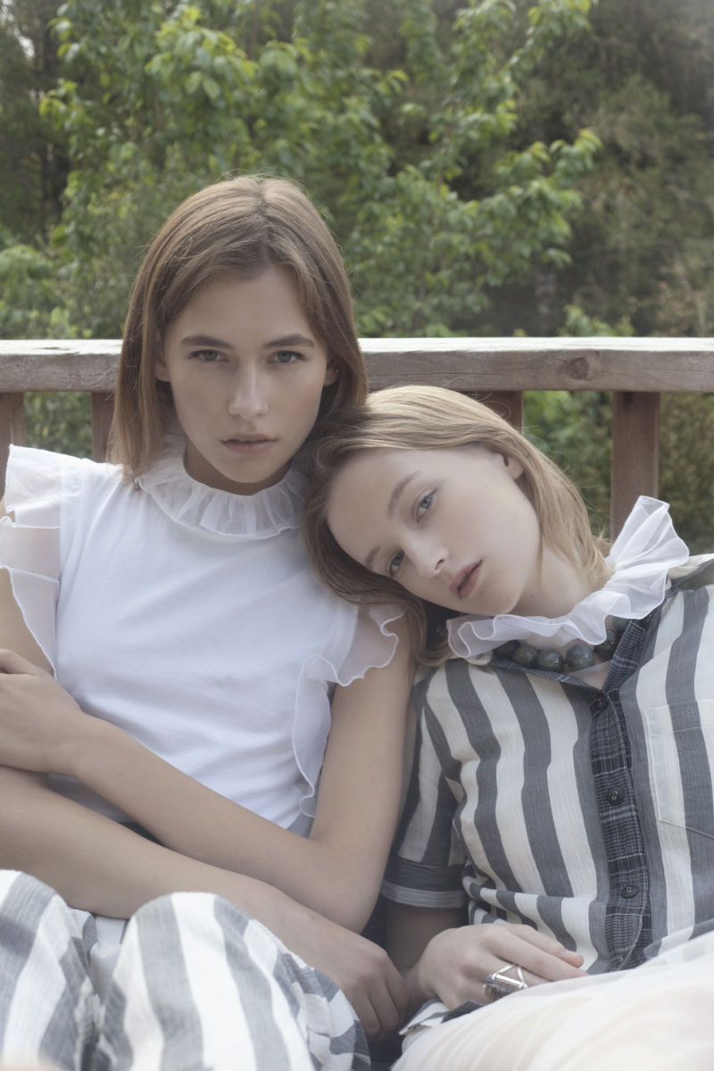
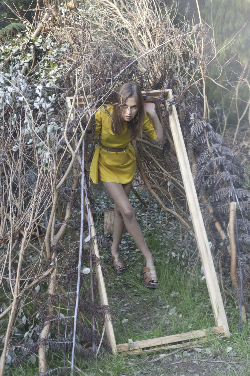
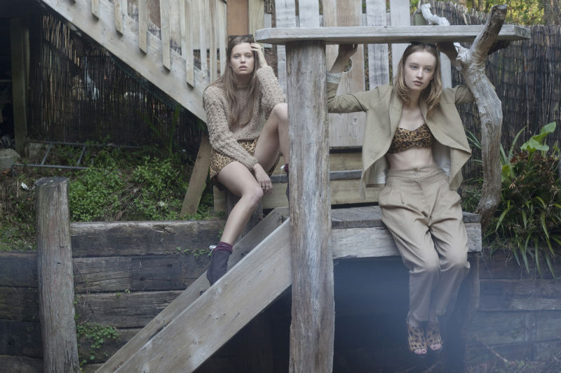
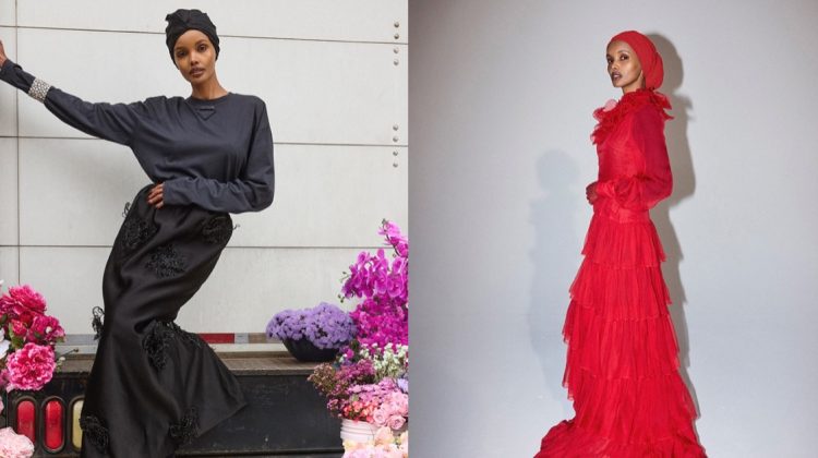
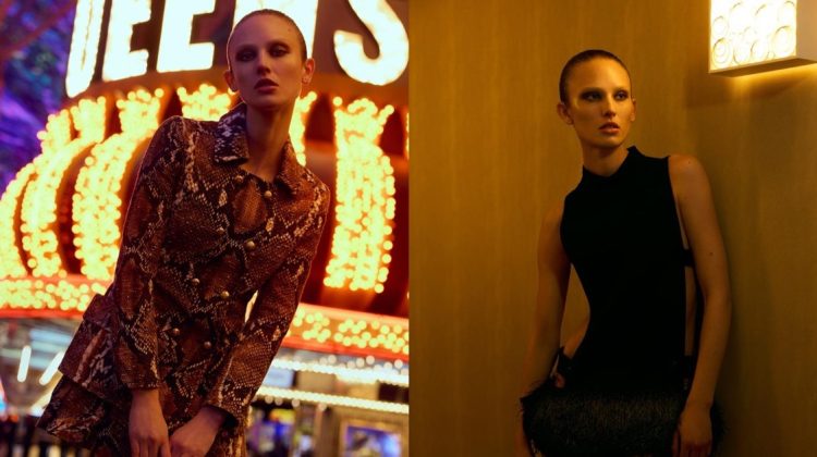
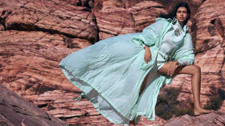
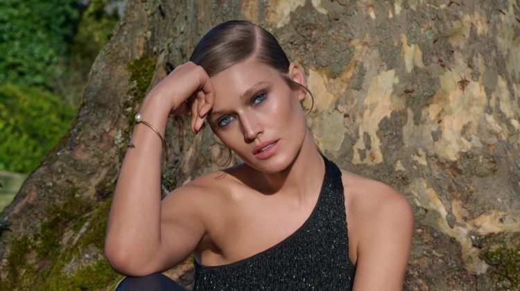
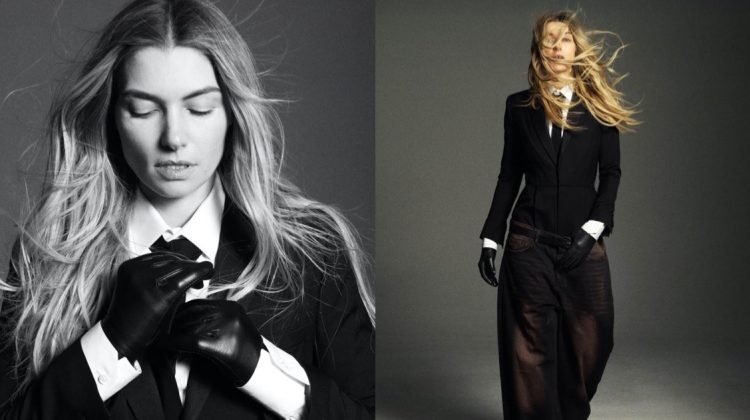
Karen Inderbitzen-Waller captures two of Australia’s fresh faces, Dempsey Stewart and Stephanie Cherry, for the latest issue of No. Magazine. Joined by Lithuanian model Vilma Putriute, the trio takes to the great outdoors in the relaxed stylings of Zara Mirkin. / Lighting & digital by Delphine Avril Planqueel
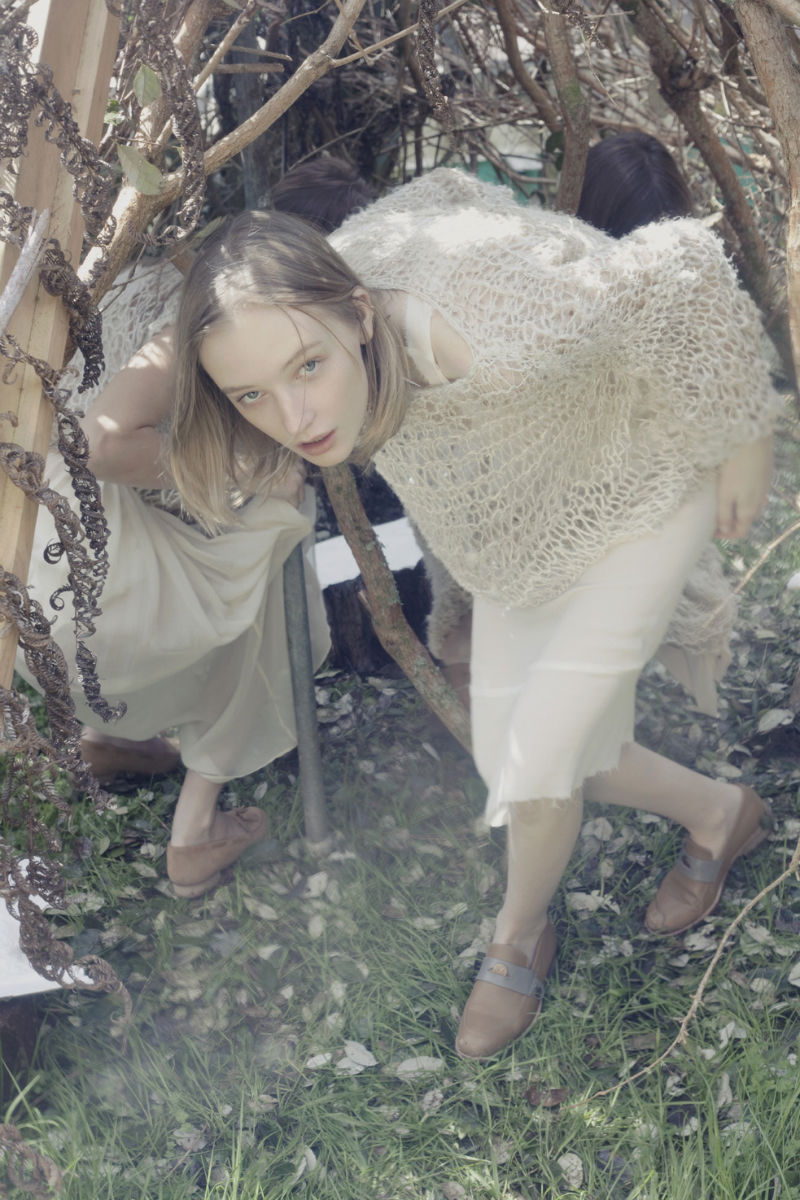
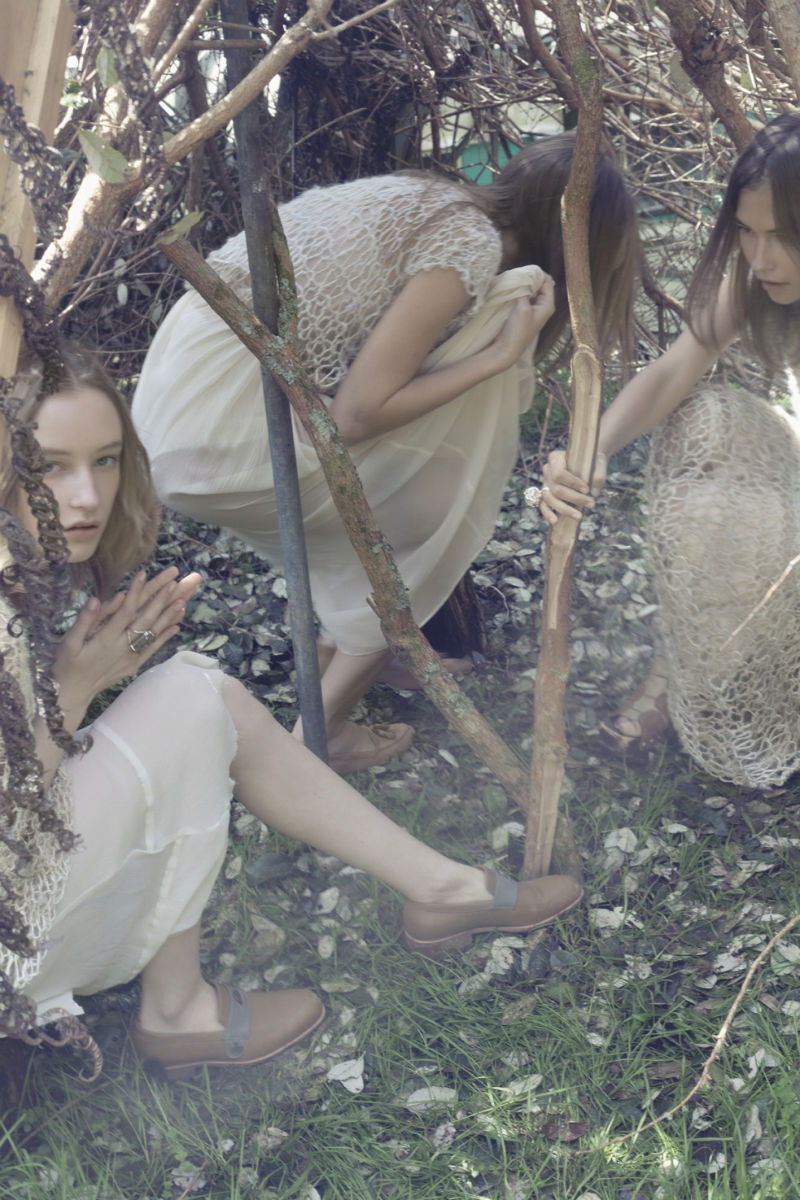
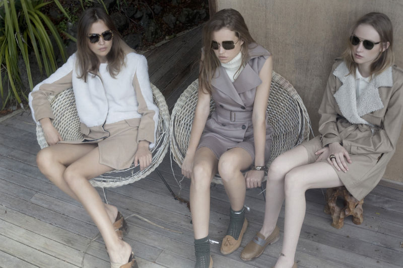

i love this! the monochromatic looks with a bit of prints is really lovely
http://whycantmybestfriendbeme.blogspot.com/
wow i love the models and the styling…very niceee!!
http://deniseandthegang.blogspot.com/
I love the photography and I love, love, love the styling. But I hate the fact that these girls look like their 12. Sorry, but they just seem too young for this.
Are you sure the soft lighting and makeup aren’t playing tricks on your eyes? None of them look under 17 to me.
Maybe it’s my age and the fact that I’m a parent, so that I’m a bit more sensitive to it. And lol, 17 is still very young to me! But also artistically, I just think it work better with more womanly models, than girlish ones. But that’s just mho… They’re still beautiful photos.
lovely photography
😉
new PICS every monday… follow:
http://blog.sebastiankubatz.de
cheers,
sebastian
I can understand, that the meaning of fashion photography is not to show the world as it is, but this one is quite grotesque. In a bad meaning. The girls look very, very young. Much too young for that styling. I’d never buy anything, that is worn by a 12 year old. IMO shot in a foot
What about this is grotesque? I just cannot grasp what you mean.
There are so many things wrong with this comment…
I agree with Glorifed on this one. The styling is far too mature for the models. Fail!!
There are so many things wrong with this comment…
I like that they seem younger, it’s very virgin suicides-y.
Agree.
?????? ! 10 ??? ?????? ! ! !
Beautiful 🙂
But Vilma is definitely 18 not 12.
Vilma is 18 or, I met her she is no babe in the woods, and I am sure all the girls loved the clothes and would have loved to have kept them all – you guys are bleating about nonsense.
In any case this is much better than the usual NO. editorial – it feels beautiful and coherent (even if it is stealing a little too much from LULA), good simple palette, actually decent compositions from K-I-W and the softness really is right for the clothes. Best styling in NO ever I think, what a breath of fresh air it’s not all grunge things are actually allowed to be worn the right way (I have no problem with stylists f-king stuff up but it is too obvious in NO as ZM always does it). The only problem, really, is the grade (i.e. colour & tone processing/correction). Nothing has been done to maximise the feel of the shots, direction, etc – it is just left too muddy and I bit it printed horribly on the stock NO uses. Why not just take it a little bit further, maximize the potential, it’s so easy to do Camilla Akrans does it all the time. Watch a little Garden of the Finzi-Continis even… push it a bit further, take the images to their fullness.
Oh wait, NO. doesn’t like that, do they? This is what happens when editors get dogmatic about what “their magazine” is.